
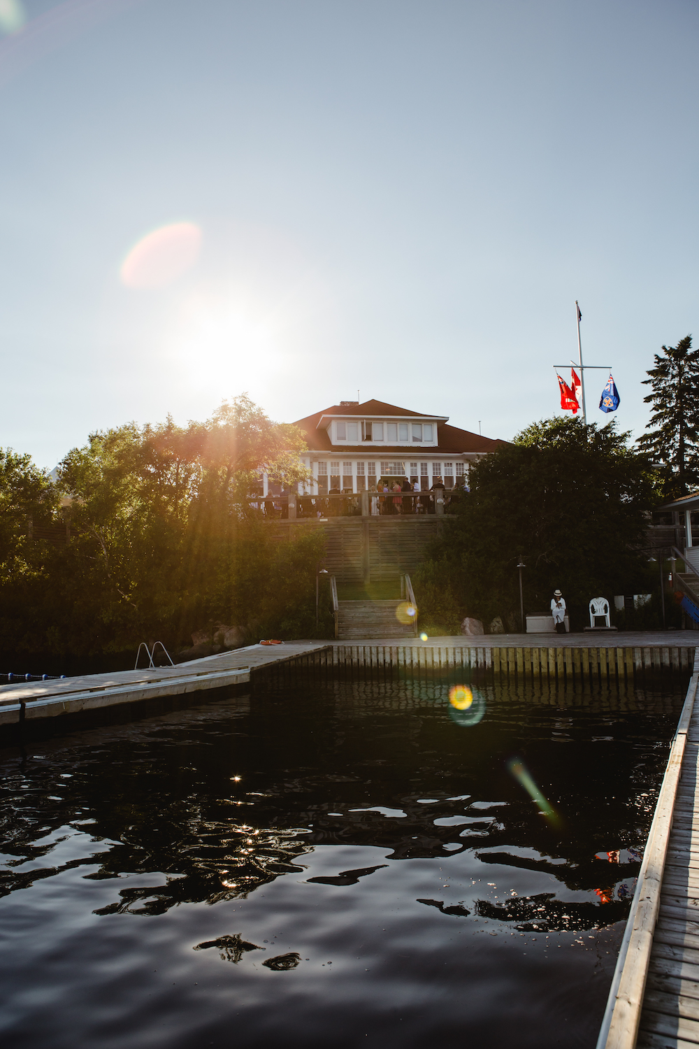
Lake of the Woods Wedding at the Kenora Yacht Club
Sam and Jordan's wedding was my first ever working at the Yacht Club in Kenora, and I loved it! The July sun was out, the skies were clear, and Samantha is a really fun person so I knew it was going to be a great wedding.
Working at the Yacht Club has a unique set of challenges, the biggest of which is that it's on an island! We had to drive out to Kenora with everything packed carefully into the back of my van, meet up with the wedding coordinator, and then load everything into the Club's pontoon boat. We then putted across the lake for about 20 minutes, at which point the pontoon boat ran out of gas about 500 metres from the dock...So after a staff member hopped onto a jet ski and got us some gas, we eventually made out way over to the island and got started.
Photos: luckygirl photography | Videography: Prairie Film Co | Wedding Coordinator: Styled Wedding & Event Planning | Dress: Bliss Bridal Boutique

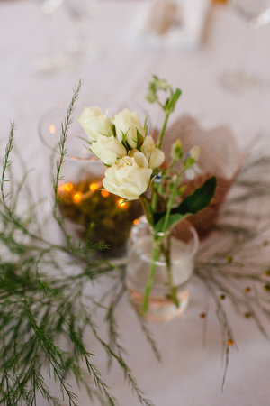
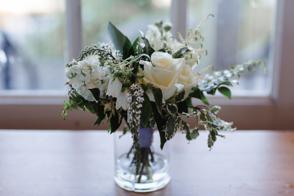
We wanted the keep the palette pretty simple: whites, greens, and watery blues to reflect the incredible view. The Lake of the Woods area is just gorgeous. I also tucked in a few burgundy touches from my garden to add a little depth.
Bridal Bouquet Ingredients: roses, lisianthus, anemones, dendropbium orchids, veronica, stock, ferns, eucalyptus, and pittosporum with burgundy heuchera foliage and tiny touches of light blue tweedia.


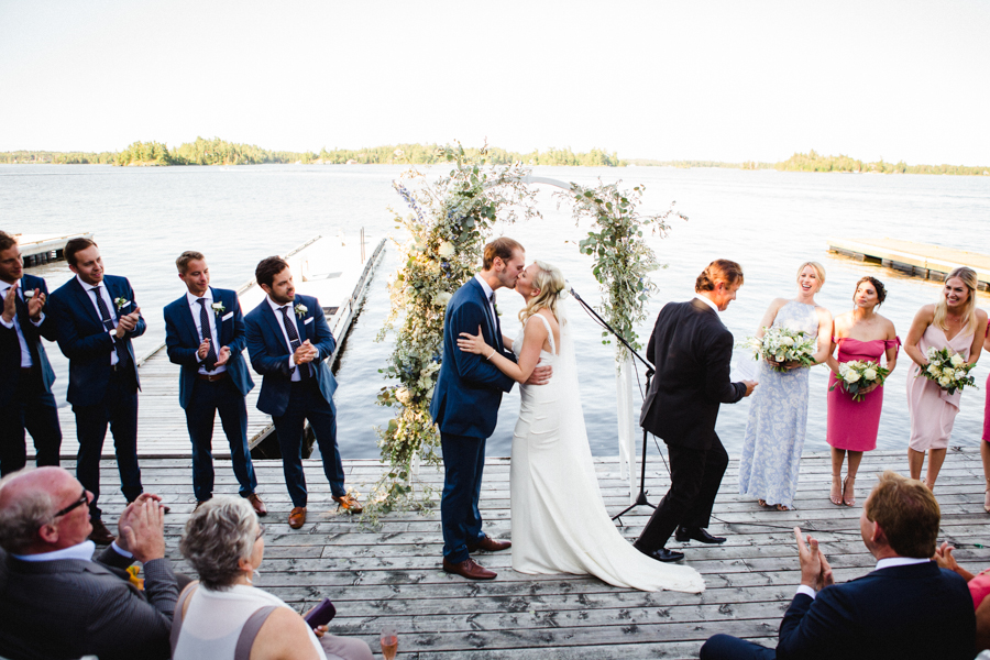
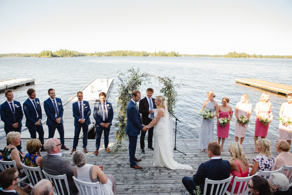
This was definitely one of my favourite ceremony spaces to design of the entire summer! Being on that dock, in the warm sun, was just wonderful (and I got a wicked sunburn that kicked off my summer tan, so bonus! Until I snipped off the tip of my finger when I was almost finished the arbor...just a little slice, it was such a huge deal ha!).
I started with the arch. The couple had purchased this plain white arch, and the plan was for me to dress it up. Given the natural surroundings, I didn't want to do anything too perfect or tidy, and I wanted to keep the palette pretty soft. I started with a lot of soft green foliage (mostly foraged silver willow foliage, olive, and several varieties of eucalyptus). I popped in a few white mums as focal flowers, and then worked in dark blue, light blue, and white delphinium throughout. I love how the long delphinium stems point in all directions; they really add dimension and shape.
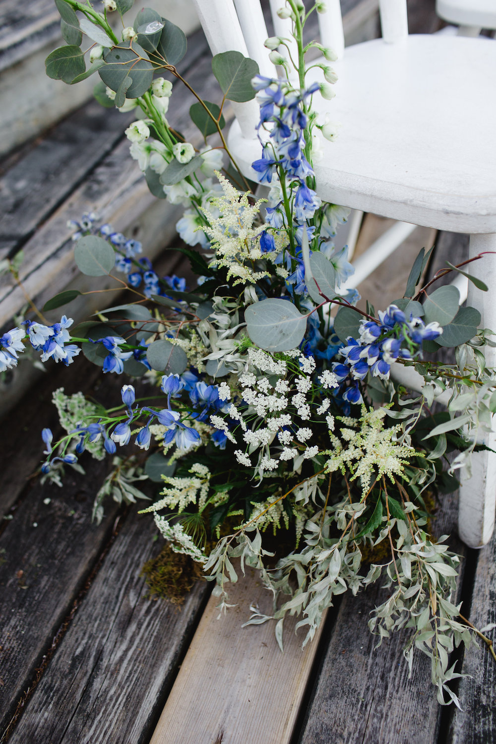
There wasn't much in the way of an aisle, because the dock area is pretty short and there was only space for a handful of chairs before the steps started. Sam wanted something to mark an aisle though, so I created a few of these natural, free-form pieces at the base of a couple of chairs. They felt like they were growing up out of the dock, which I love.


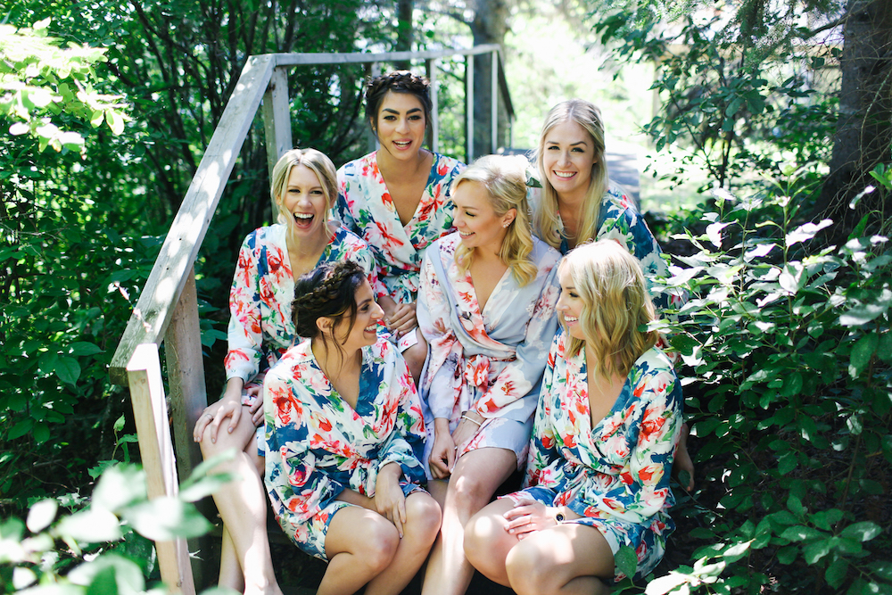
I absolutely LOVE the colours and styles of these bridesmaid dresses. This coral colour is UNREAL, and paired with that floaty soft blue dress? Amazing. This is mistmatched bridesmaids done right.

How to Choose a Gorgeous Wedding Colour Palette
Your colour palette is one of the most important things when it comes to the visual experience of your wedding, and there are a number of things to consider when you're first choosing the right combination. I'm going to briefly walk you through a few of the top things to consider, and then tell you where I think a lot of couples go wrong.

1) Your venue. Let's face it, a lot of venues have some BIZARRE and very noticeable colour palettes already going on. Purple and orange carpet, anyone? I've seen it (at more than one venue...barf). You definitely have to keep the built-in colour palette of your venue in mind when selecting your colour combination.
2) Your favourite colours! Are you drawn to warm tones or cool tones? Neutrals or bright colours? Do you like contrasting colours or complimentary colours? Pulling out a colour wheel is a great way to identify some possible accent colours. Check out this post for some great help.
3) How you can tie these together in a way that is unique, interesting, and not boring? Like all trends, colour combinations tend to go in cycles. And like everything that pops up on Pinterest, most colour combinations become VERY overdone. That doesn't mean these colours aren't great...it just means that the chances of your wedding looking a LOT like everyone else's are pretty high. Take, for example, navy/blush/gold. It's a great combination, but because of how overused it is, it doesn't lend anything personal or unique to your wedding style.
Okay, so what is it that I find most people do wrong when it comes to choosing a gorgeous wedding colour palette? They play it too safe! There's no need for you to stick to just 1 or 2 colours, or a palette which is predictable, or sticking to a combination that is overly seasonal (you don't need to use only white and green in winter...just do whatever you want!).
HERE'S MY TOP TIP FOR DEVELOPING A GORGEOUS WEDDING COLOUR PALETTE:
Don't be afraid to expand on your colour palette to find the right accents.
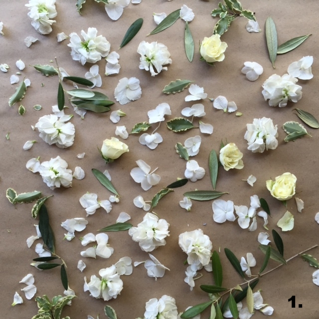

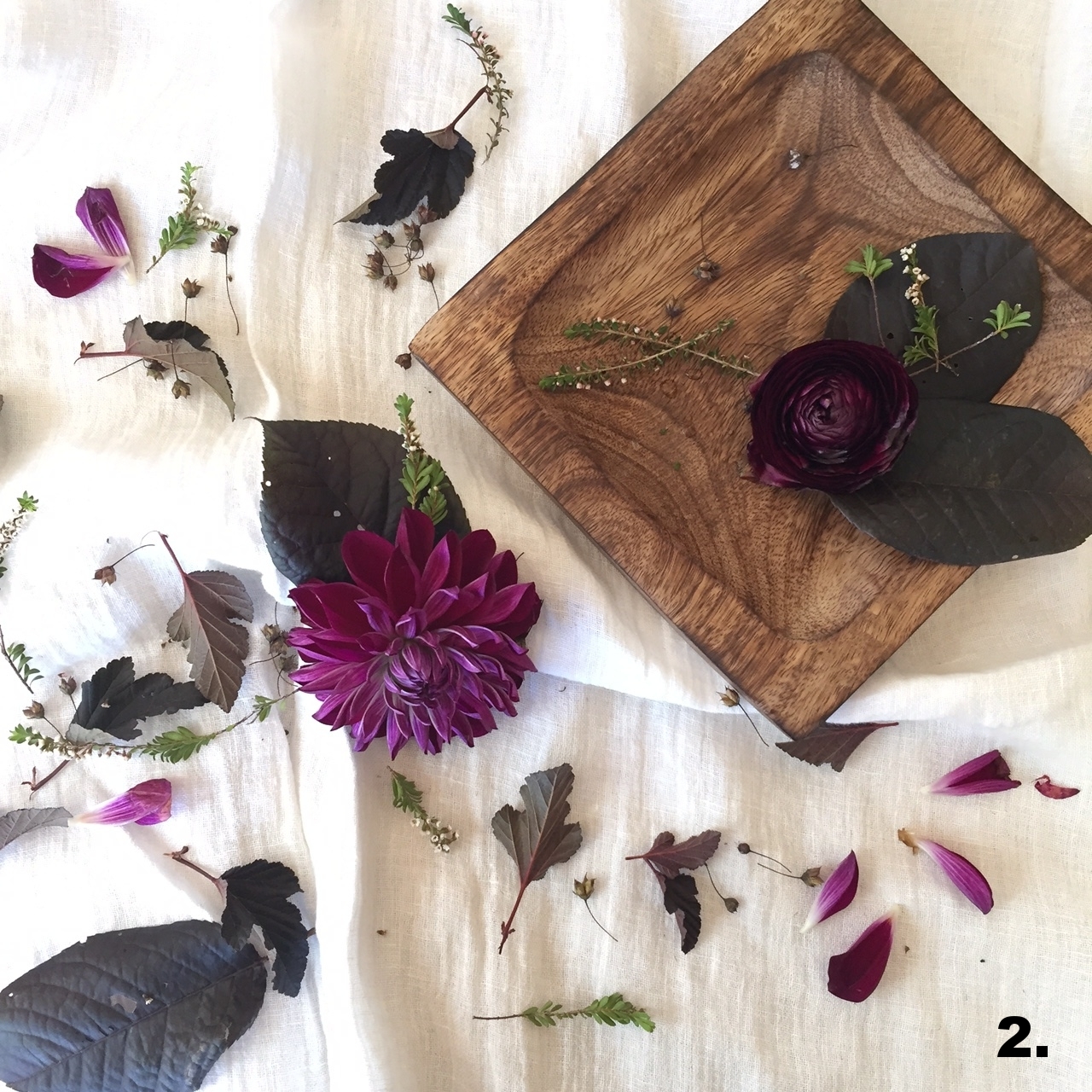
1. Take the colour palette progression photos above as an example. I started with a pretty basic colour palette: white and green. Now, there's nothing wrong with white and green but it's really hard to make a white and green bouquet different from the last white and green bouquet.
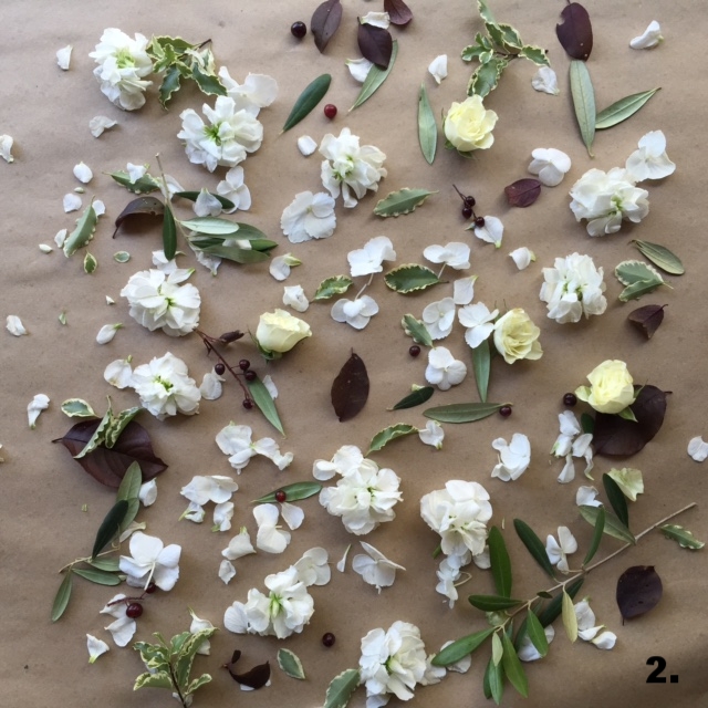
2. So, I added in a touch of burgundy foliage and berries. This added a bit of depth and texture at the same time, but it's not too much and if you're a bit afraid of colour, this is a great level for you.
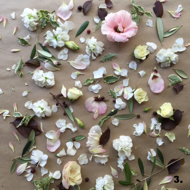
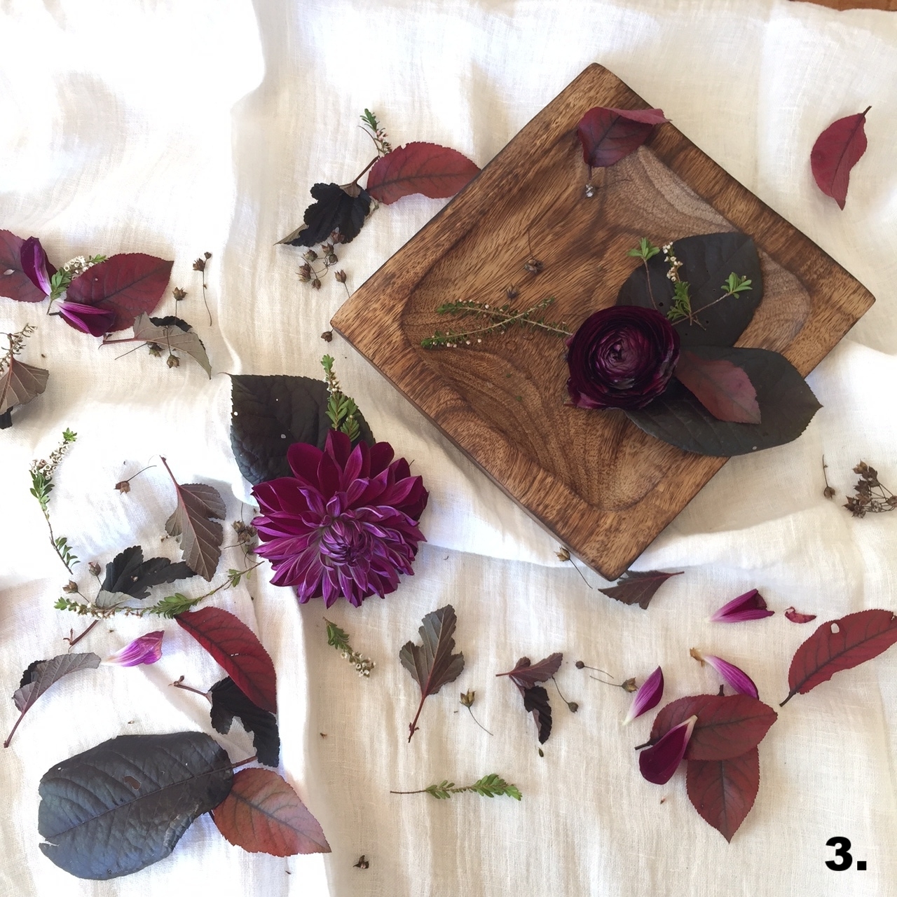
3. Now, if you're ready to go a touch farther, layer in a bit of soft pink. This can be just an accent, or it can be bolder, too. Bonus points if your pink blooms have a touch of that burgundy tone, like the centre of these gorgeous lisianthus.
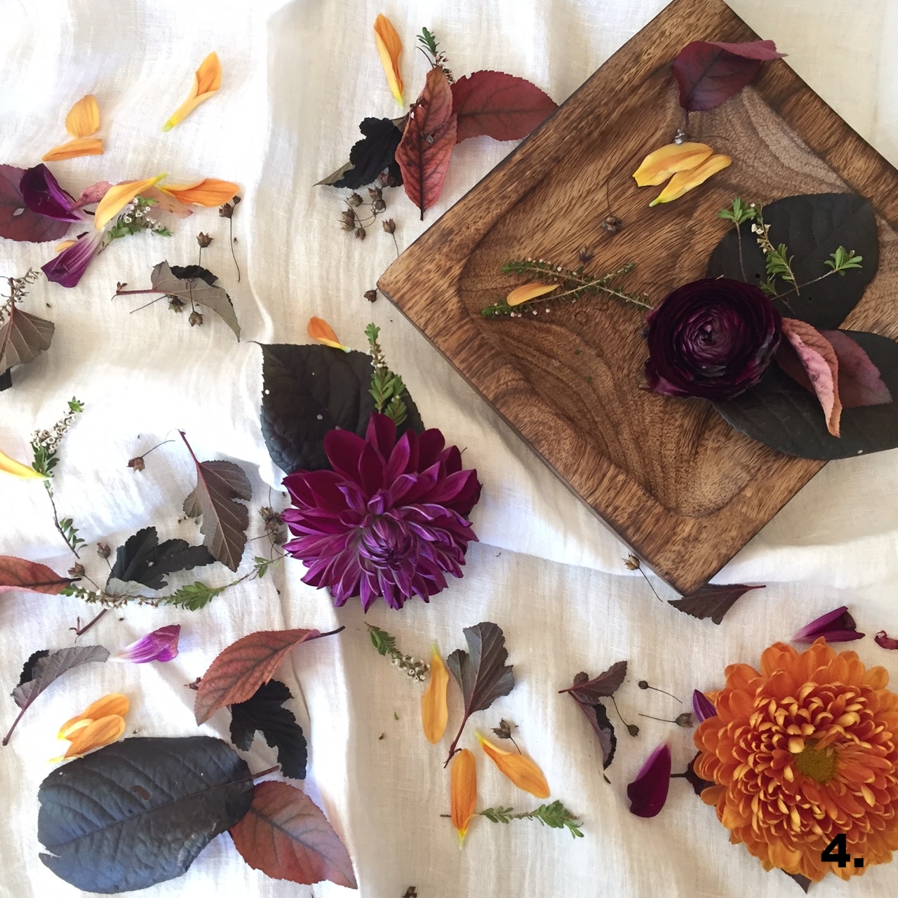
4. And finally, if the idea of adding in colour doesn't stress you out, then just go for it: add in some yellow. In almost every palette, I find that a delicate hint of yellow brings life and excitement.
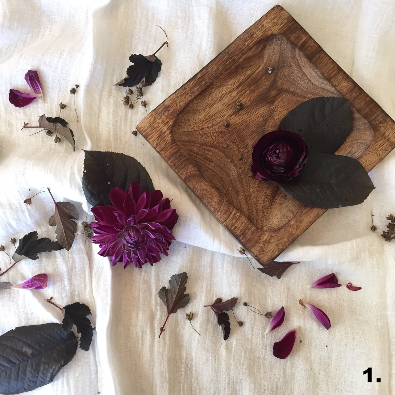
Here's another example, with a fall palette!
If you're unsure of how to develop your wedding colour palette, flowers are a great place to work in accent colours without needing to have different tones splashed throughout the decor. And if you need a second opinion or some different suggestions, I'd love to talk with you.
I'm now booking 2018 weddings! Click the button below to send me an inquiry. I can't wait to hear from you!
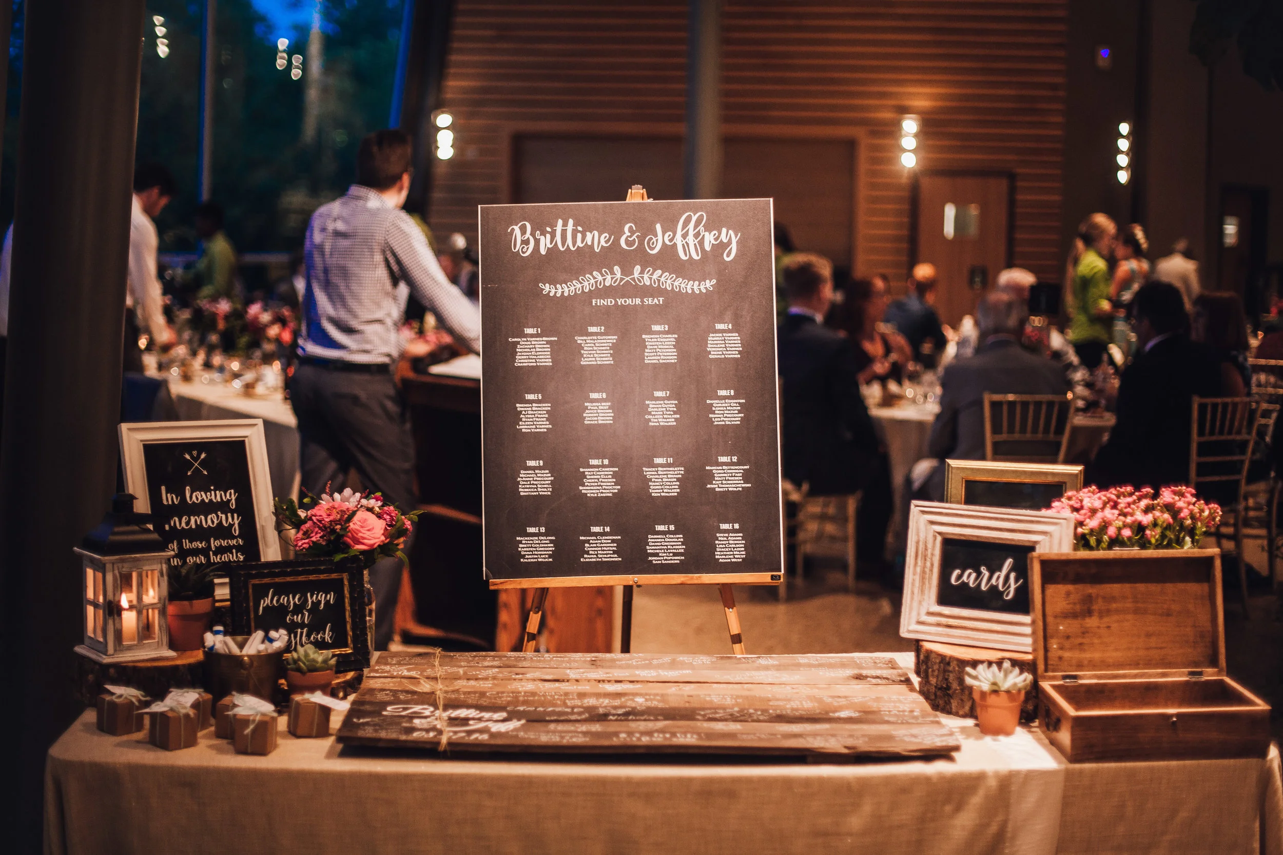
Bright and Colourful Summer Wedding at The Qualico Centre
Brittine and Jeff got married on my birthday. And I'll tell you what, guys: my birthday is at the end of August and it always has THE BEST weather. So basically, I'm a good luck charm. When we first met, Brittine told me she couldn't decide between a bright and colourful wedding palette, or, in her words, "a blush palette like every other basic white bride." I laughed, and then asked her to please, as a birthday present to me, choose to go with a bright colour palette. Mission accomplished.
Photos: JP Media Works | Coordination: Amanda Douglas Events | Linens and Rentals: Planned Perfectly | Venue: Qualico Family Centre
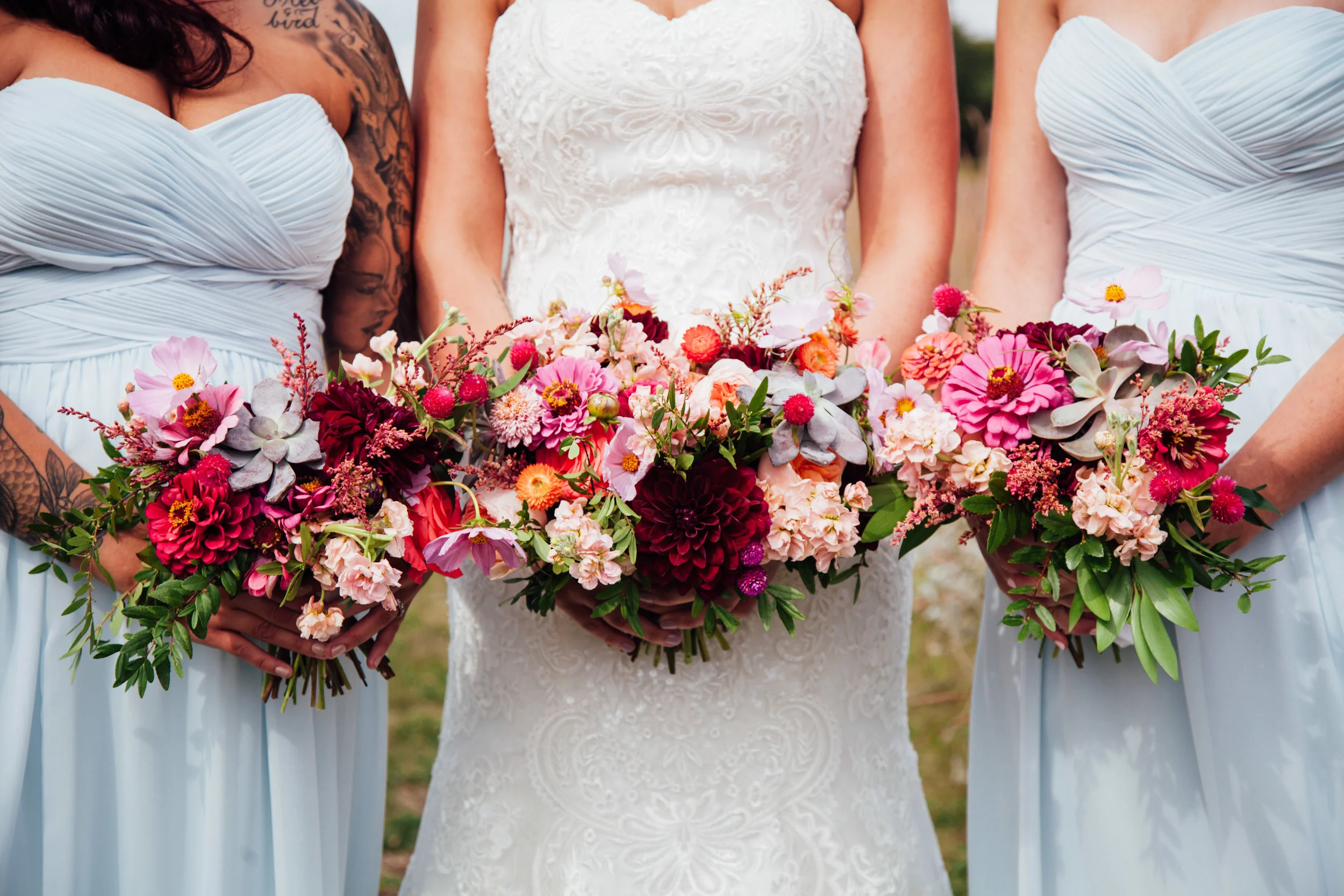
I'm definitely a colour lover. I know that bright colour can be tricky to use at a wedding, and some people are afraid to really go for it (I'll be honest...I'm often one of those people!). But Brittine was not afraid! Her bridesmaids were wearing several different shades of blue, so for her flowers, we chose peach, burgundy, coral, orange, and greens. I LOVED it.
Bridal Bouquet Ingredients: dahlias, zinnias, gomphrena, cosmos, garden roses, stock, solidago, succulents, and boxwood.


Brittine and Jeff have two rambunctious dogs and I made these bright floral dog collars for them. They were so cute!
The reception was at the Qualico Family Centre in Assiniboine Park. I designed two different centrepiece styles, one with a large potted plant and mini floral arrangements, and the other with a larger floral arrangements and mini potted succulents. It came together really cute and was perfect for summer!


The Perfect Spring Wedding Flowers
Around this time of year, I always get restless. Well, let's be honest. Restlessness sets in as soon as January 1 has come and gone and I'm just good and ready for all the snow to MELT ALREADY. My grandpa used to say, "If I can just make it through January, I'll be just fine." That's how I feel about both January and February. I love living in Winnipeg and I love having 4 distinct seasons, but I could do with a lot less winter.
Needless to say, I've been craving spring (I know I'm not the only one out here on the prairies feeling that way). And with a desire to get working and get my hands dirty, combined with a particularly stressful week, I headed off to my wholesaler to pick up anything with colour. And so, here we are: the perfect spring wedding flowers.
I also thought I'd break this down into a few steps, to show you a bit of the behind-the-scenes of how I work! (although, I designed this in my kitchen and my studio is NOT as beautiful as this is, ha!)
Ingredients: green viburnum (yeah baby!), peach spray roses, white lisianthus, skimmia, calcynia, sprengeri fern, peach Icelandic poppies (yeah baby x2!), and soft blue muscari (yeah baby x3!). I also had some hellebore I was hoping to use, but they bit the bullet pretty quickly. There's no telling with those guys if they're going to make it or not!
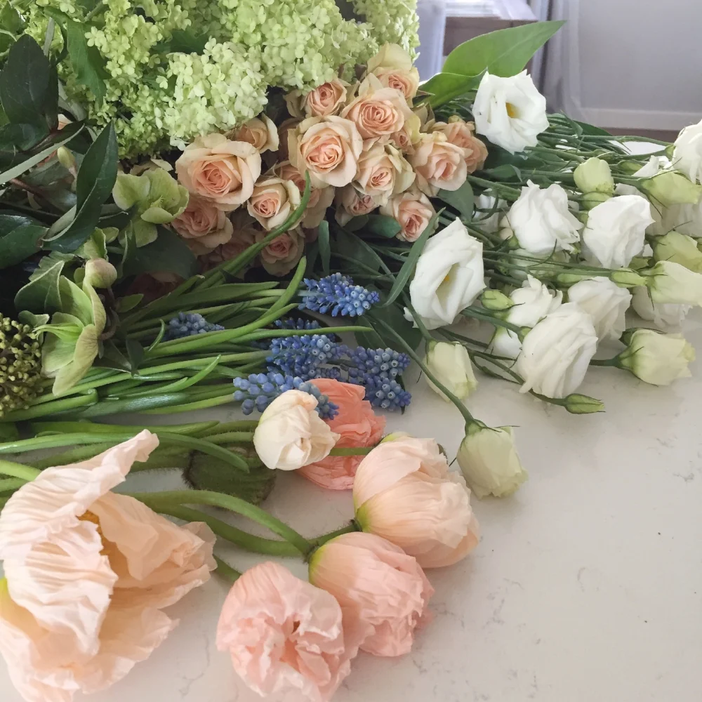

Layer 1: Greenery and shape. I actually cut this sprengeri fern off a plant that I have! It's nice and light, but sometimes it can be on the thorny side, so I don't use it all that often. The viburnum is my favourite thing. Depending on where you live, you won't see this in green for too long, as the blooms quickly turn white and they look like big, beautiful snowballs. But I do really love the green of the blooms - it's that soft, springy, fresh green that is just perfect.

Layer 2: Texture. Here I added in calcyina for a little bit of pink, and skimmia for interesting texture. I also really like that the skimmia leaves are a bit of a darker green, which adds some nice contrast.

Layer 3: Base flower layer. I added in the peach here with the spray roses, most of which were tucked down pretty deeply for coverage in the vase (speaking of which, I LOVE this concrete vase). White lisianthus is always pretty, and has lovely little buds, and that was added in here as well.

Layer 4: All the good stuff :) This layer is definitely my favourite! I really could have left it at layer 3, but having the chance to use some more special, unique flowers and really letting them shine was too good of an opportunity to pass up here. So, poppies and muscari went in! I've never used this type of poppy before and I don't think they're particularly long lasting, so I'll give these a test and see what happens. I do love their incredible, paper-thin pleated blooms and the way each is a slightly different shade - they're PERFECT for spring wedding bouquets. And the muscari is a delicate little bloom. The blue is a lovely complementary tone of the peach, and adds a little more dimension to the overall palette.
By the way, I'm now booking for 2018 weddings! I am meeting with quite a few eager brides and grooms over the next two months, so if you want to talk wedding flowers with me, don't hesitate to reach out with more details about your wedding day. Just click the box below!
Modern White and Green Wedding at The WAG
When I first met with Jessica and Andrei to talk about their wedding flowers, I simultaneously felt like I wasn't cool enough to be a part of their wedding and also knew that I had to become cool enough to be a part of their wedding. 'Cause when a city planner and an interior designer get married, you know it's going to be pretty slick.
As featured on Host Winnipeg
Photos by Kamp Photography

And if this one picture doesn't prove it to you, allow me to continue. This couple has a modern aesthetic, the coolest house in Wolseley, and just check out Jessica's Houghton NYC gown.


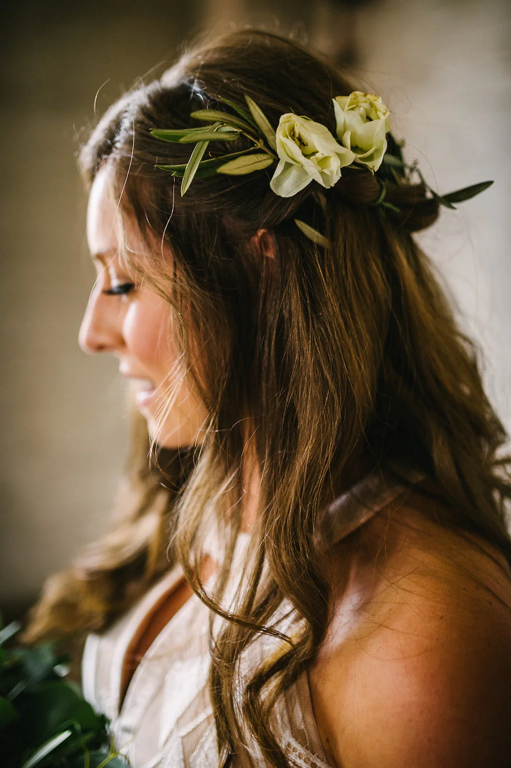
Jessica's bridal bouquet was really fun to create, and it was SO light and easy to carry. I used three different types of eucalyptus, olive foliage, air plants, white protea, and a few stems of large-headed white roses. I also created a large, full white rose floral crown for her.


For the bridesmaids, we did up bouquets of just greenery, and also loose blooms for their hair. This was probably the best-dressed group of bridesmaids I have ever seen.


The couple crafted this incredibly cool, geometric arch for their rooftop ceremony at the Winnipeg Art Gallery. They also made mini cement planters for potted succulents, and I provided them with monstera leaves and white protea for their centrepieces.

