How to Choose a Gorgeous Wedding Colour Palette
Your colour palette is one of the most important things when it comes to the visual experience of your wedding, and there are a number of things to consider when you're first choosing the right combination. I'm going to briefly walk you through a few of the top things to consider, and then tell you where I think a lot of couples go wrong.

1) Your venue. Let's face it, a lot of venues have some BIZARRE and very noticeable colour palettes already going on. Purple and orange carpet, anyone? I've seen it (at more than one venue...barf). You definitely have to keep the built-in colour palette of your venue in mind when selecting your colour combination.
2) Your favourite colours! Are you drawn to warm tones or cool tones? Neutrals or bright colours? Do you like contrasting colours or complimentary colours? Pulling out a colour wheel is a great way to identify some possible accent colours. Check out this post for some great help.
3) How you can tie these together in a way that is unique, interesting, and not boring? Like all trends, colour combinations tend to go in cycles. And like everything that pops up on Pinterest, most colour combinations become VERY overdone. That doesn't mean these colours aren't great...it just means that the chances of your wedding looking a LOT like everyone else's are pretty high. Take, for example, navy/blush/gold. It's a great combination, but because of how overused it is, it doesn't lend anything personal or unique to your wedding style.
Okay, so what is it that I find most people do wrong when it comes to choosing a gorgeous wedding colour palette? They play it too safe! There's no need for you to stick to just 1 or 2 colours, or a palette which is predictable, or sticking to a combination that is overly seasonal (you don't need to use only white and green in winter...just do whatever you want!).
HERE'S MY TOP TIP FOR DEVELOPING A GORGEOUS WEDDING COLOUR PALETTE:
Don't be afraid to expand on your colour palette to find the right accents.
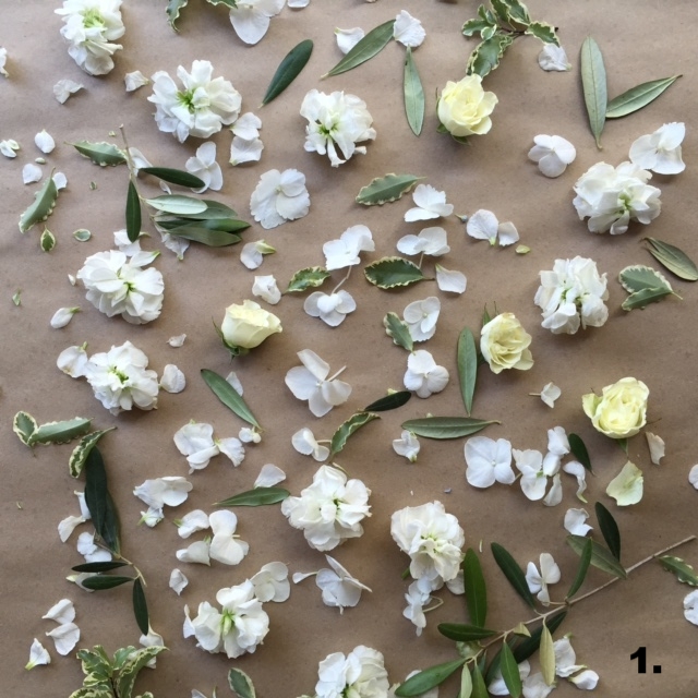

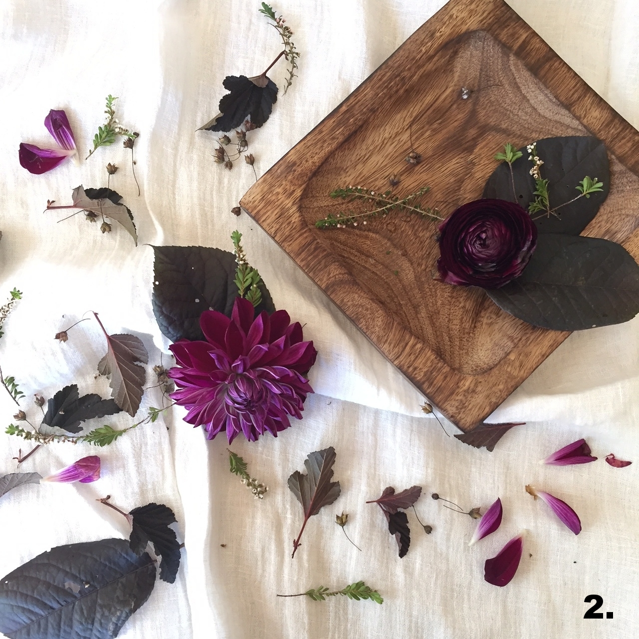
1. Take the colour palette progression photos above as an example. I started with a pretty basic colour palette: white and green. Now, there's nothing wrong with white and green but it's really hard to make a white and green bouquet different from the last white and green bouquet.
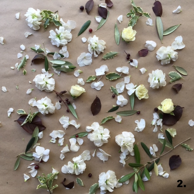
2. So, I added in a touch of burgundy foliage and berries. This added a bit of depth and texture at the same time, but it's not too much and if you're a bit afraid of colour, this is a great level for you.
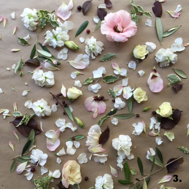
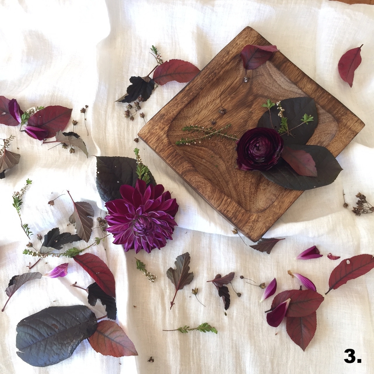
3. Now, if you're ready to go a touch farther, layer in a bit of soft pink. This can be just an accent, or it can be bolder, too. Bonus points if your pink blooms have a touch of that burgundy tone, like the centre of these gorgeous lisianthus.
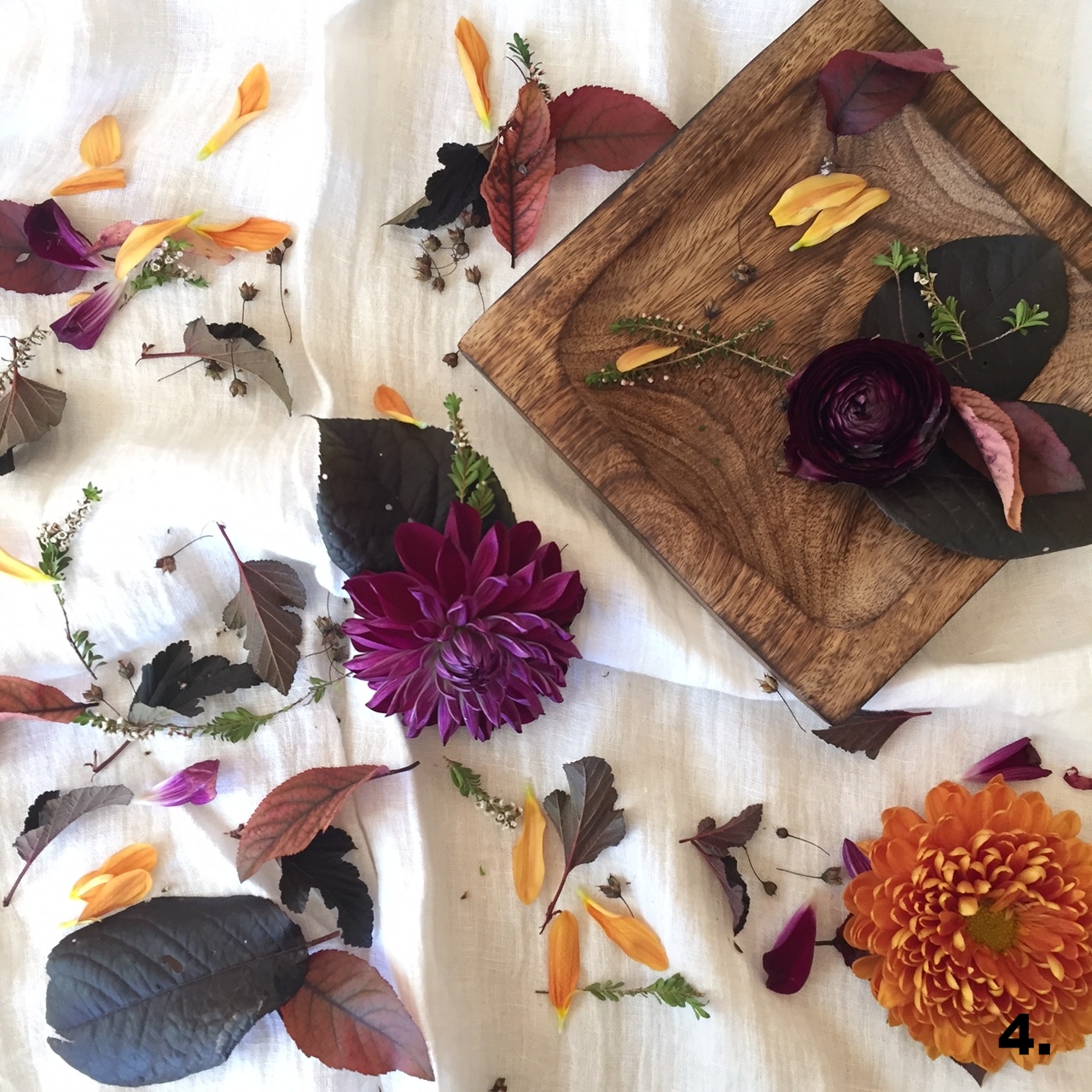
4. And finally, if the idea of adding in colour doesn't stress you out, then just go for it: add in some yellow. In almost every palette, I find that a delicate hint of yellow brings life and excitement.
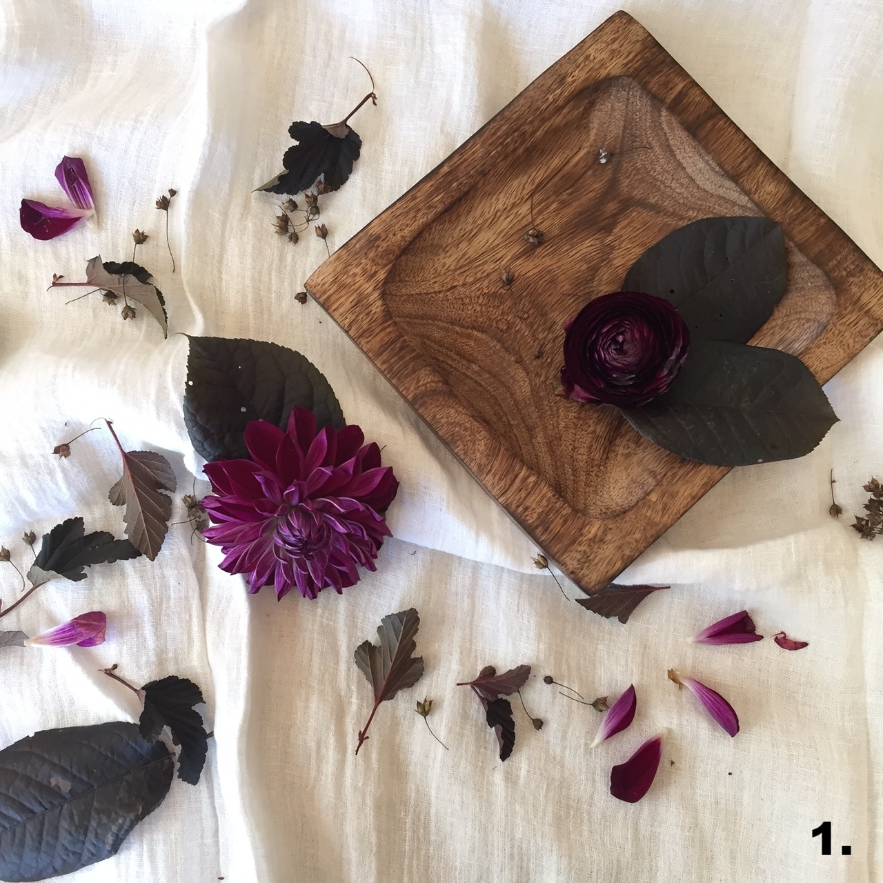
Here's another example, with a fall palette!
If you're unsure of how to develop your wedding colour palette, flowers are a great place to work in accent colours without needing to have different tones splashed throughout the decor. And if you need a second opinion or some different suggestions, I'd love to talk with you.
I'm now booking 2018 weddings! Click the button below to send me an inquiry. I can't wait to hear from you!