

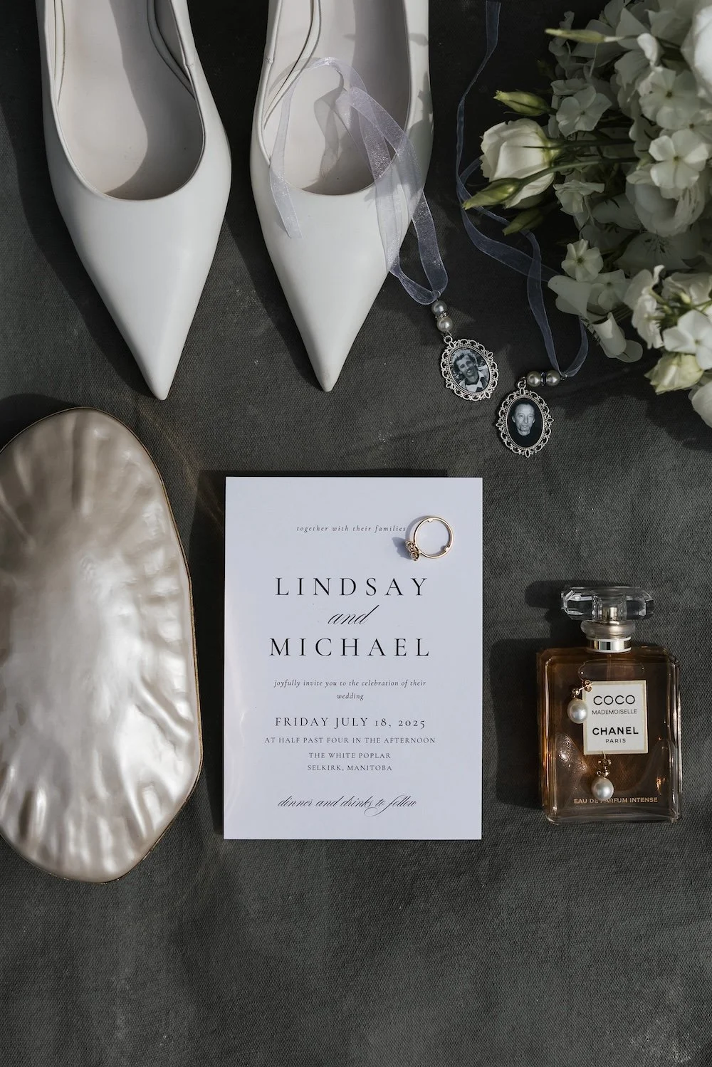
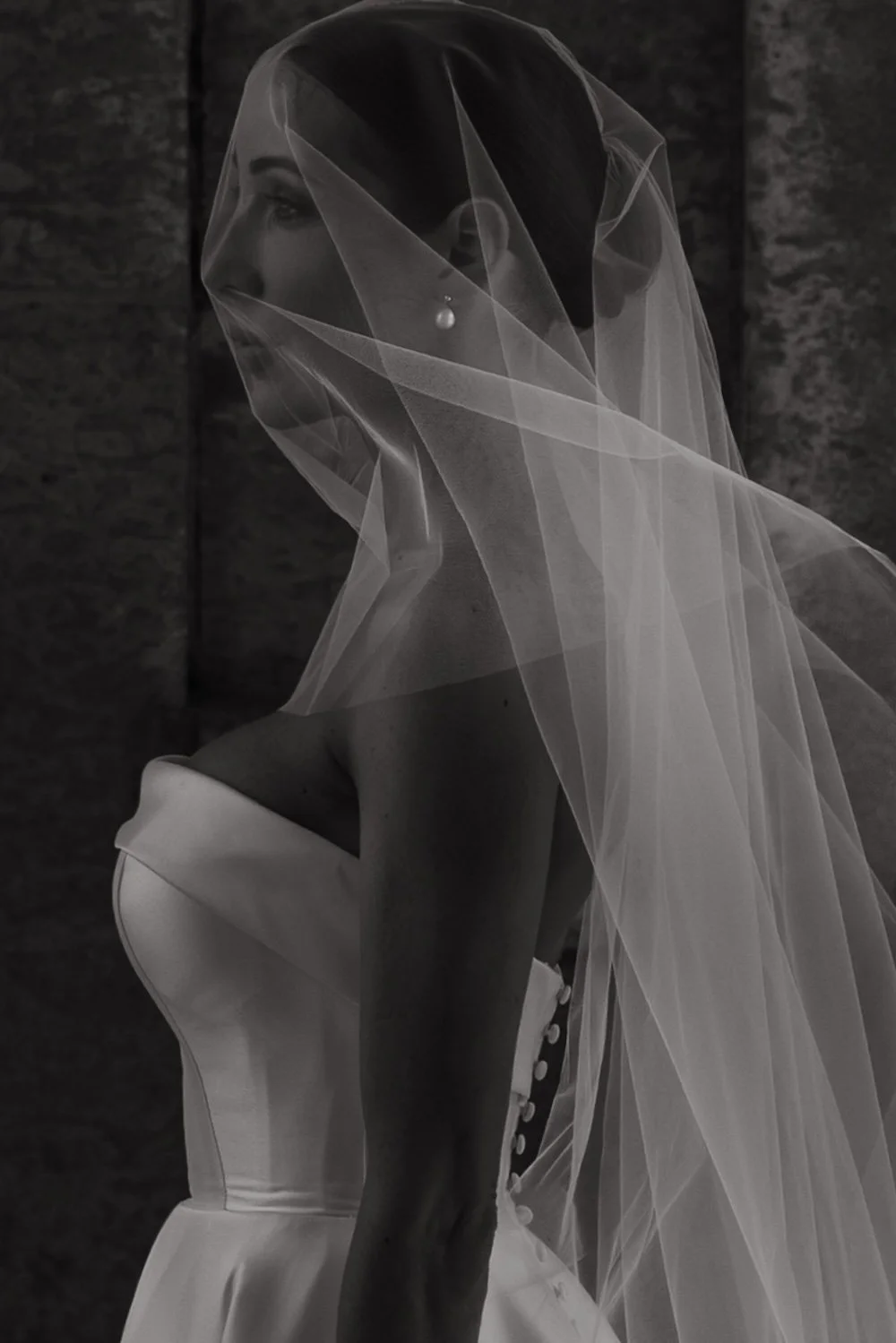
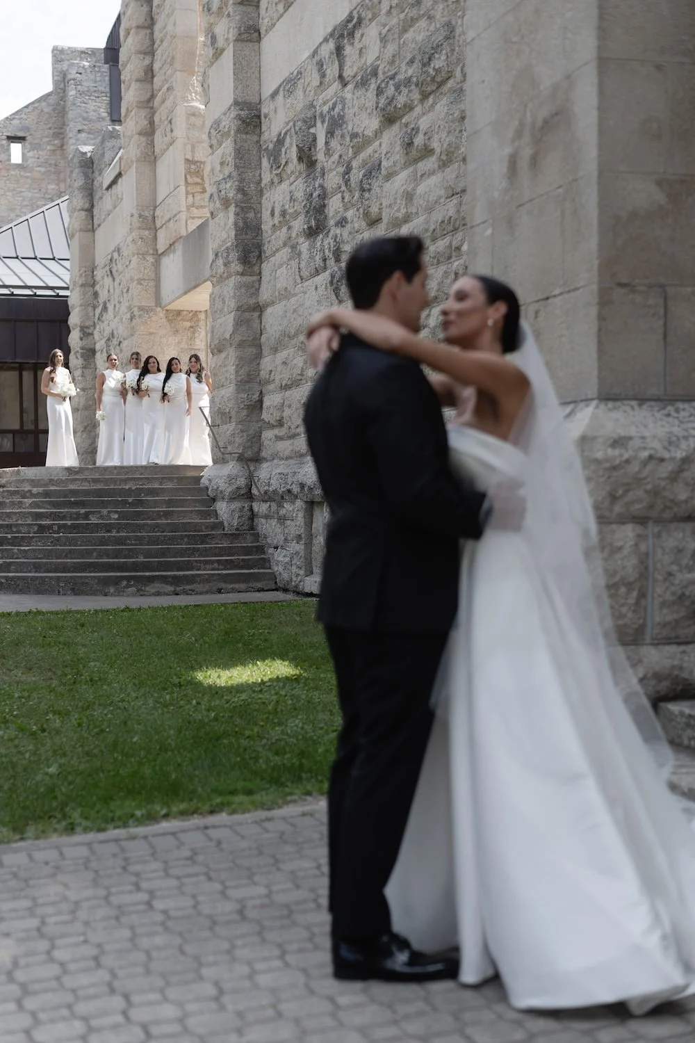
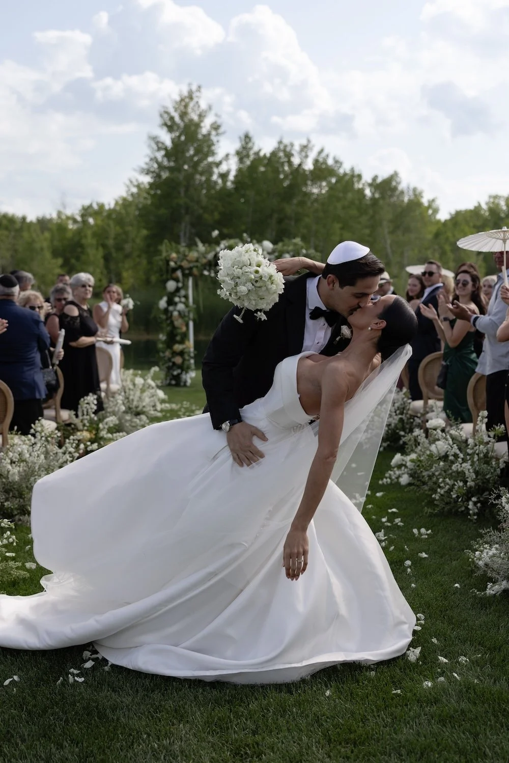
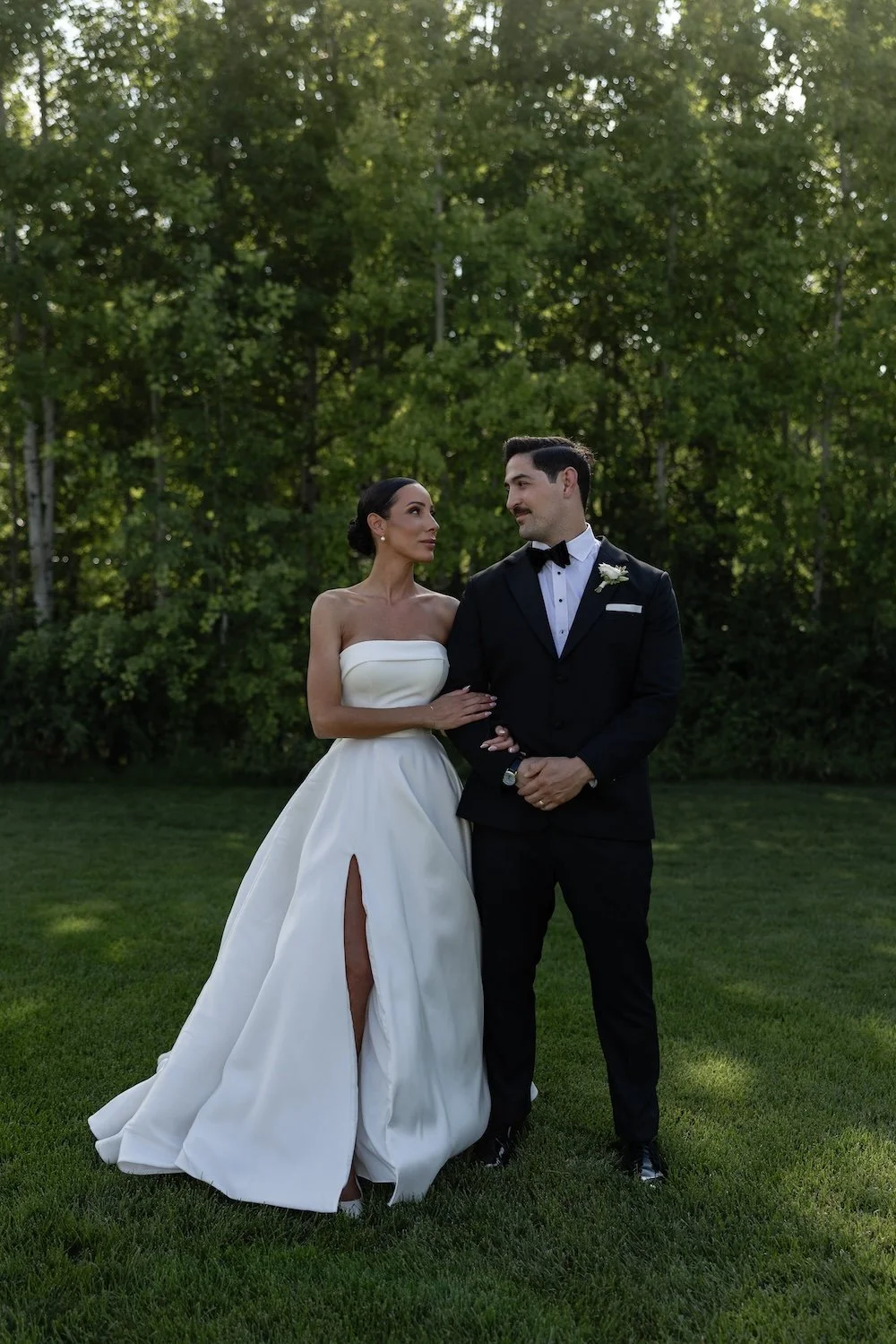
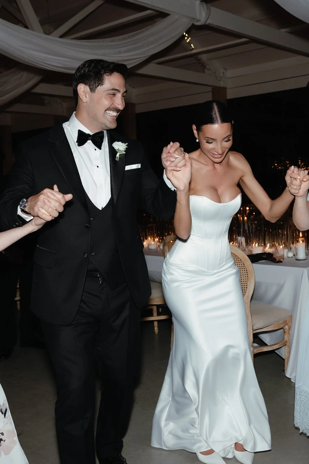
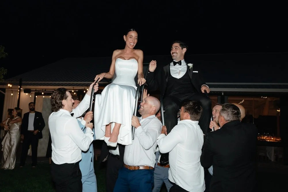
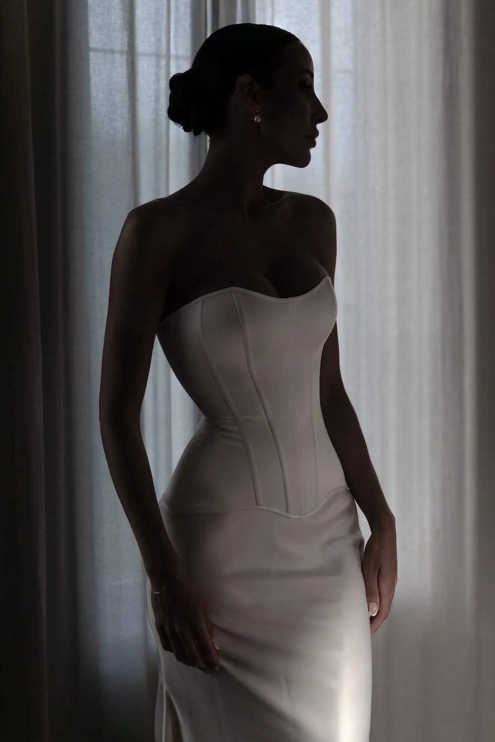
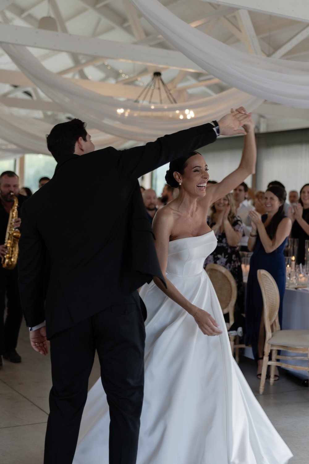
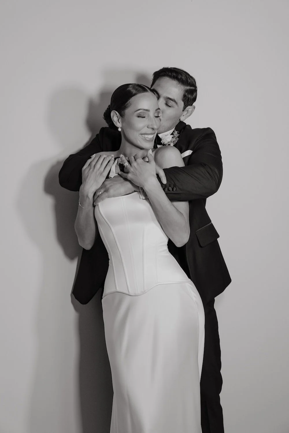
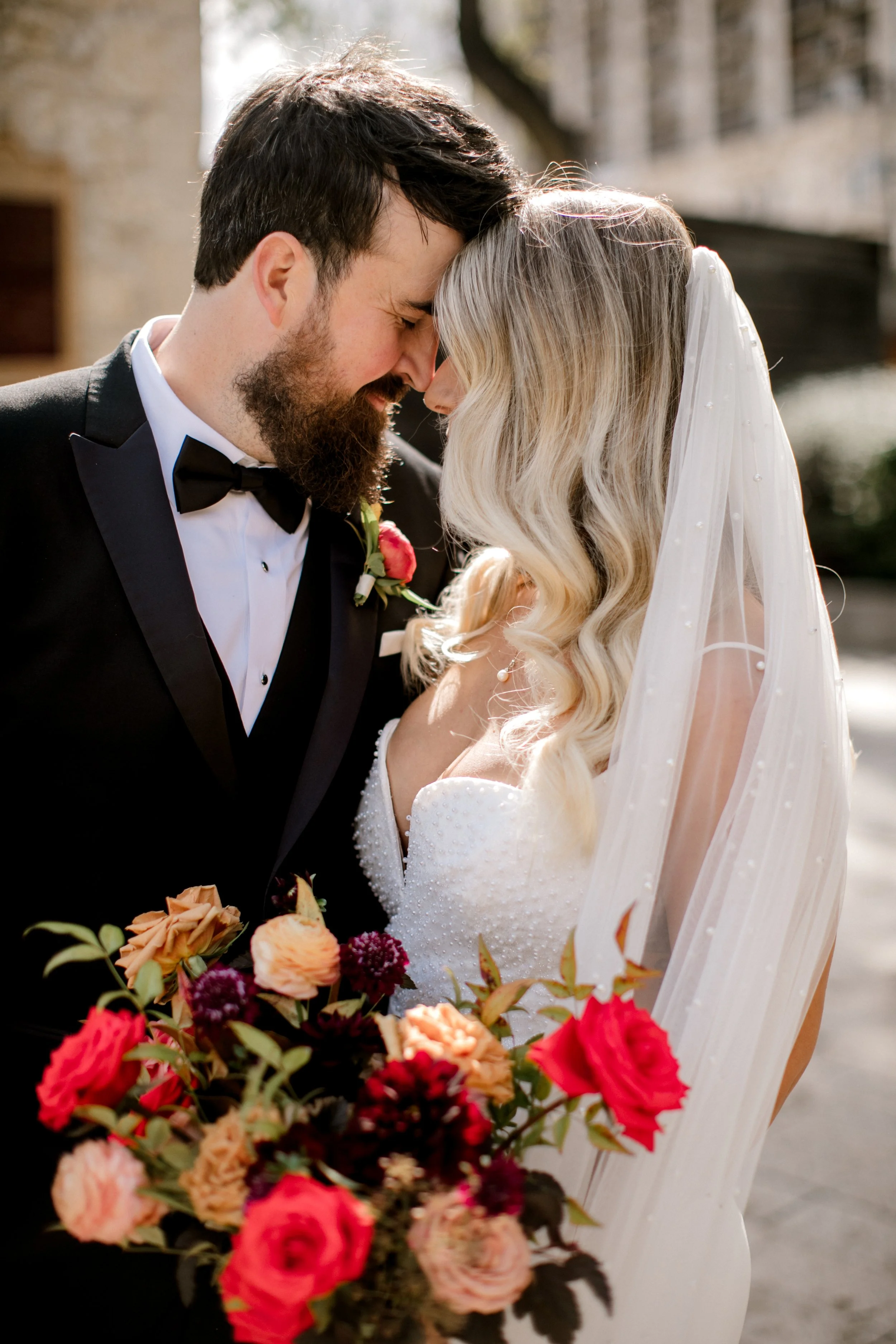
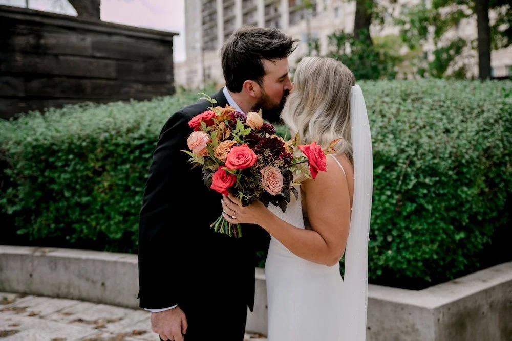
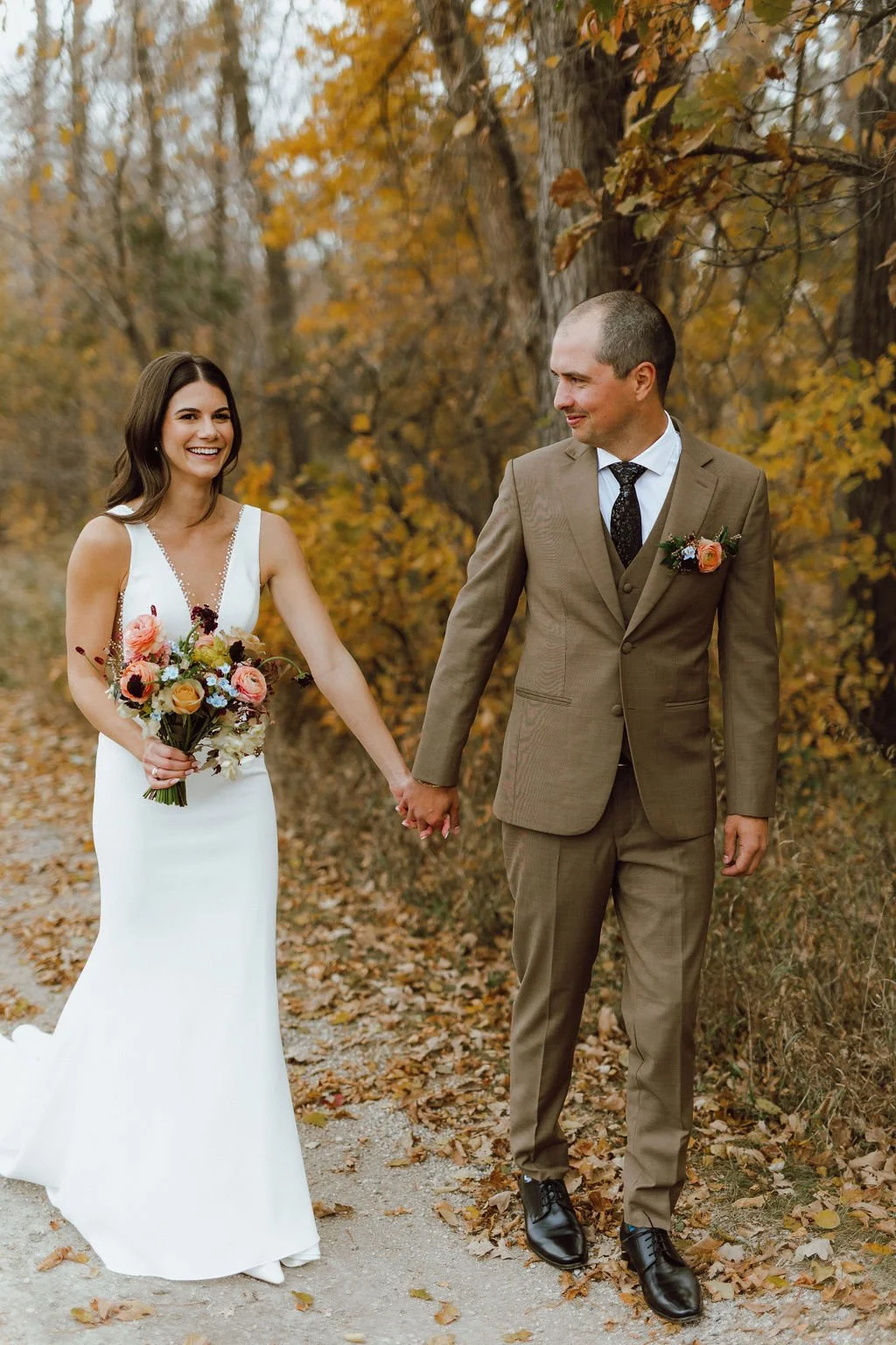
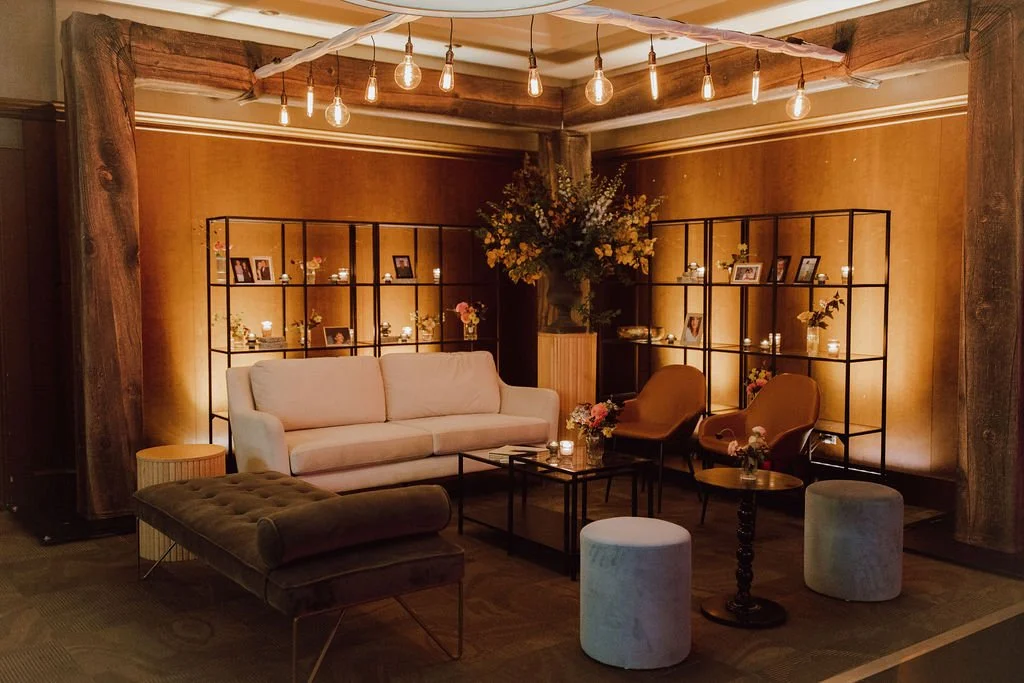
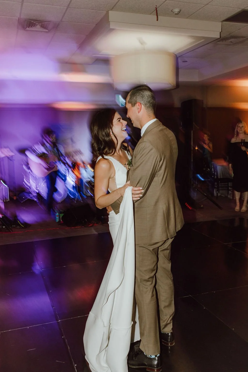
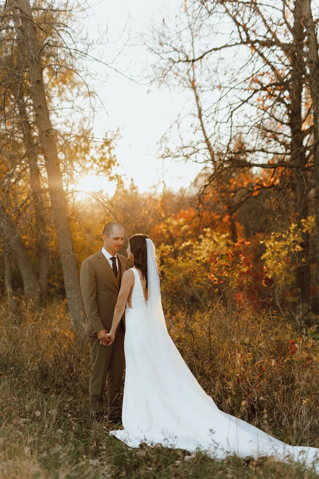
Minimalist Meets Maximalist Wedding at The White Poplar
Lindsay came to me requesting monochromatic, minimalist meets maximalist vibes with spotlight floral features. Over time, things shifted a bit into a luxurious, modern European direction and I can’t wait to tell you all about it.
I always love to start my blog posts for the new calendar year with some of my favourite weddings from the previous year. Lindsay and Michael’s wedding was absolutely a highlight of 2025!
Photos by Michael & Melanie
Planning and Design by Melanie Parent Events
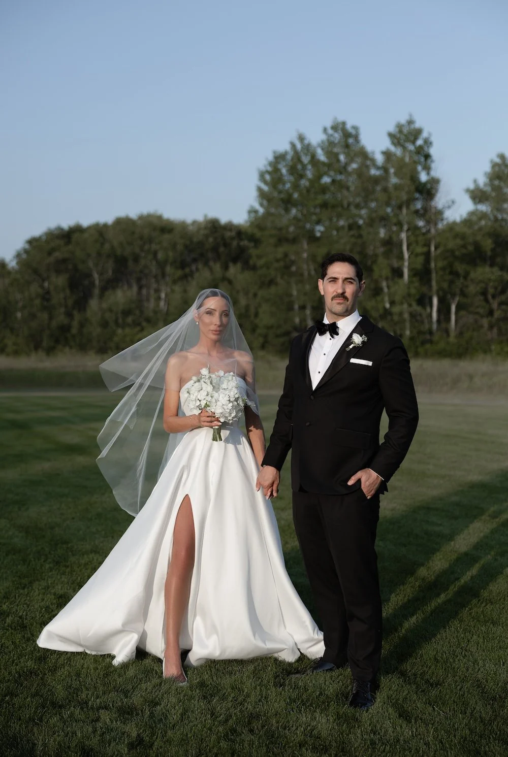
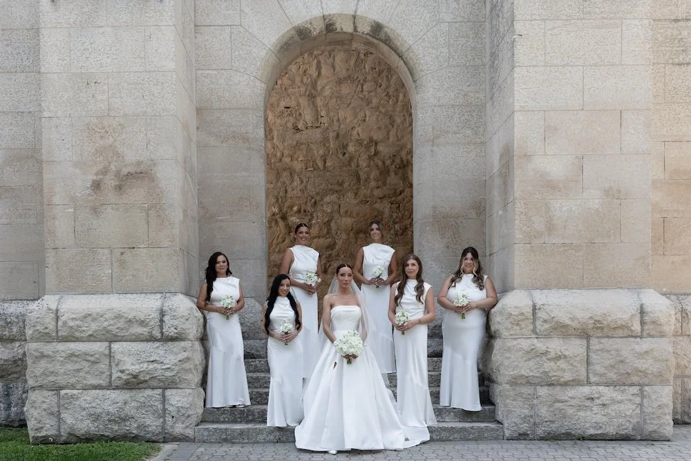
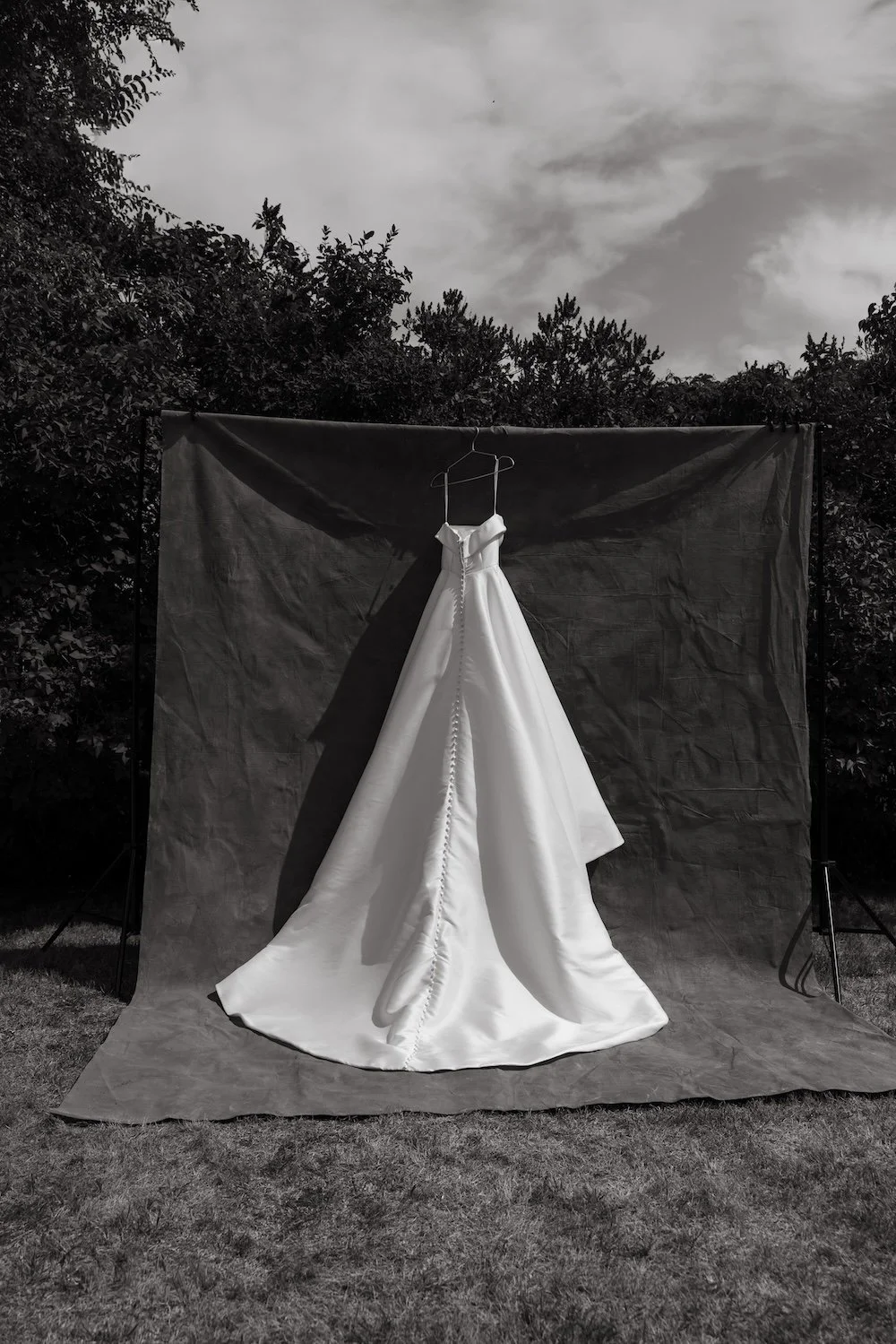
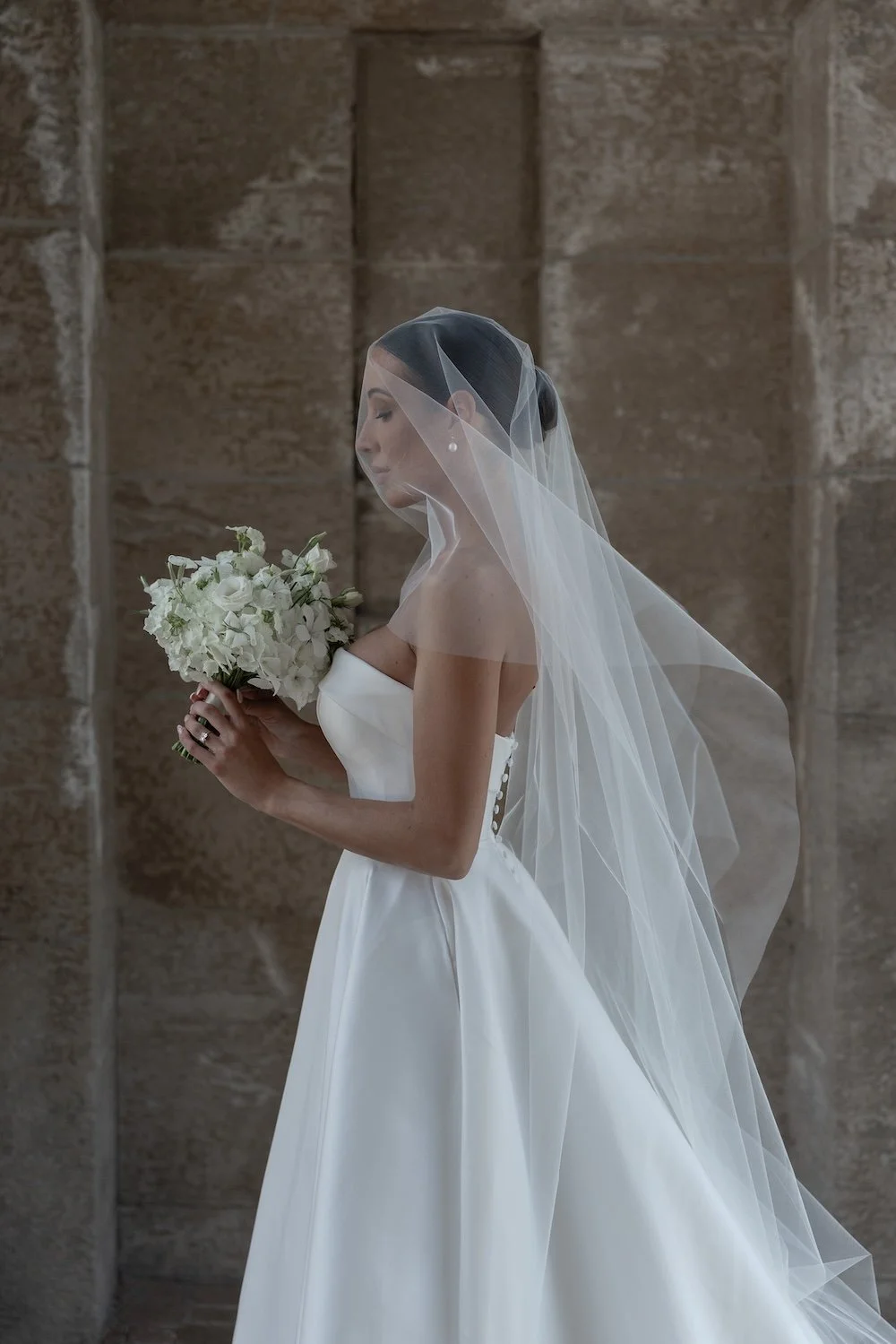
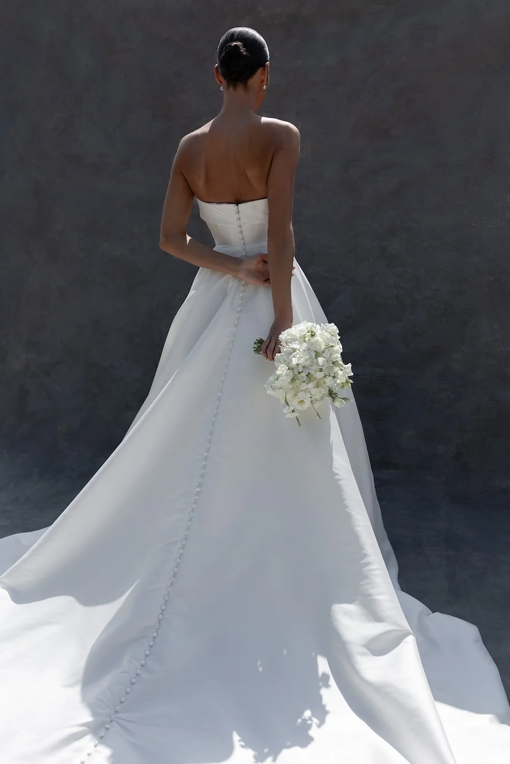
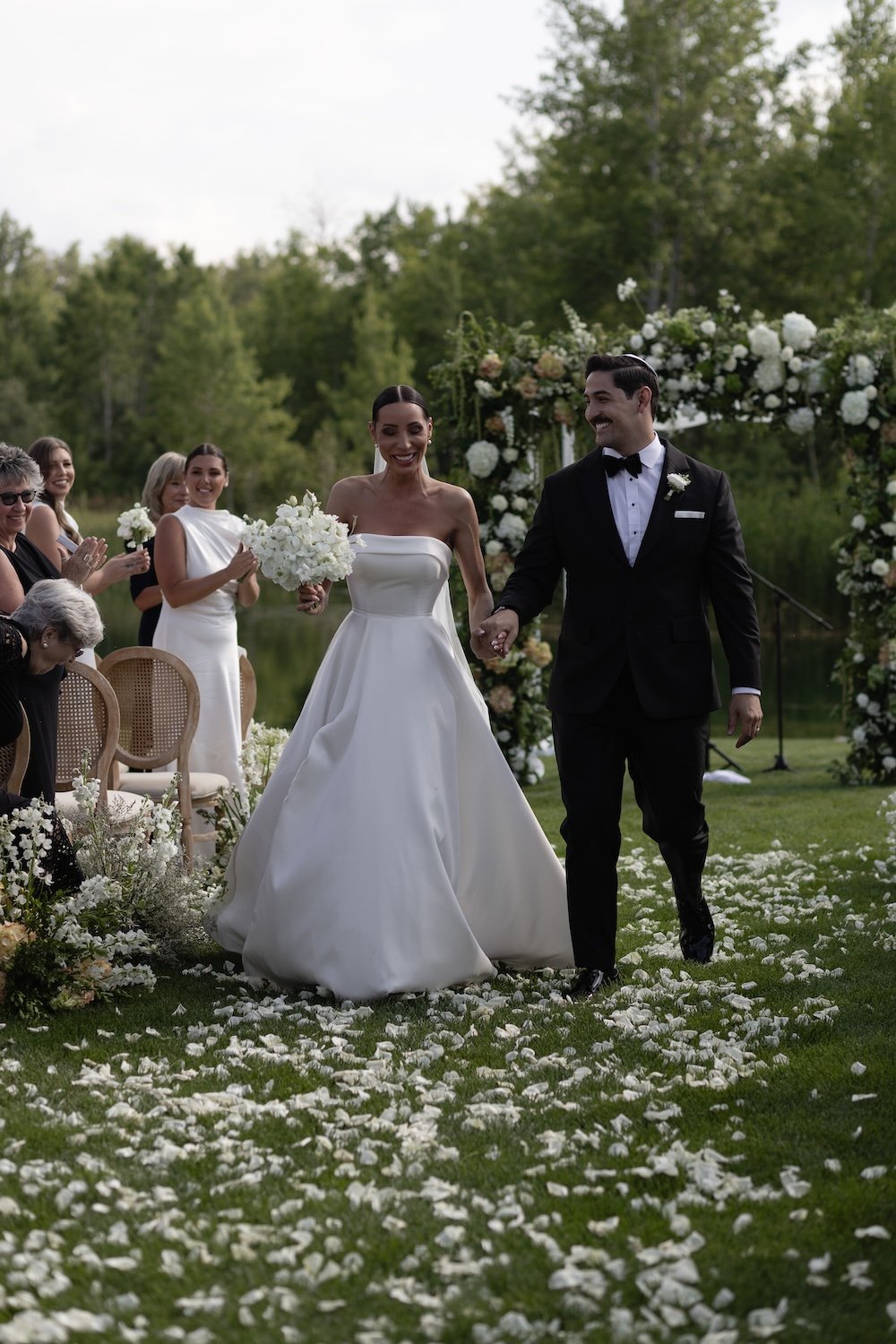
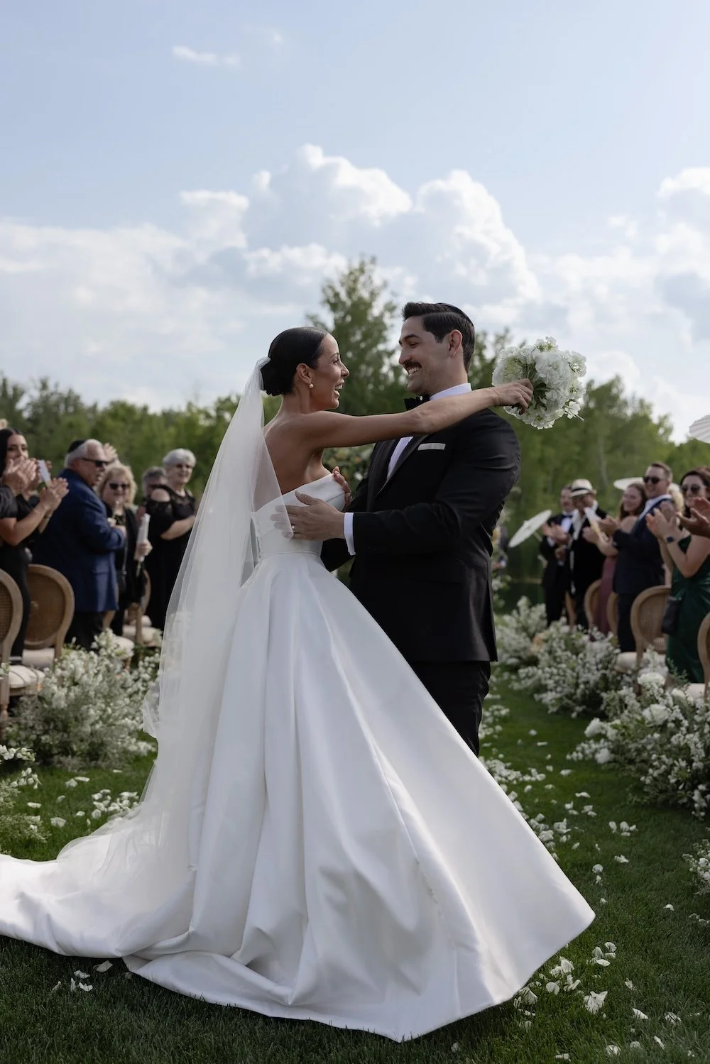
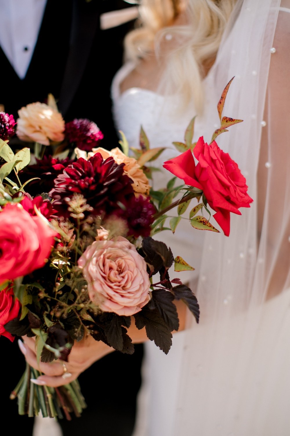
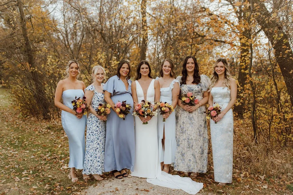
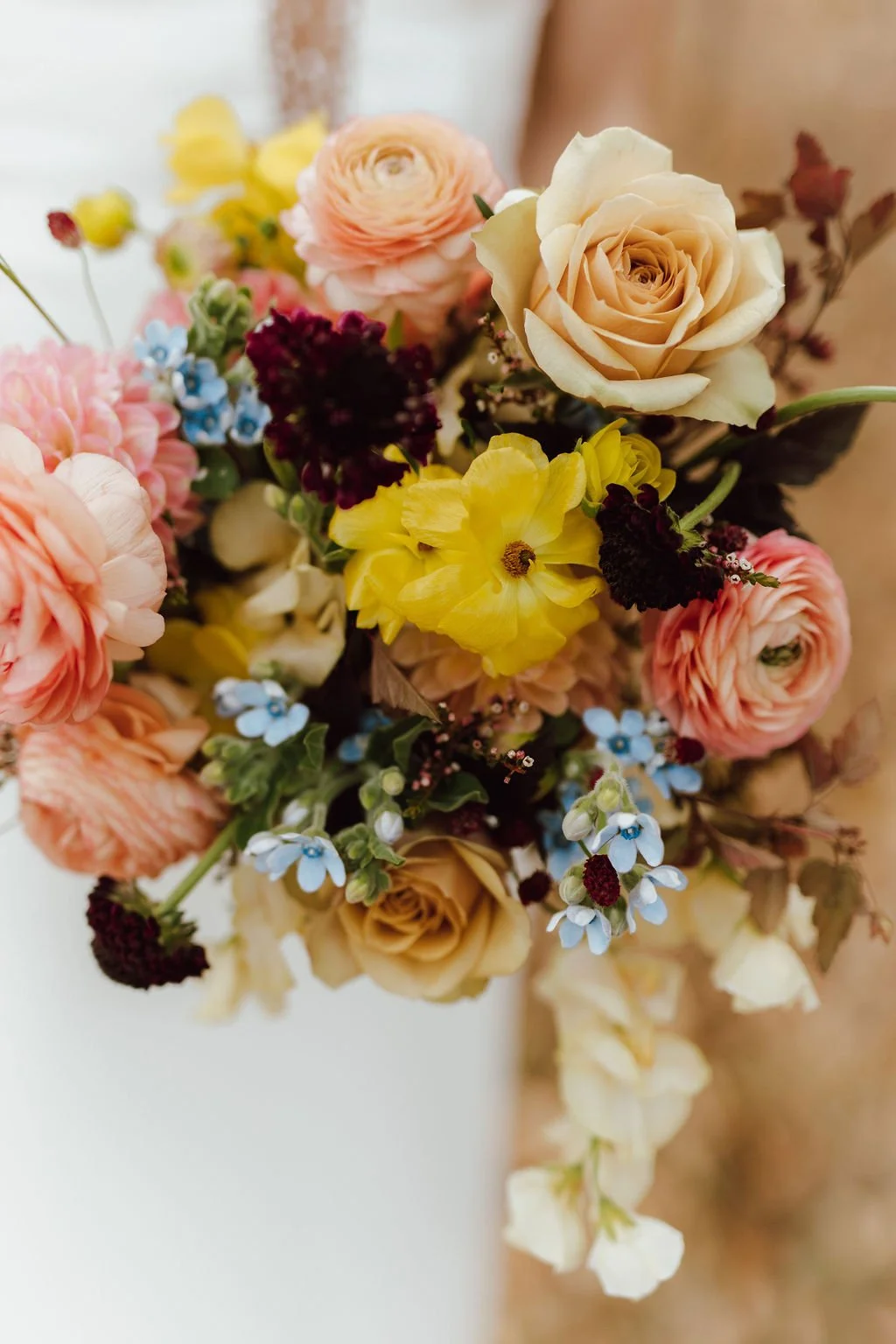
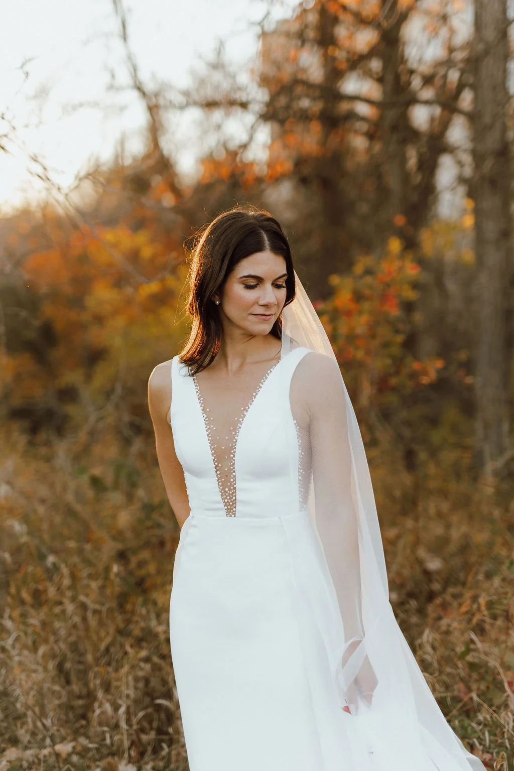
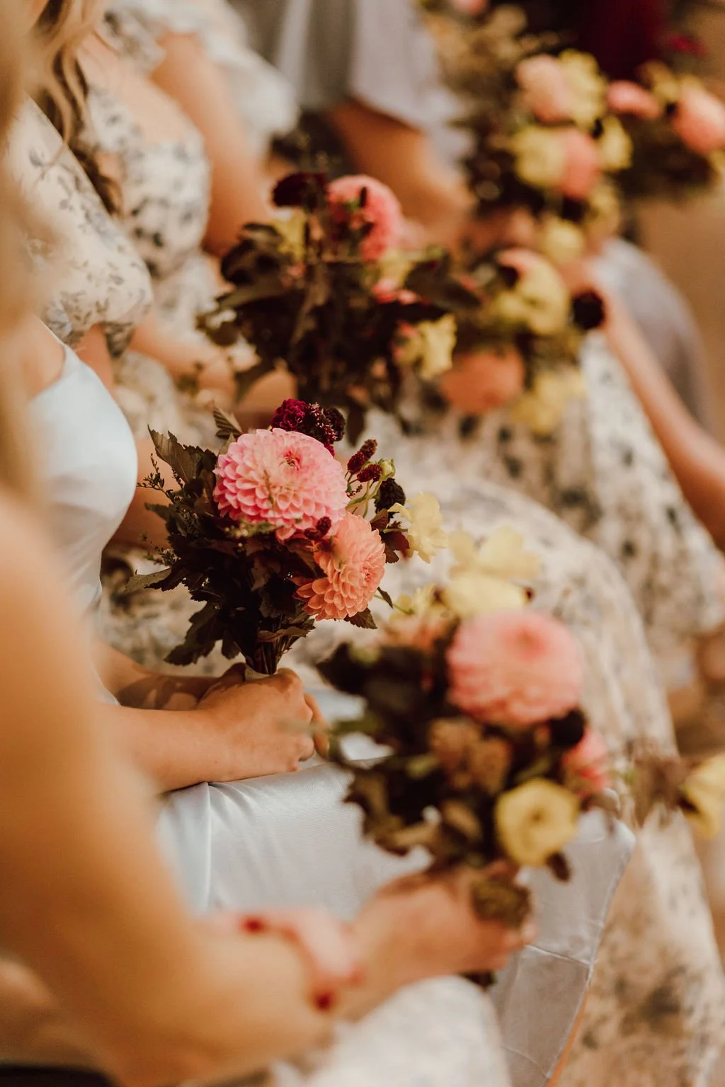
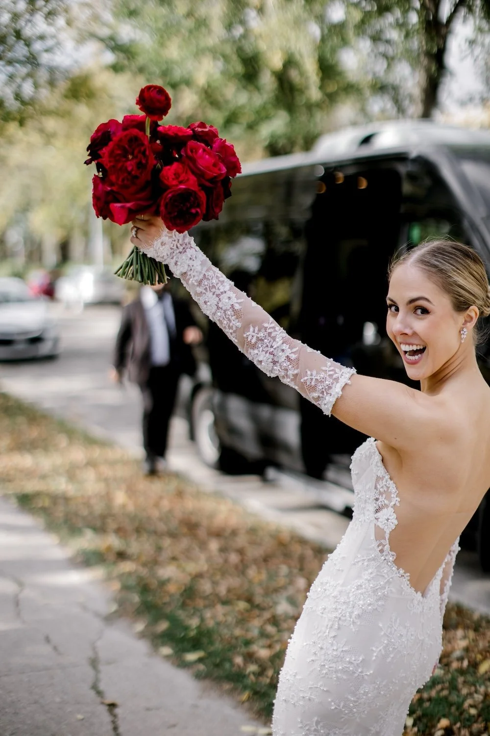
The Bridal Bouquet
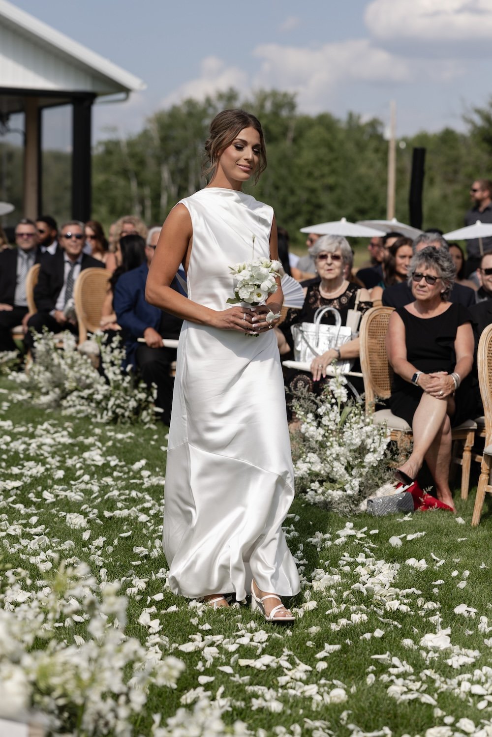
Lindsay’s vision for the wedding design shifted and flowed throughout their engagement, but one thing that remained the entire time was my suggestion for her bridal bouquet: smaller, scaled back, slightly floaty, and with absolutely no focal flowers. I wanted the overall feel of her bouquet to be refined, and definitely as an accent to her dress isntead of taking centre stage on its own.
Bridal Bouquet Ingredients: hydrangea (as a base), phlox, corn cockle, and lisianthus.

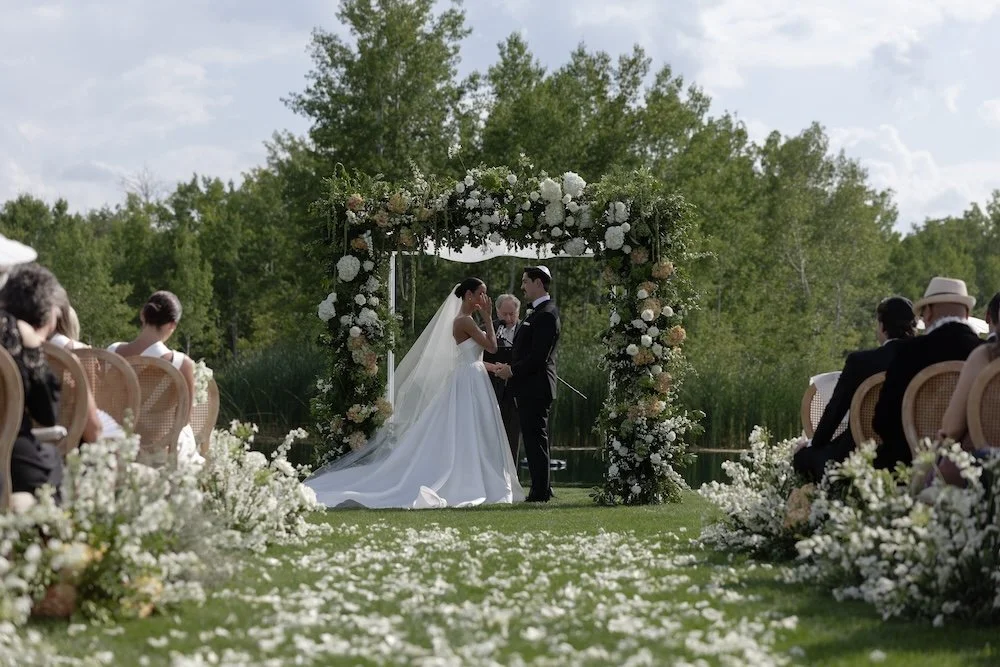

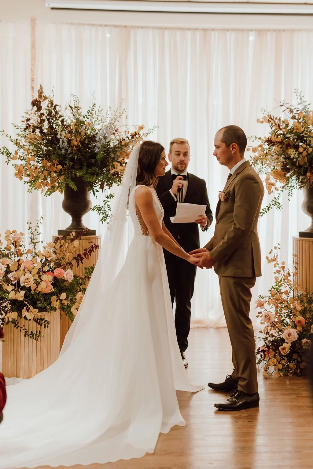
The Ceremony
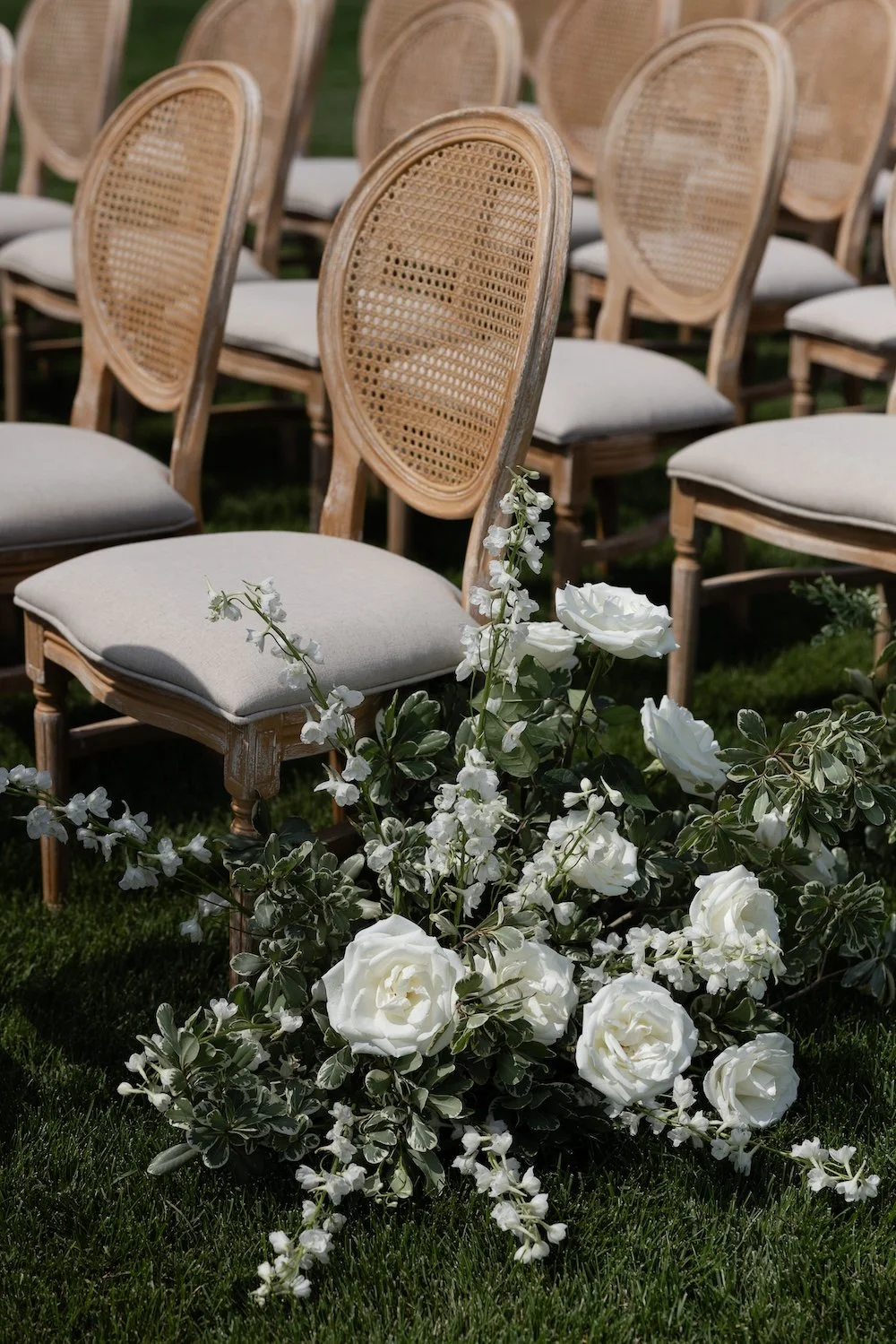
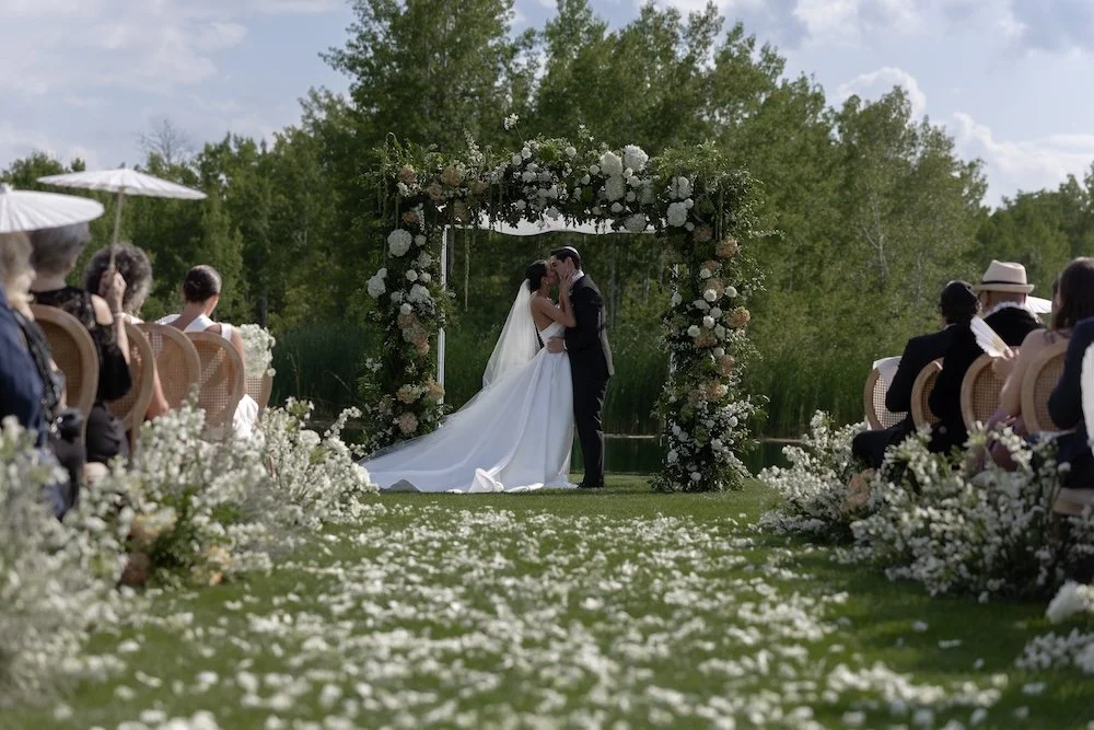
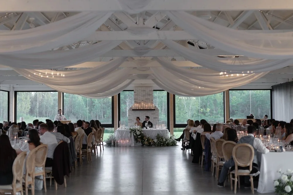
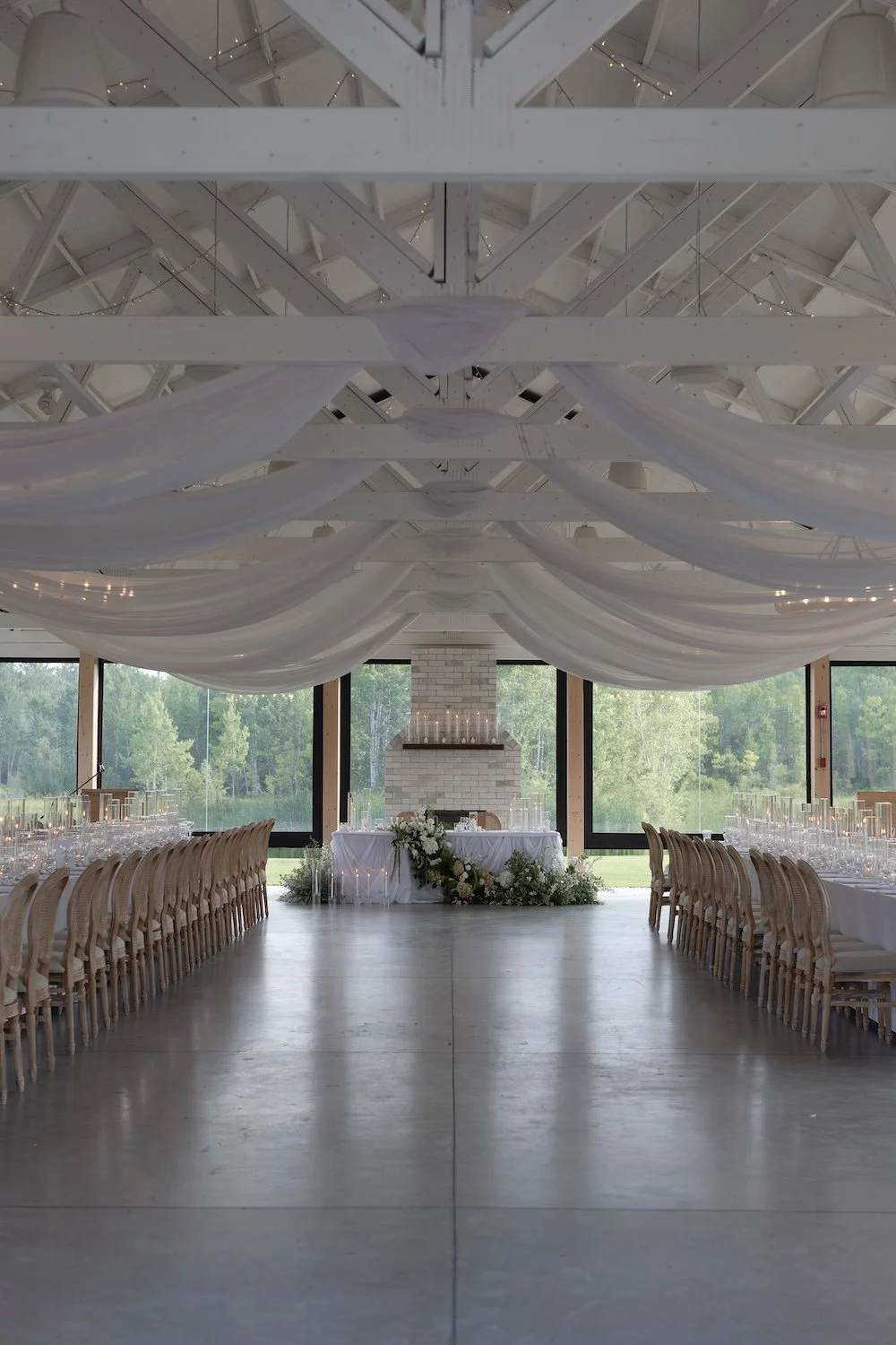
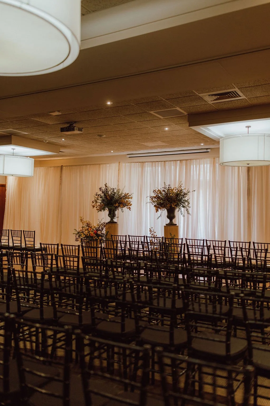
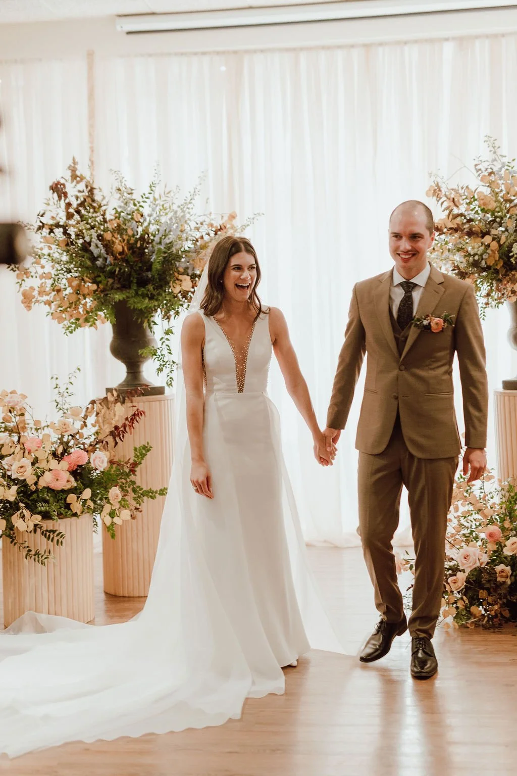
With the overarching design goal to feature maximalist moments, we decided that the ceremony chuppah and aisle would be the primary floral feature. This was one of the areas where the design fluctuated a lot! We weren’t originally planning to have anything down the aisle, and the ceremony focal point was originally planned to be a ground-based arch.
Chuppah: we designed with full coverage on the front of the chuppah, with grouped floral placements to create a lot of visual interest. The colour pockets allowed both the green and the white to stand out more, instead of creating a polka dotted effect (which would have been the DEATH of me).
Aisle: I was pumped after Lindsay saw an image of another wedding with a beautiful aisle and asked if we could incorporate floral pieces. While a full aisle is not necessary to create a beautiful space, it really makes a visual impact! I focused on longer stems and lots of texture, to create a fluttery path that felt organic and modern.
The draping textures were gorgeous, but one unexpected, hilarious moment happened at the beginning the ceremony: Michael stood at the chuppah, and decided he didn’t care for the draping green amaranthus bits that Lindsay loved…so he ripped them down 😂 We were all standing inside the venue just quietly killing ourselves laughing.
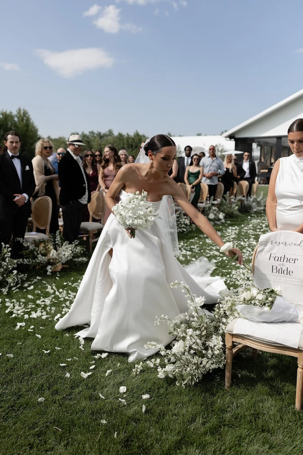
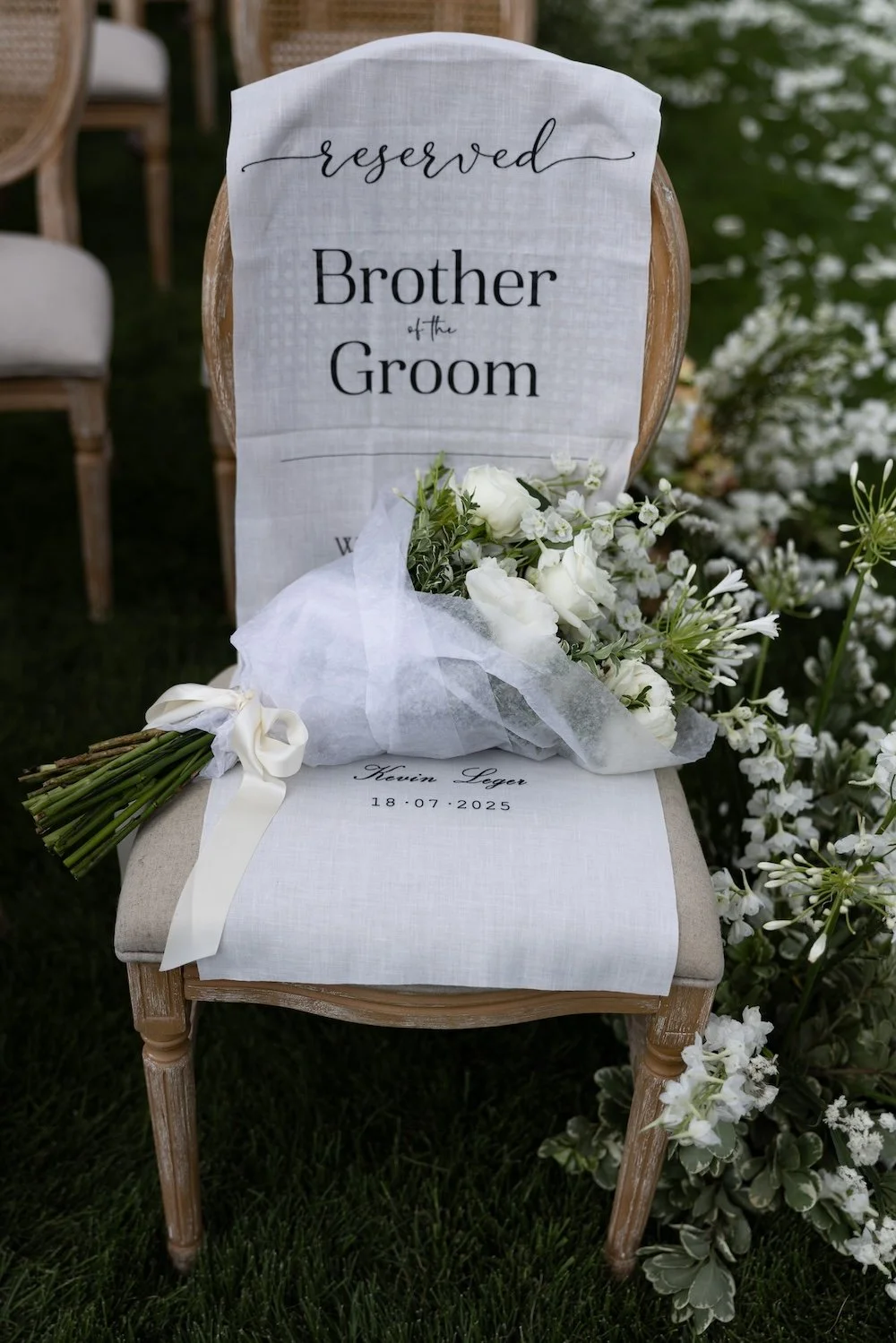
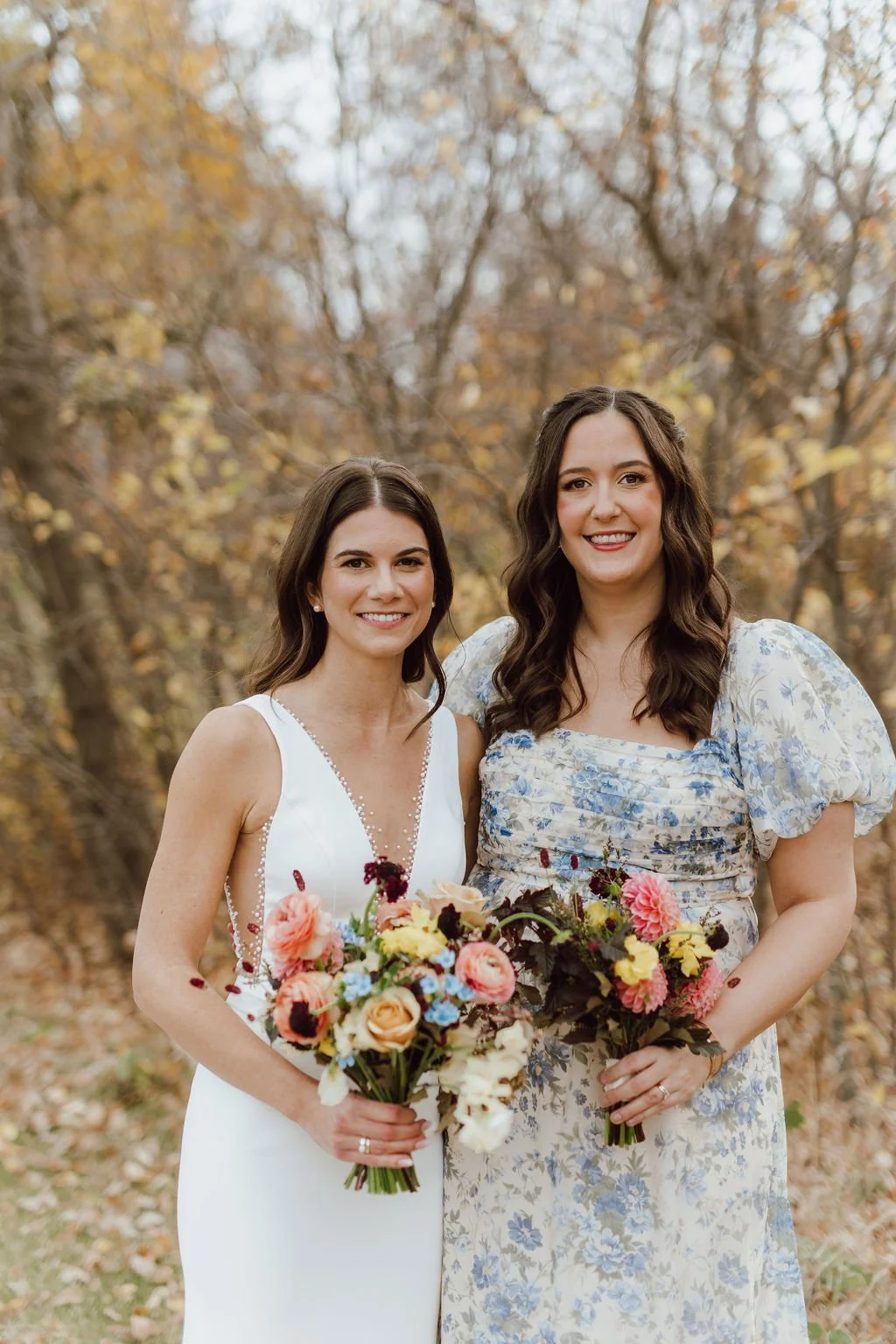
Memory Bouquets: A few beloved family members had passed and we wanted to find a simple, thoughtful way to honour them during the ceremony. We decided on a handtied bouquet placed at each chair. Each bridesmaid and Lindsay carried a single white rose that was tucked into the back of their bouquets, and placed on the memory chairs as they walked down the aisle.

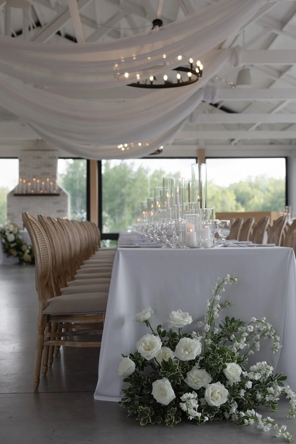
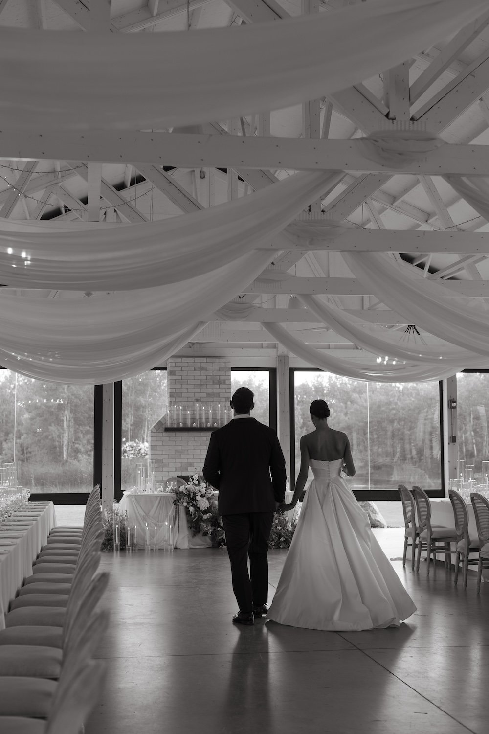
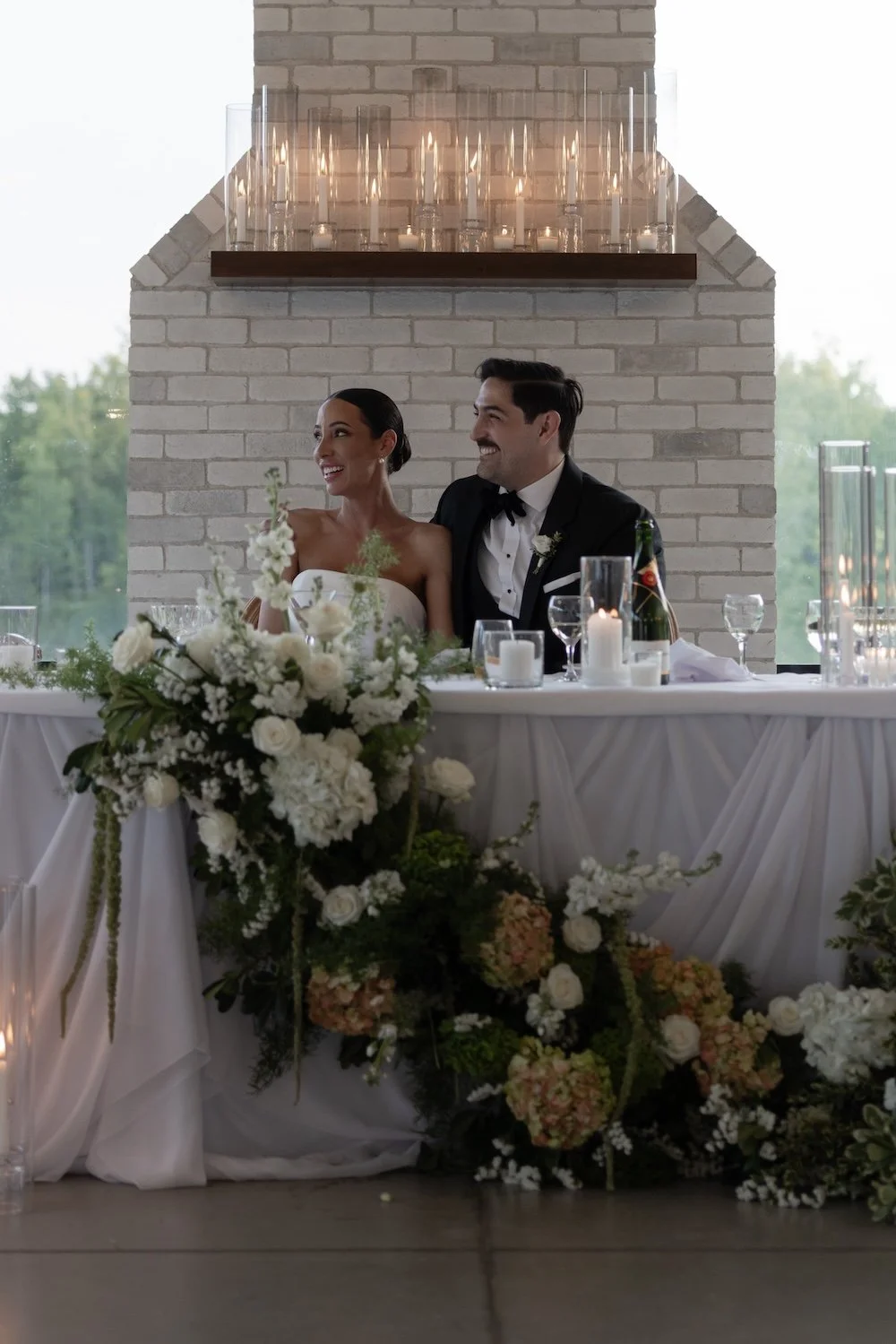
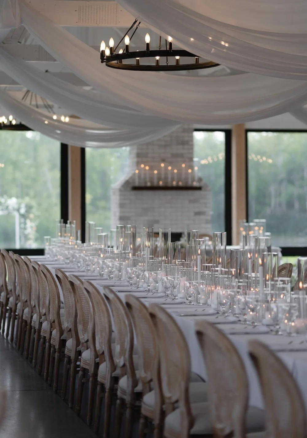
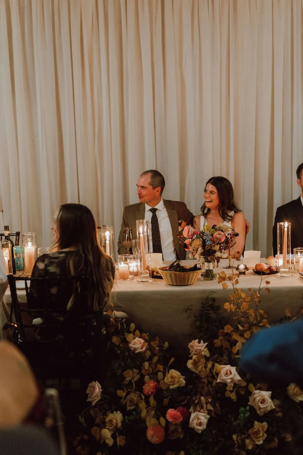
The Reception
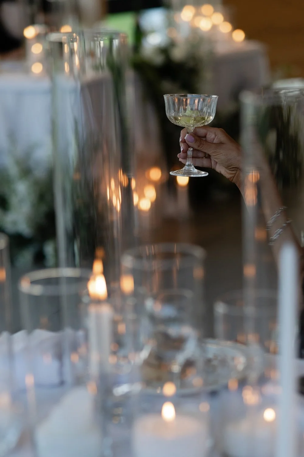
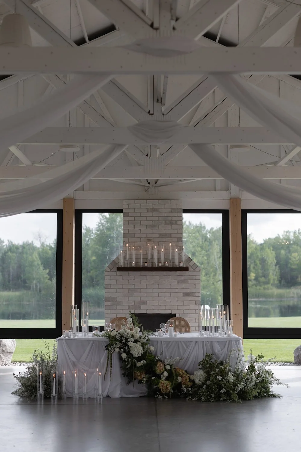
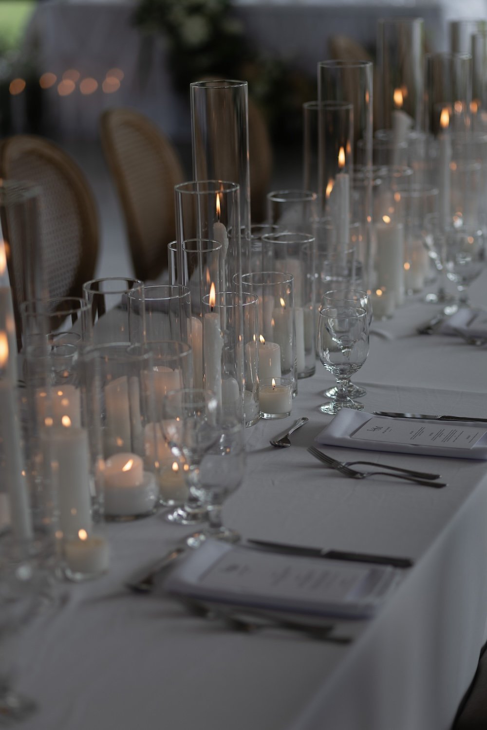
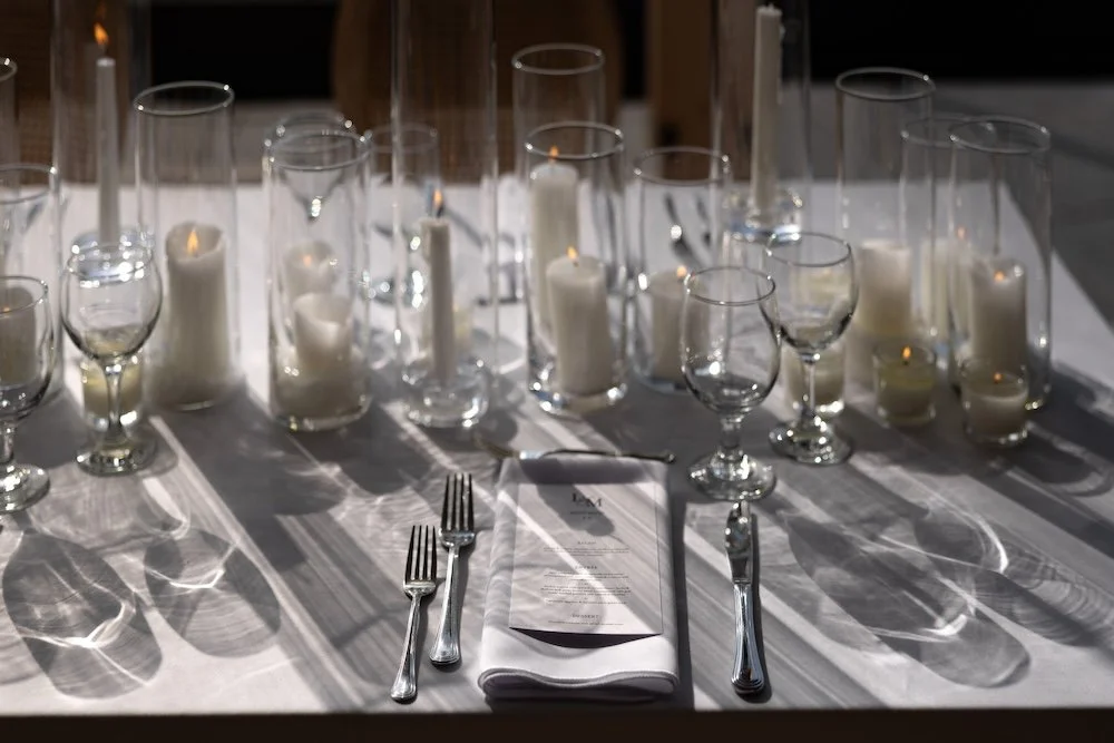
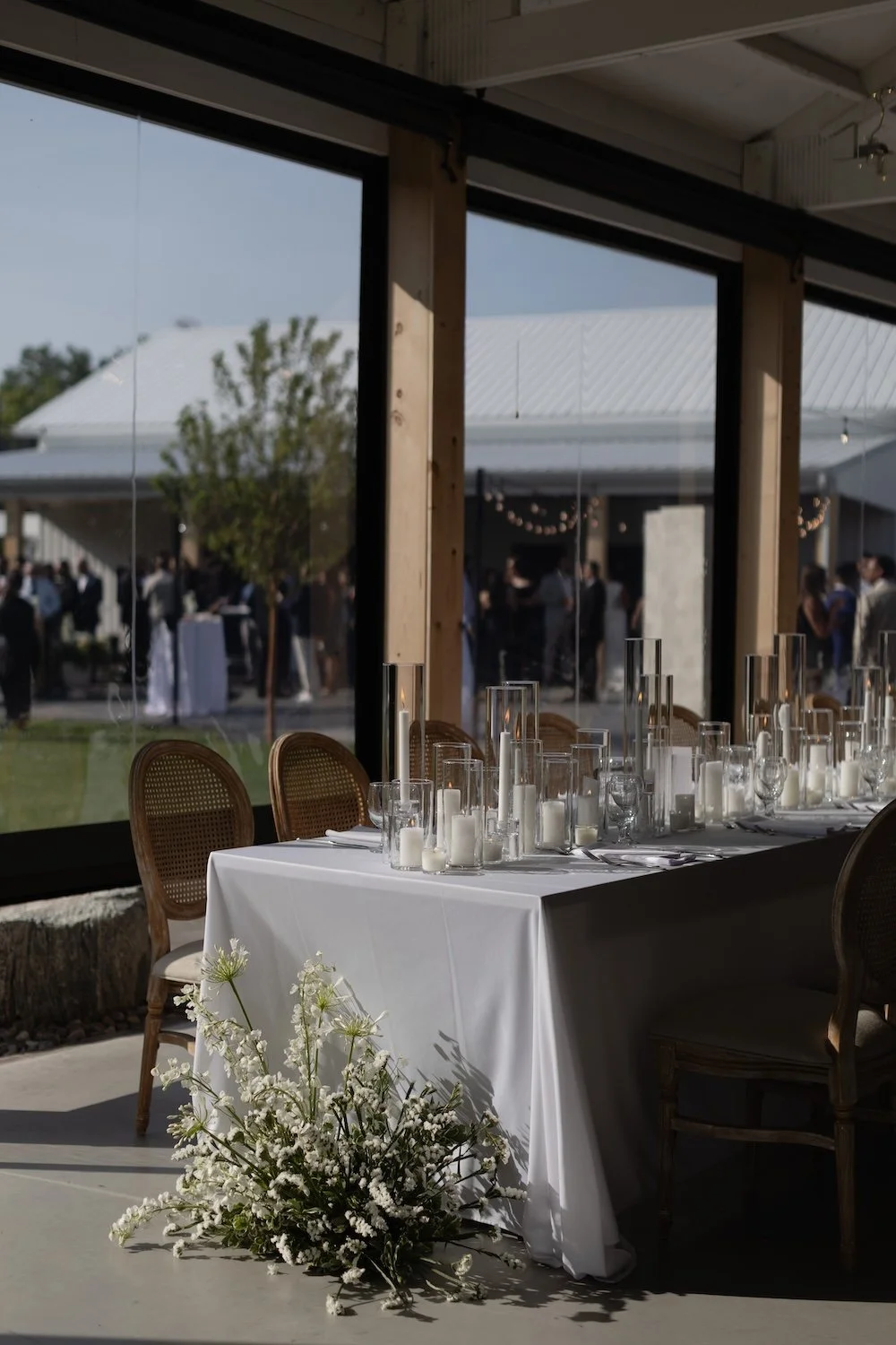
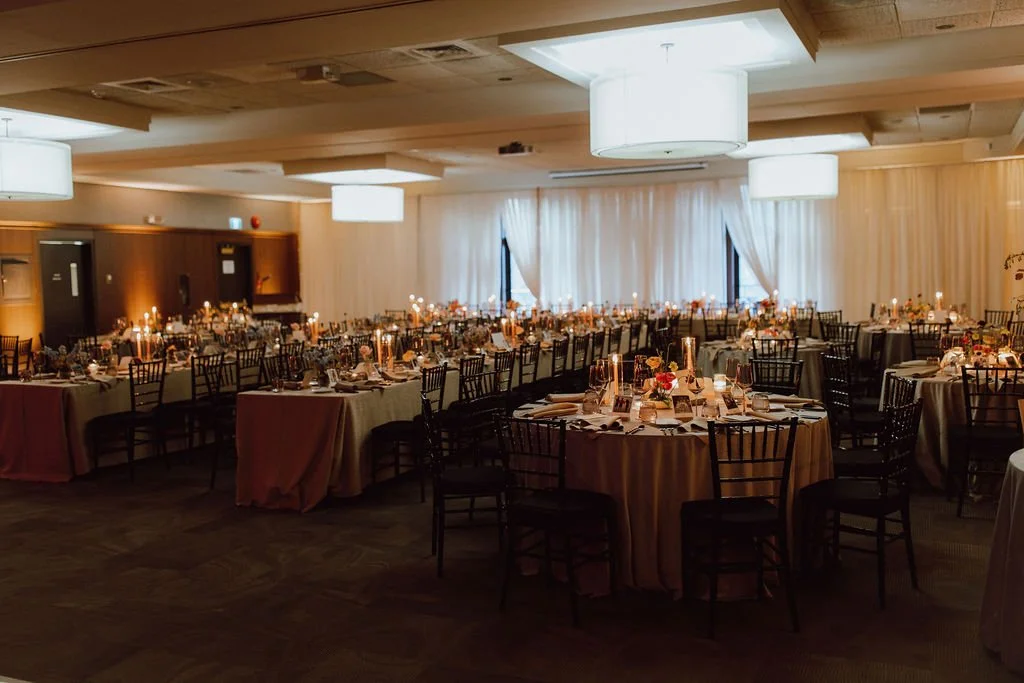
Florals on the tables were not a design priority for Lindsay. She wanted a twinkling candlelit evening, and Reveal Event Decor absolutely LOADED the tables with candles. I was so glad it wasn’t us that needed to light everything (though we did pitch in — you wouldn’t believe how long it took ha!) and even more glad that we weren’t responsible for cleaning the wax out of all the holders afterwards!
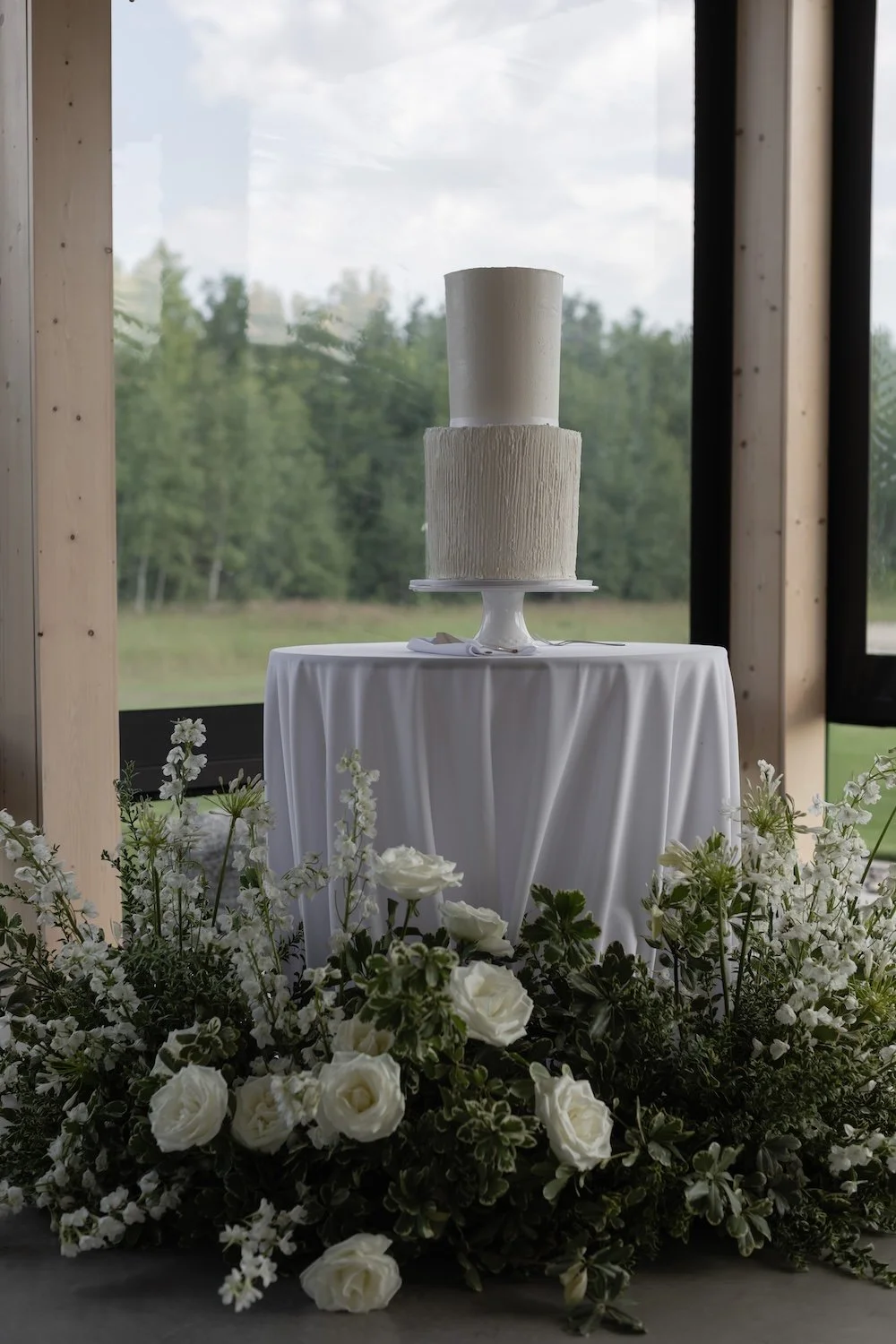
We repurposed all of the aisle florals to the ends of the tables and around the base of the cake table, allowing the sweetheart table to be the second major focal point.
The Floral Waterfalls
From the sweetheart table to the bar, we incorporated these cascading waterfall moments to create a major impact.
These babies are gorgeous but sure aren’t a design to underestimate. These are time-intensive, full of product, and tricky to get properly weighted. But the end result? Total magic!
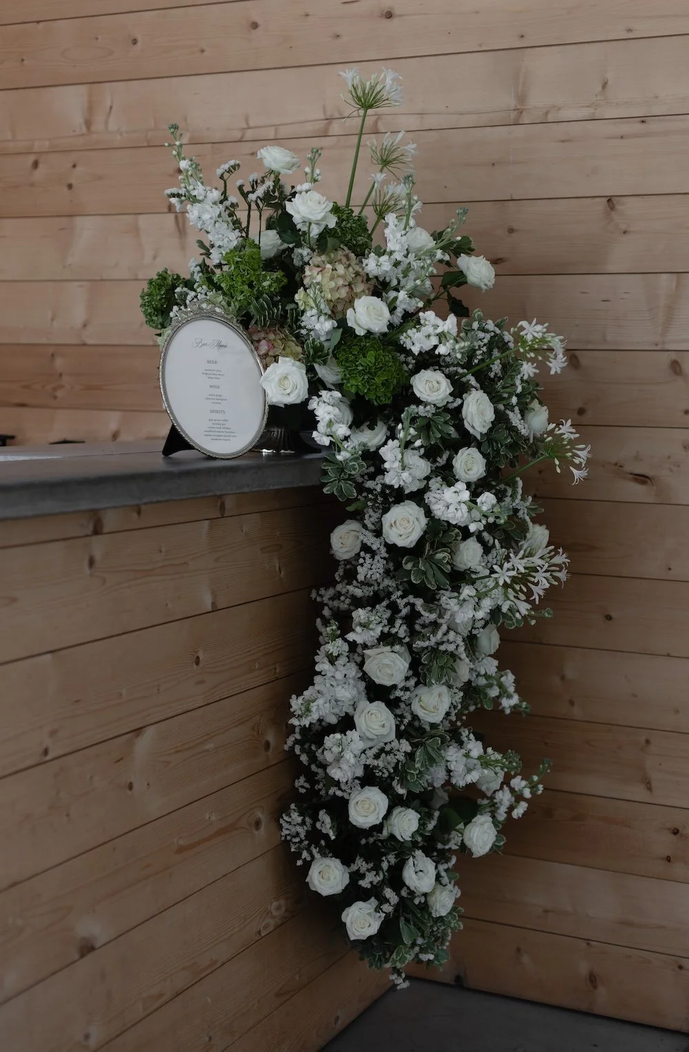
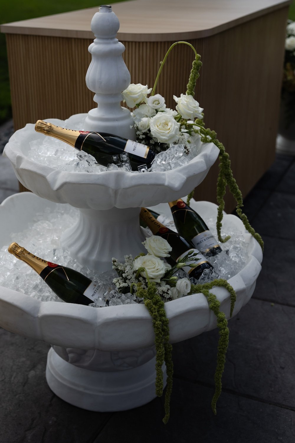
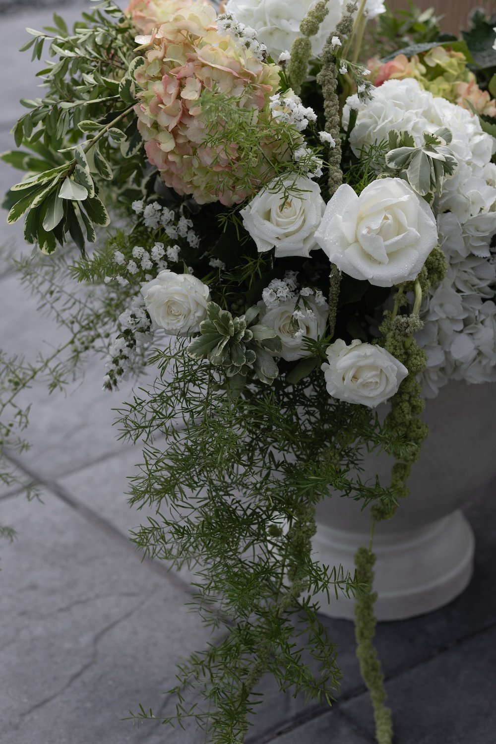
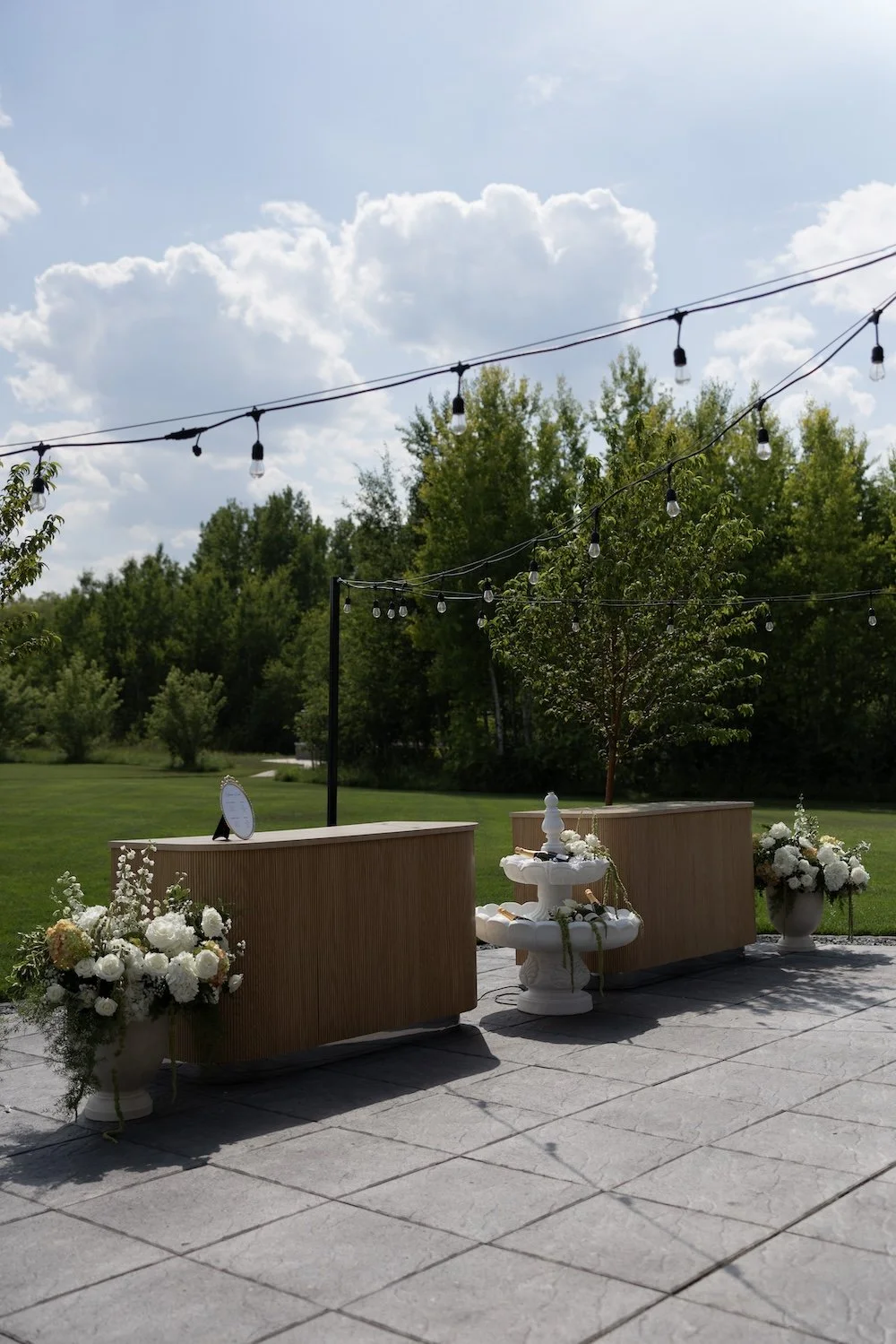
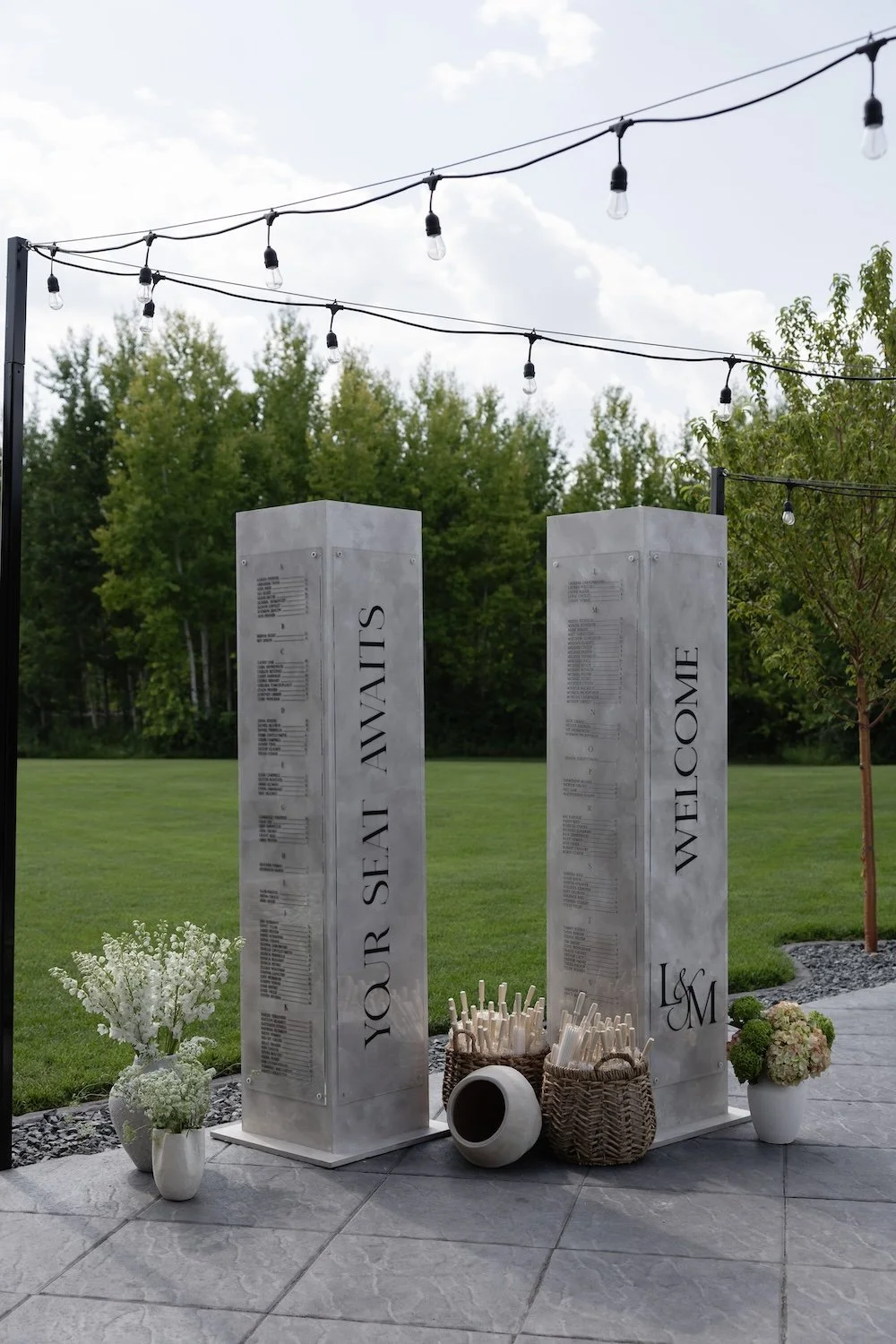
Luxurious moments were added to cocktail hour on the patio, with floral touches cascading out of the fountain, floral urns on either side of the bar, and a gorgeous seating chart.
It can be really hard to sift through all of this inspiration that’s available out there, and figure out what you want to do for your own wedding — especially when your engagement is long. Lindsay’s design ideas were generally within the same vein, but we tossed around a brighter green with some more modern styling choices, or possibly incorporating some deep burgundy, and we also considered waterfall floral features cascading off the ends of each table. All of these would have been gorgeous choices and led to a great design and ambiance.
Sometimes, my advice to couples is to take your time and not put pressure on making every single decision. Save images, and see what your thoughts keep coming back to.
And sometimes, my advice is to hire a planner (technically, my advice is always to hire a planner because a good planner is truly invaluable). Melanie Parent came on board and really helped Lindsay to refine her vision and ease the worries.
Michael & Melanie Photography ~ Melanie Parent Events ~ The White poplar ~ Stone House Creative ~ Lauren B Wycoff ~ REveal Event Decor ~ Planned Perfectly ~ Collective event rentals ~ Creating a Scene ~ Sweet Retreat Bakery ~ Asarye Paperie ~ Bride Files ~ Hair by KelCey Marie ~ Refinery Event Rentals ~ All SEason’s Catering ~
LOOKING FOR A WEDDING FLORAL DESIGNER IN WINNIPEG?
Getting married at The White Poplar? We happen to know the space REALLY well, and in our completely biased opinion, we’re the best at bringing the space to life 😎
At Stone House Creative, florals are crafted in harmony with the surrounding space, bringing balance, atmosphere, and a quietly elevated feel to your celebration.
Elegant Fall Wedding with Fun Colour Palette
I’m continuing to catch up on sharing stories from last fall’s weddings, and today we’re looking at Tatiana and Kevin’s! They planned an elegant fall wedding, with a fun colour palette and some moody details.
One of my personal highlights from the day was setting up the ceremony arch. We were working in the garden, enjoying the flowers, and just peeking through the fence at the wedding party taking their photos. They were so happy, so chill, the bridesmaid dress selection was gorgeous, and it just looked like they were having the best day!
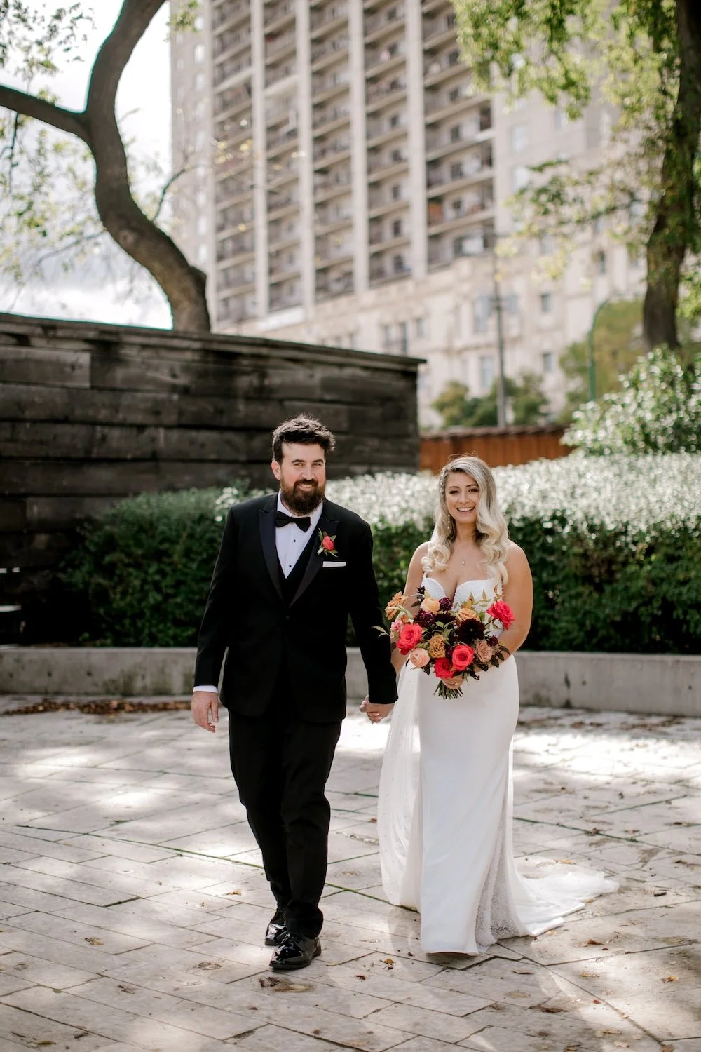
I’m continuing to catch up on sharing stories from last fall’s weddings, and today we’re looking at Tatiana and Kevin’s! They planned an elegant fall wedding, with a fun colour palette and some moody details.
One of my personal highlights from the day was setting up the ceremony arch. We were working in the garden, enjoying the flowers, and just peeking through the fence at the wedding party taking their photos. They were so happy, so chill, the bridesmaid dress selection was gorgeous, and it looked like they were having just the best day — which is exactly how we want you to feel!
Photos by Brittany Mahood Photography

See what I mean about a fun colour palette and a great combination of bridesmaid dresses? Everything feels rich, layered, with a cinnamon-and-spice vibe. The varied textures and fabrics of the dresses are gorgeous, too, and I happen to think the flowers look quite delicious in those hands.


The Flowers
Moody, elegant, and romantic. Tatiana wanted the flowers to do a lot of the work within the overall design. She liked gardenesque shapes and luscious flower-filled designs. I designed a pretty large bouquet for her, with smaller, coordinating bouquets for the bridesmaids.
Bridal Bouquet Ingredients: nina roses, salmon ranunculus, toffee roses, plum scabiosa, plum dahlias, antique carnations, ninebark and nandina foliages.


The Colour Palette
One thing I love about fall weddings is the saturated colour palettes. Now, don’t hear what what I’m not saying: just because it’s fall, doesn’t mean you need to do a Crayola bright orange/red/yellow palette. I will almost never suggest this, because it mostly looks like a Dollarama wedding and that’s just not the vibe.
What I AM saying is, go for the colour. Add in richness and depth with deep shades, add in vibrancy and warmth with something bold, and blend it all together with variegated foliages.
For Tatiana and Kevin’s palette, we planned to use 70% bright and deep reds, with 30% accents of salmon/toffee/blush pink. Her bouquet would not have looked or felt the same without the deep reds/burgundies in there. That result would have been a lot less moody, and it would have been more difficult to create a feeling of elegance. You need some variation and depth to bring that about.


The Ceremony
Let’s pause for a moment and talk about how adorable this flower girl is!! Walking down the aisle and scattering her petals, only to walk back and pick them up. So sweet!
The ceremony was held in the Bonnycastle Gardens at the Manitoba Club, to the sounds of a very cool live jazzy/punk trio and with a fair bit more wind than I like to have 🫠 The welcome sign kept blowing over (granted, it was very lightweight, as they almost always are) but the arch was well weighted down and it stayed put (thank goodness! I could always do without wind!).
The arch was always going to be a focal point. The Garden has a perfect nook that overlooks the Upper Fort Garry gate, and it’s just a really lovely setting! I went for full greenery coverage (with the most delicious nandina foliage) and we went for a little more dark burgundy as the base here, so the golden toffee tones and the bright reds stood out more. One of my favourite elements was the really dark lilies — adding in a star shaped flower here and there can really bring a design to life!


The Reception
Reception time! The reception was in the Provencher Ballroom on the main floor of the Fort Garry, which is conveniently right across the street from the Manitoba Club. This meant that we could set up the reception while the ceremony was going on, then pop across the street to grab the arch post-ceremony, and wheel it into the Provencher Room on trolleys! I’ll tell you what, it’s pretty fun crossing the street with a big floral arch! It feels very New York.
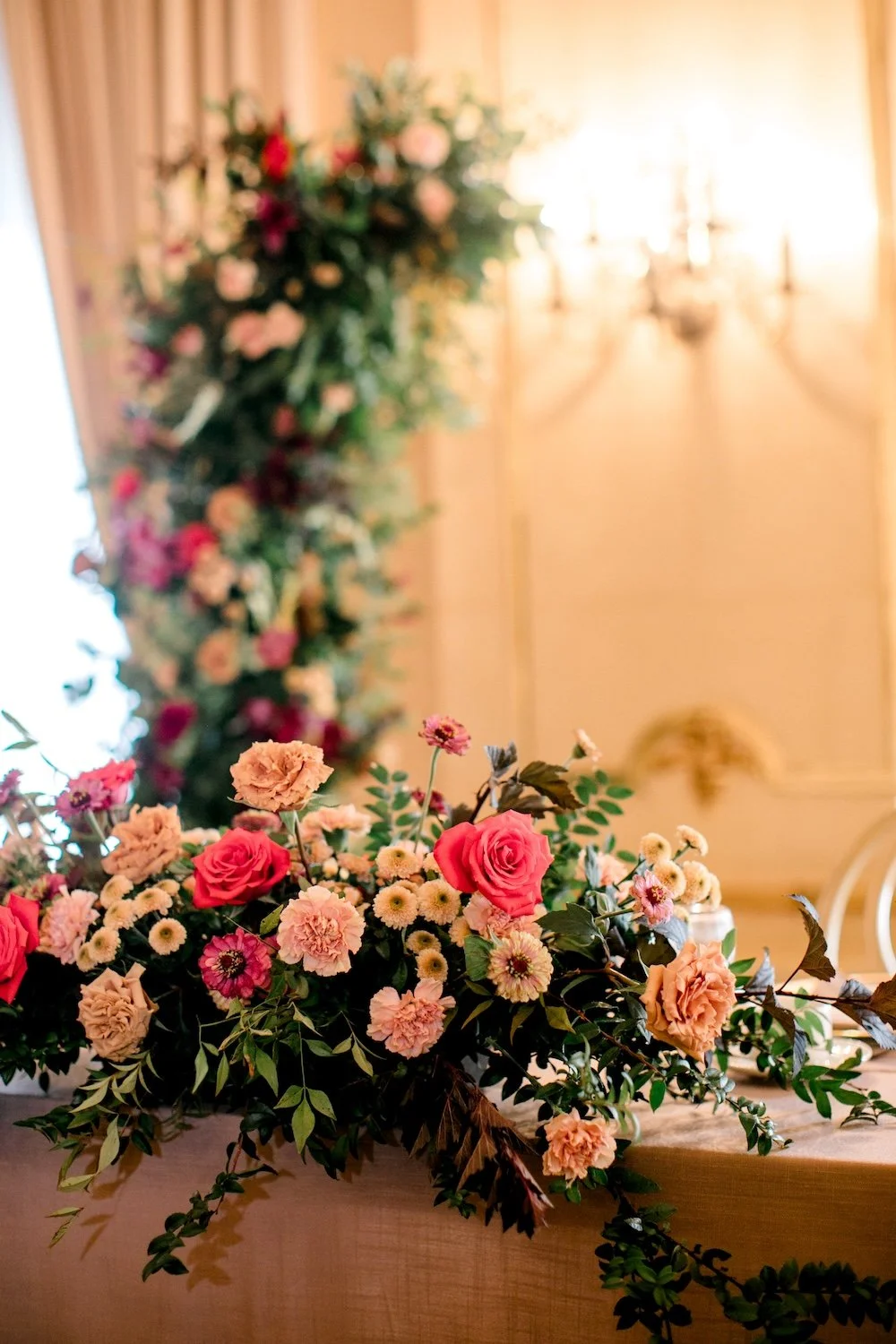
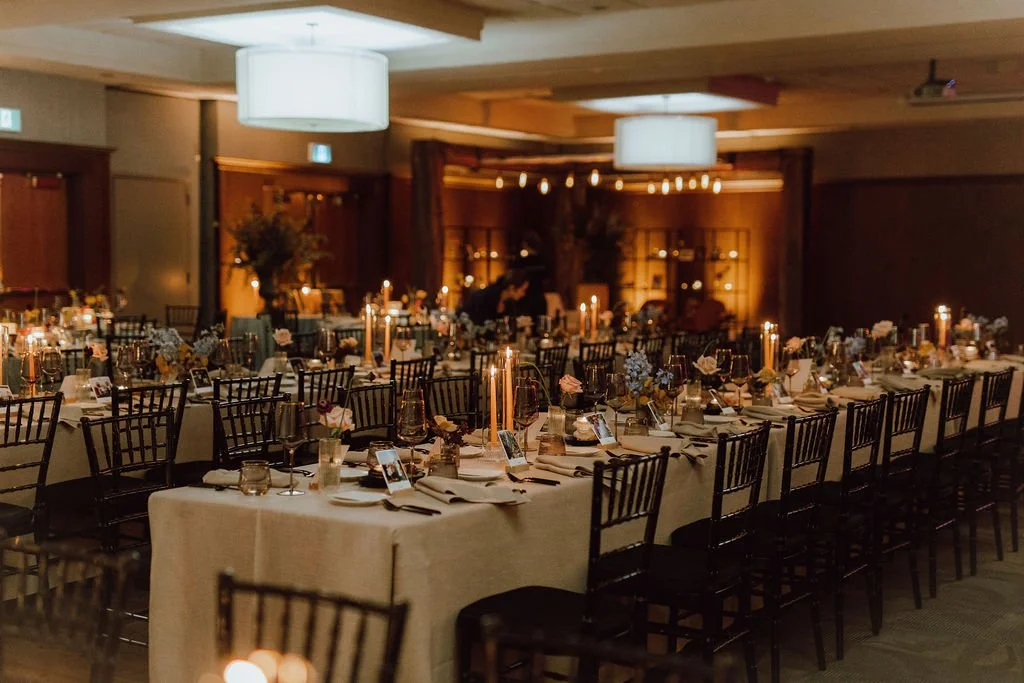
We repurposed the arch behind the head table, to which we added a low, lush floral piece that coordinated. Guest tables were all round, and they chose toffee linens from Planned Perfectly with gold chairs from Collective. This was such an elegant base and looked perfect with the Provencher Room’s warm neutral walls.

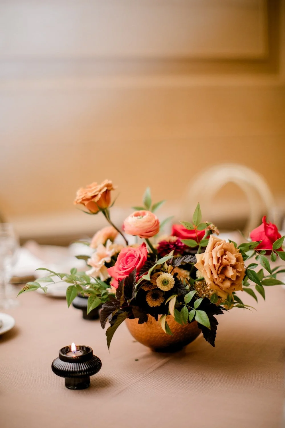

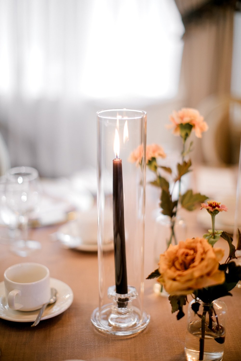
We elected to go with 2 coordinating styles of table centrepieces: on half, a low, lush floral arrangement in a hammered copper bowl, and on the other half, a trio of stem vases with black taper candles. Both looked awesome, adding pops of colour and flickering candlelight throughout the room.
One look at this photo to the right, and you’ll understand my plea to never have coffee cups pre-placed on the tables. See how much space these things take up? If it’s a brunch wedding and you know that everyone’s going to have a coffee, then sure. But otherwise, ask your venue if you can have coffee service at the bar/tableside, or if there can be a coffee station set up!


Looking for a Wedding Floral Designer in Winnipeg?
Flowers are the best way to make a statement at your wedding. Reach out to Stone House Creative for stunning bridal bouquets, truly unique ceremony backdrops, and beautiful floral centrepieces to create the perfect ambiance for your wedding!


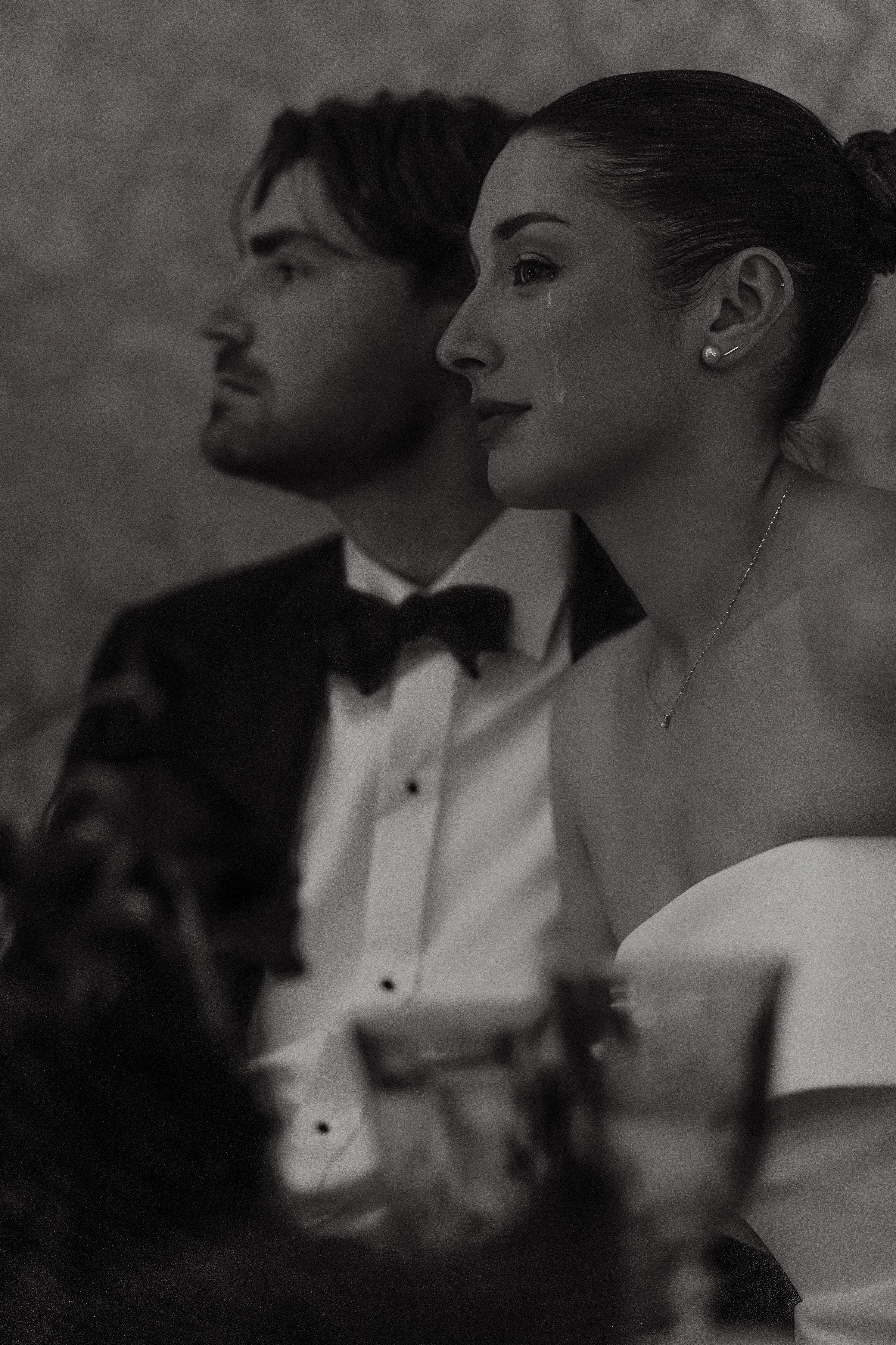
Modern, Sculptural Wedding at The Winnipeg Art Gallery
Happy anniversary to one of my very favourite weddings of all time! Jacqueline and Michael were married last October in a moody, modern wedding at the Winnipeg Art Gallery.
They wanted to create the atmosphere of really intimate dinner party, but with a full guest list of 130. Their style tends toward the modern and they weren’t afraid of using rich, deep reds and burgundies, so you know I had a ton of fun planning out at then executing the floral design.
Photos by Michael & Melanie
Planning and design by Soiree Event Planning


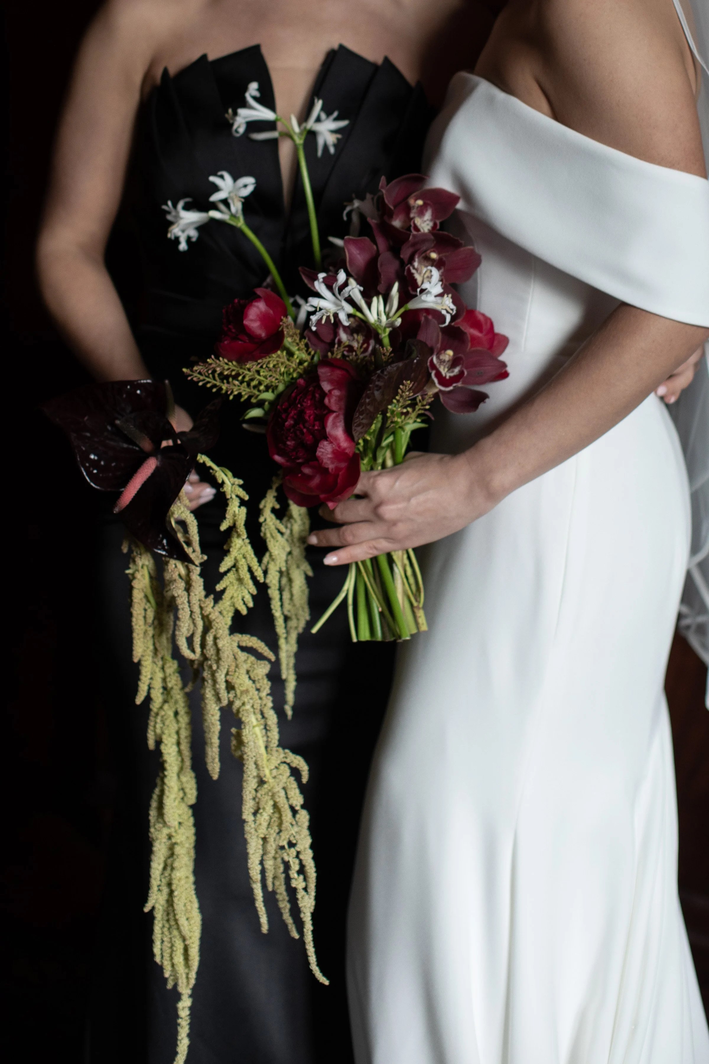
The Bridal Bouquet
I remember Jacqueline telling me that she wasn’t that fussed about her bouquet. And I was like, “well, I’m fussed.” ha! Bouquets are definitely one of my favourite things to design and the moment of handing it over to you on your wedding day is so thrilling — many brides cry, realizing that the day is really here.
So all that to say, Jacqueline gave me a lot of creative freedom. I wanted to go a bit restrained in size, create a cool, sculptural shape, and dig into the rich tones. The bridesmaid bouquets were composed on hanging green amaranthus and black anthurium, so I repeated those ingredients into the bridal bouquet. I added in ruby peonies, cymbidium orchids, long stemmed white nerine lilies, and a base of pieris. We all loved it!


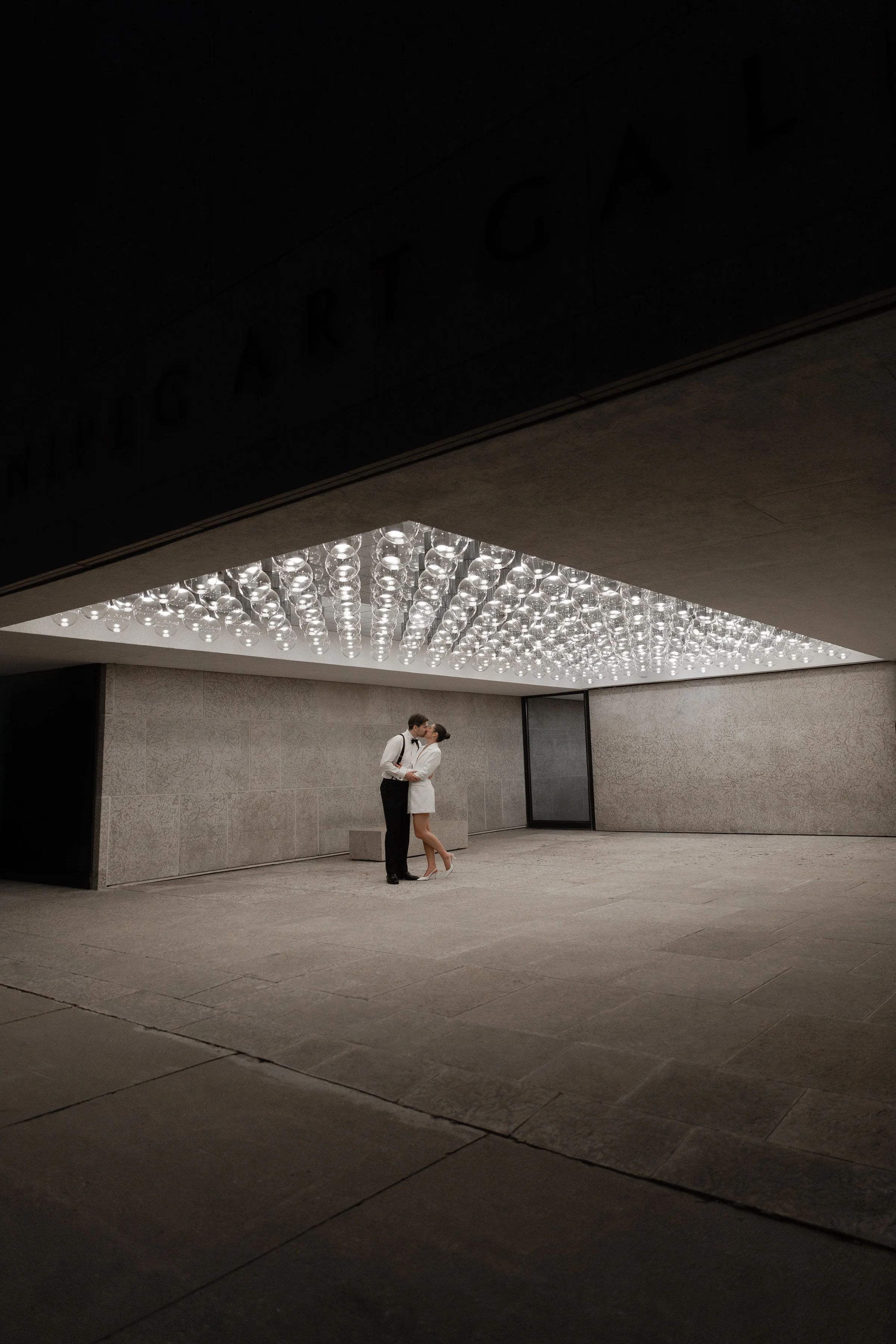
The Chuppah
The moody vibes kicked off for the ceremony under the skylight. Taupe wall draping and a deep, deep plum aisle runner added so much drama to the otherwise very light space, which felt so good. It was such a great way to ensure this space felt different than it does for most other weddings.
The chuppah itself came from Creating a Scene, and we added sculptural but minimal pockets of floral to it. I wanted this to feel really cool, but restrained — sometimes, more is not better, and in this case, we wouldn’t have been able to create that sculptural design style if we had gone with full coverage on the chuppah. I also find that when a client is asking for a more modern design, limiting the number of floral ingredients is a key choice. Too many bloom styles and you lose that feeling of sleekness. Finally, adding in long stemmed white agapanthus felt SO GOOD.
We also added sculptural floral pieces to the aisle, being very careful not to take up too much space because there wasn’t any space to spare! I kept these arrangements in keeping with the rest of the floral design: deep, saturated, and sculptural. Again, the white agapanthus had a lot of fun being the stars.
Jacqueline’s grandma walked her down the aisle, and those moments were just so sweet and beautiful. And what a chic ensemble!


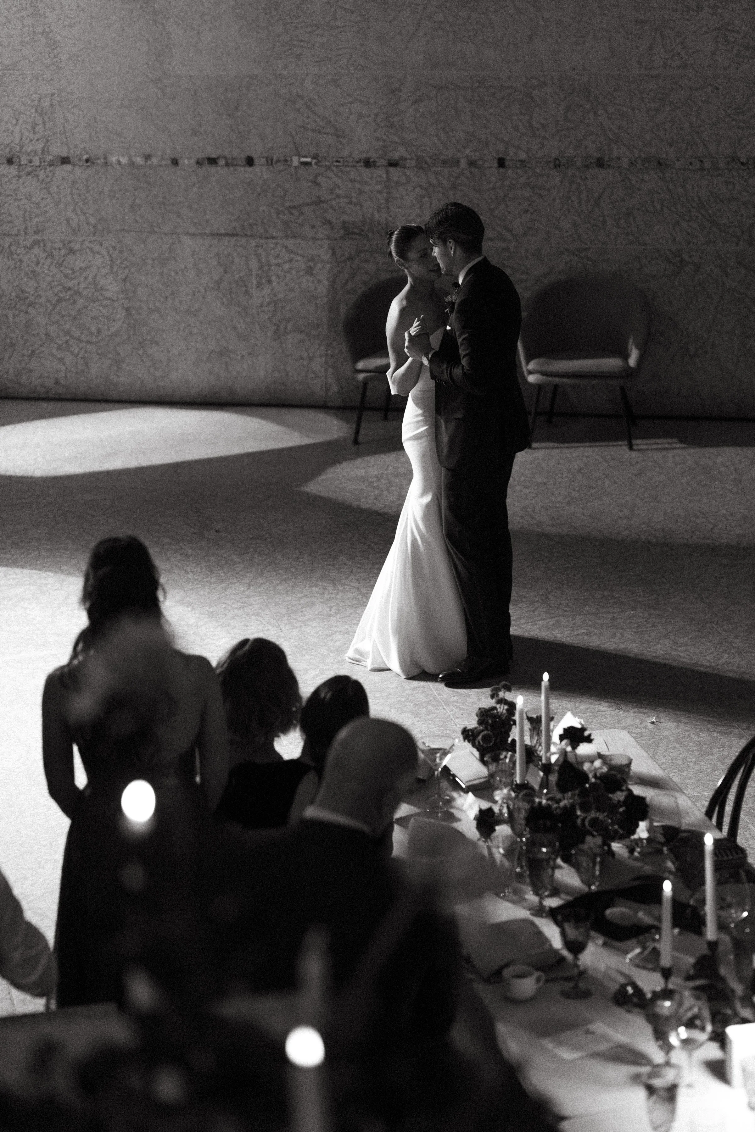
The Ambiance
Creating an intimate feel and a fun ambiance was a top priority for the couple — they really wanted their wedding to feel like a cool dinner party. That’s not the easiest thing to do when you have 130 people on the guest list, so Soiree got to work making sure all the decisions made would fit that dinner party vibe, with a moody style. Food, wine, flowers, and decor were top priorities to make that happen.
With that as our goal, I knew I didn’t want all of the tables to look exactly the same. I created a very specific, colour-coded centrepiece map that outlined the 7 different centrepiece styles I planned. This allowed us to repeat similar elements, which streamlined our design time, but creating unique feeling tablescapes so no one would ever look around and see the exact same thing over and over again.
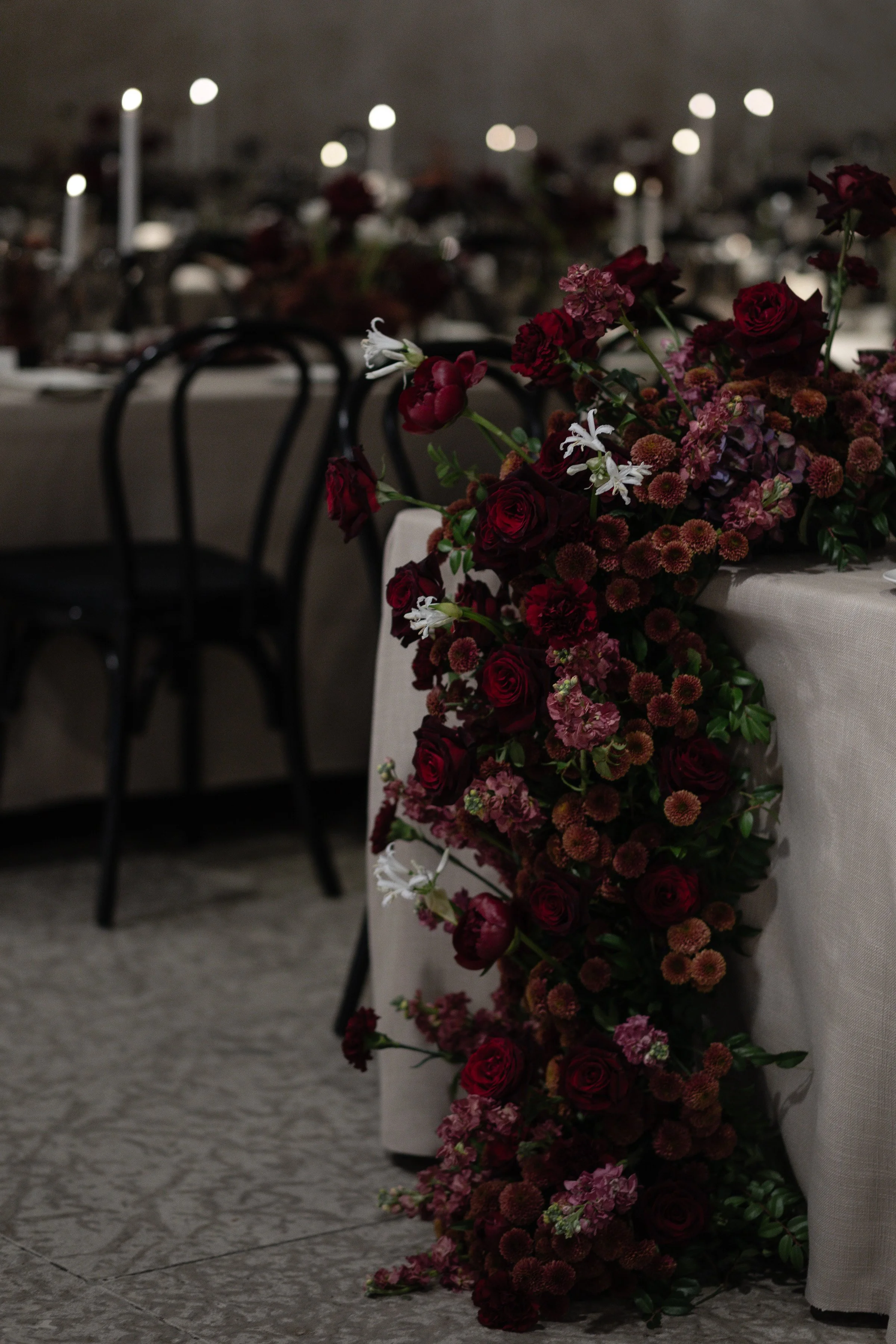
The repetition of black and smoky accents were such a great design choice to add that oomph to the moodiness. Black chairs and flatware, candle trays, smoke glassware, and black and smoke glass vases did the trick!
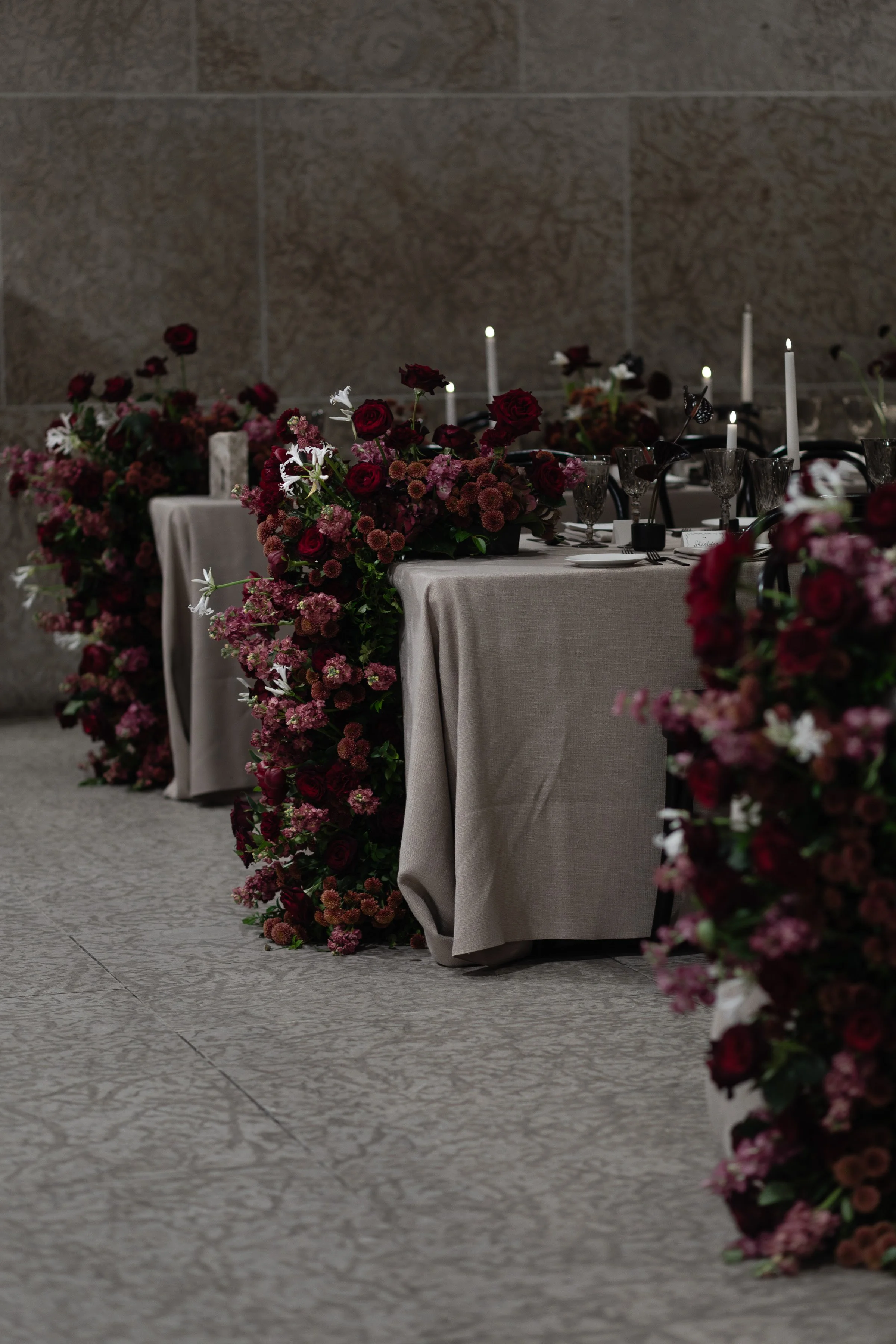


The Floral Waterfalls
Is that what we should call these floral features? It seems to fit. We debated on a few different design ideas, and I’m so happy we landed on this. With the 4 long dining tables on full display as guests entered the WAG, Jacqueline loved the idea of a spotlight floral moment that would make her guests feel wowed.
We designed these babies lush, full, and dramatic. I LOVE designing with a saturated, rich colour palette like this in the fall. It just feels so delicious! It did take me a while to get them all done, so ensuring that there’s ample on-site time is necessary!


With long tables, we don’t typically have a ton of space to add a lot of floral to. We did bump these tables up to a wider size (which I always recommend to couples going for this style of floor plan!) which added a lot more roominess, so I could add a few scattered large floral centrepieces mixed in with candles and petite arrangements.
We had such a delicious mix of ingredients for these lush arrangements — really deep antique burgundy hydrangea, dark roses, almost black anthurium, pieris, and we tucked in touches of reflexed white tulips or nerine lilies for a sculptural shape and visual interest. We also created petite sculptural pieces made entirely of burgundy button mums, and scattered burgundy amaranthus trailing down the tables, too.


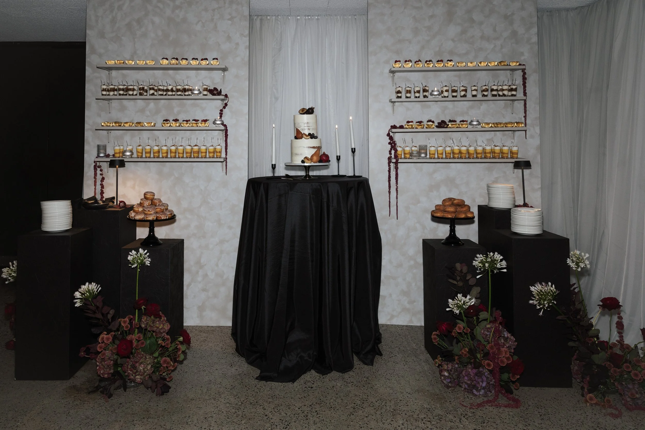
One of my goals is to ensure that, no matter what your aesthetic preferences are, your florals and design are polished and details are not left unfinished. It’s easy to do that when working with a planning team like Soiree! I loved the symmetry of the desserts display below (and I desperately wanted to dig my fingers into that Jenna Rae Cakes buttercream!! lol!) and the lounges were so beautifully laid out that all we needed to do was add some gorgeous spotlight florals and a clustering of candles, and they were perfect.


It’s always a pleasure to work with an incredible team of professionals to create an elevated event. Any one of them would be an excellent hire for your wedding!
Michael & Melanie Photography ~ Soiree Event Planning ~ WInnipeg Art Gallery ~ Planned Perfectly ~ Collective event rentals ~ Event Light ~ Creating a Scene ~ Trend Decor ~ Union Table ~ Sugar & Salt BakeSHoppe ~ Brides Eye View ~ Lineage House ~ The Aesthetic Makeup ~ Sign Source ~ Luminous String Quartet ~ Keith MacPherson ~ Tempo Collective
LOOKING FOR A WEDDING FLORAL DESIGNER IN WINNIPEG?
Getting married at the Winnipeg Art Gallery? We happen to know the space REALLY well, and in our completely biased opinion, we’re the best at bringing the space to life 😎
Flowers are the best way to make a statement at your wedding. Whether you already have a specific vision or want me to dream up something custom just for you, reach out to Stone House Creative for stunning bridal bouquets, truly unique ceremony backdrops, and beautiful floral centrepieces to create the perfect ambiance for your wedding!

Moody, Stylish Fall Wedding at Niakwa Country Club
You know when the wheat fields and aspen trees turn golden, and the sky is a moody grey blue? That was my starting point for Leanne and Kyle’s moody, stylish fall wedding.
They wanted to create intimate restaurant vibes (within a golf course banquet room), so I leant into a combination of playful, moody, and autumnal design elements. I cannot wait to dig into this one with you!
Photos by Ariana Tennyson


The Event Design
Leanne hired me for full-scale event design along with floral design. From the beginning, we had a few goals we hoped to accomplish: create an intimate restaurant vibe (despite being in a golf course banquet room), bring in a moody autumnal feel, and keep it all in the same space.
Colour palette always plays a big role for me in any design. Leanne was open to my suggestions, and had a few inspiration images that included the coral and plums. I had been ruminating on our gorgeous prairie skyline in fall, when the wheat fields are golden and the skies are a moody grey blue. I wanted to keep that as the base for my palette: golden + moody grey blues, and then layer in the coral and plum overtop.

The Floral Design
Leanne let me have a lot of fun with the flowers! Guided by the colour palette and the desire to create a lot of warmth and vibrancy, I played with the contrast between warm and cool tones.
Bridal Bouquet Ingredients: Golden mustard roses, dahlias, tweedia, ranunculus, butterfly ranunculus, calcynia, sweet pea, scabiosa, and ninebark.

The Ceremony
The best view in the room is a wall of windows, which is also where the head table is usually positioned. I didn’t want direct light from the windows, and I wanted to soften the crispness a bit so I had Planned Perfectly install oatmeal toned drapery along the entire wall. It felt warm but still neutral.
I created a focal point for the altar, utilizing 3x modern pleated wood pedestals topped with foliage and floral pieces, and combined that with a few ground-based floral pieces. I wanted to explore the full colour palette in a modern, garden-inspired way.


The Floor Planning
So, when you’re working with a single space, and you need to have both the ceremony and the reception in it, AND you don’t have multiple hours to re-set the room completely between ceremony and reception, you have to get really organized and very creative. Niakwa has one of those partition walls that folds into the wall, or can extend to break the overall room into several smaller spaces.
We utilized that partition wall to create a back space, where we pre-set the lounge and the reception tables, ready to pull out as soon as the ceremony was cleared. It was a very tight squeeze, but was highly functional!
Once the ceremony was over, guests went into the lobby and outside for cocktail hour, and we went to work. The wall was pushed in, the chairs were pulled out, and tables moved into place for final details.
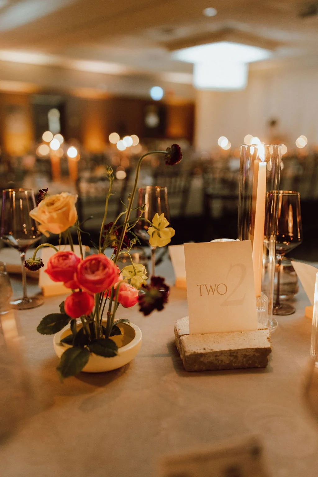
To create that restaurant vibe, one of my thoughts was to use different orientations and sizes of tables. We used some long banquet tables, full size rounds, and small rounds. I also added a lounge to the back corner with a cool lighting feature to add that moodiness.


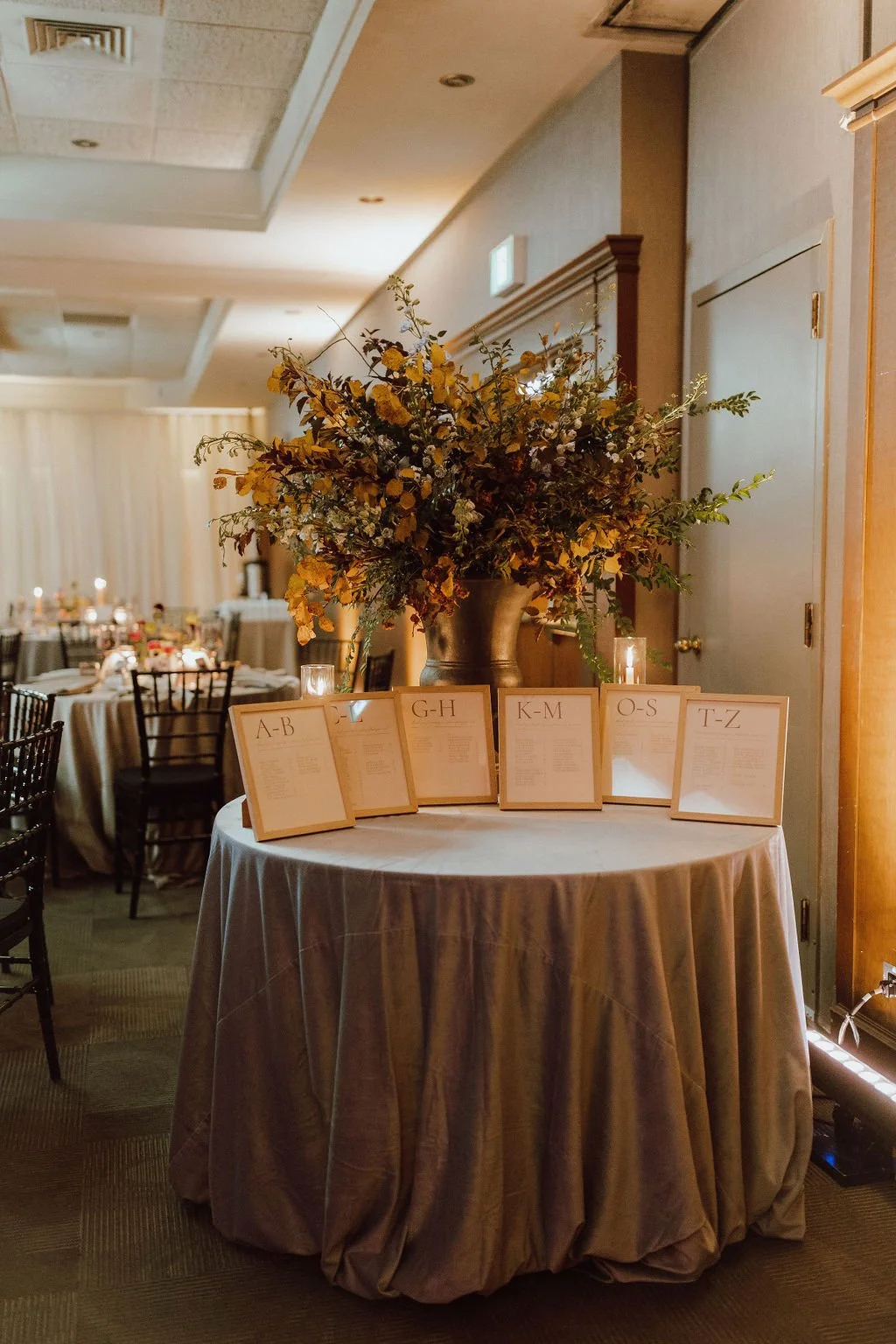
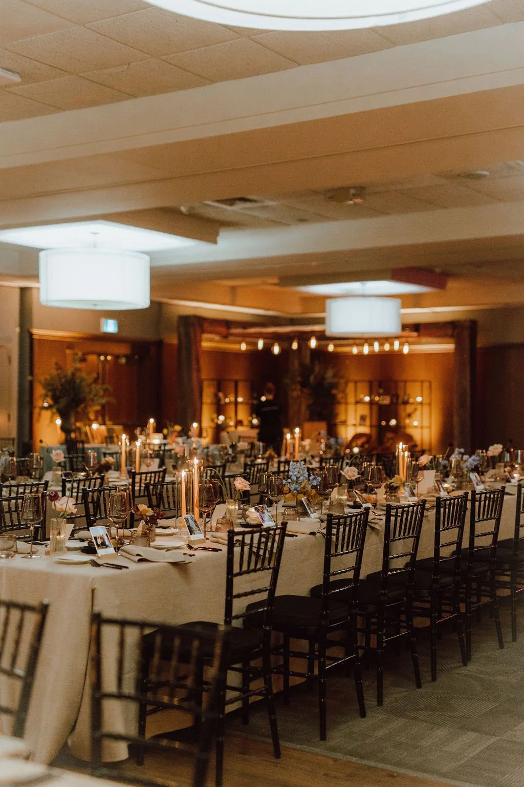
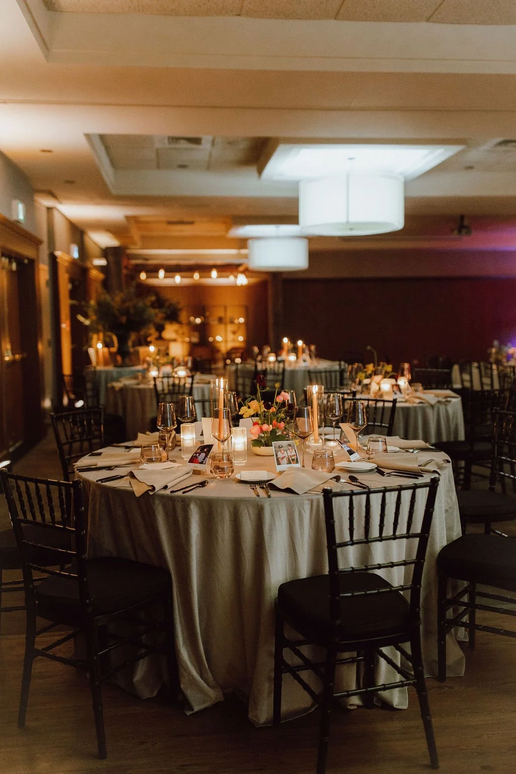
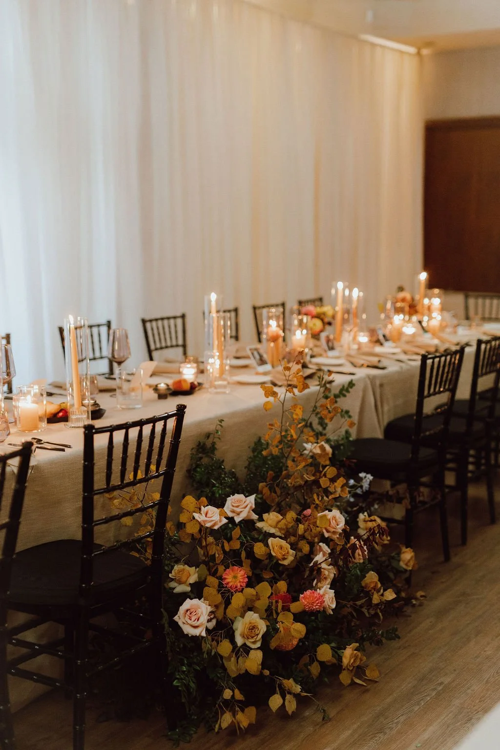

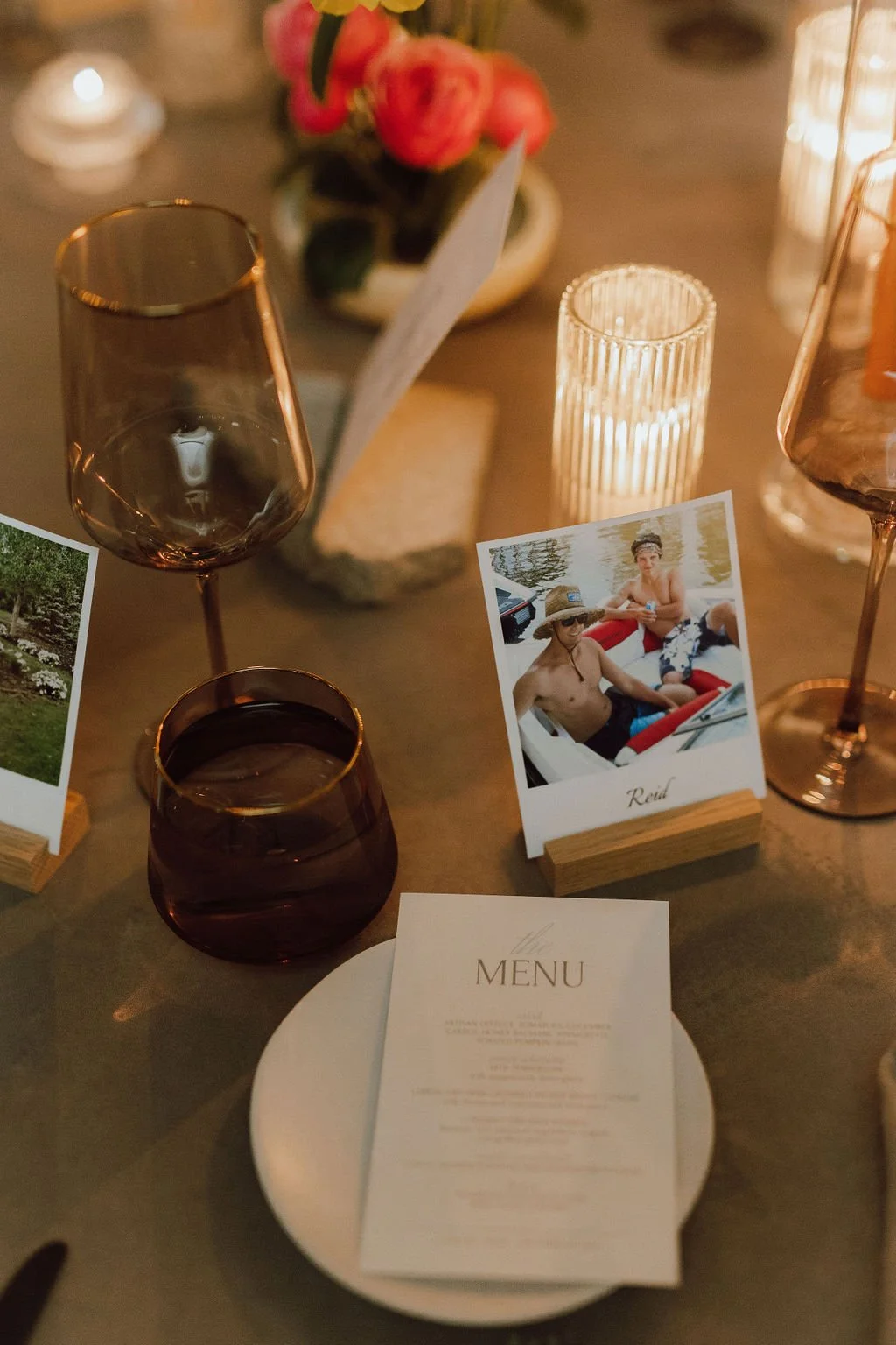
Tabletop Styling
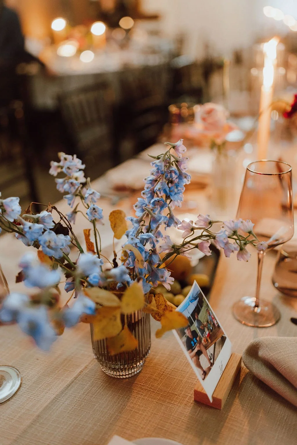
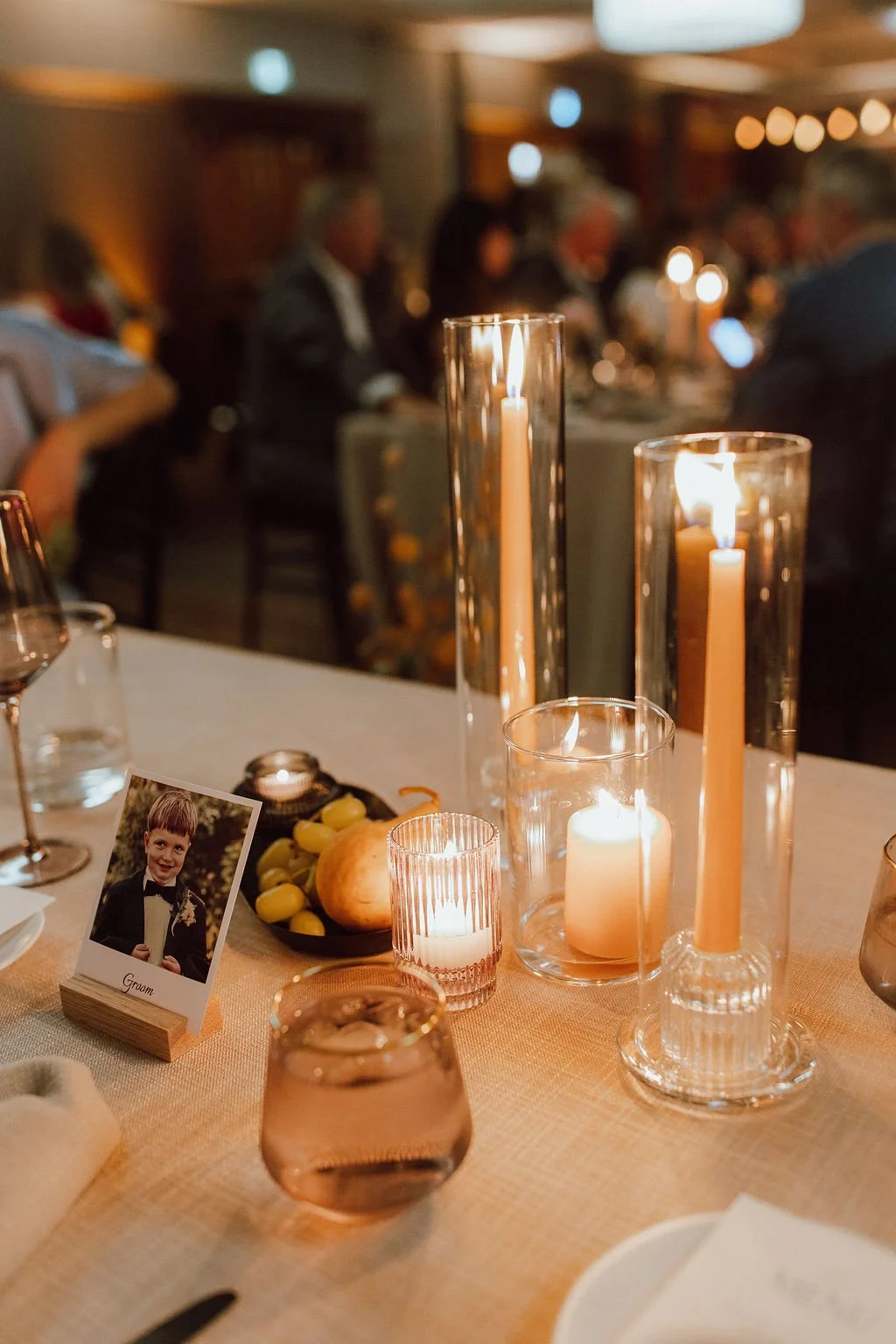
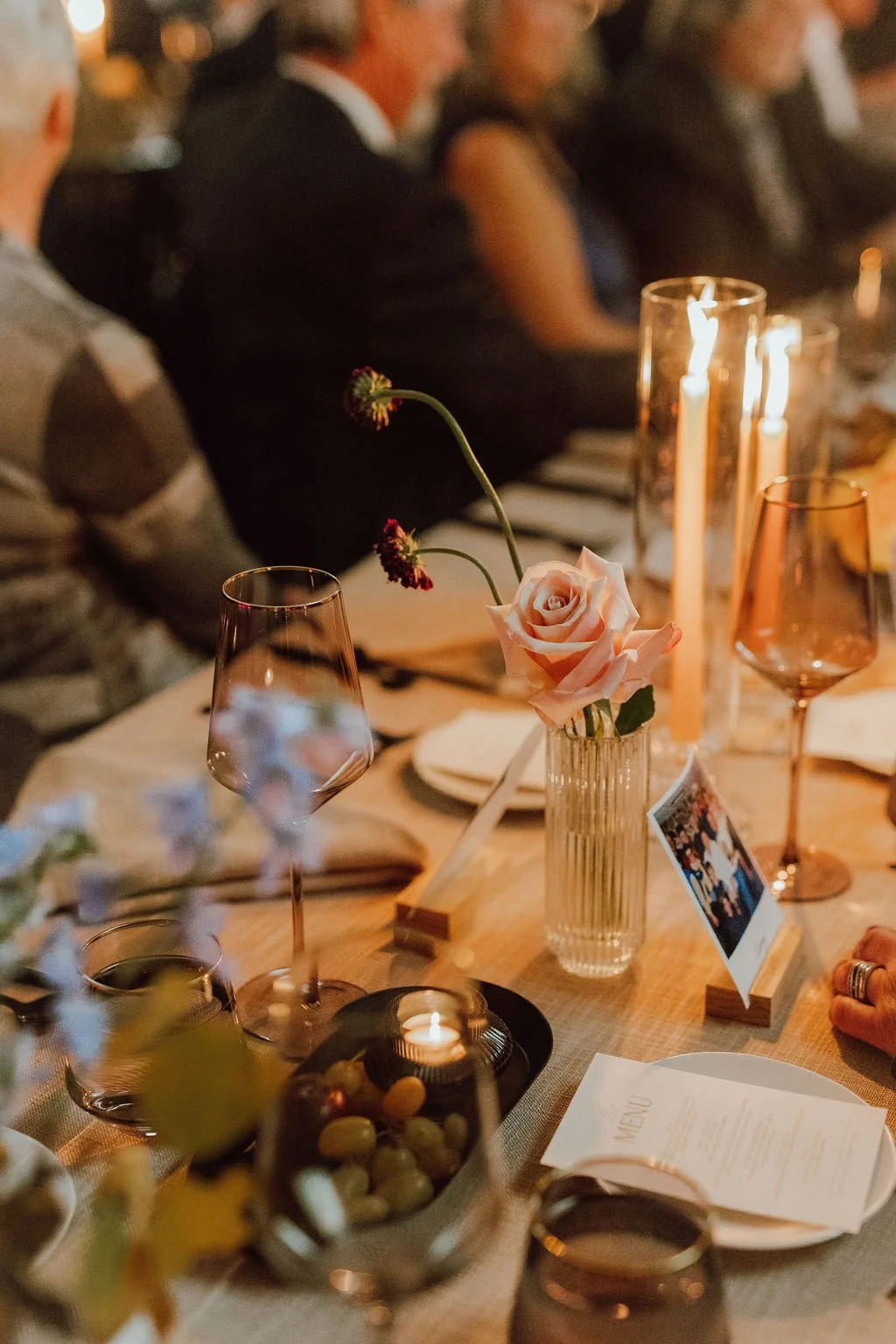
Centrepieces, fruit, candles
Personalized photos at each guest’s place setting
Rich linen and velvet tablecloths in cool grey and blue tones
Dim lighting — while technically nothing to do with the tabletops, it was a crucial element to creating the ambiance in the space! Event Light always does the perfect job. I told them the overall vibe I wanted to create, and let them make all the decisions.

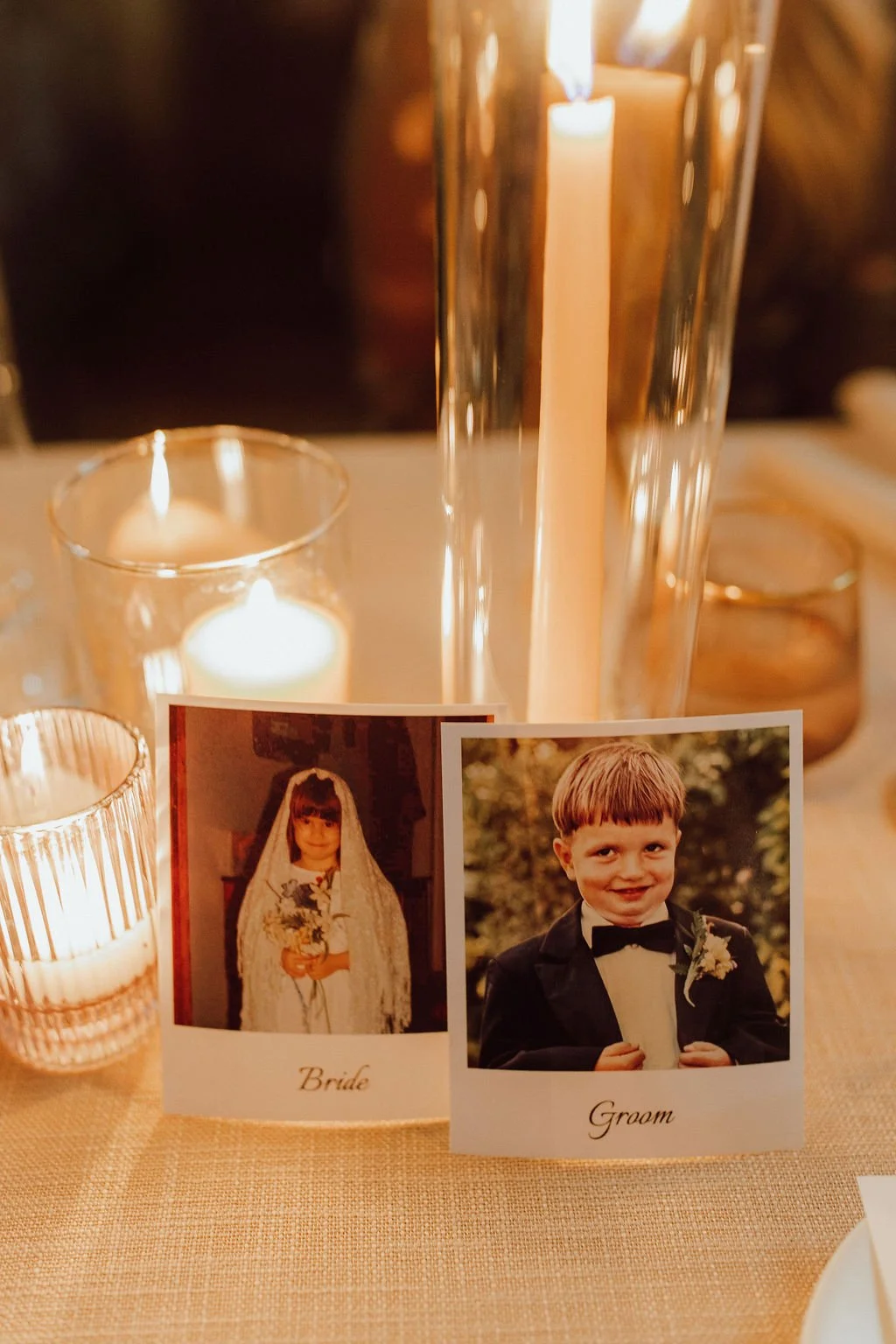
One of the sweetest moments of the wedding came from a completely personalized design element that Leanne came up with. She had seen a tiktok where guests walked into a wedding and found personalized notes to every single guest from the couple. She and Kyle worked so hard to find a picture of each guest with either or both of the couple. Guests were so stunned when they walked in to find these at their place settings!


Adding in a lounge corner with soft seating, a lighting feature, and well-styled details was one of the elements I used to create that laidback, restaurant type of ambiance they wanted. A great restaurant almost always has that cozy seating element somewhere, some cool furniture pieces, and lots of candlelight. I love the way this one came together, from the furniture selections to the lighting feature Event Light created (they are THE best).
I’m really grateful for Kayla Lagos Events! Leanne wanted a wedding coordinator, and I recommended they talk to Kayla. She has a really calming personality, is so easy to talk to, and does such a great job of staying on top of things and making it all happen. It was great to work with Kayla on the wedding day to execute everything!
Ariana Tennyson Photography ~ Kayla Lagos Weddings & Events ~ Karta House ~ Niakwa Country Club ~ Planned Perfectly ~ Collective Event Rentals ~ Event Light ~ Trend Decor Winnipeg ~ Luxe Linens
LOOKING FOR A WEDDING FLORAL AND EVENT DESIGNER IN WINNIPEG?
I offer full scale event design along with florals for about 3 dates per year. Reach out to inquire about your date availability!
Whether you already have a specific vision or want me to dream up something custom just for you, reach out to find out how we can create the perfect ambiance for your wedding.

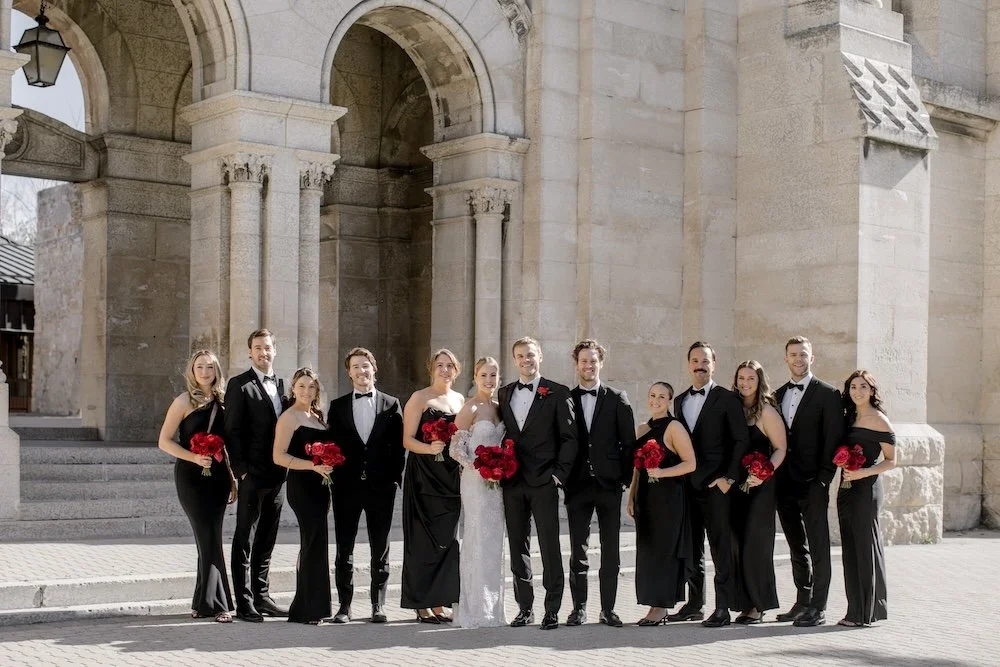
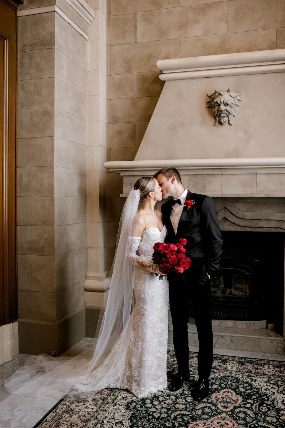
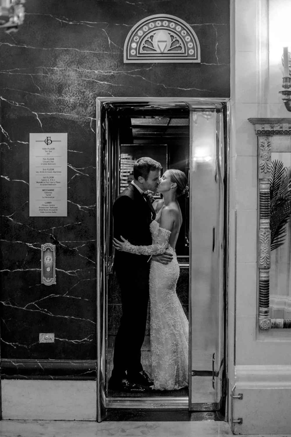
Striking Red Wedding Flowers at the Fort Garry Hotel
There’s one perfect way to describe a red wedding in my mind, and that is: STRIKING. When red is done with carefully measured intention, the design elements are unforgettable, rich, bold, and classic all at the same time.
You know me, I’m not the most traditional designer, so I wanted to make sure that I took this classic wedding palette and added a modern floral design to it. I think that my work, paired with Soiree Event Planning’s amazing design, really took a red and white palette to the next level.
Photos by Brittany Mahood
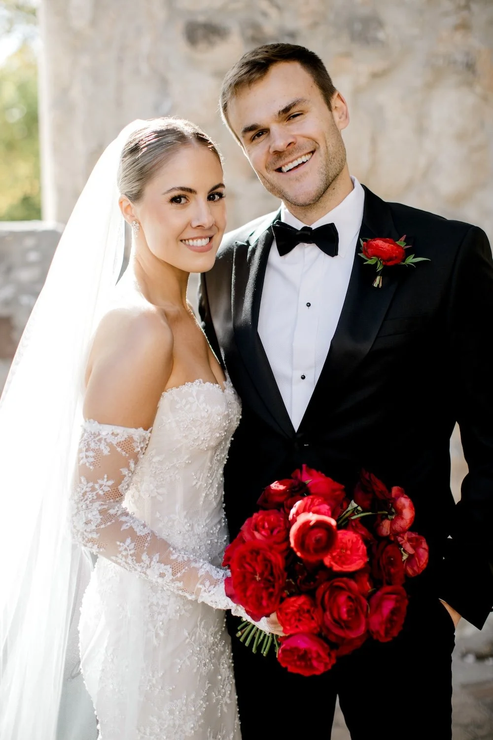

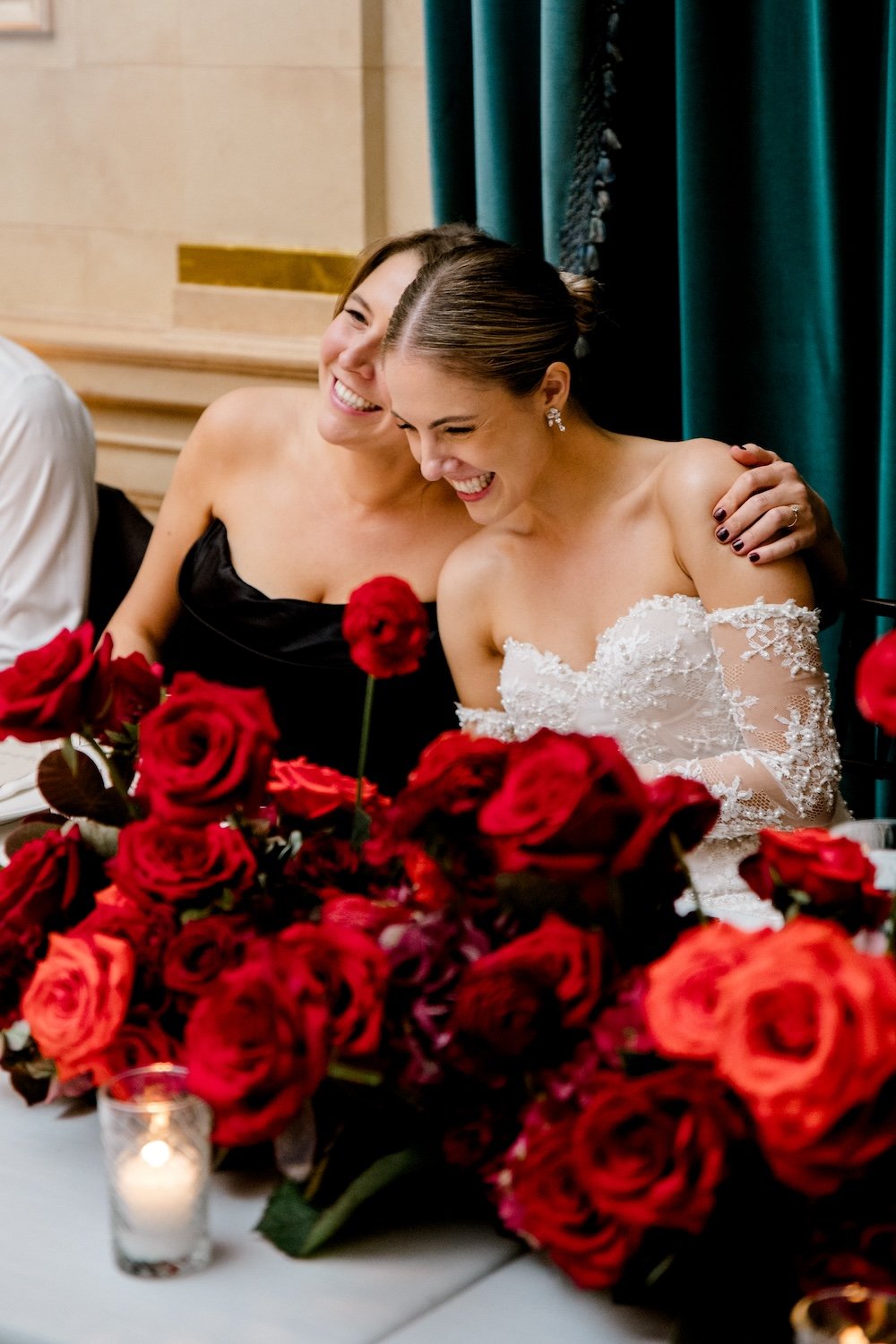
“Thank you for bringing our wedding floral vision to life so beautifully! Seeing your proposal was one of the most exciting moments of the wedding planning process, and you exceeded every expectation on the big day! The red roses were everything we dreamed of and more. ”
The Floral Design
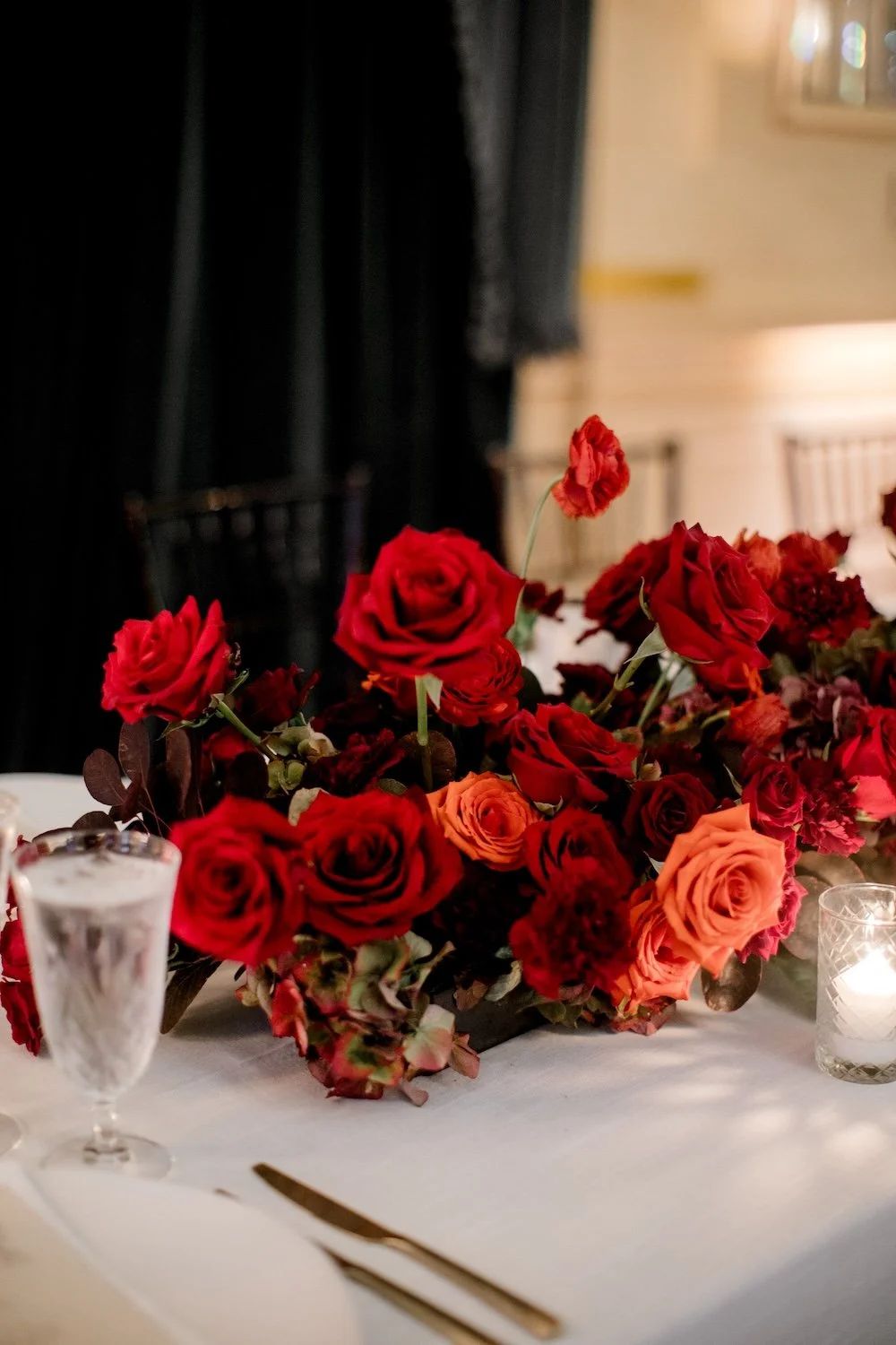
I am always shouting from the rooftops how much I love colour, and that includes a striking monochromatic palette. Working completely in reds was SO much fun for me. With red, I like to go either monochromatic like this, or use it as an accept to other juicy and bold tones. I have been asked many times to do red and white together, and it’s really challenging to make that work — the contrast between them is just too strong. It ends up looking like a maple leaf or polka dots (neither of which you want for your wedding).
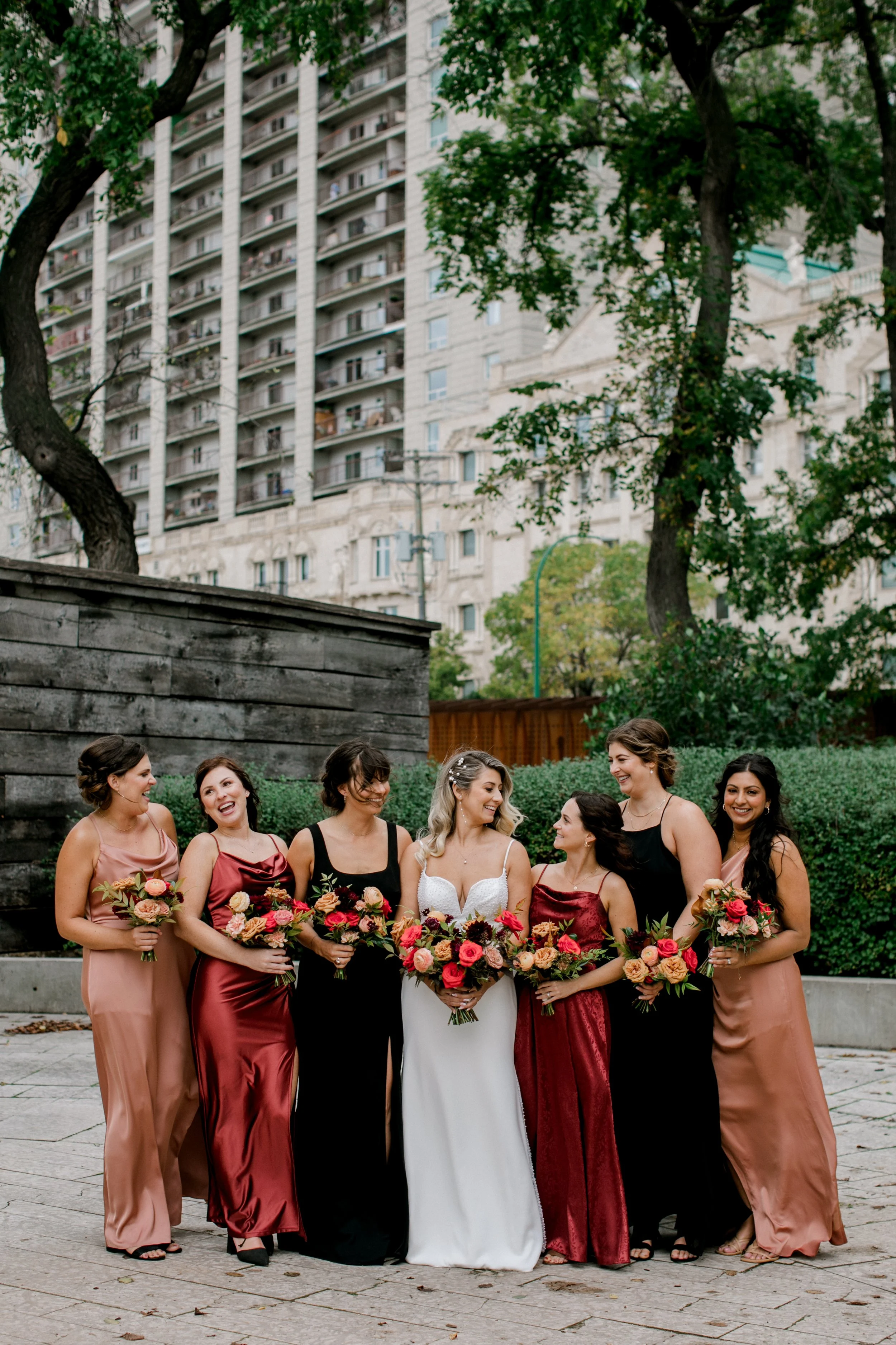
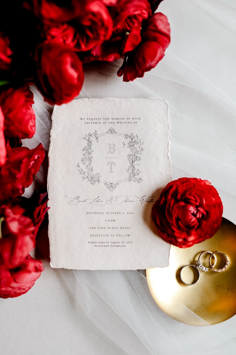
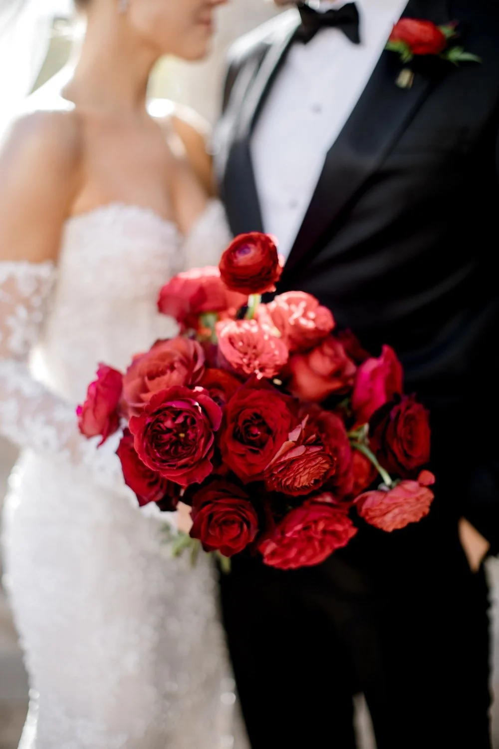
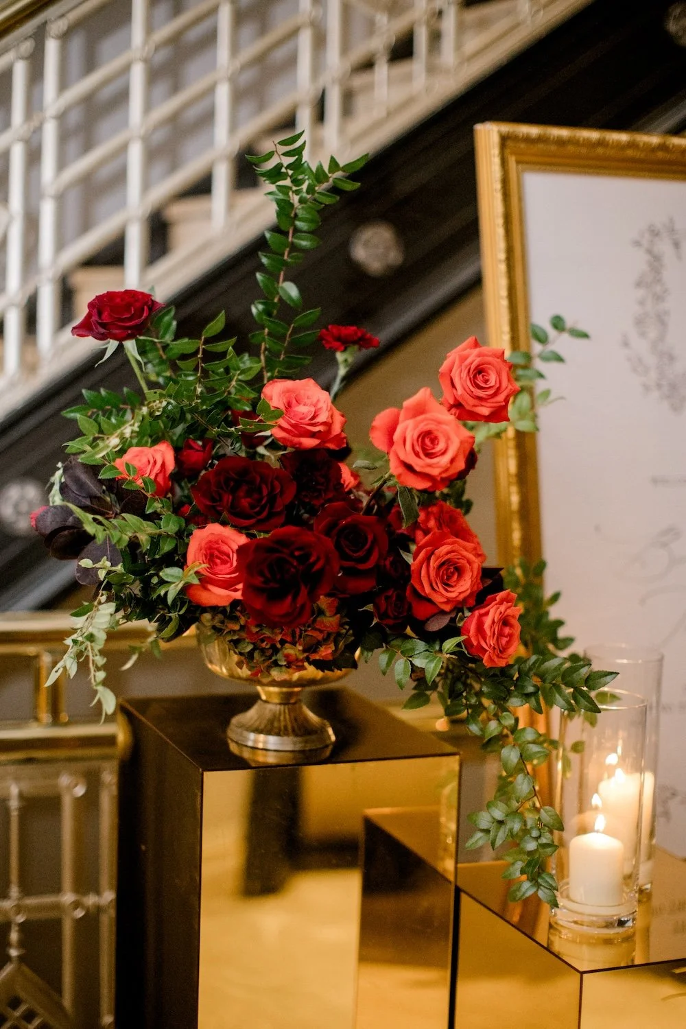
Bridal Bouquet Ingredients: Tess garden roses, Matilda roses, red piano roses, black beauty roses, and red ranunculus. I designed Brooke’s bouquet with an overall classic round shape, but with lots of depth and movement so it didn’t feel dense, compact, or dated.


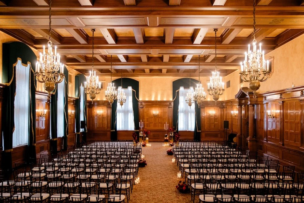
The Ceremony Design
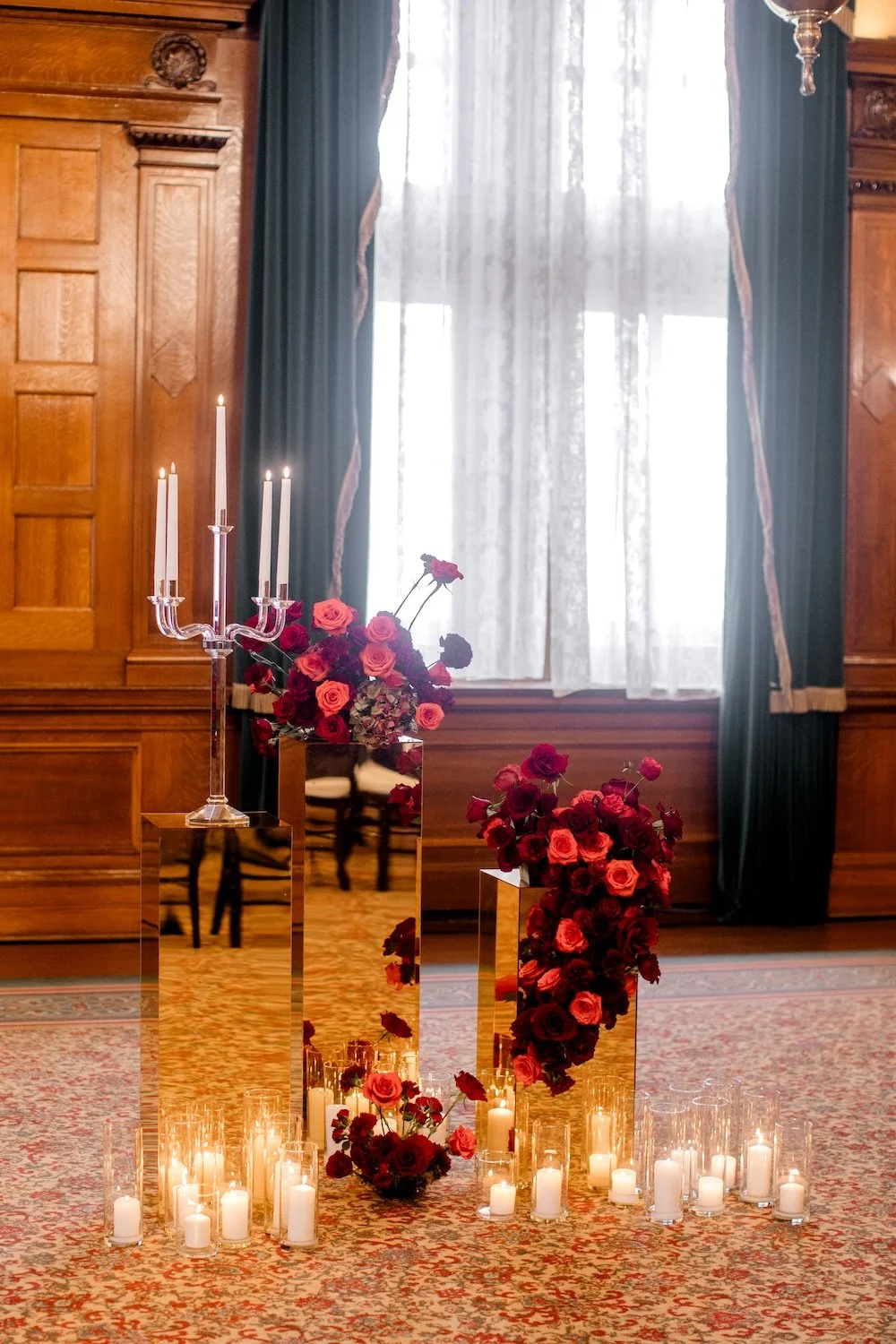
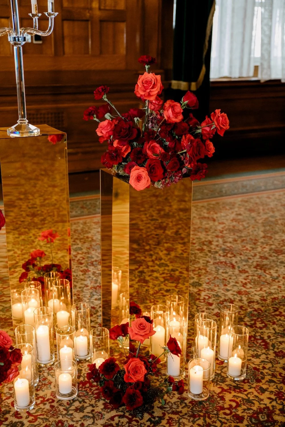
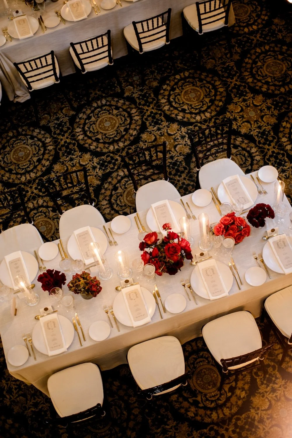
From mockup to reality! Brooke wanted moody and interesting designs, with an overall deep and luxurious feel to the event and tons of candlelight. The rich reds were just totally perfect 🥀 We used mirrored gold pedestals from Collective, and I focused on multiple floral pieces that worked together to make a large statement: larger “puffs” placed on top of pedestals, smaller puffs that I tucked onto the ground with candles, and lush snaking pieces that cascaded off and around the pedestal tops.


I love working through these digital mockups — it gives you the reassurance that you can visualize what our goal is, and helps me make decisions about what I think will be best along the way — but I love the final end product so much more. It’s so rewarding seeing it all come to life and then when you finally get to see it and enjoy it…it’s perfect!
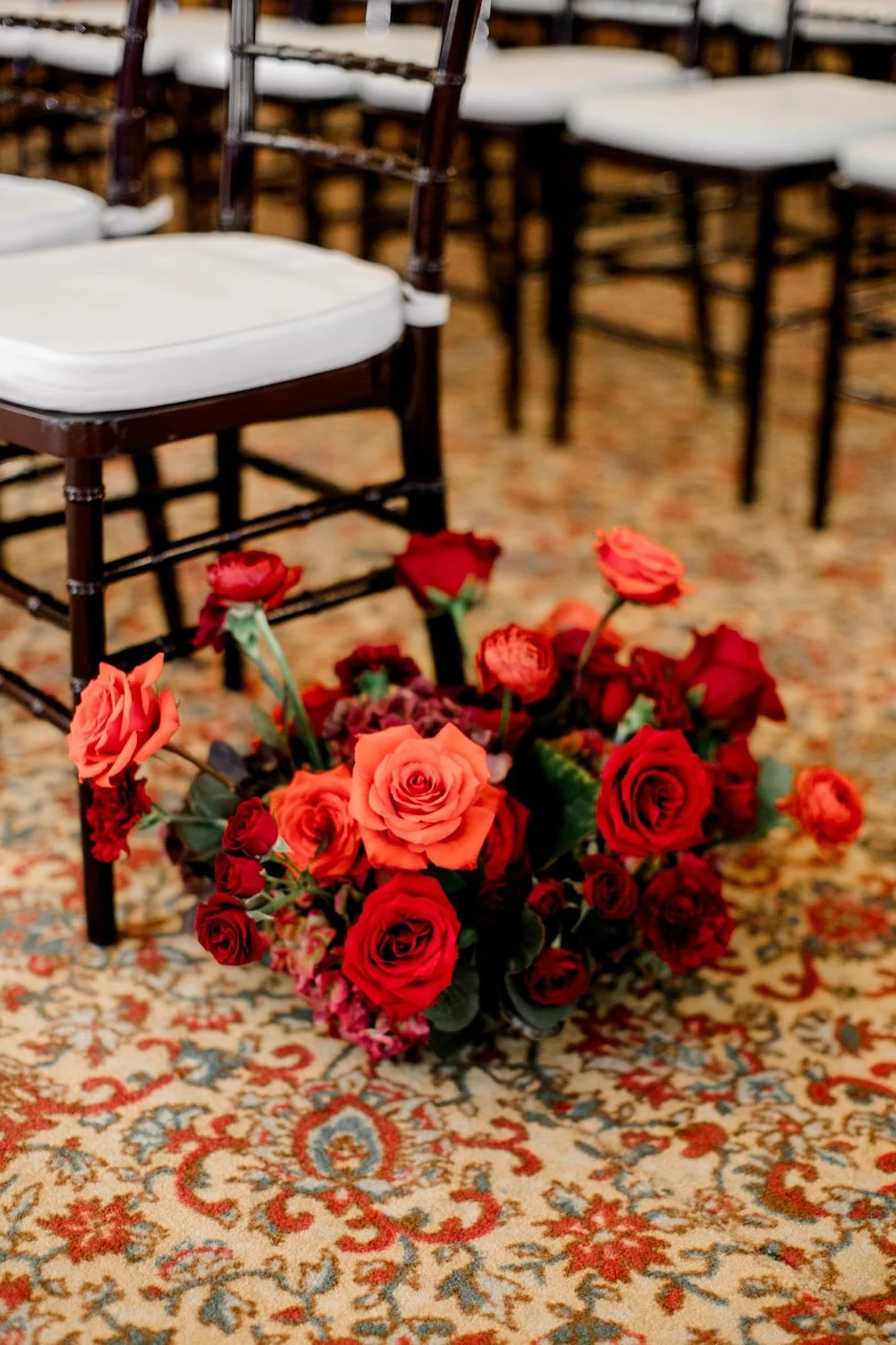
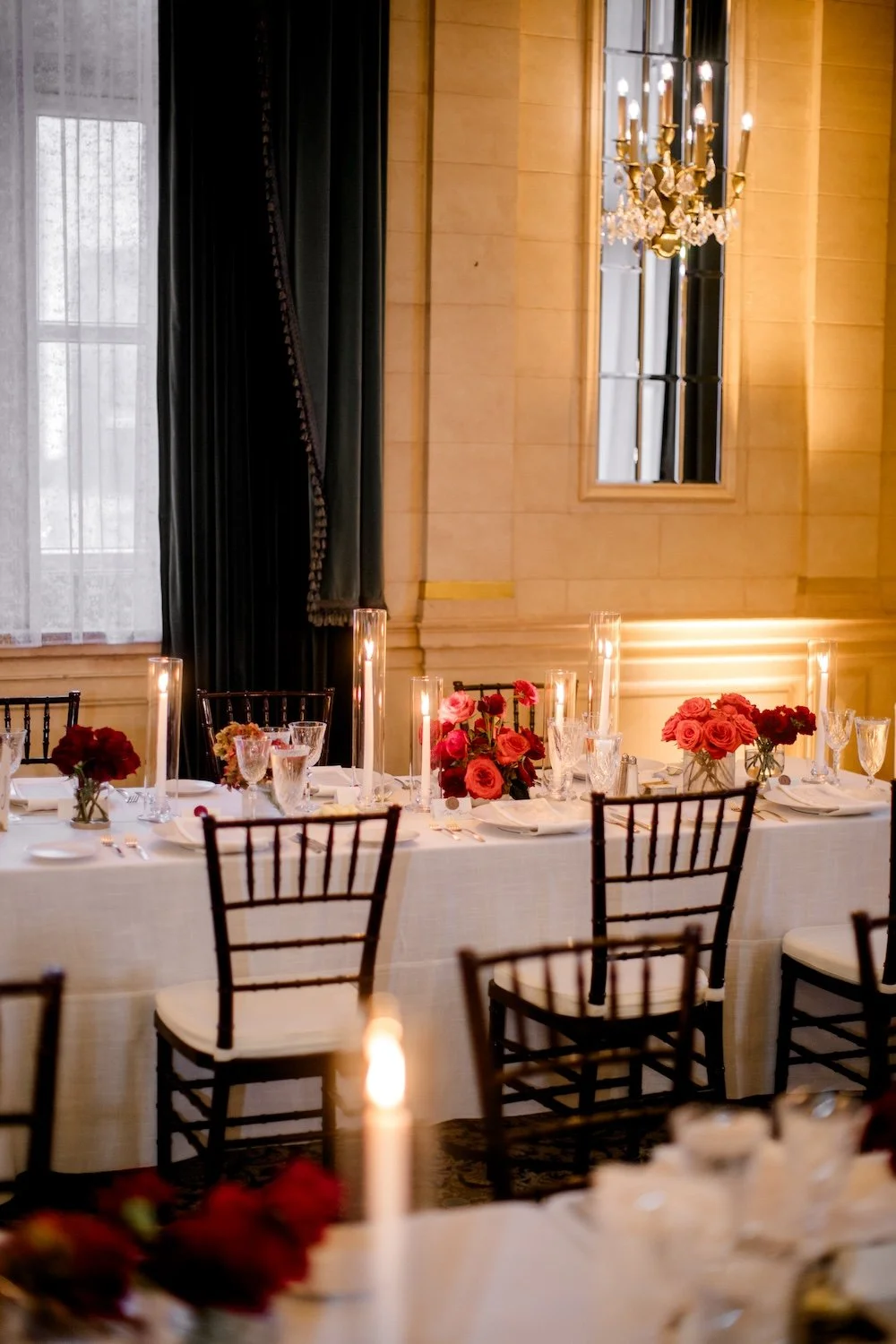
Down the aisle, we alternated low, lush floral pieces with clusters of candles. All of this was later repurposed to the head table!


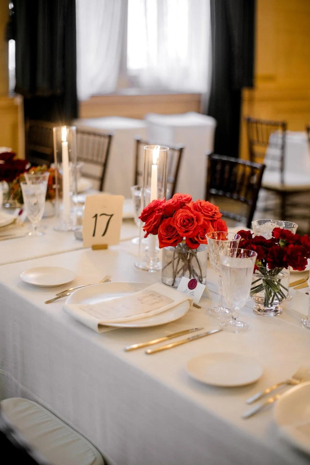
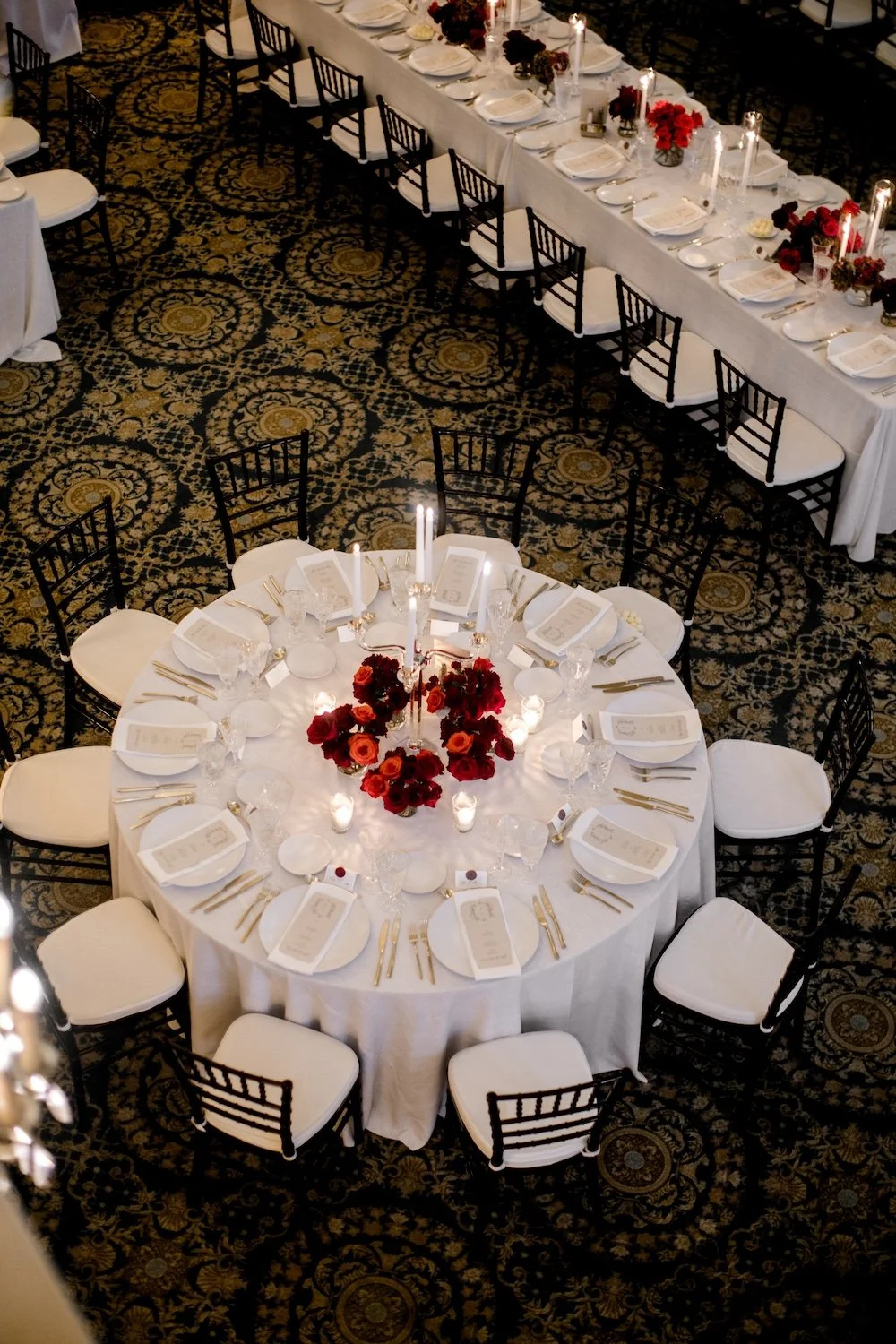

Tabletop Styling
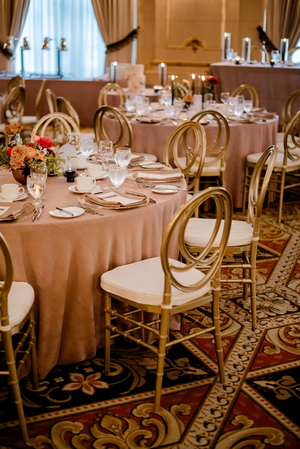
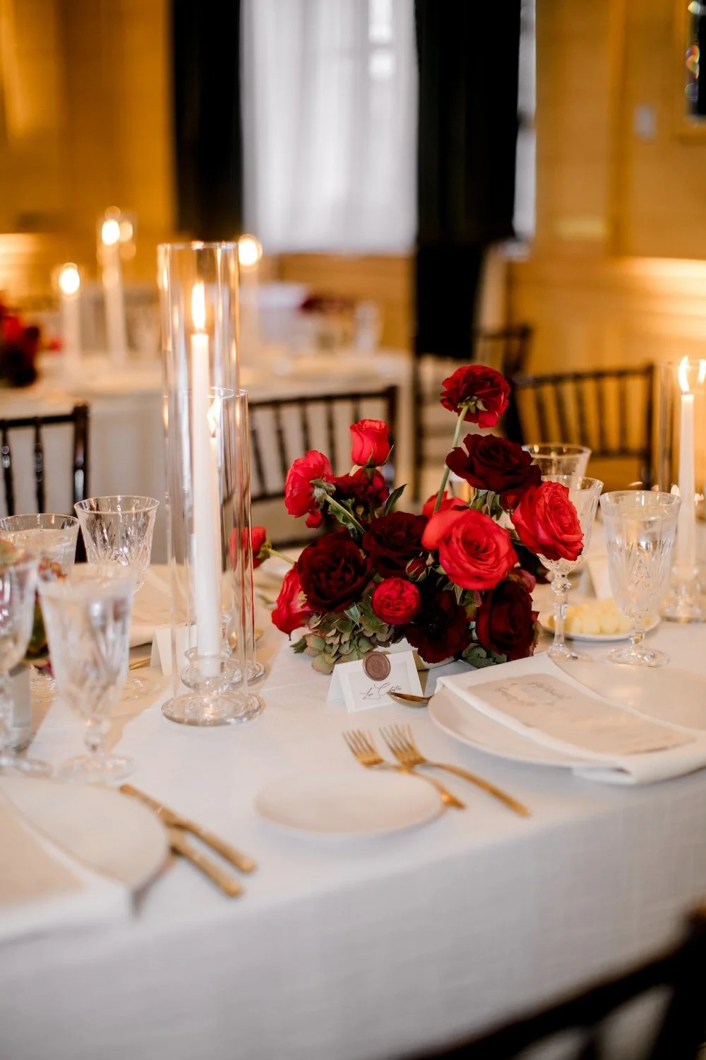
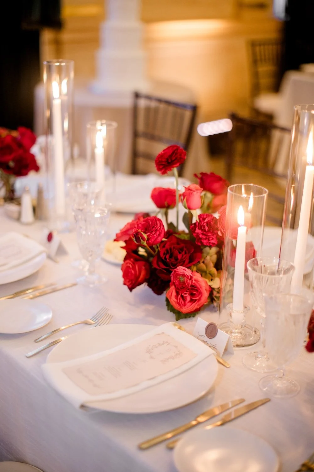
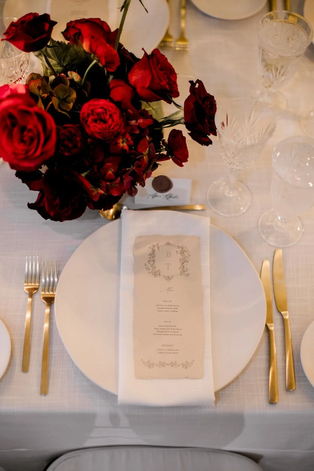
The way these tables came together was just *chef’s kiss! Each element was very thoughtfully considered to curate elegant, classic settings and a warm ambiance. This wedding design is a perfect case study in why I love working with Soiree Event Planning — the design process is so seamless. They just know how to make things beautiful.
Linens
While I normally vote for a subtle colour in the linen, this crisp white from Planned Perfectly created such a beautiful, neutral base. Coordinating white napkins allowed the other tabletop elements to play centre stage.
Glassware and Dinnerware
The glassware was kept traditional, with a clear cut glass duo of glasses from Collective Event Rentals. Classic white chargers paired really beautifully with the soft champagne flatware from Union Table. They’re the perfect accent of metallic without being brassy or cheap looking.
Candles and Holders
I love a good mix of candles! I kept it simple with white taper candles and and votives in gut class holders (adding a layer of a classic texture). I loved the candelabras! I rented them from my friend Andrea at Addison Taylor Design after Brooke searched high and low online for a gold candelabra that didn’t look tacky or cheap. Turns out that search was really hard! The clear candelabras had a slight gold accent (I used LED candles in them), and we surrounded the base of those with red florals.
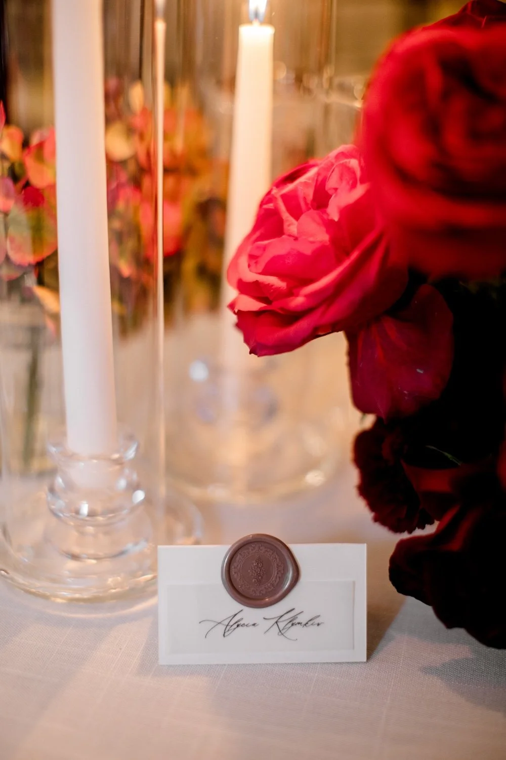
Stationery
Brooke’s friend Faith Robert designed all the stationery, and her work was the perfect subtle way to elevate the place settings. The hand-drawn monogram, the calligraphy, the handmade, deckled edge paper, and the wax seals (colour coded to meal selections) were incredibly elegant.
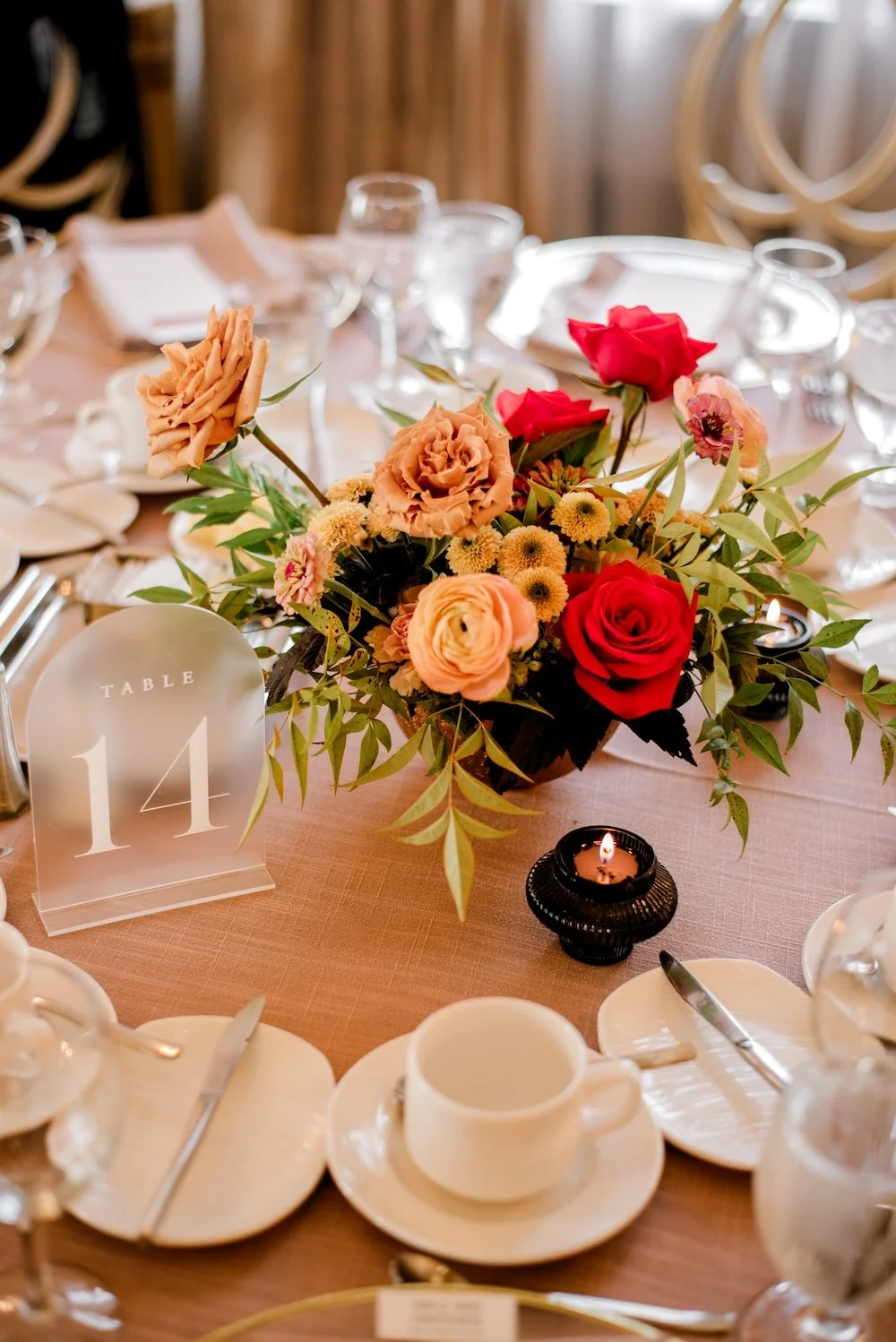
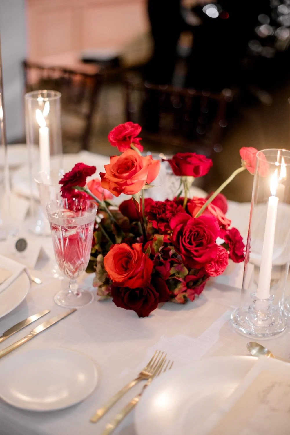
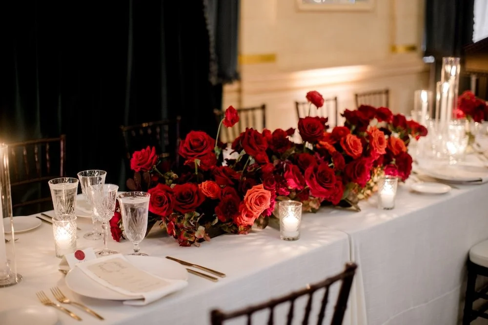
Floral Centrepieces
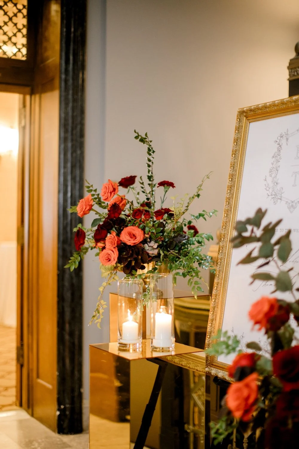
Obviously one of my favourite details! On the long tables, we created a lot of visual interest with varied heights of twinkling candles mixed with multiple sizes of monobloom floral arrangements. Keeping the arrangements in one bloom type create more of a punch, especially when working with a range of shades.


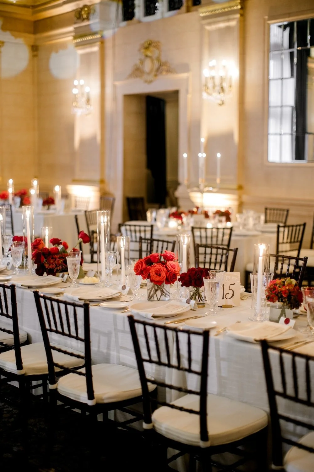
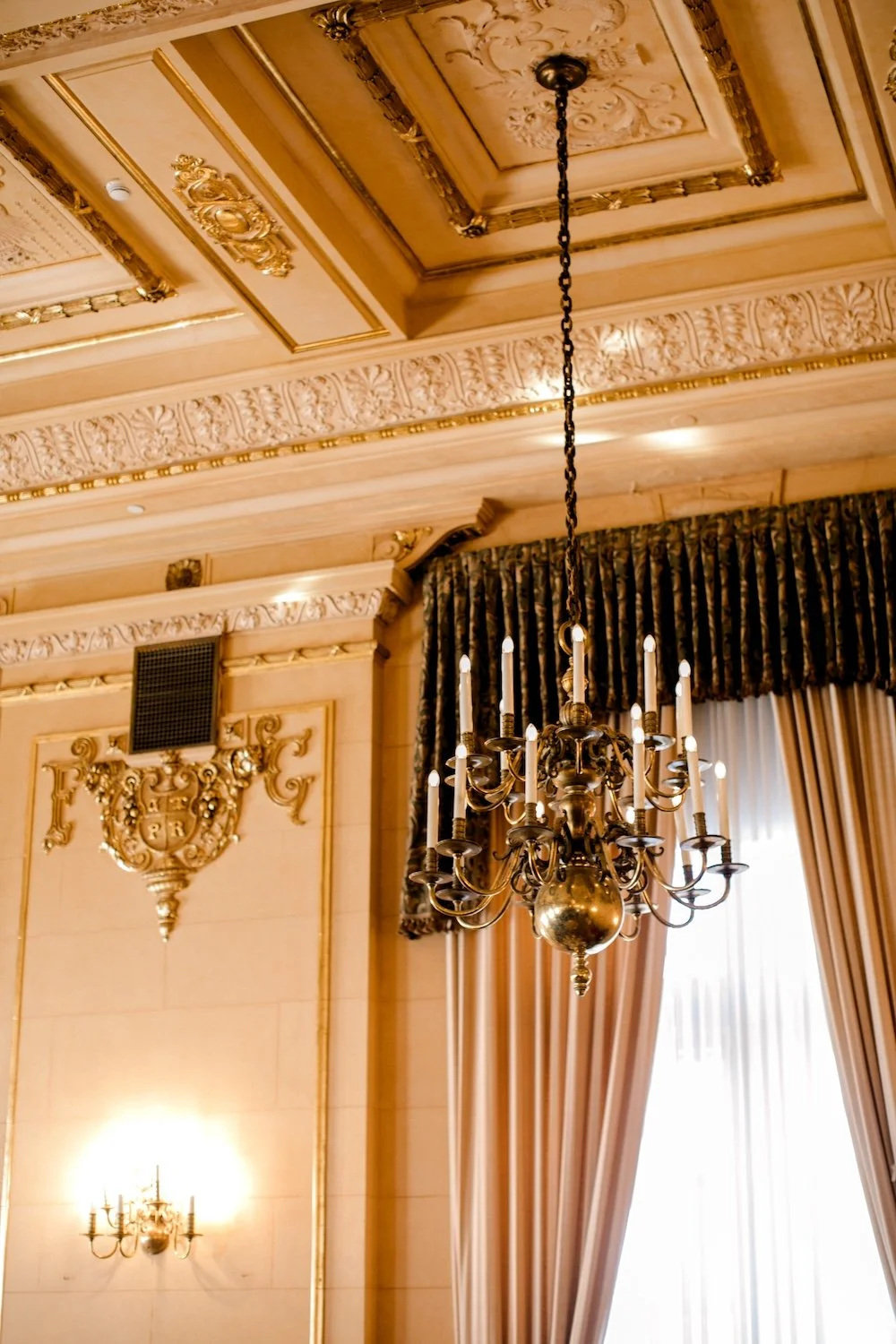
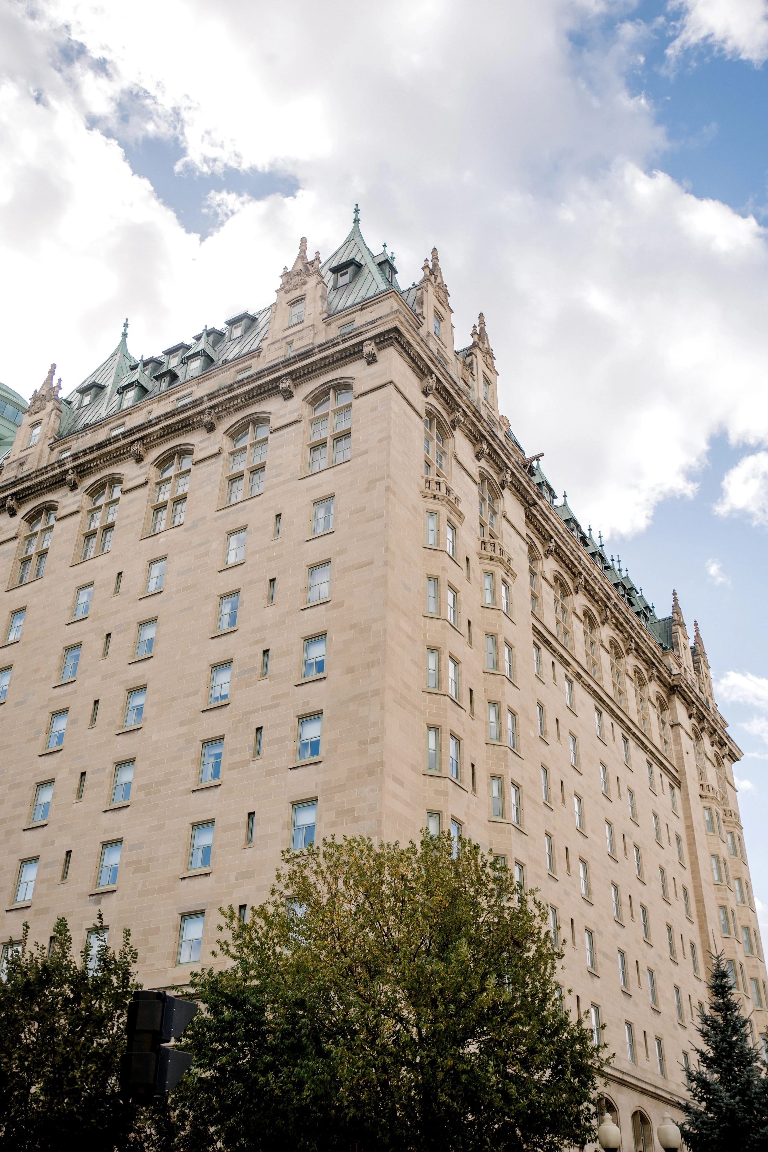
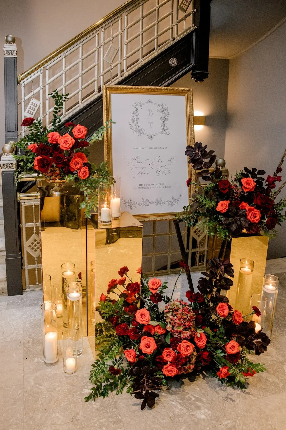
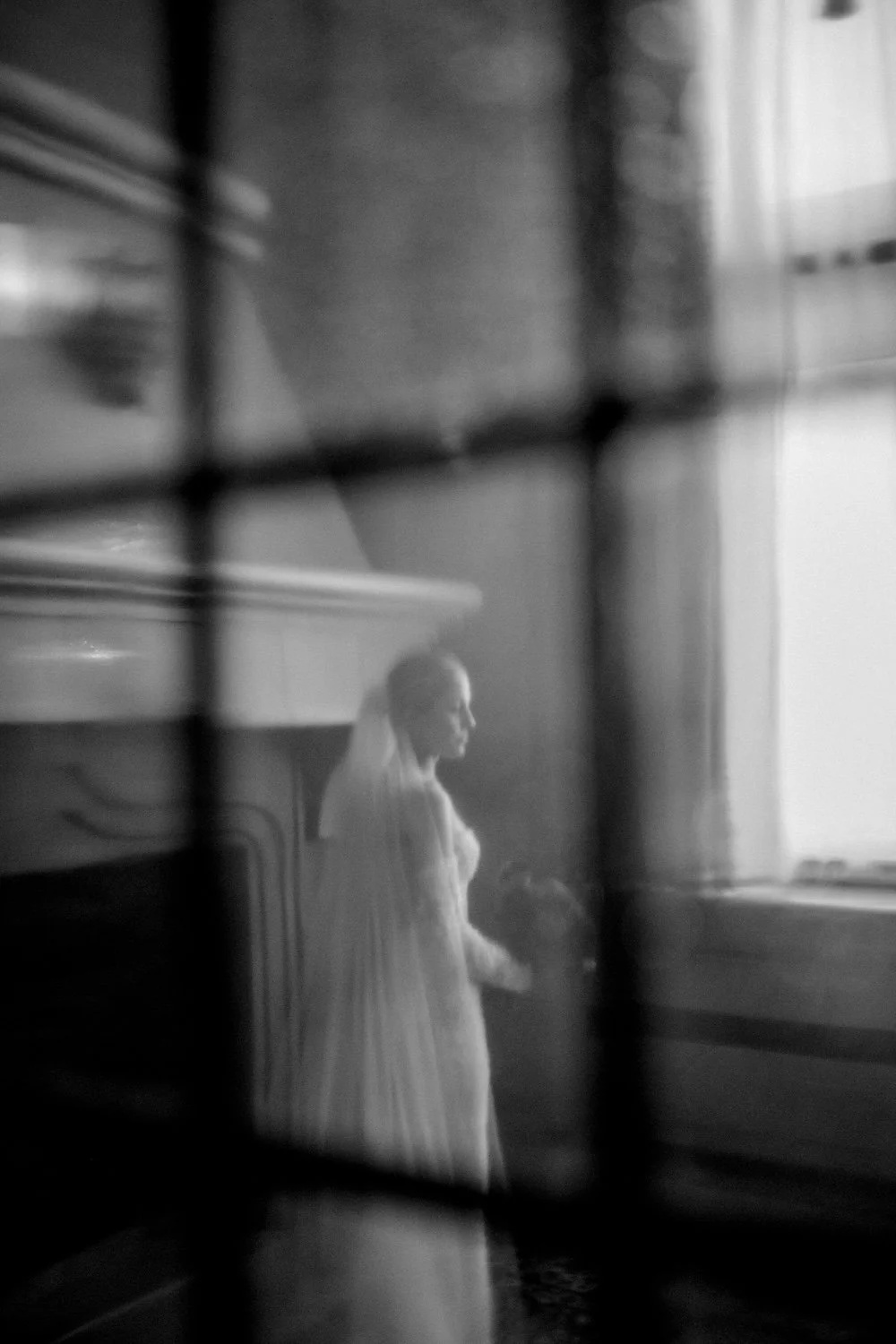
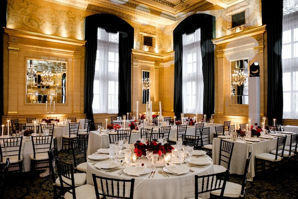
The loggia areas of The Fort Garry’s 7th floor is one of my favourite aspects of the venue.
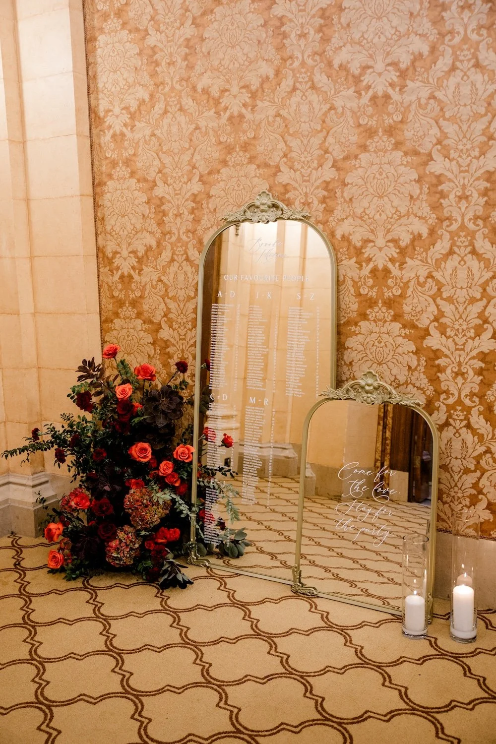
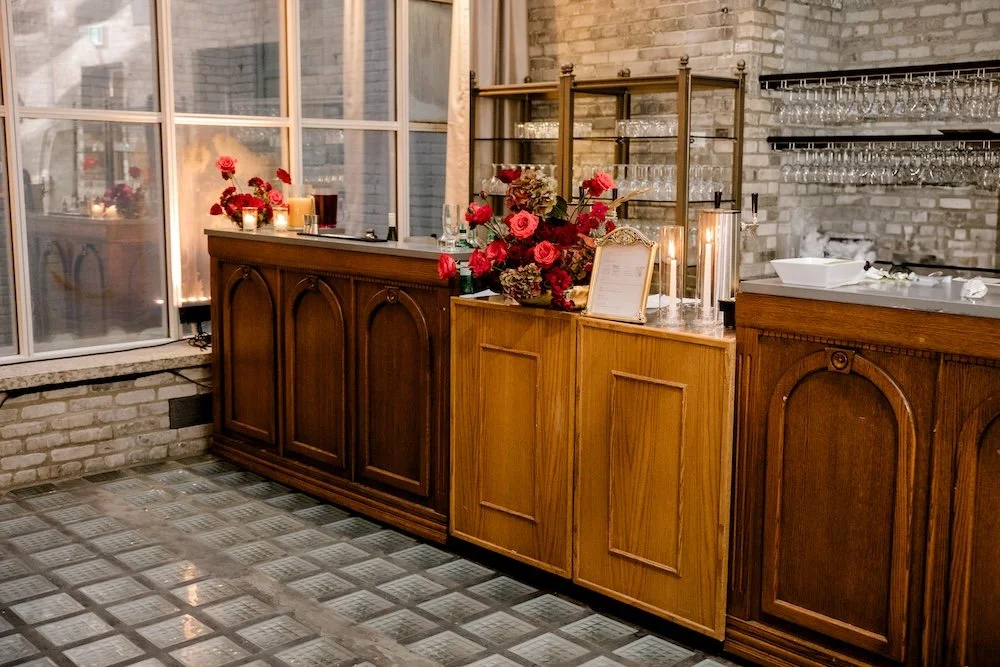
If you book the entire 7th floor, you have ample space for guests to exit the elevators to a personalized welcome design, enjoy the ceremony in the Crystal Ballroom, serve cocktails in the hallway, and even include design elements like a seating chart with floral moment, like this one right here.

Who This Design is For
I know that red has this polarizing ability to stress people out! So here’s who this design works best for:
Couples with a classic style who aren’t afraid of boldness.
Weddings with a larger guest list, and a large enough venue to allow them to play with multiple table shapes and centrepiece styles.
Planners who know how to walk the line of less is more, and won’t be tempted to add in a lot of unnecessary detail.


Brittany Mahood Photography ~ The Fort Garry Hotel ~ Soiree Event Planning ~ Planned Perfectly ~ Collective Event Rentals ~ Lauren B Wycoff ~ Event Light ~ Big City All Star Band ~ Luminous String Quartet ~ Union Table ~ Sugar & Salt Bakeshoppe ~ Lineage House ~ MYUZ Artistry ~ 4SquareFoto ~ Faith Robert

LOOKING FOR A WEDDING FLORAL DESIGNER IN WINNIPEG?
Planning a wedding at The Fort Garry Hotel and want polished florals that suit the space? I’d love to be your floral designer.
Flowers are the best way to make a statement at your wedding. Whether you already have a specific vision or want me to dream up something custom just for you (like a greenery canopy hung above your dinner tables!), reach out to Stone House Creative for stunning bridal bouquets, truly unique ceremony backdrops, and beautiful floral centrepieces to create the perfect ambiance for your wedding!