Elegant Fall Wedding with Fun Colour Palette
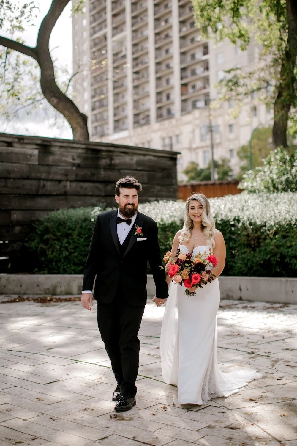
I’m continuing to catch up on sharing stories from last fall’s weddings, and today we’re looking at Tatiana and Kevin’s! They planned an elegant fall wedding, with a fun colour palette and some moody details.
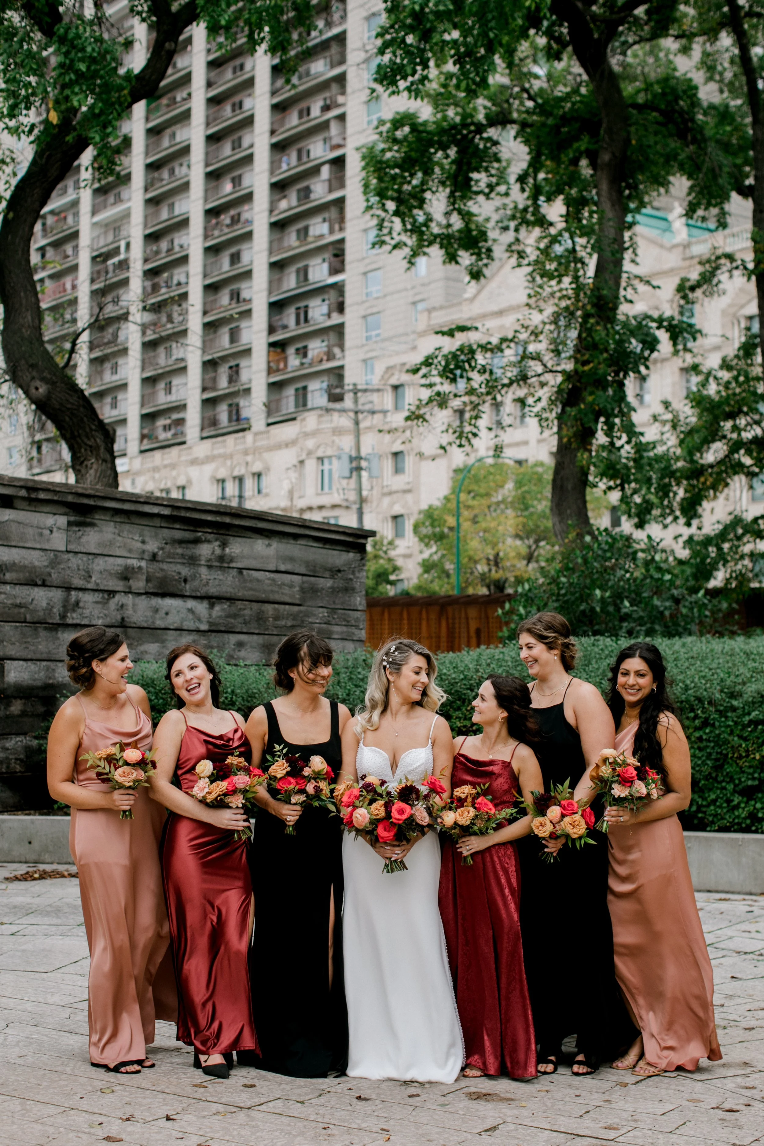
One of my personal highlights from the day was setting up the ceremony arch. We were working in the garden, enjoying the flowers, and just peeking through the fence at the wedding party taking their photos. They were so happy, so chill, the bridesmaid dress selection was gorgeous, and it looked like they were having just the best day — which is exactly how we want you to feel!
Photos by Brittany Mahood Photography

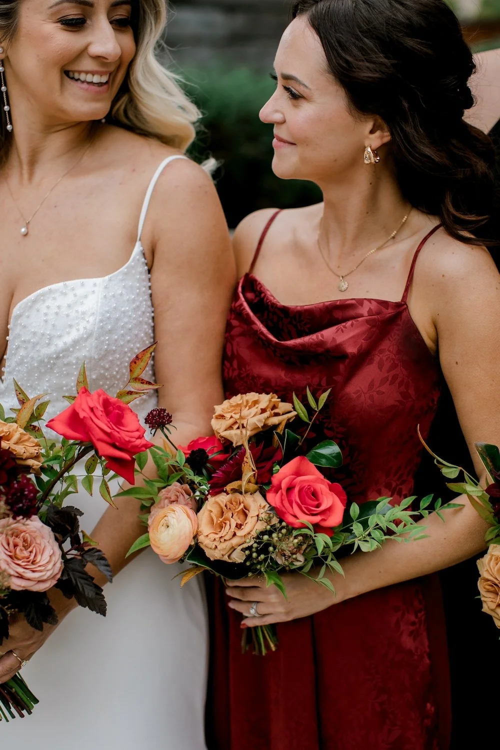
See what I mean about a fun colour palette and a great combination of bridesmaid dresses? Everything feels rich, layered, with a cinnamon-and-spice vibe. The varied textures and fabrics of the dresses are gorgeous, too, and I happen to think the flowers look quite delicious in those hands.


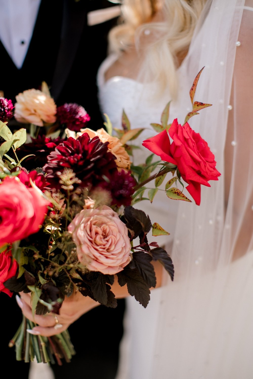
The Flowers
Moody, elegant, and romantic. Tatiana wanted the flowers to do a lot of the work within the overall design. She liked gardenesque shapes and luscious flower-filled designs. I designed a pretty large bouquet for her, with smaller, coordinating bouquets for the bridesmaids.
Bridal Bouquet Ingredients: nina roses, salmon ranunculus, toffee roses, plum scabiosa, plum dahlias, antique carnations, ninebark and nandina foliages.


The Colour Palette
One thing I love about fall weddings is the saturated colour palettes. Now, don’t hear what what I’m not saying: just because it’s fall, doesn’t mean you need to do a Crayola bright orange/red/yellow palette. I will almost never suggest this, because it mostly looks like a Dollarama wedding and that’s just not the vibe.
What I AM saying is, go for the colour. Add in richness and depth with deep shades, add in vibrancy and warmth with something bold, and blend it all together with variegated foliages.
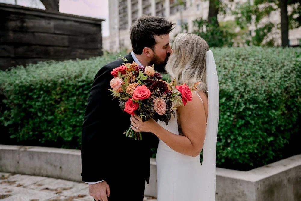
For Tatiana and Kevin’s palette, we planned to use 70% bright and deep reds, with 30% accents of salmon/toffee/blush pink. Her bouquet would not have looked or felt the same without the deep reds/burgundies in there. That result would have been a lot less moody, and it would have been more difficult to create a feeling of elegance. You need some variation and depth to bring that about.


The Ceremony
Let’s pause for a moment and talk about how adorable this flower girl is!! Walking down the aisle and scattering her petals, only to walk back and pick them up. So sweet!
The ceremony was held in the Bonnycastle Gardens at the Manitoba Club, to the sounds of a very cool live jazzy/punk trio and with a fair bit more wind than I like to have 🫠 The welcome sign kept blowing over (granted, it was very lightweight, as they almost always are) but the arch was well weighted down and it stayed put (thank goodness! I could always do without wind!).
The arch was always going to be a focal point. The Garden has a perfect nook that overlooks the Upper Fort Garry gate, and it’s just a really lovely setting! I went for full greenery coverage (with the most delicious nandina foliage) and we went for a little more dark burgundy as the base here, so the golden toffee tones and the bright reds stood out more. One of my favourite elements was the really dark lilies — adding in a star shaped flower here and there can really bring a design to life!


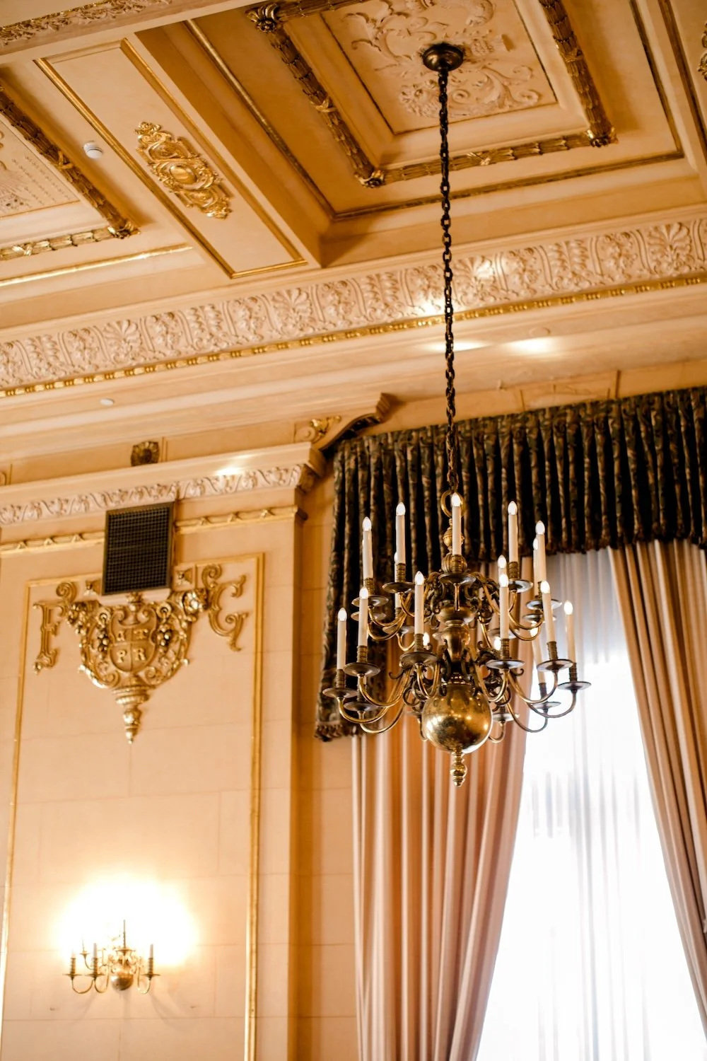
The Reception
Reception time! The reception was in the Provencher Ballroom on the main floor of the Fort Garry, which is conveniently right across the street from the Manitoba Club. This meant that we could set up the reception while the ceremony was going on, then pop across the street to grab the arch post-ceremony, and wheel it into the Provencher Room on trolleys! I’ll tell you what, it’s pretty fun crossing the street with a big floral arch! It feels very New York.
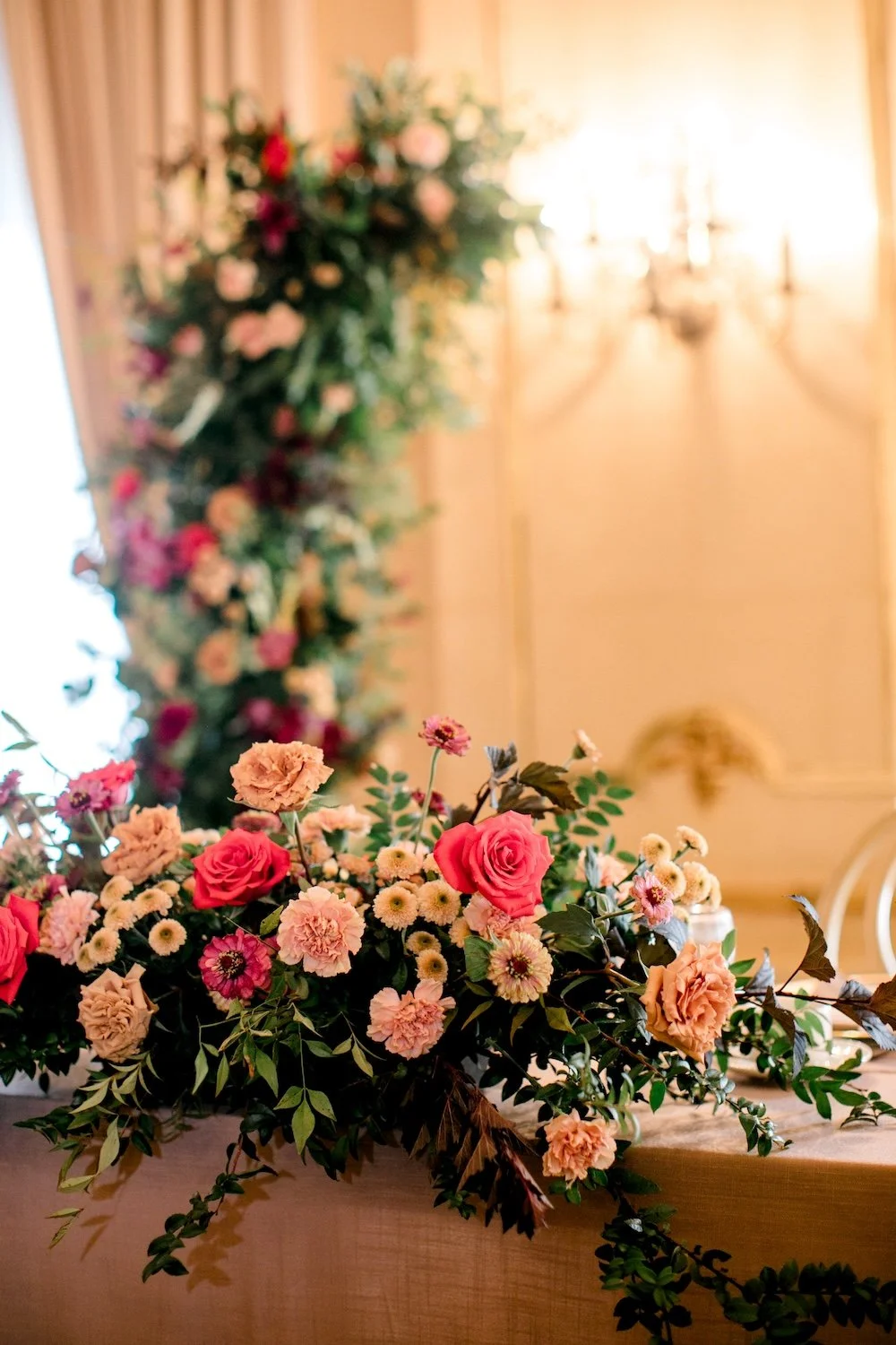
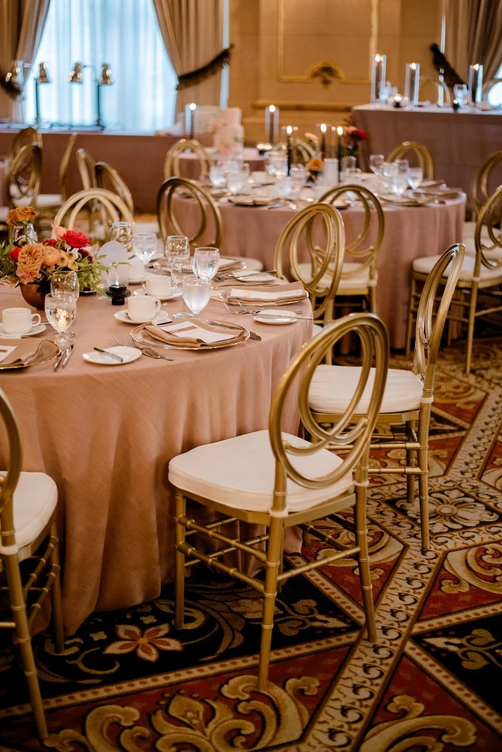
We repurposed the arch behind the head table, to which we added a low, lush floral piece that coordinated. Guest tables were all round, and they chose toffee linens from Planned Perfectly with gold chairs from Collective. This was such an elegant base and looked perfect with the Provencher Room’s warm neutral walls.

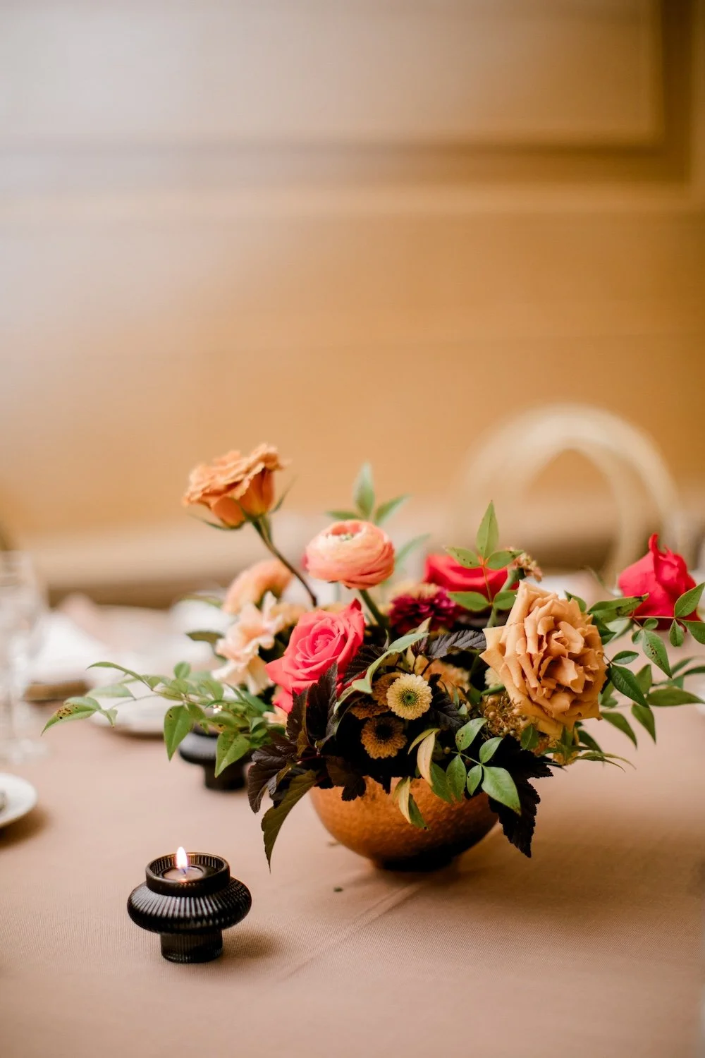

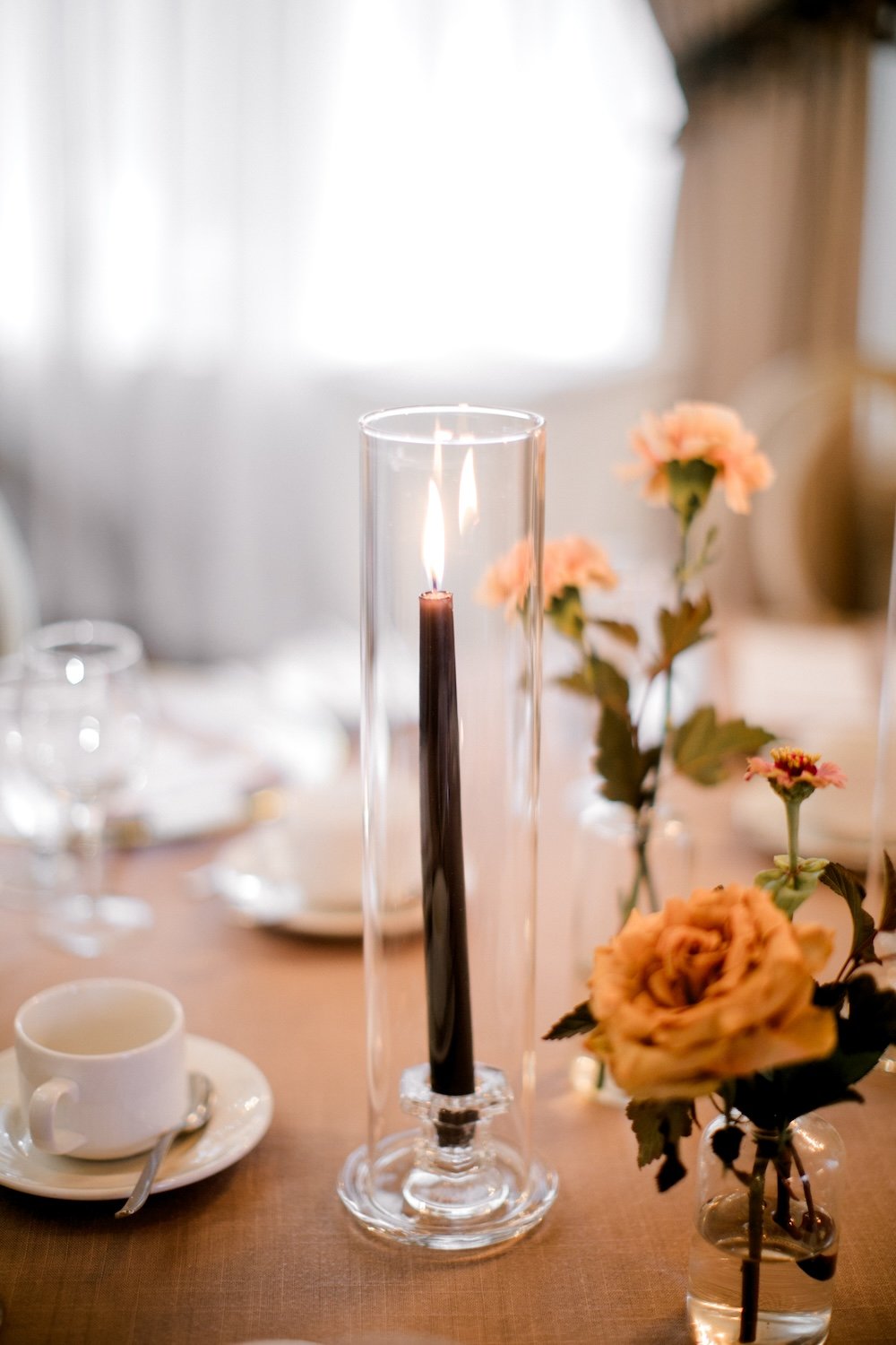
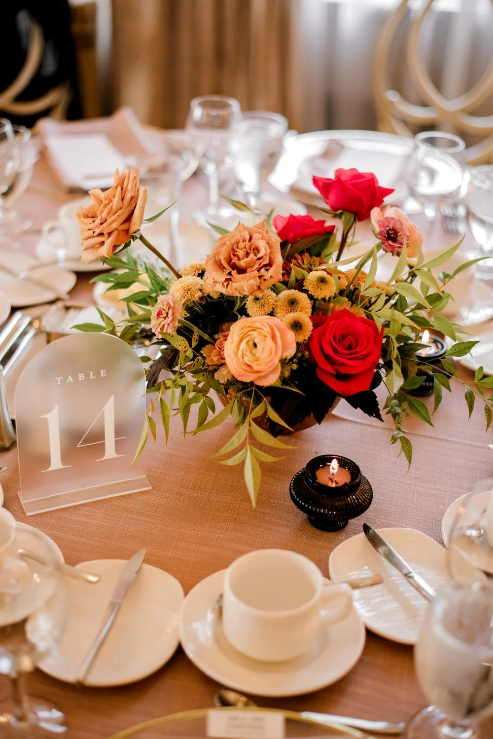
We elected to go with 2 coordinating styles of table centrepieces: on half, a low, lush floral arrangement in a hammered copper bowl, and on the other half, a trio of stem vases with black taper candles. Both looked awesome, adding pops of colour and flickering candlelight throughout the room.
One look at this photo to the right, and you’ll understand my plea to never have coffee cups pre-placed on the tables. See how much space these things take up? If it’s a brunch wedding and you know that everyone’s going to have a coffee, then sure. But otherwise, ask your venue if you can have coffee service at the bar/tableside, or if there can be a coffee station set up!


Looking for a Wedding Floral Designer in Winnipeg?
Flowers are the best way to make a statement at your wedding. Reach out to Stone House Creative for stunning bridal bouquets, truly unique ceremony backdrops, and beautiful floral centrepieces to create the perfect ambiance for your wedding!
