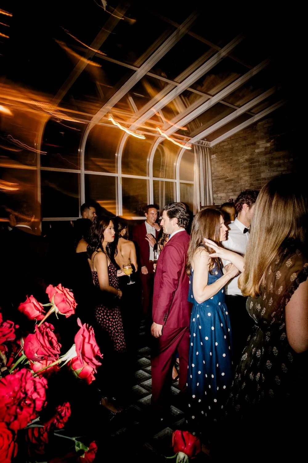
Striking Red Wedding Flowers at the Fort Garry Hotel
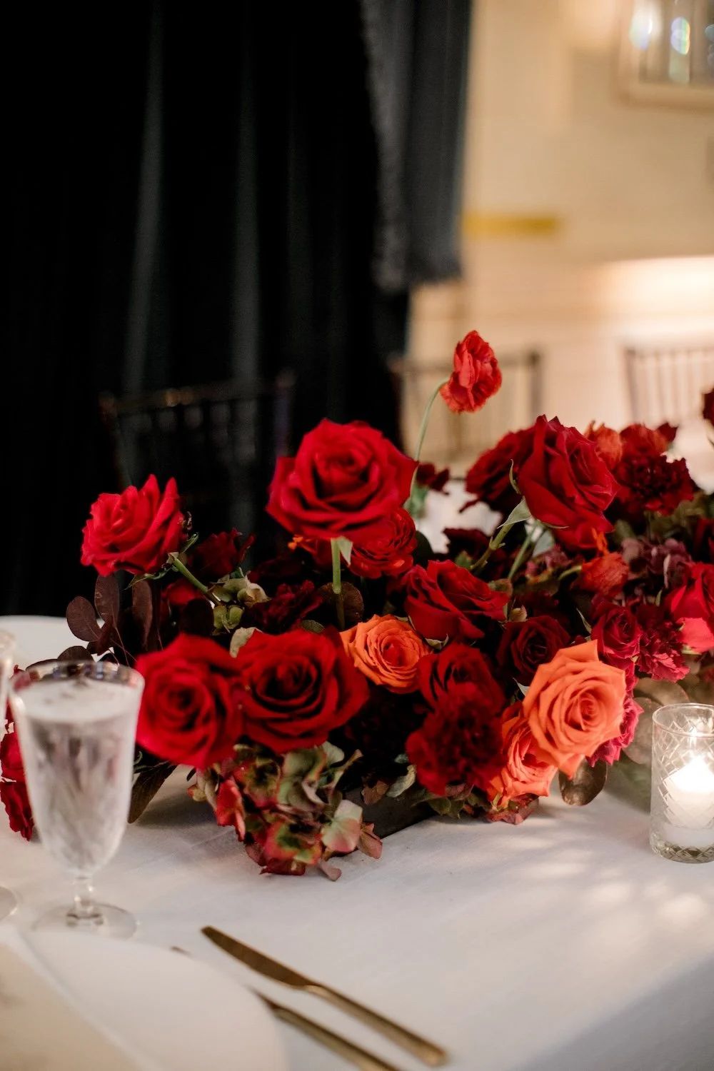
There’s one perfect way to describe a red wedding in my mind, and that is: STRIKING. When red is done with carefully measured intention, the design elements are unforgettable, rich, bold, and classic all at the same time.
You know me, I’m not the most traditional designer, so I wanted to make sure that I took this classic wedding palette and added a modern floral design to it. I think that my work, paired with Soiree Event Planning’s amazing design, really took a red and white palette to the next level.
Photos by Brittany Mahood
“Thank you for bringing our wedding floral vision to life so beautifully! Seeing your proposal was one of the most exciting moments of the wedding planning process, and you exceeded every expectation on the big day! The red roses were everything we dreamed of and more. ”
The Floral Design
I am always shouting from the rooftops how much I love colour, and that includes a striking monochromatic palette. Working completely in reds was SO much fun for me. With red, I like to go either monochromatic like this, or use it as an accept to other juicy and bold tones. I have been asked many times to do red and white together, and it’s really challenging to make that work — the contrast between them is just too strong. It ends up looking like a maple leaf or polka dots (neither of which you want for your wedding).
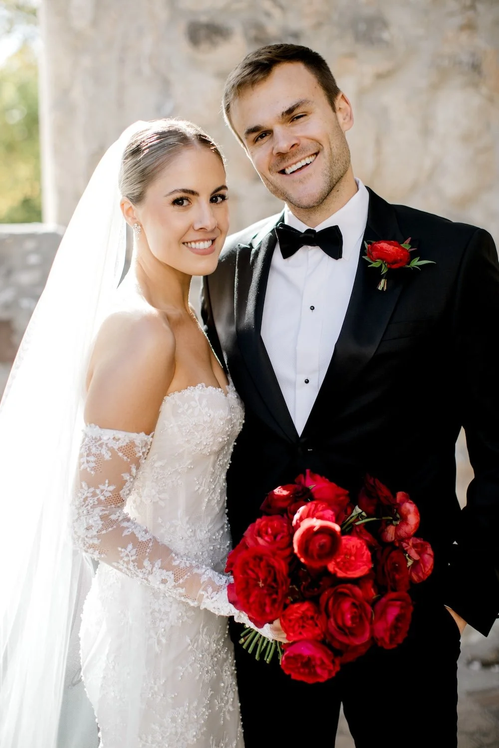
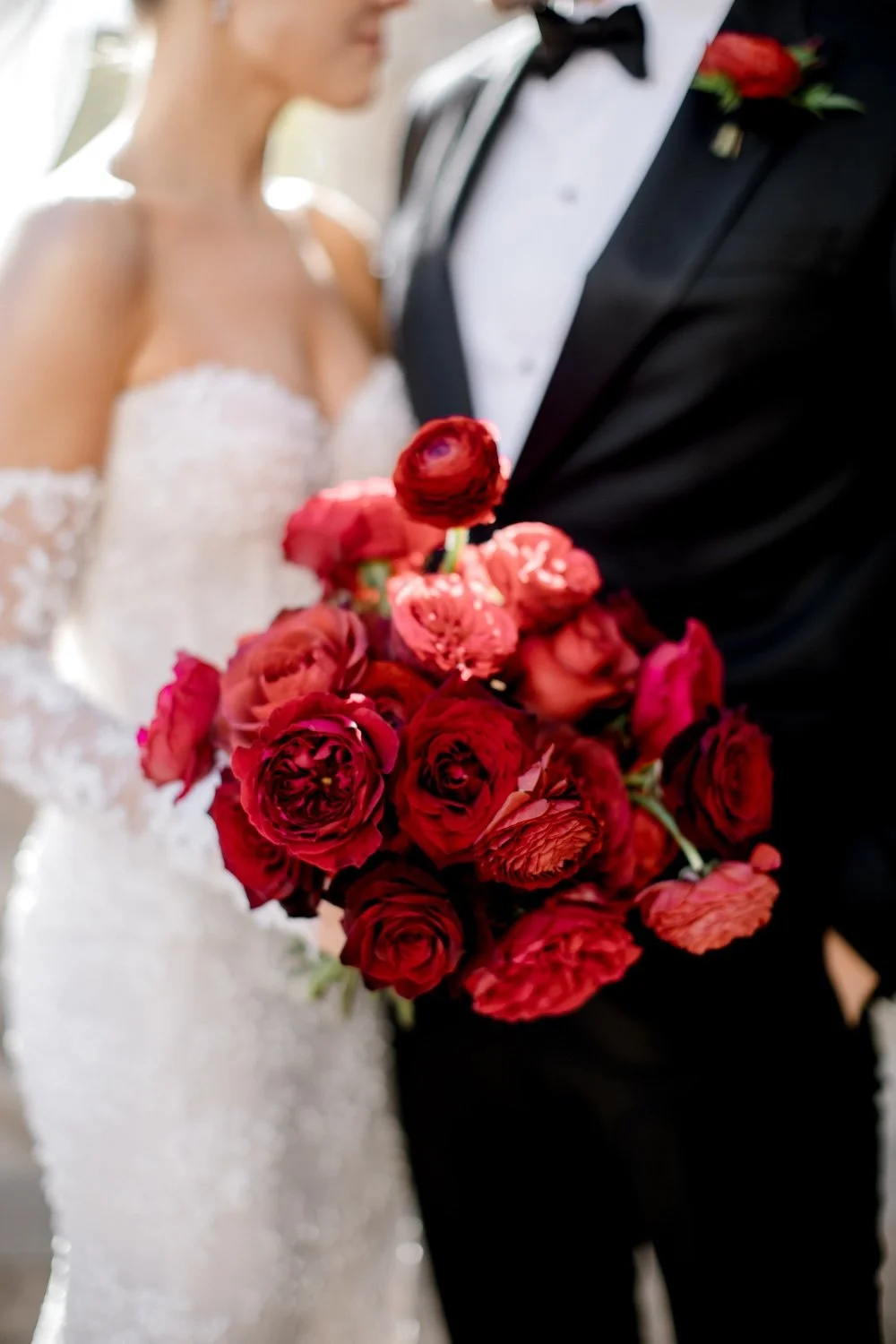
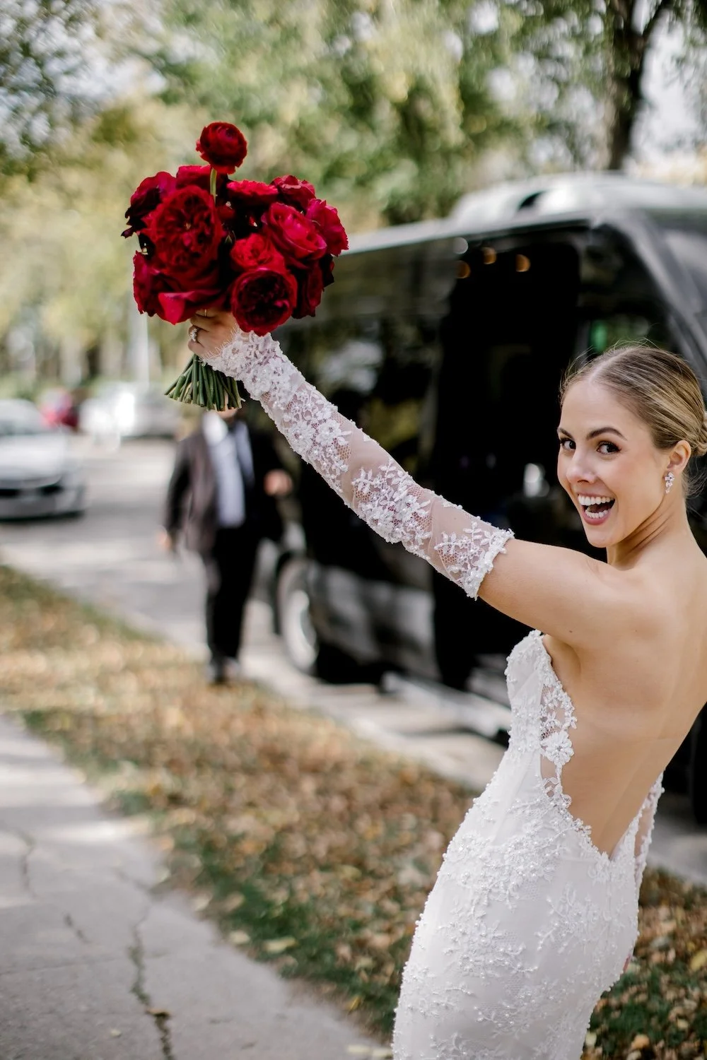
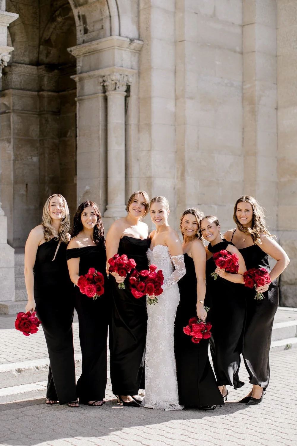
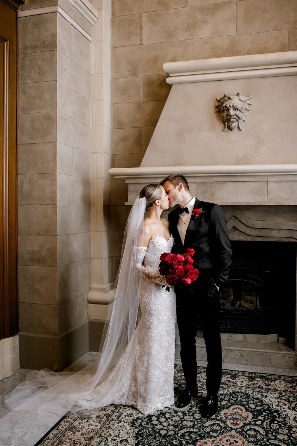
Bridal Bouquet Ingredients: Tess garden roses, Matilda roses, red piano roses, black beauty roses, and red ranunculus. I designed Brooke’s bouquet with an overall classic round shape, but with lots of depth and movement so it didn’t feel dense, compact, or dated.
The Ceremony Design
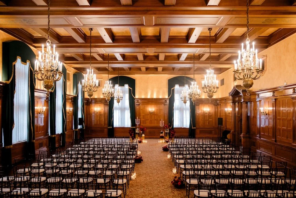
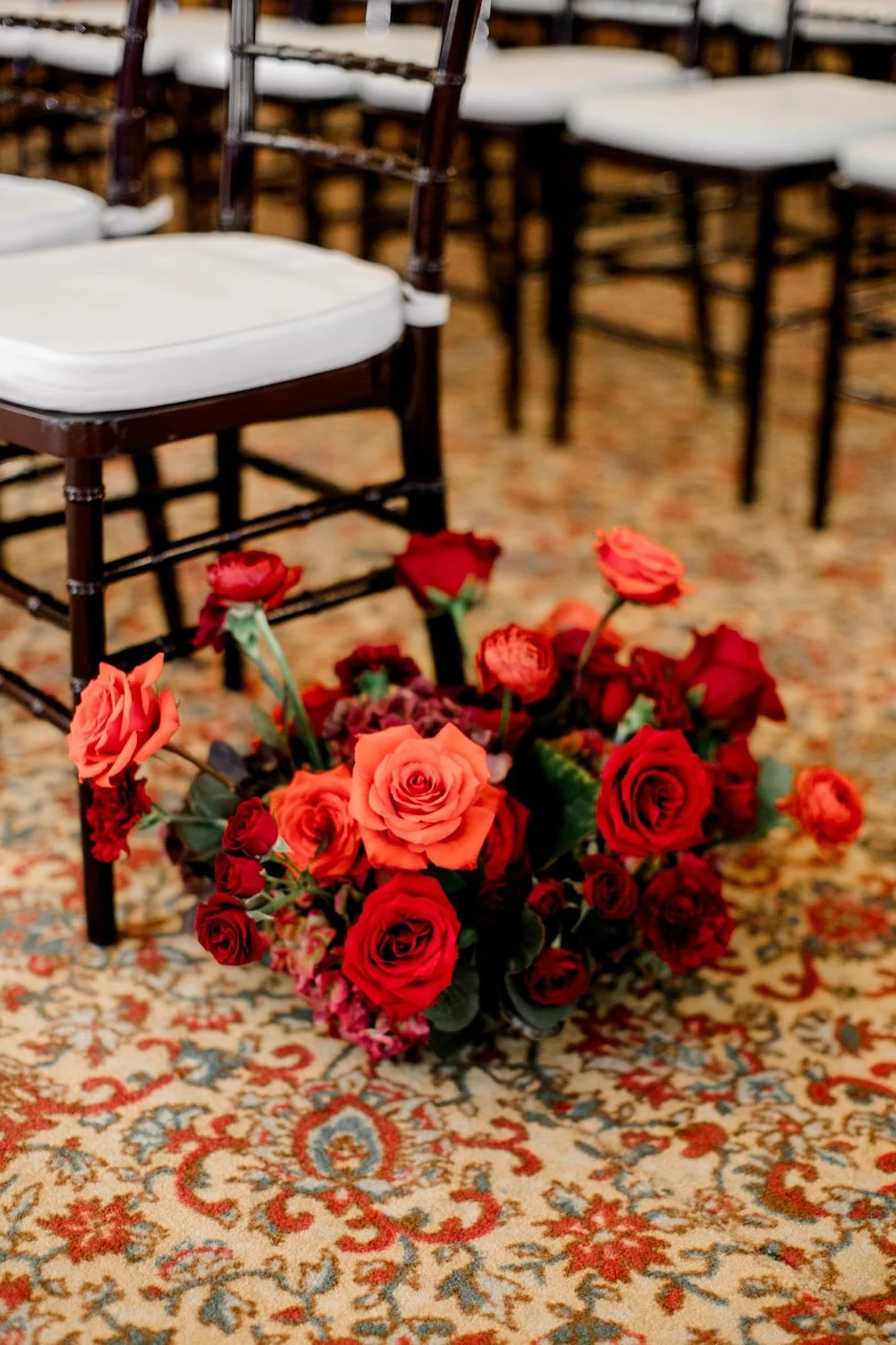
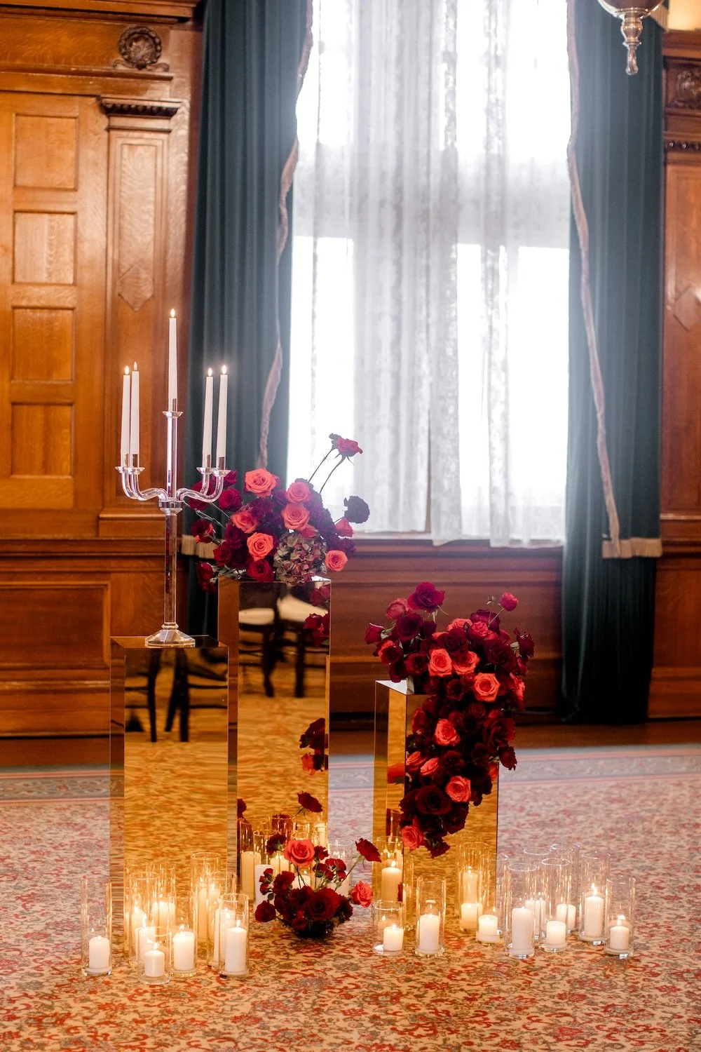
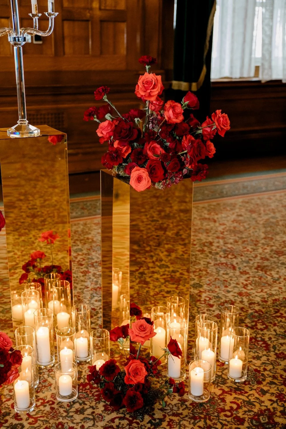
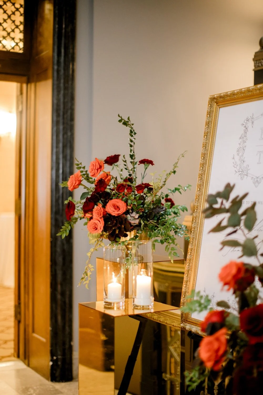
From mockup to reality! Brooke wanted moody and interesting designs, with an overall deep and luxurious feel to the event and tons of candlelight. The rich reds were just totally perfect 🥀 We used mirrored gold pedestals from Collective, and I focused on multiple floral pieces that worked together to make a large statement: larger “puffs” placed on top of pedestals, smaller puffs that I tucked onto the ground with candles, and lush snaking pieces that cascaded off and around the pedestal tops.
I love working through these digital mockups — it gives you the reassurance that you can visualize what our goal is, and helps me make decisions about what I think will be best along the way — but I love the final end product so much more. It’s so rewarding seeing it all come to life and then when you finally get to see it and enjoy it…it’s perfect!
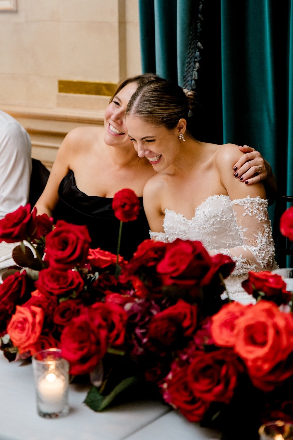
Down the aisle, we alternated low, lush floral pieces with clusters of candles. All of this was later repurposed to the head table!
Tabletop Styling
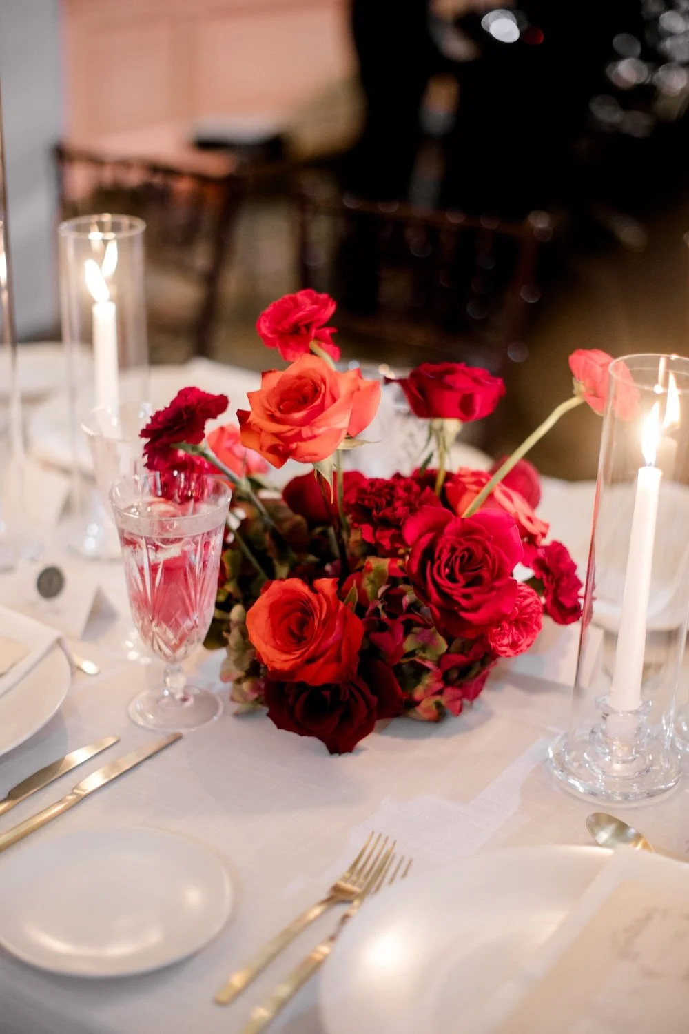
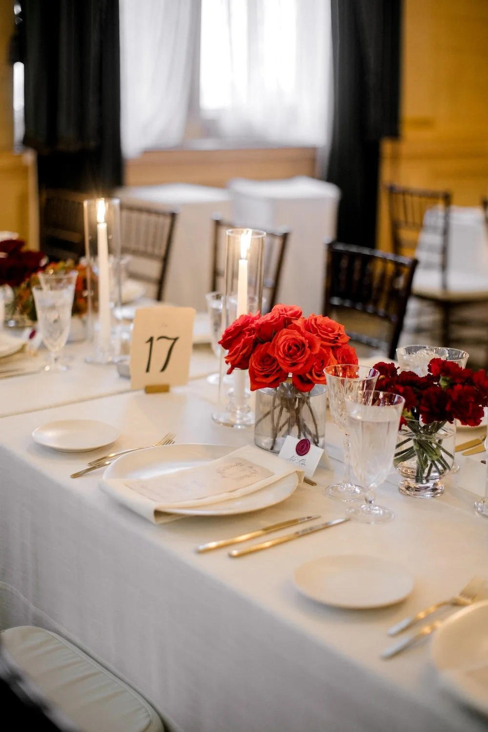
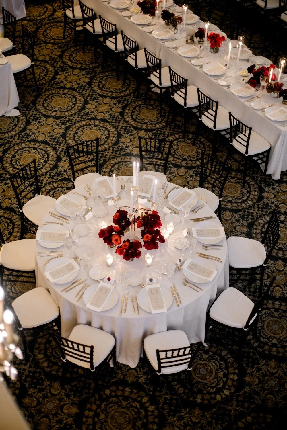
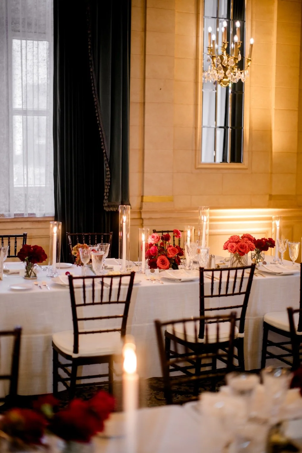
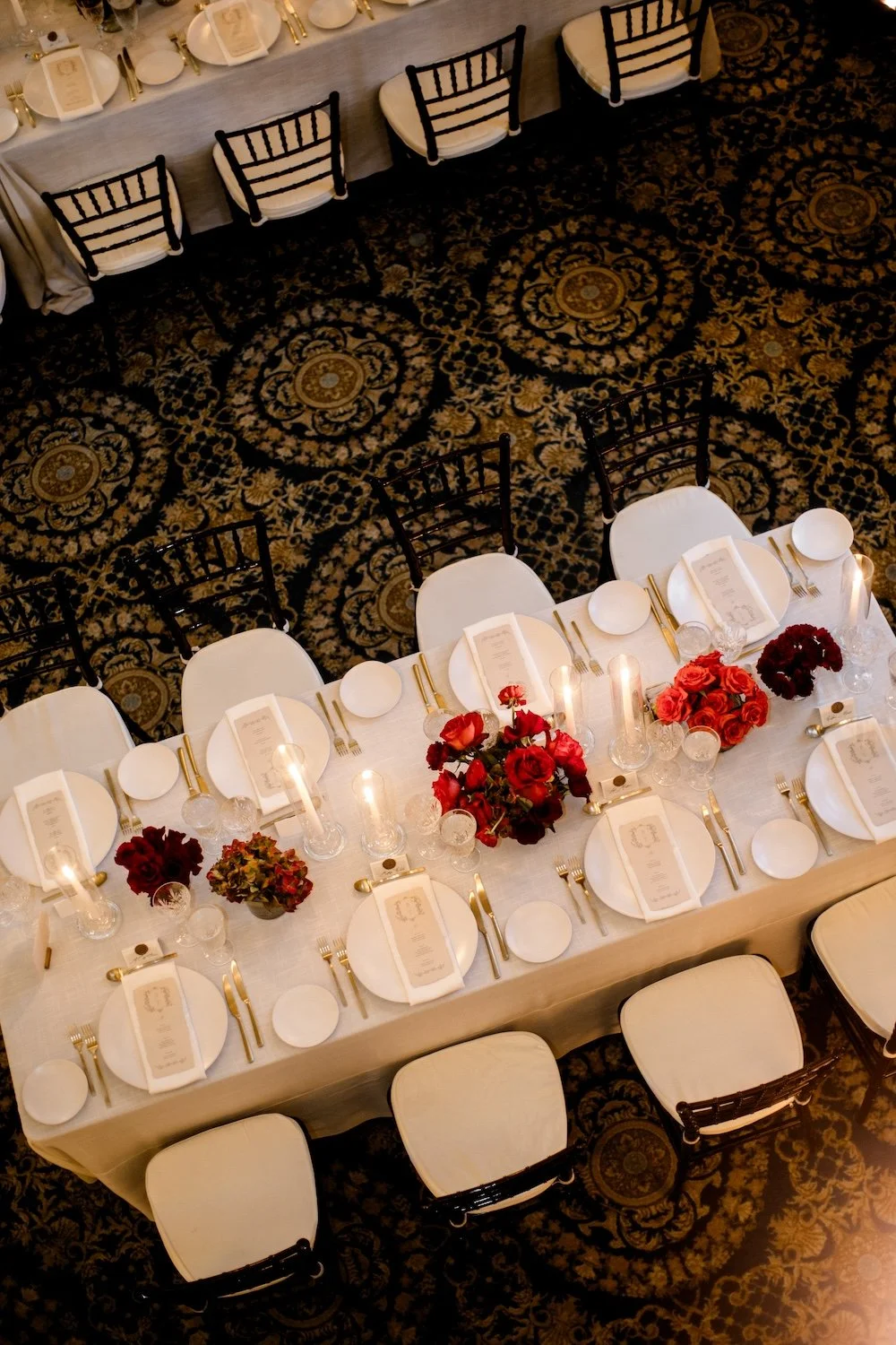
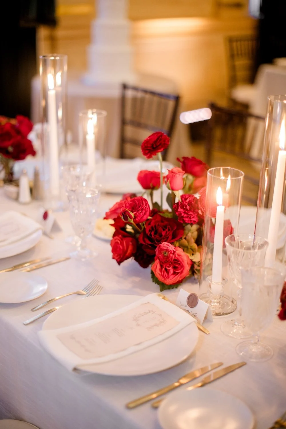
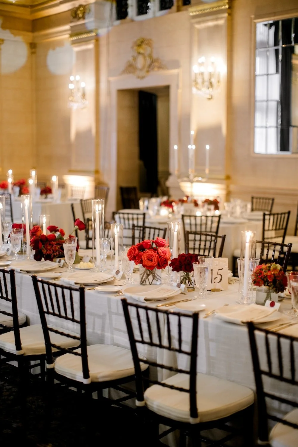
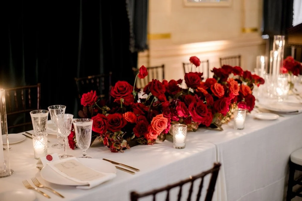
The way these tables came together was just *chef’s kiss! Each element was very thoughtfully considered to curate elegant, classic settings and a warm ambiance. This wedding design is a perfect case study in why I love working with Soiree Event Planning — the design process is so seamless. They just know how to make things beautiful.
Linens
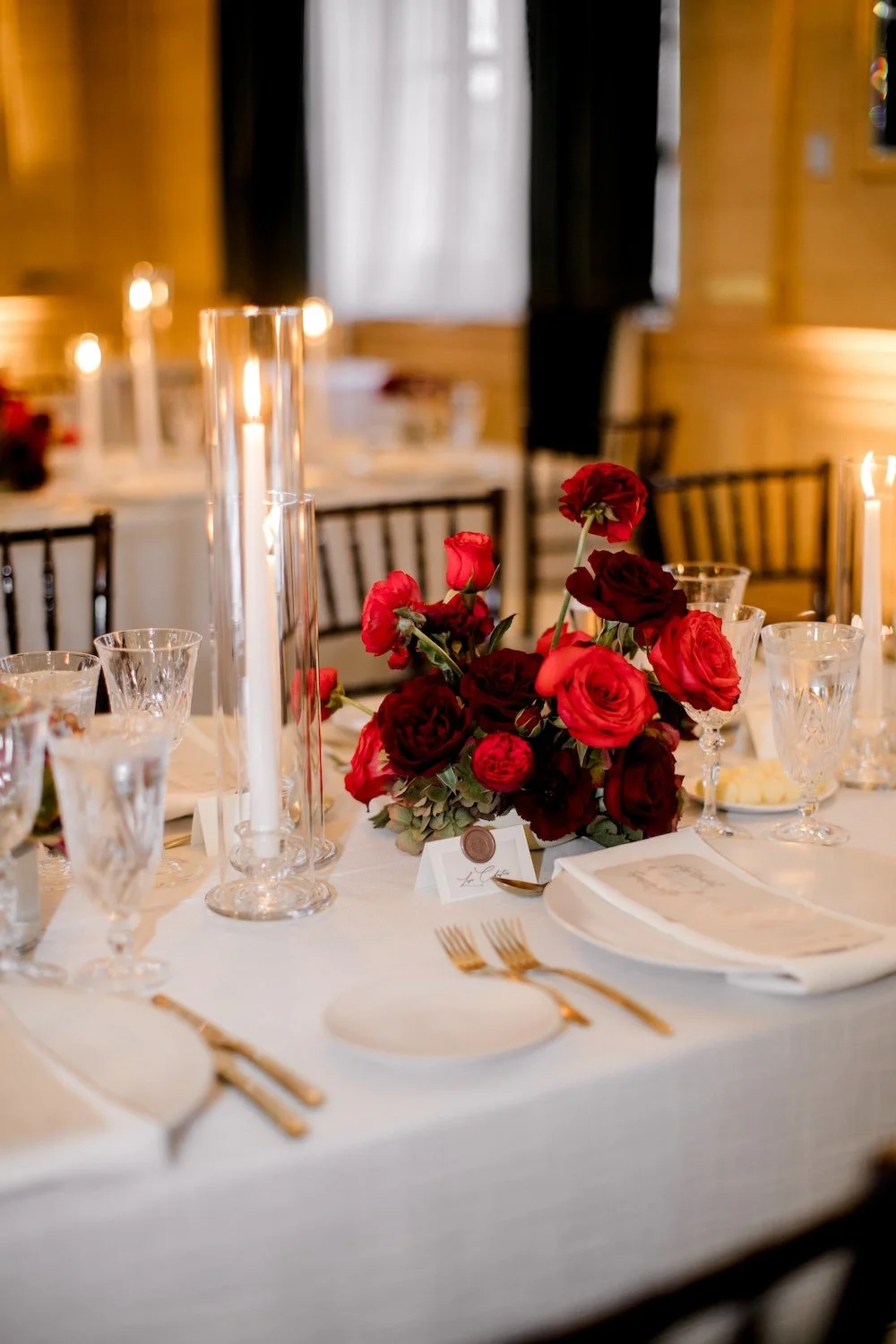
While I normally vote for a subtle colour in the linen, this crisp white from Planned Perfectly created such a beautiful, neutral base. Coordinating white napkins allowed the other tabletop elements to play centre stage.
Glassware and Dinnerware
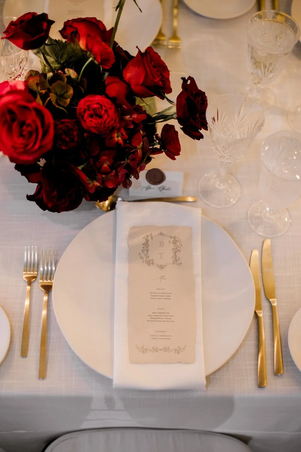
The glassware was kept traditional, with a clear cut glass duo of glasses from Collective Event Rentals. Classic white chargers paired really beautifully with the soft champagne flatware from Union Table. They’re the perfect accent of metallic without being brassy or cheap looking.
Candles and Holders
I love a good mix of candles! I kept it simple with white taper candles and and votives in gut class holders (adding a layer of a classic texture). I loved the candelabras! I rented them from my friend Andrea at Addison Taylor Design after Brooke searched high and low online for a gold candelabra that didn’t look tacky or cheap. Turns out that search was really hard! The clear candelabras had a slight gold accent (I used LED candles in them), and we surrounded the base of those with red florals.
Stationery
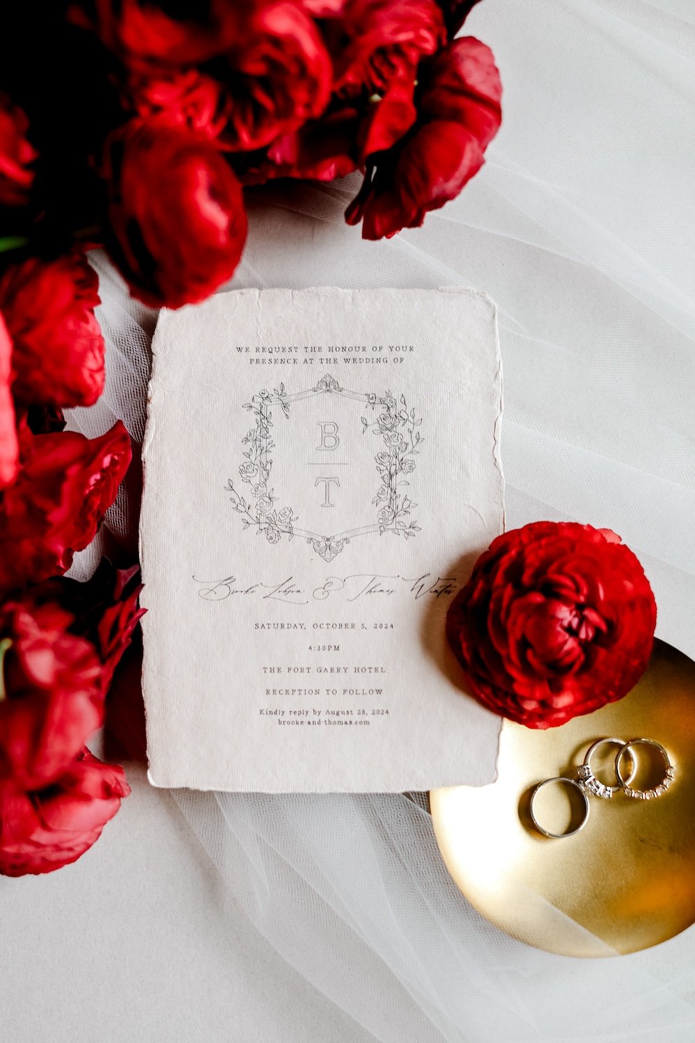
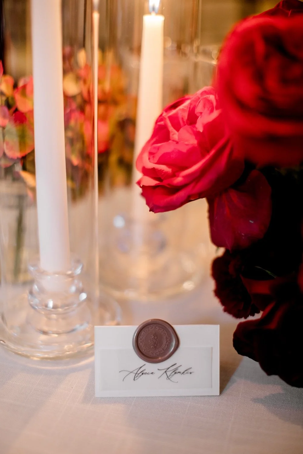
Brooke’s friend Faith Robert designed all the stationery, and her work was the perfect subtle way to elevate the place settings. The hand-drawn monogram, the calligraphy, the handmade, deckled edge paper, and the wax seals (colour coded to meal selections) were incredibly elegant.
Floral Centrepieces
Obviously one of my favourite details! On the long tables, we created a lot of visual interest with varied heights of twinkling candles mixed with multiple sizes of monobloom floral arrangements. Keeping the arrangements in one bloom type create more of a punch, especially when working with a range of shades.
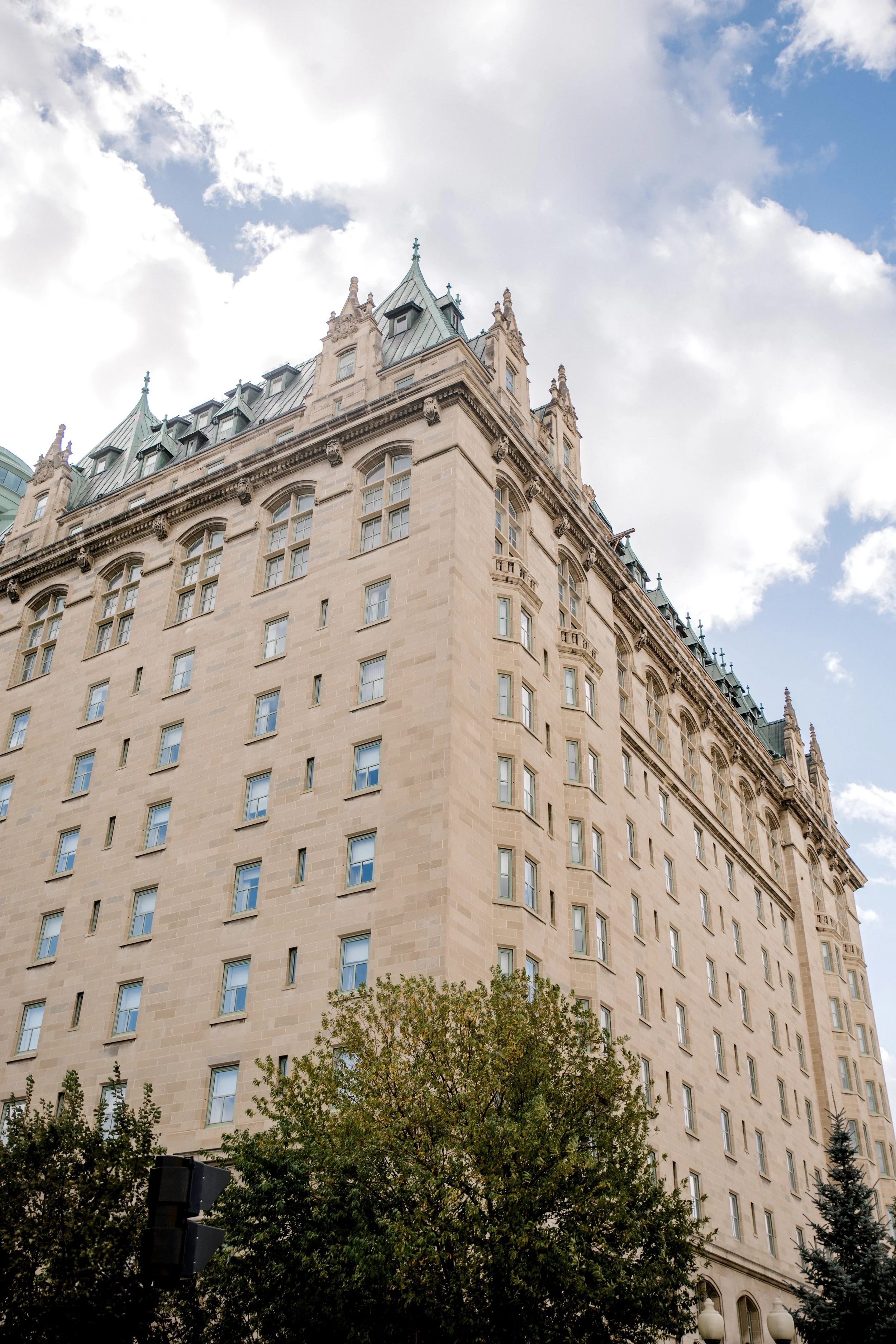
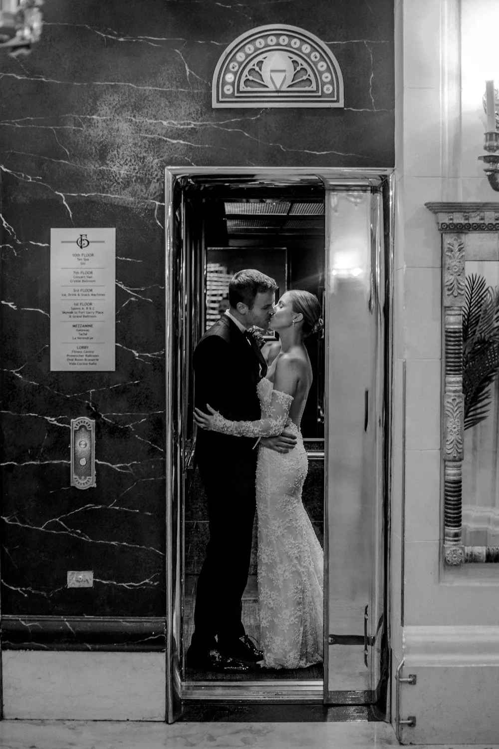
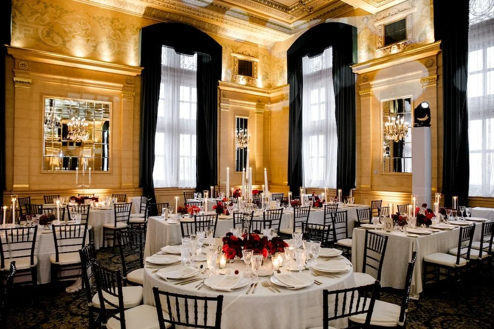
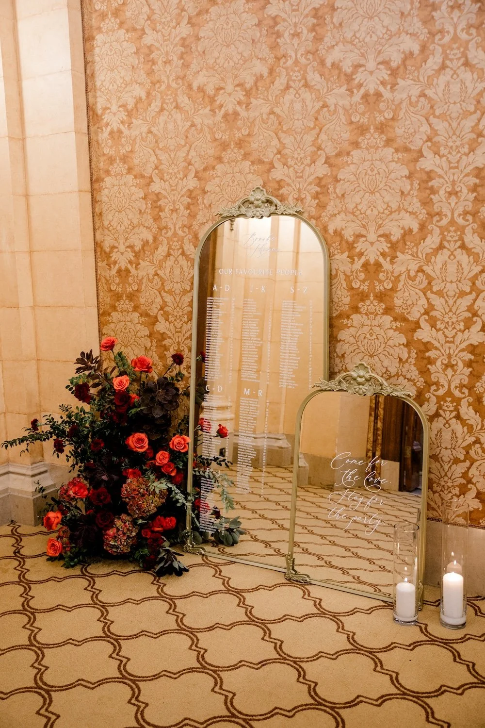
The loggia areas of The Fort Garry’s 7th floor is one of my favourite aspects of the venue.
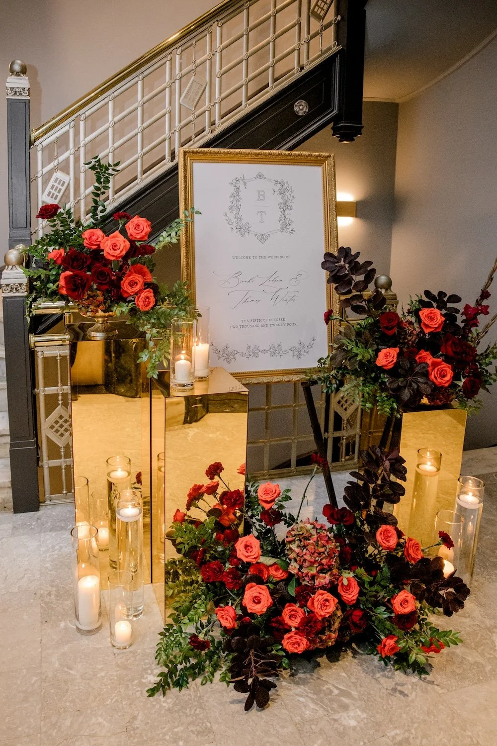
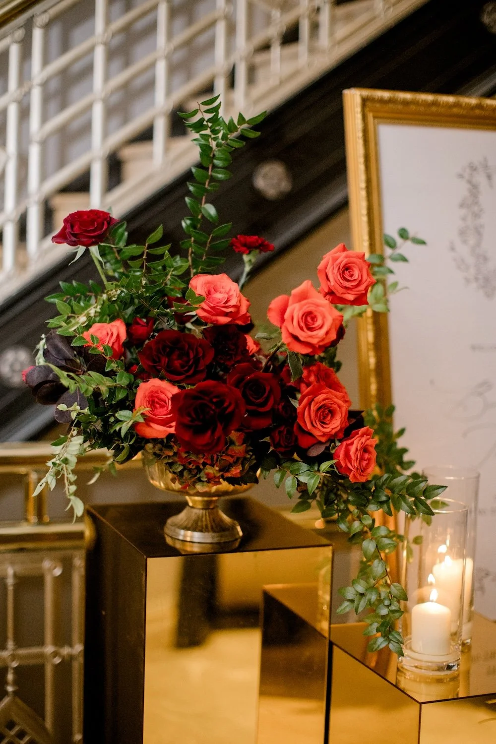
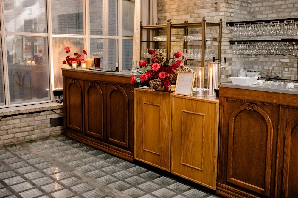
If you book the entire 7th floor, you have ample space for guests to exit the elevators to a personalized welcome design, enjoy the ceremony in the Crystal Ballroom, serve cocktails in the hallway, and even include design elements like a seating chart with floral moment, like this one right here.
Who This Design is For
I know that red has this polarizing ability to stress people out! So here’s who this design works best for:
Couples with a classic style who aren’t afraid of boldness.
Weddings with a larger guest list, and a large enough venue to allow them to play with multiple table shapes and centrepiece styles.
Planners who know how to walk the line of less is more, and won’t be tempted to add in a lot of unnecessary detail.
Brittany Mahood Photography ~ The Fort Garry Hotel ~ Soiree Event Planning ~ Planned Perfectly ~ Collective Event Rentals ~ Lauren B Wycoff ~ Event Light ~ Big City All Star Band ~ Luminous String Quartet ~ Union Table ~ Sugar & Salt Bakeshoppe ~ Lineage House ~ MYUZ Artistry ~ 4SquareFoto ~ Faith Robert
LOOKING FOR A WEDDING FLORAL DESIGNER IN WINNIPEG?
Planning a wedding at The Fort Garry Hotel and want polished florals that suit the space? I’d love to be your floral designer.
Flowers are the best way to make a statement at your wedding. Whether you already have a specific vision or want me to dream up something custom just for you (like a greenery canopy hung above your dinner tables!), reach out to Stone House Creative for stunning bridal bouquets, truly unique ceremony backdrops, and beautiful floral centrepieces to create the perfect ambiance for your wedding!

