

Creative Rock N Roll Rainbow Wedding in Winnipeg
Sam and Evan’s rock-n-roll themed rainbow wedding was definitely a career highlight for me. Everything about it was SO creative, so well thought-out. They clearly put in so much effort to consider making their wedding an amazing experience for all of their guests, as well as for themselves. The personalization level was top-notch. The music was amazing. The ceremony was so engaging.
And obviously, the florals were 🤌🏻 You know I LIVE for colour and this palette and overall design that Soiree Event Planning created was just DIVINE and such a delight to flower for.
Photos by Joel & Justyna


There are endless things to say about how wonderful this wedding was. They hosted their guests on Sam’s parent’s private property in Charleswood — it’s one of those amazing places where you don’t realize the yard is going to be big enough and then you walk out the back door and discover that it’s TOTALLY PERFECT.
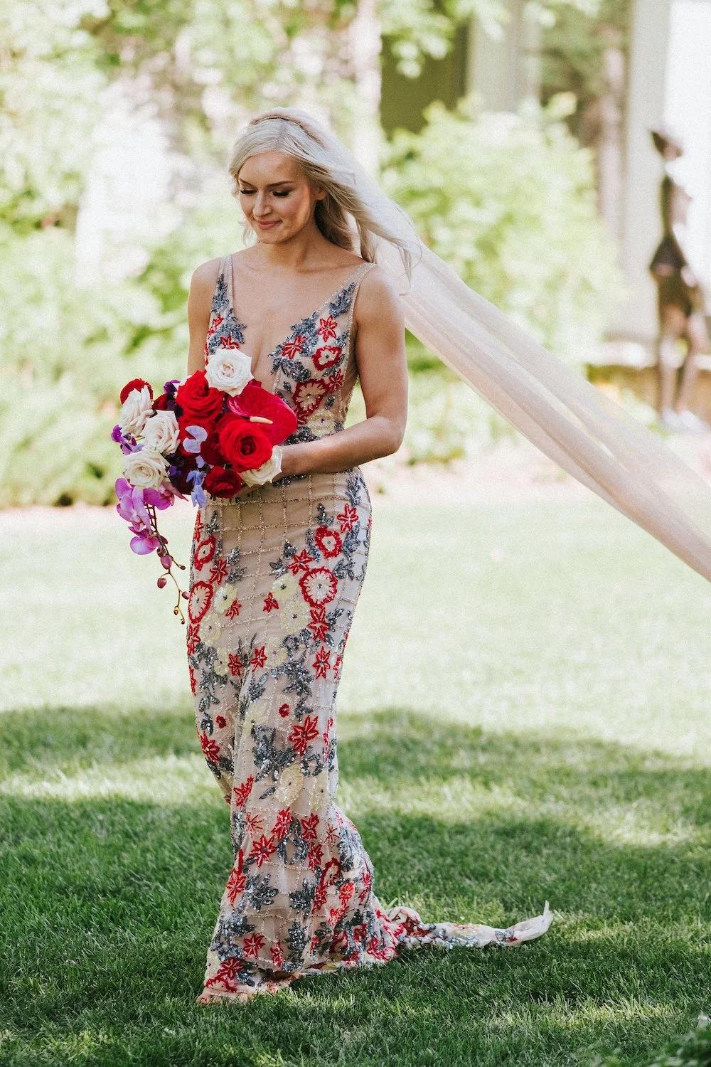
The ceremony faced the river, with a clear top tent installed beside it. Guests entered through the house, enjoyed a welcome cocktail on the patio, and then walked across the shaded lawn to a long, narrow aisle. Samantha’s walk down the aisle was breathtaking — it was deliciously dramatic, with her beige veil with custom embroidery catching the breeze.
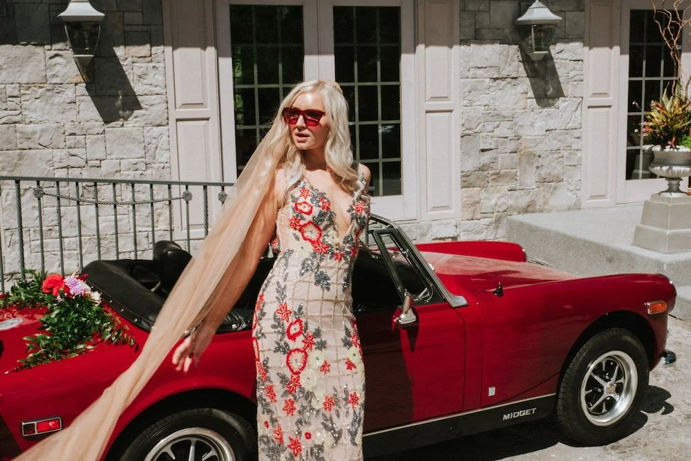
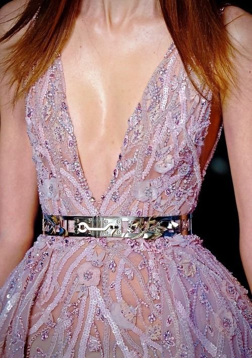
The couple are music lovers, and came up with a clever wedding slogan: “Stairway to Evan.” This was embroidered on Sam’s veil and it was just so stunning. And I mean, her dress. Yes. I know that a colourful dress is not for everyone, but I think we can all agree that her gown was spectacular.
Given the colour in her dress, I wanted to minimize the colours in her bouquet. We definitely wanted to hit the creamy/beige tones, and the red. I decided to add in the violet to play off the rest and just love how it worked. This was one of my fave bouquets of the year, and Sam’s, too — Sam had it preserved by Stephanie Singh in Toronto and sent me a picture of her tear drops on the box as she packed it up! Click here to see how it turned into an incredible art piece.
Bridal Bouquet Ingredients: anthurium, nina and sahara roses, lavender sweet pea, red ranunculus, and lavender phalaenopsis orchids.


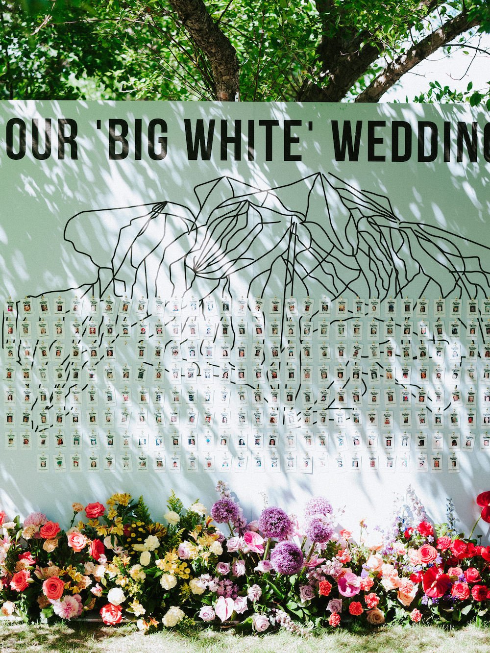
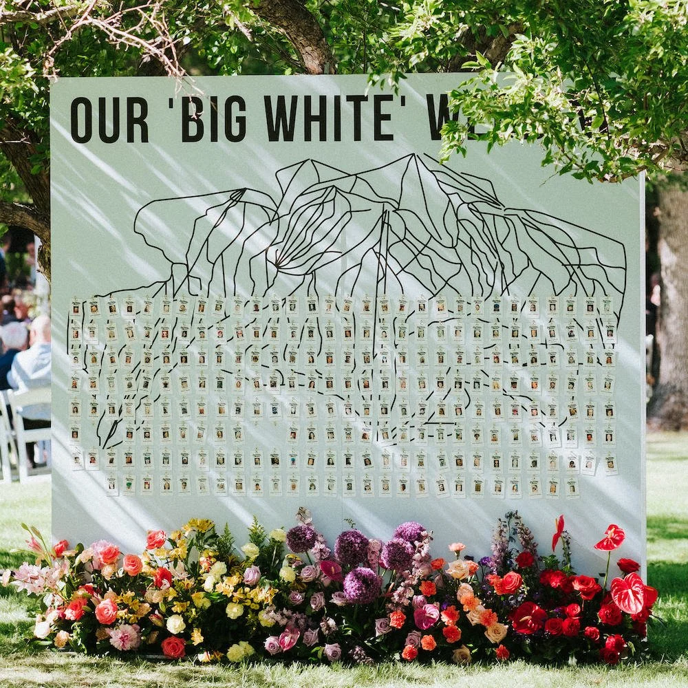
Sam’s career is in the colour world, so she had a ton of Pantone swatches that she thought could be used. Enter, the creative genius of Michelle from Soiree. She took the couple’s love for Big White (the ski hill where they first met, had their first kiss, and have vacationed many times) and transformed these Pantone swatches into an art piece / photo backdrop inspired by the mountain ranges.


The Big White theme kept coming, with this incredible seating chart also conceptualized by Soiree. They took the run map and created individual lift tags for each guest, which told guests which table they were at as well as became their ticket to get into the after party. ADORABLE.
And obviously, we added some slick colour blocked floral to enhance it.
This isn’t the first time I’ve done a rainbow wedding with Soiree — we did one at Whitetail Meadow a few years ago, but with a very different overall style. Take a look!


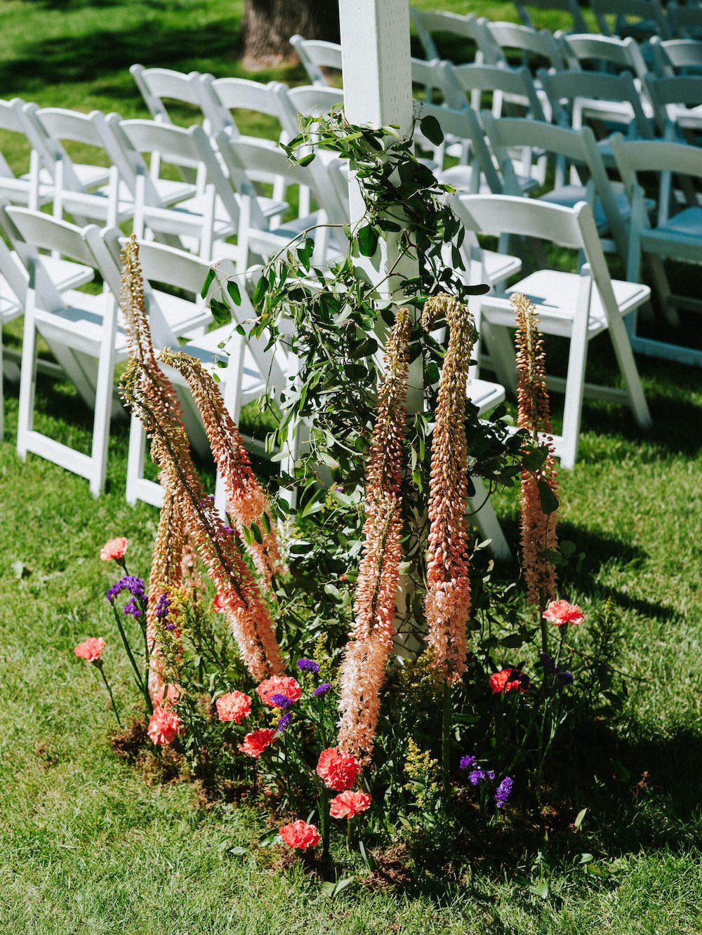


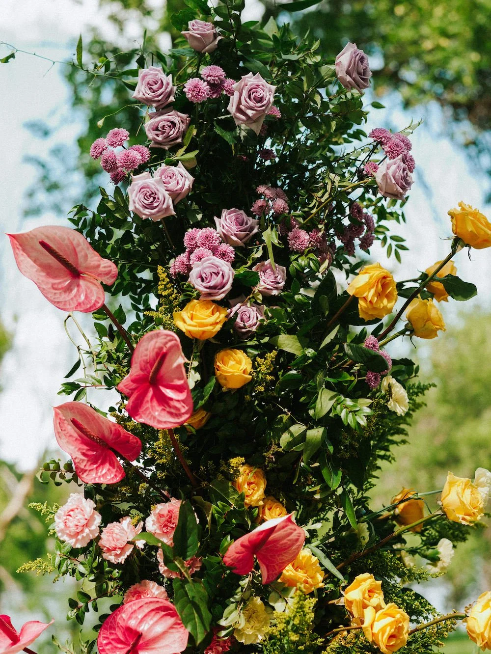

OHHHHKAY. The ceremony florals were my favourite. Evan constructed the open air chapel beams — amazing. We went back and forth on a few ideas for aisle florals, and always knew that we wanted a dramatic altar with colour-blocked floral pillars. They needed to be pretty tall and full to suit the scale of the white aisle beams.
Down the aisle, I decided to grow up clustered florals around the chapel uprights. We wanted to camoflauge any grass damage (there wasn’t much, in the end) and just blend amp up the colour and the garden-inspired ambiance even more.
I could have lived here happily for the rest of my life.


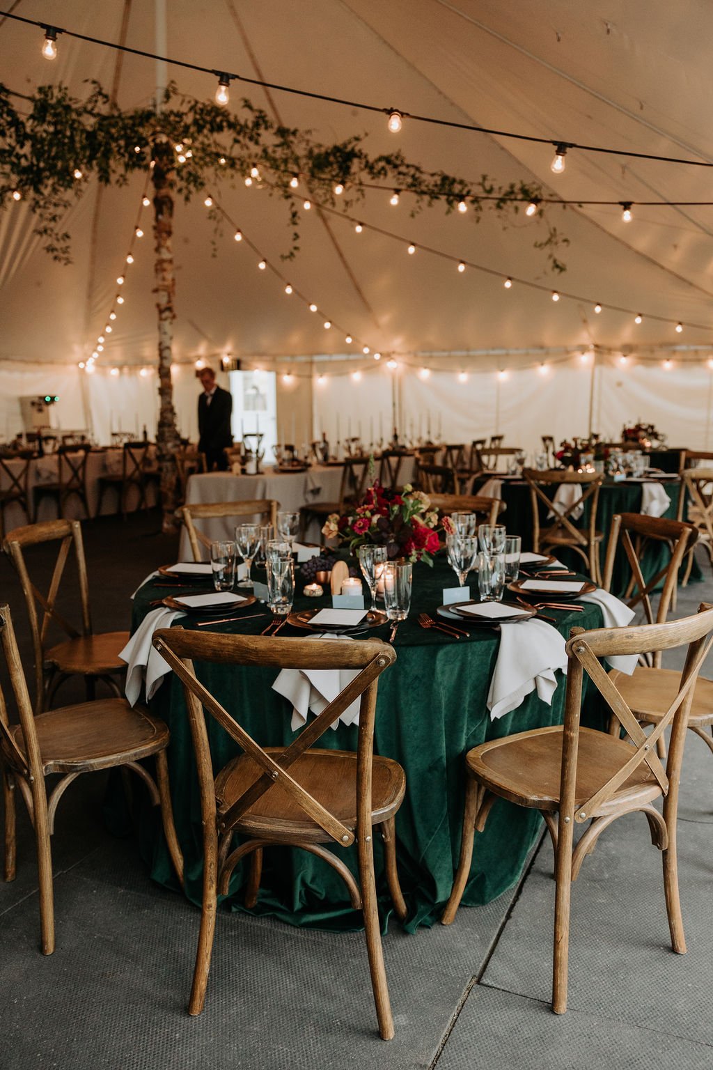
And here comes the tent! The Soiree team worked SO diligently on this layout to maximize the design and it paid off. White linens paired with clear and smoke chairs, to set a minimal base. The tables were carefully laid out to colour block the entire tent. We decided on three different centrepiece styles (a full floral arrangement in a compote, a low floral arrangement with no visible vase, and a clustering of unique stem and smaller vases), per colour. This meant that my team never made the same arrangement more than 3 or 4 times — it was so refreshing and creatively inspiring.
My favourite part of the tablescapes was the custom-made, colour-blocked velvet charger plates. The Soiree team handmade them all and anytime I asked them “isn’t that going to be a big project?!” Michelle would say, “oh, it’s not bad! You just do this and do this and and and” and I was astonished. But the effort was OBVIOUSLY worth it.


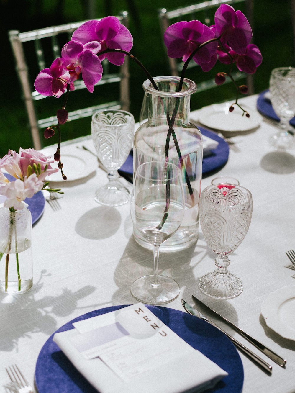
The head table was so perfectly coordinated to hit the entire rainbow palette with detailed colour-blocking. The charger plates lined up perfectly with the centrepieces, and lined up perfectly with the seating. You’ll notice a mix of velvet and leather chairs and sofas used for seating for the wedding party at the head table, and we sprinkled in bud vases and candles in the entire range of colours down the length of the table. So fun!
I also had Meg Does Pottery, a local artist, create a couple of ADORABLE bud vases custom for the head table in the red/lilac palette. They’re on my shelf and I will love them forever.


My team was SO mighty. I’m so grateful for their hard work! It’s always a long week, and a long wedding day, and it’s so rewarding to see it all come together but it’s exhausting nonetheless.
Deanna, Emily, Vanessa, Andrea, Chad, Tricia — thank you all SO much. My hands certainly couldn’t have gotten this much done alone.
Joel & Justyna Photography ~ Picture and Poet ~ Soiree Event Planning ~ Planned Perfectly ~ COllective event rentals ~ Trend Rentals & Decor ~ Event Light ~ beyond the lounge ~ two fold paper co ~ Cathy Wiebe Clothing (AFter party Dress and custom veil) ~ BERTA ~ MYUZ Artistry ~ Creating a Scene

Wedding Colour Palettes Featuring Lilac
The fashion girlies are all wearing lilac this year, and we’re seeing that filter into your wedding palettes.
It can be tricky to use something so trendy in a fresh way. But, lucky for us, lilac is one of those shades that you can use in so many different ways to evoke a different design style. Here are some of my favourites!

Lilac is one of the big colour trends of the year, and lucky for us, there are so many different ways to use it!
The fashion girlies are all wearing lilac this year, and we’re seeing that filter into your wedding palettes.
Oftentimes, it can be tricky to use something so trendy in a fresh way. But, lucky for us, lilac is one of those shades that you can use in so many different ways to evoke a different design style. here are some of my favourites!
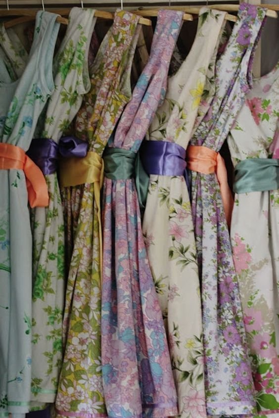
First things first: feeling stuck? One of my favourite places to find colour palette inspiration is in fabric. Take a look below and tell me you’re not inspired. Another way to find colour palettes that sing to you is in art! I love looking at abstract art and seeing how different shades and tones interact.
I’m keeping things easy here, with just a few colours in each of the palettes below. But, I often find that the most exhilarating palettes are those that are broad and bold, so don’t be afraid to take one of the ideas below as a starting point and then layer in other ideas. Don’t just go with 2 colours. We need to blend and create movement, mkay?
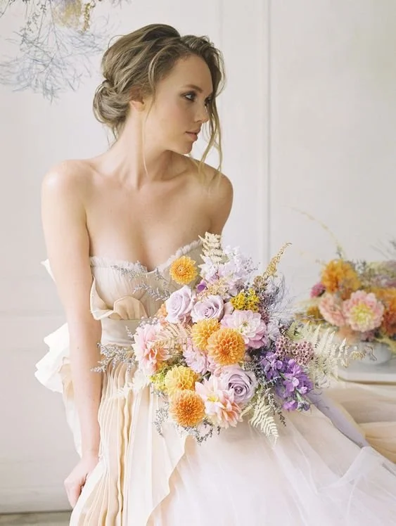
Lilac and Peach/Orange
This is undoubtedly one of my favourite combinations of the year. Whether you’re going a bit more subtle with the peach or you want to go bold with orange, these combinations pair so beautifully and feels juicy, fresh, and will legit make you crave candy.
Coral and raspberry are natural additions to this palete!


Floral Design by Native Poppy / See it all here

Stone House Creative / See it all here
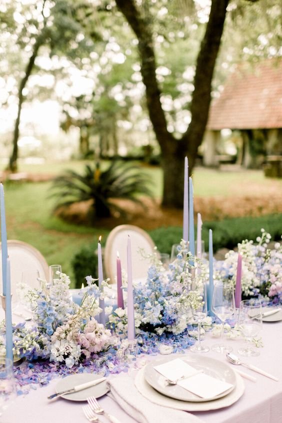
Lilac with Pastel Blue and Pink
Pastels are always an easy go-to. If you’re inspired by all things feminine, ruffly, and delicate, then this is a natural choice for you. It works great in a ballroom setting, it works great in a garden setting. I’d love to see this paired with adorable butterflies (Golden Age Botanicals makes AMAZING ones you could tuck into your bouquet!!). K call me. I want to do this.


Floral Design by Native Poppy / See it all here
Lilac, Grey, and Peach
Another option if your style is naturally feminine, I love that this digs into the cool tones. You can have a lot of fun with smokey greys (these smoke glassware!) and them amping it up with metallic gold.

Lilac and Red
Modern, bold, chic. I need more of this in my life.
This is giving sleek, rock and roll, bold and fearless. It’s giving red lips and a feather dress. It’s giving a killer pair of heels.

Floral Design by Isibeal Studio / See it all here
Lilac with Gold and Olive
This one takes a more practised hand to oversee, but I think there’s a lot that can be done here. You’re going to need to do some really solid blending, bringing in other tones to make it work.


Floral Design: Stone House Creative / Photo: Aimee De La Lande
looking for a wedding floral and event designer in winnipeg?
We’ve got a small handful of 2023 dates remaining, and 2024 bookings are now open.
Call me biased, but I think flowers are the best way to make a statement at your wedding. I would love the creative challenge of taking your wedding vision and spinning it into a reality that you never could have dreamed of.
Need help with your full event design? I’ll guide you through your colour palette selection, floor plan creation, and collaborate on all the design elements that will make your wedding YOURS. Full and partial event design services available.
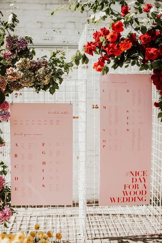
My Favourite Wedding Seating Chart Ideas
What do I mean by marrying form with function? It’s pretty straightforward — your seating chart has a very important purpose: corral your guests and tell them where to go to avoid a chaotic dining experience. It’s also an opportunity to create an interactive design focal point that wows your guests while getting the job done.

The seating chart: the perfect place to marry form with function.
Madeline Kate Photography
What do I mean by marrying form with function?
It’s pretty straightforward — your seating chart has a very important purpose: Corral your guests and tell them where to go to avoid a chaotic dining experience. It’s also an opportunity to create an interactive design focal point that wows your guests while getting the job done.
Before we get started, a few tips on putting together your seating plan:
Order names alphabetically by last name, not by table number!
Ask your parents to help figure out their friends’ seating
Do away with the singles table
Whether you assign people to tables or to specific seats at tables, make it all REALLY clear
One more general piece of advice that seems common sense until you start going deep into design and you start to lose common sense: make it legible. Thin script fonts, clear acrylic or glass backdrops, too many mirrored elements all make it hard for your guests to actually read.
And now, let’s get into the pretty and inspirational! These are all from weddings I’ve designed the florals for in the past few years, and each was amazing for different reasons. Read on for more (And PS — if you’re newly engaged, congratulations! If you’re new here, welcome! I share a deep look into my real weddings, along with sharing planning advice and tips!).
Looking for more? I’ve also created a Pinterest Board rounding up some seating chart designs that recently caught my eye. Check that out right here!
Fun Colour Use
Oh my goodness, I absolutely LOVED the way this bold seating display came together for Jess and Donny’s wedding a few years back.
Emily from Feast & Festivities is very detailed in her design planning, and she’s definitely not afraid of colour. Using this orange acrylic is just SO MUCH FUN, right? It also helps to make the names legible, as clear acrylic can make it pretty tricky to read.
The florals were all repurposed from the ceremony, and the staggered plinths takes this design from basic to extraordinary, while also being cost-effective!
As featured on Carats & Cake.


Arches and A Little Disney
This seating chart is simple but impactful. The repetition of the arched elements makes a big statement, pairing the seating chart (hung from a black arched frame) with an arched backdrop displaying their name a touch of Disney. Note that the names are arranged alphabetically! Woo!
There’s almost always an opportunity for some florals, but I definitely prefer a statement floral piece as opposed to “just a little something added to the sign.” If you’re not going to go big, then just go home — as in, don’t bother adding florals to your seating chart if the budget doesn’t support it. Adding a “little something” just adds up quickly without making an impact to the design and often just feels like unnecessary fluff.
See more from this wedding here!

Enter in Style
One of my design goals for Tiff and Steph’s tent wedding was to really bring the outdoors in, which was especially good as it rained most of the day. We designed this lush, delicious tent entrance and then nestled my seating chart base into it. Feast & Festivities put together the seating chart itself, and I just ADORE the magenta. It’s an unexpected colour pop, which really grabs everyone’s eyes and makes sure they can’t miss it.

Modern Base with Florals Added
I had this modern, clean white base custom-made for this wedding that I provided both florals and event design for. The seating chart itself was printed on a large piece of foam-core, and slid right into the base.
We positioned the seating chart at the entrance to the room in SNAC, which served to bring a little more purpose and presence to the cards table while welcoming everyone in.
I then designed this all-white floral piece to place on the ground in front of the seating chart base, and I was lucky to incorporate a lot of locally grown white lilac, which is one of the bride’s faves. More to come from this wedding soon!

Big, Bold, and Creative
This couple’s wedding was inspired by their love for Big White, the ski hill where they first met and shared their first NYE midnight kiss (adorable). So for their seating chart, they took inspiration from the ski runs, using it as a graphic backdrop for the chart itself. And instead of a typical seating chart, each guest’s name and photo was printed to look like a ski hill pass, and then clipped onto a custom lanyard. It was so creative!
I LOVE a good colour blocked floral moment. While it’s not right for every wedding or couple’s style, colour blocking your florals can make a big design moment feel even more impactful.
See more featured on Green Wedding Shoes!

Go for the Wow (and Fill Space!)
Everything about Karleigh and Matt’s wedding was a designer’s dream, and this seating display was certainly no exception.
In many venues, you’re really limited by the amount of space you have to work with. But here, we had the entire 7th floor of the Fort Garry Hotel, with the dinner in one ballroom and the party in the other, so the entire hallway served as a welcome and cocktail area, and that left a lot of space to add in a statement making seating display.
The plinths were a combination of clear acrylic and mirrored gold, which felt very glamorous and also allowed us to design some florals inside the pedestals, some outside, some on top.
See the entire wedding here for some more jaw-dropping design elements!
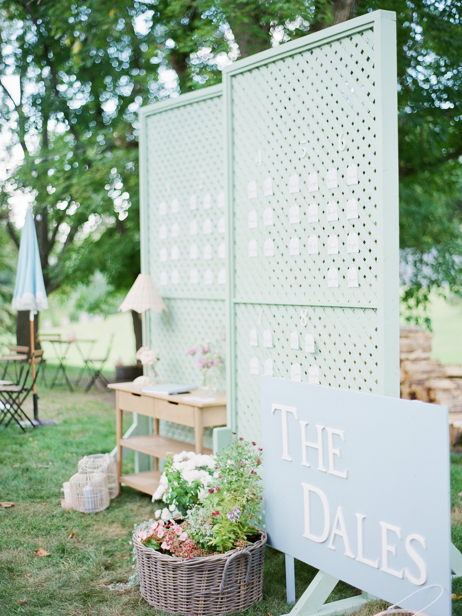
Cottage-Core Influence
My dear bride Brenna planned and designed her wedding and every element was a perfect reflection of her personal style. They created this backdrop that served to guide guests in to their backyard, added a guest book on their adorable console table, and the seating assignments were added to the pegboard backing, too. Multi-functional and tres adorable. Oh, and it hid the wood pile behind it!
I cannot wait to share more from this backyard wedding. In the meantime, take a look at this cutie reel showing their romantic ceremony setting.

Define Your Tent Entrance
If you’re hosting a tent wedding in the summer, chances are pretty good that you’ll have the walls open to bring in some fresh air. And if that’s the case, then it can be tricky to get your guests to enter from the correct spot, which could interfere with the serving staff or bartenders, cause people to trip over electrical wires, and so on. So, integrate your seating chart into a tent entrance design that defines the entryway.
This particular seating chart was super simple — just individual names with their table number hand-calligraphed and pinned onto a linen-wrapped board, and topped with a little greenery sprig!
If you’re looking for more tent wedding ideas, I’ve rounded up my top 5 tips for designing a beautiful tent wedding right here.
looking for a wedding floral and event designer in winnipeg?
We’ve got a small handful of 2023 dates remaining, and 2024 bookings are now open.
Call me biased, but I think flowers are the best way to make a statement at your wedding. I would love the creative challenge of taking your wedding vision and spinning it into a reality that you never could have dreamed of.

Now Booking 2024 Weddings
I’ve started booking 2024 weddings and I just love this part of the process! We get to dream together and envision how your wedding will look and feel. Taking your inspiration and interpreting it through my creative lens is just SO much fun — I want to take your inspiration, and elevate it to make it truly unique for you.

My schedule is Open:
I’m now booking 2024 weddings!
I love that as soon as we start talking about flowers, your eyes start to light up and wedding planning starts to become exciting. Even more, I love that when I deliver your bouquet on your wedding morning, the entire thing becomes real.
I’ve started booking 2024 weddings and I just love this part of the process! We get to dream together and envision how your wedding will look and feel. Taking your inspiration and interpreting it through my creative lens is just SO much fun — I want to take your inspiration, and elevate it to make it truly unique for you.
If you’re interested in working with me for your wedding florals, here are some things you should know:
Sustainability is important to me. The floral industry is anything but green, but prioritizing locally grown flowers, eliminating the use of toxic and non-biodegradable elements like floral foam, bleached product, and spray paint, and composting my waste are all elements of my business that I take pride in. It’s a lot easier to just go with the flow, but it’s worth it to spend the time and energy (and money!) to design differently.
I love colour. I think everyone should embrace colour, at least when it comes to flowers, and that’s not to say you need a Crayola-bright, rainbow wedding if that’s not your vibe. We can create warmth, moodiness, joyfulness, fun…whatever it might be, we can find the right palette to make it work. The key is blending, finding the right balance of colours, and adding in the right accents.
I’ve known people to regret doing an all-white wedding or something more subtle because they felt it would be “classic” or that they wouldn’t look back on it in 20 years and roll their eyes…but if that’s why you’re choosing a white palette, then you’re going to regret it anyways. It’s not you! Nothing is really timeless — just GO FOR COLOUR.The way I serve you is just as important to me as the final floral product. In my own life, I want to be taken care of by professionals who know what they’re doing, and I seek to create the same environment for you. There are a lot of floral designers out there. We’re all good at different things, we all offer different rentals or design styles, at different price points. Serving you, collaborating with you, elevating your experience AND the final product — that’s what I do.
Stone House Creative is known for our signature lush, garden style floral design. Inspired by the way flowers look in nature and their intoxicating scents, I’m constantly seeking to elevate my work through unique colour palettes and intriguing details, and make it simple for design-oriented couples who believe that flowers bring life to a celebration.

I design beautiful weddings for great people.
whether you’re looking for florals only or need a little more help and want to inquire about event design services as well, I design wedding flowers that are an elevated take on a garden-inspired aesthetic, and I specialize in dreaming up compelling designs that you haven’t seen at your friends’ weddings.
If you need
Unique ways to bring special touches to your wedding design;
Someone to handle the aesthetics while you handle the details — a designer to take your ideas and flesh them out, bringing together your entire wedding;
Excellent customer service from a professional, while still fun and inspiring, environment
Then I would love to connect with you about your wedding!

Stone House Creative has a minimum $4000 floral investment for 2024 bookings, with some exceptions made for intimate weddings under 50 guests, so that I can guarantee my clients the design style they’re looking for.
I do my best to only book one wedding per date to provide a higher level of service to each of you. I love being able to be on site, finessing and making sure that every detail is perfect. If I don’t have to rush off to another wedding, then I can actually do that for you!


Stone House Creative offers both floral design and full scale event design for weddings in winnipeg, southern Manitoba, and Northwestern Ontario.
Flowers are the best way to make a statement at your wedding. Whether you already have a specific vision or want me to dream up something custom just for you, reach out to Stone House Creative for stunning bridal bouquets, truly unique ceremony backdrops, and beautiful floral centrepieces to create the perfect ambiance for your wedding!
I’m currently booking appointments into late February and early March. At this early stage, you don’t need to worry about knowing every detail or making every decision. We can talk basics, dream up some ideas to consider, and book the date in so you have peace of mind that you’re on my calendar, and then revisit design ideas closer to the wedding!

Spanish-Inspired Red Wedding at The White Poplar
Natasha and Joe, in August at The White Poplar — better known as one of my favourite weddings of the year.
And one of your favourites, too — every time I post something from their wedding, Instagram goes wild. The reel I posted of their arch has almost 300 shares…that’s WAY WAY WAY more than anything else I’ve ever shared. So yeah. Natasha and Joe’s wedding is a good one. Let’s dig into it.
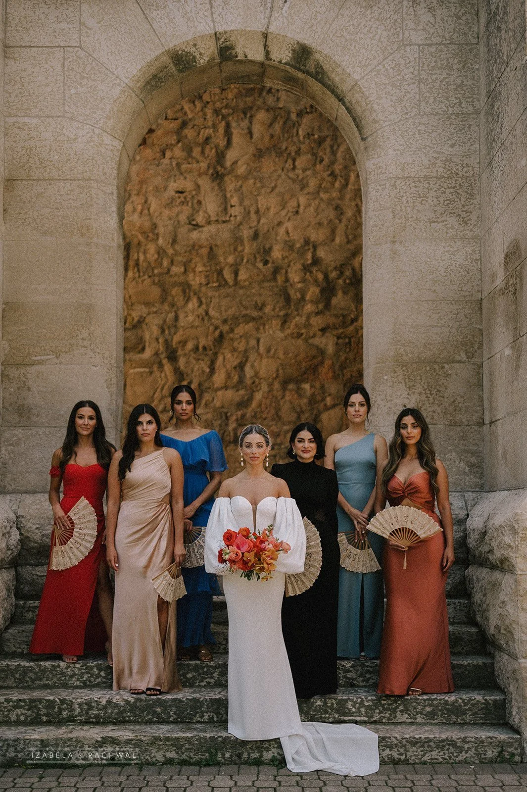
Natasha’s style is obviously impeccable, and she came into the planning with a Spanish-inspired vision. The colour palette? Perfect. Her dresses? Breathtaking. The ceremony arch? One of my absolute faves.
Natasha and Joe, in August at The White Poplar — better known as one of my favourite weddings of the year.
And one of your favourites, too — every time I post something from their wedding, Instagram goes wild. The reel I posted of their arch has almost 300 shares…that’s WAY WAY WAY more than anything else I’ve ever shared. So yeah. Natasha and Joe’s wedding is a good one. Let’s dig into it.
Natasha’s style is obviously impeccable, and she came into the planning with a Spanish-inspired vision. The colour palette? Perfect. Her dresses? Breathtaking. The ceremony arch? One of my absolute faves.
Photos by Rachwal Photography


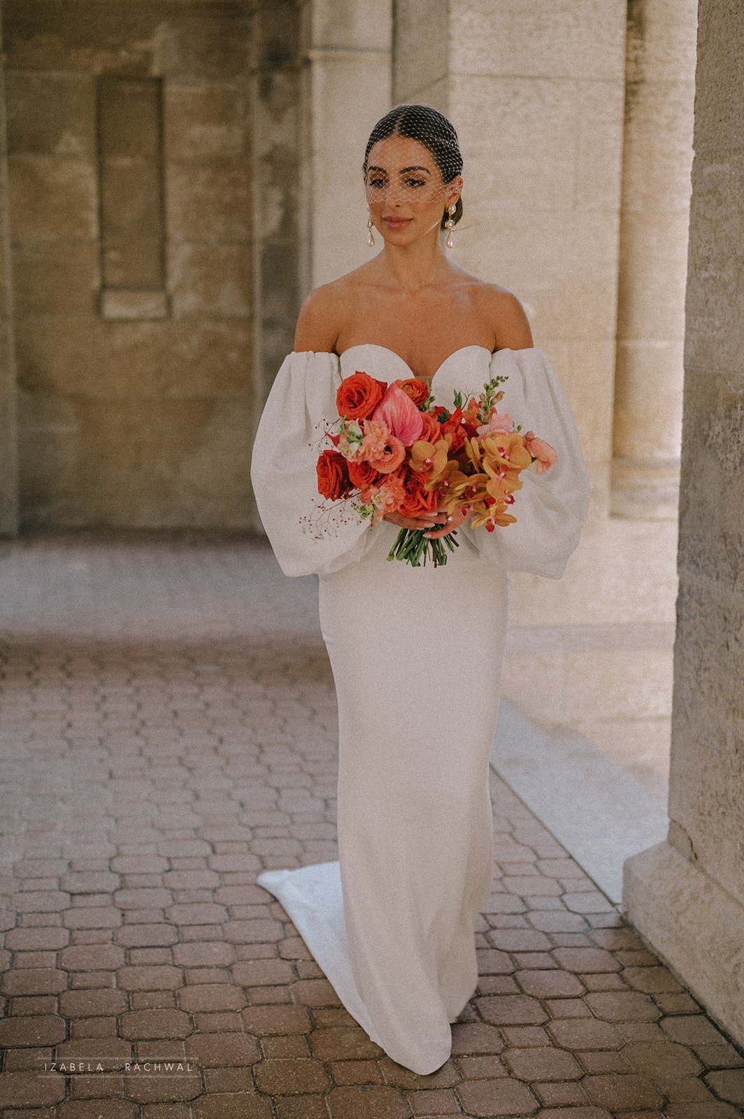
BOUQUET PERFECTION. If I do say so myself 😘 Everything about this bouquet was just perfect. We obviously kept the colouring rich (which looks amazing against white dresses — if you’re on the fence about colour, please: GO FOR IT), focusing on those poppy reds with touches of brighter and softer pink added in, and finished with those breathtaking orchids that couldn’t have been more perfect.
FYI there’s a lesson in here — we don’t have a lot of control over the flowers that come in at our wholesaler, specifically when they’re more specialty flowers. Like, your roses are basically always going to come in with the correct variety and stem count that you want. But something like an orchid is trickier up here in the great white North, so I gave my rep a few colour options that I liked and the overall palette of the wedding, and then hoped for the best. I couldn’t guarantee to Natasha that I was going to get something that was going to be perfect, and so we couldn’t try to control it. BUT IT WAS PERFECT.
Bridal Bouquet Ingredients: Nina roses, rockstar roses, gladiola, ranunculus, snap dragons, Jewels of Opar, sweet pea, anthurium, and those perfect phalaenopsis orchids.


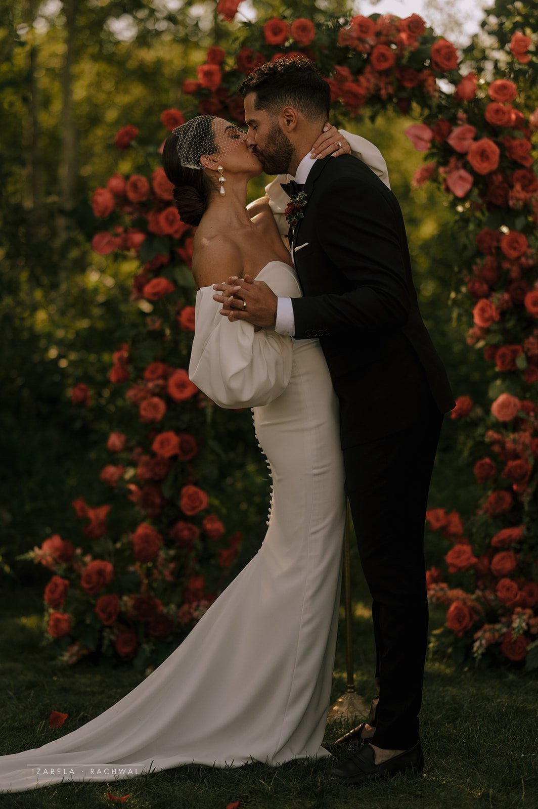
The ceremony. This arch. The perfect spot in the trees. I don’t know what else I can say aside from PERFECTION.
I love designing a statement arch but the red obviously kicked it up a notch unlike any other palette. Someone else, please give me a red palette and I will KISS you.


Okay, so we obviously had a lot of fun with the reception design. Natasha had a clear vision but wasn’t totally sure how to bring it all together or what products were available for rent here in Winnipeg, so I was happy to come alongside her and make suggestions about rentals, styling, and so on — and honestly, the trust that she put in me was AMAZING and that’s what creates the best experience and final product.
Since their wedding was originally going to be at a different venue (and then postponed because of Covid, and then that venue wasn’t actually BUILT so she had to switch gears altogether), Natasha viewed White Poplar as a blank slate that she could do whatever she wanted with.


First, Natasha brought in cross-back chairs instead of the black metal that are standard at the venue, and added white draping to soften the more barn/industrial style space. She also added a dusty rose velvet linen to the head table to create an elevated aesthetic and also make sure the bridesmaids don’t have to worry about sitting prim and proper all night long. We added a gorgeous low floral piece to the centre of the head table, along with clusters of candles and greenery touches to finish that design up.
I wanted to create a sense of undulation down the tables, and Natasha liked the idea of these low arrangements that felt like they were growing out of the tables. We paired those with fuller florals in gold urns, and added plenty of candles in a soft taupe to elevate the aesthetic (this makes SUCH a big difference…sometimes a white candle is the way to go, but sometimes it’s just too stark and basic!).


I loved the place settings! The gold-rimmed plates were lovely and felt rich, and I suggested layering in a terracotta napkin underneath the bread plate, for both function and fashion. It added a bit of authentic rustic vibes, and also didn’t blow away — word to the wise, The White Poplar is suuuuuper windy. Natasha’s friend designed all the stationery on this luxe, luscious paper (isn’t the colour stunning?!) and then on the day-of, when Alex from Alexandra Lillian Events was setting everything up she came up against the wind when setting the place cards. I suggested they be tucked into the salad fork tynes, which again felt a little rustic (in a good way guys, not in a burlap barn way, k?) and also got that job done.


We need to give a MOMENT to this cake. Woah. Jenna Rae Cakes absolutely blew it out of the water with this complete masterpiece. I connected with Jenna in advance of the wedding and let her know what flowers I was using, and what I could provide her with that would last on the cake, and then she just went for it. Seriously, if you want your cake to be a true work of art, you need to connect with Jenna.

And, obviously, the flowers were pretty spectacular, if I do say so myself! My team really killed it, and we had an awesome time designing lush pieces filled with locally grown and specialty imported flowers.


Everything about this day was amazing. What made it even better was the vendor team, all listed below. This was my first time working at White Poplar, and AJ is AMAZING. Alexandra Lillian Events provided coordination services, and she’s always such a breath of fresh air and such a gentle spirit to work alongside. Jenna Rae Cakes BROUGHT IT. Truly, everything about this wedding was just chef’s kiss.* Hire vendors who get your style, and let them help you along the way. It’ll work out so much better for you!
Izabela Rachwal Photography ~ The White Poplar ~ Alexandra Lillian Events ~ Jenna Rae Cakes ~ Planned Perfectly ~ Collective Event Rentals ~ Idyll Paper ~ Faith Robert ~ Chef Ben Kramer ~ Bliss Bridal Boutique ~ JP Media works
LOOKING FOR A WEDDING FLORAL AND EVENT DESIGNER IN WINNIPEG?
My 2024 calendar is now open!
Flowers are the best way to make a statement at your wedding. Whether you already have a specific vision or want me to dream up something custom just for you, reach out to Stone House Creative for stunning bridal bouquets, truly unique ceremony backdrops, and beautiful floral centrepieces to create the perfect ambiance for your wedding!