

Modern Garden Wedding at The White Poplar
I absolutely LOVE working at The White Poplar and I will shout it from the rooftops! So when Tori and Ian inquired about their wedding (more than a year and a half in advance!) I was already pumped. Then they brought on the best vendor team, and a gorgeous design plan, and I was in wedding design heaven.
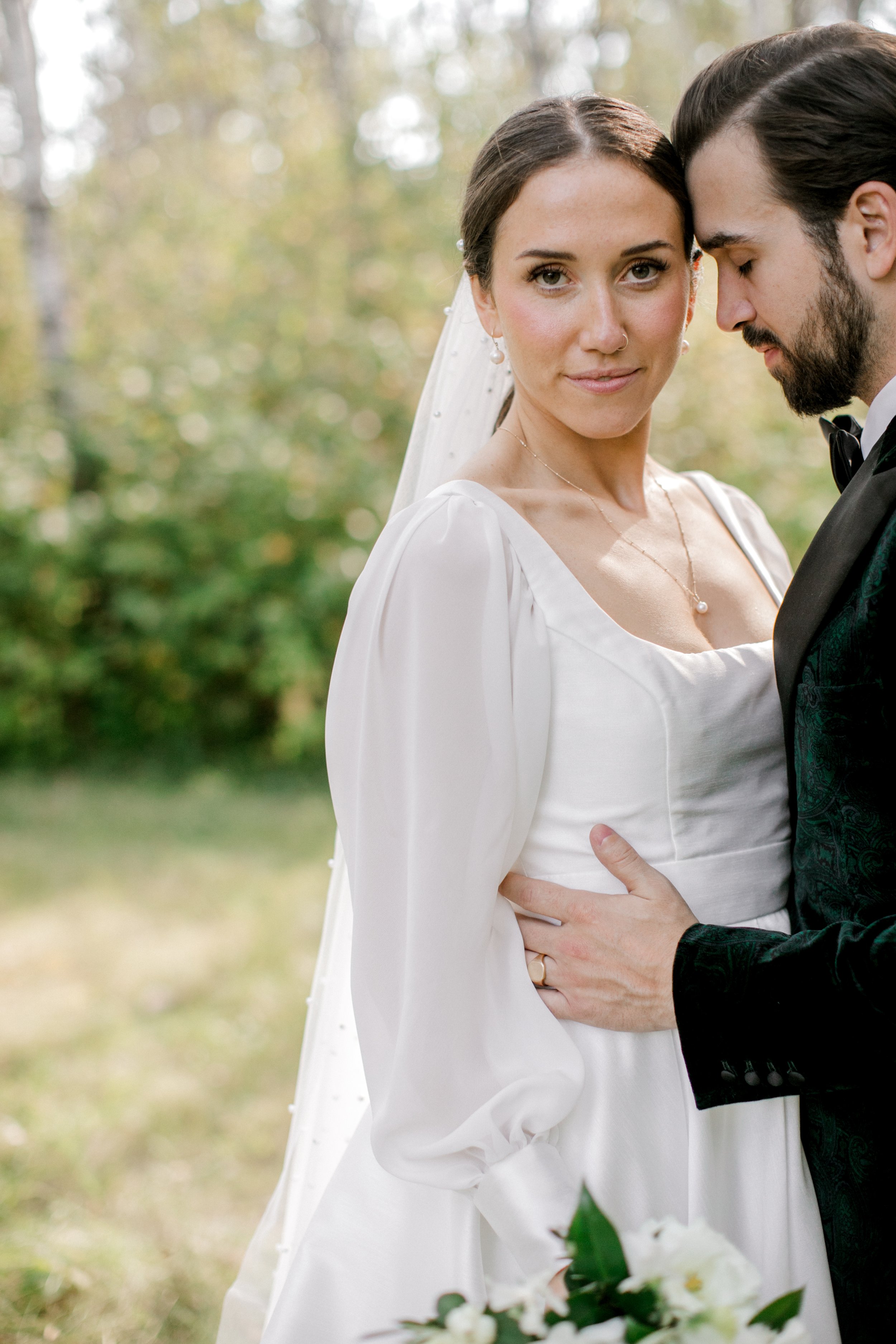
Tori has a really classic style, and we wanted to meet it with modern sensibility — so a crisp palette of black and white was chosen, with warm taupes and mixed greens added.
Photos by Brittany Mahood Photography
I absolutely LOVE working at The White Poplar and I will shout it from the rooftops! So when Tori and Ian inquired about their wedding (more than a year and a half in advance!) I was already pumped. Then they brought on the best vendor team, and a gorgeous design plan, and I was in wedding design heaven.
Tori has a really classic style, and we wanted to meet it with modern sensibility — so a crisp palette of black and white was chosen, with warm taupes and mixed greens added.
Photos by Brittany Mahood Photography

“Lauren, I cannot thank you enough for your beautiful work. It was truly better than I could have imagined! I spent so much time on the dance floor just staring at the arch, it was insane!! Thank you thank you thank you 💕”
— Tori and Ian


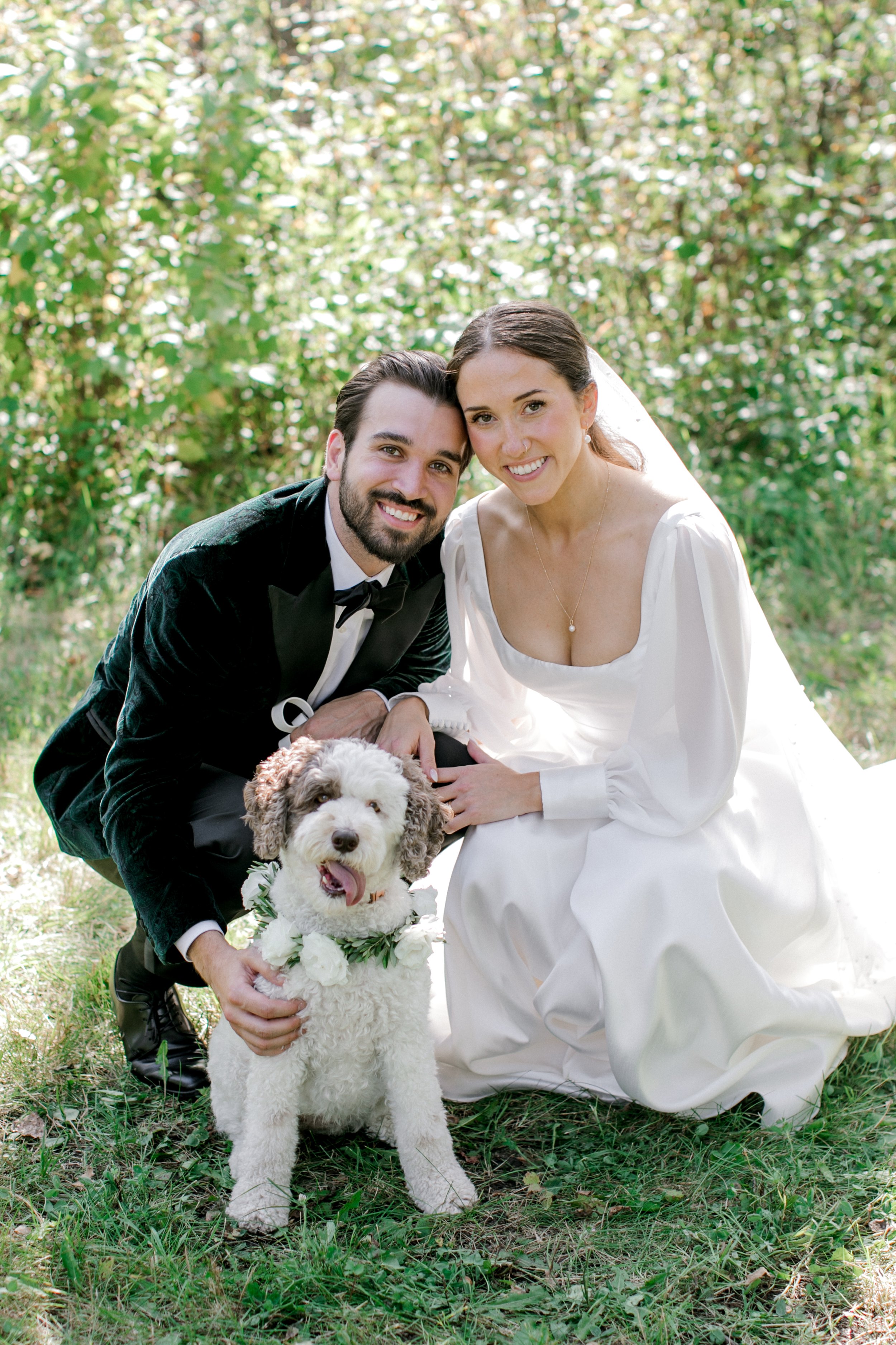
There’s something about the shape of Tori’s beautiful gown that reminds me of Maria from The Sound of Music. It is so refined! Her pearl-dotted hair and veil were the perfect finishing touches. And isn’t the green tone they bridesmaids chose gorgeous? This was a September wedding, so we definitely didn’t have “fall” leaves yet but the richness of the green was very seasonally appropriate.
Tori requested a classic cascading bouquet, and I initially made it WAY too big because the flowers were just so lush and divine. Late summer is the perfect time for locally grown flowers, and we had them in abundance for Tori.


If you’ve been around here a while, you know that I’m a lover of lots of colour. That’s just my personal preference, but part of that is also because a lot of white weddings look the same. Designers tend to gravitate toward their few favourite ingredients, so it’s tricky to see how to pull through the client’s individual style along with the designer’s style.
I actually designed quite a lot of white weddings this year, and I made it a mission to make them each unique. My secret weapon: locally grown flowers. Tori’s wedding had SO many.
Bridal Bouquet Ingredients: white lisianthus, roses, dahlias, anemones, sweet pea, and snowberry combined with olive and stephanotis vines.


One of many reasons why The Poplar is an incredible place to get married: the photo ops! The natural setting is really stunning.


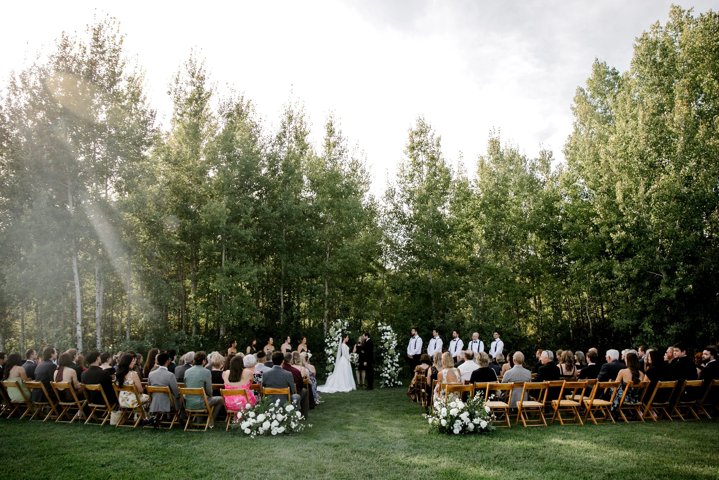
This ceremony because such a beautiful focal point for the day! Their service was personal and relaxed, and of course, I loved the florals. When your backdrop is a wall of trees, we need to be careful with a green and white palette, so that the arch you’re investing money into doesn’t get blend right into the scenery.
The couple loved the idea of an asymmetrical 2 piece arch, with full white and green coverage. Gorgeous — but also, very easy to end up looking like every other white and green wedding. It’s always a priority for me to make each wedding look unique, so I decided to focus on selecting ingredients that would feel fresh.
For any white wedding, I almost always use playa blanca roses. They open up HUGE and have such a gorgeous shape. But again, even though they’re the perfect rose, I needed to add something that would be unique. So, I cut and dried locally grown green hydrangea — they dry exactly like they look fresh, so I didn’t have to worry about a water source. We clustered these in different groupings along the arch structure, and then focused on lots of white lisianthus (locally grown, whenever I can get them!), the roses, white delphinium for a few fluttery touches, and some clustered white ball dahlias.
We added 2 large arrangements at the back of the aisle to tie the entire space together.


Reception time! The building at The White Poplar is so great — those large front doors, the patio leading to the ceremony site, and all those clear walls make for a great blank space.
The first thing guests saw when they entered was this beautiful seating chart, where we repurposed the aisle flowers. The tables flowed from there, with long tables lining the centre of the room and round tables along the outsides. A sweetheart table was positioned in front of the fireplace.


Soiree Event Planning chose the perfect matte black flatware to accent the industrial black chairs, and a gorgeous dark olive napkin. For the long tables, we clustered petite arrangements in black and grey smoke glass vases (all white, mostly locally grown florals!), and added in ribbed grey smoke glass votives along with soft green taper candles.
The round tables featured a fuller floral arrangement in a matte black vase, complimented by assorted sizes and styles of candles for a more collected but still modern look.
Tip for weddings at The White Poplar: affix your place cards to your menus, and tuck them into your napkins. It can be very windy out there!


Tori and Ian literally told me that flowers weren’t a huge priority for them, but what was a priority was the overall design, and making sure that everything was the appropriate scale and just “felt right.” We went through a few revisions of the floral plan to make sure that we had it right, and I think it came together pretty perfectly between the simpler but still interesting floral centrepieces and the way we repurposed the ceremony florals.

Looking for a Wedding Floral Designer in Winnipeg?
Planning a wedding at The White Poplar? I’ve got a list of design dreams I cannot wait to make a reality. I’d love to be your designer!
Flowers are the best way to make a statement at your wedding. Reach out to Stone House Creative for stunning bridal bouquets, truly unique ceremony backdrops, and beautiful floral centrepieces to create the perfect ambiance for your wedding!


Modern Architectural Inspired Wedding at the Leaf
It’s finally time to share SO MUCH DETAIL from this architecturally-inspired editorial I designed at The Leaf!
My vision was something chic, sculptural, and heavily influenced by the use of a single type of flower (in this case, white lilies). The slatted wood wall in the mezzanine area of The Leaf was absolute perfect backdrop for the strong lines I wanted to create.
I’m going to start with a very quick visual overview of the design elements, and then get down into some nitty gritty of the pricing for you!
Photos by Keila Marie Photography


Aren’t these details just perfection! I’m so grateful to all of the wedding professionals who helped me bring this to life. It takes a team, friends!
The tabletop was a labour of love to design. Pretty early on, I decided that I wanted to use Planned Perfectly’s toffee linen and Union Table’s matte black flatware with ribbed glassware, but I hemmed and hawed over the place settings. I’m so glad I chose the speckled plates because they add such fun!
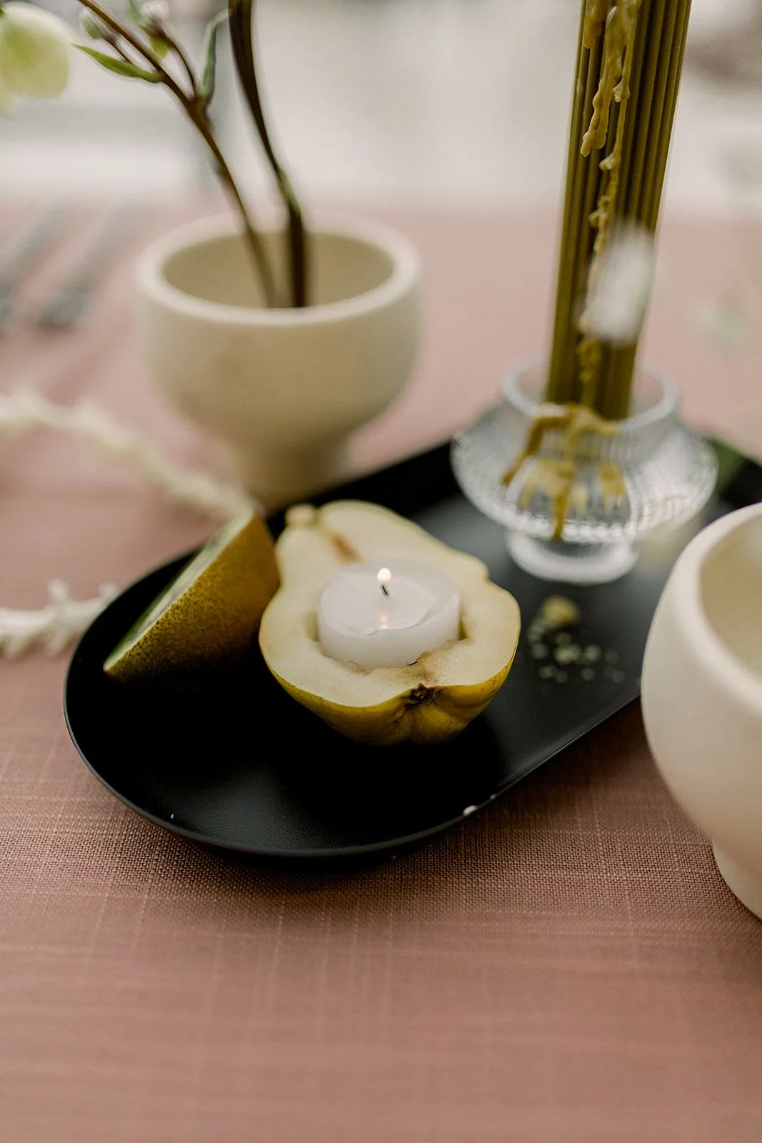
Multiple sculptural floral centrepieces are featured down the table, accented with ribbed olive green candles, black trays with fresh fruit, and chains of hyacinth blooms, which added some really fun, modern whimsy.

How much do you think this bridal bouquet costs?
Bridal Bouquet Ingredients:
Freesia
Tweedia
Hellebore
Mini Cymbidium Orchids
Allium
Looped Hyacinth Chains
And finished with hand died silk ribbon from
Tono and Co
BRIDAL BOUQUET COST: $435
This bouquet was a bit of a trial for me — because it wasn’t at all what I had planned on. Almost none of the flowers that I ordered for it actually came in! I envisioned a bouquet that was on the smaller side, with a chic, highly textured design, with these hyacinth chains as a major focal point. That’s basically the only element that came together the way I had originally intended.
That being said, sometimes we have to roll with what we can, especially when we’re working with live, perishable product! The lime cymbidium orchids were perfect for tying through that bright chartreuse tone I needed, and while I didn’t plan on using the white freesia, I loved the warm yellow in the centre and the linear stem shape.
Most of my bridal bouquets aren’t this high cost, but the ingredients I used are mostly premium product and that comes with a higher price tag.


I love wandering around the Tropical Biome at the Leaf, but I didn’t want Erika’s portraits to feel too “wedding photos at the Leaf.” Keila took my vision of clean, bright, fine art meets tropical and played up the atmosphere and the way it supported Erika’s modern column gown, rather than going too typical and obvious.
This is the Aesling Sagrada gown. It’s chic, minimal lines paired with the dramatic (detachable!) cape is what drew me to it. It was perfect for this architectural vision!

Get the Look


The arch was my personal focal point; I wanted something strong, something modern, and choosing to focus on just one ingredient type is not at all common, but forcing myself to stick to just one element allowed me to really play up the star shaped flower.
I tucked in a few double lilies for a softer texture here and there, which were absolutely divine.
Add in a set of minimal black chivari chairs, and you’ve got quite a cool ambiance thanks to that slatted wall and lily arch combo! If there’s a piece of architectural interest at your venue, consider how you can play it up.


THIS CAKE. Jenna did an amazing job, as always!! This wafer paper design feels feminine, structural, and really strong all at the same time. I honestly cringe at the thought of how long this must have taken her to make! The vertically applied wafer paper is reminiscent of that slatted wood wall I took so much inspiration from, and I love the way she curved it around the cake, and added some delicate movement to it. Cake perfection.


I remember gasping when I opened up the stationery suite from Rae + Dot. They used a speciality printing technique called blind debossing to add a three-dimensional ribbed texture to the paper, again perfectly hearkening back to the slatted wood wall that I love so much. I had requested a patterned envelope liner, and suggested that an architectural take on a lily bloom would be cool. The line drawing with the warm toffee paper was AMAZING.


Isn’t Erika absolutely gorgeous? She ALWAYS is, by the way. It’s kind of irritating how beautiful she is. Jessica Kmiec went pink and glowy on her, and Bailey pulled her hair back with these striking pearl hair pins. Chic, modern, goddess. Yeah baby.
Erika also helped me set the table and helped me clean up, and I’m so grateful to you 😘
Keila Marie Photography ~ Stone House Creative ~ The Leaf ~ Planned Perfectly ~ Union Table ~ Jenna Rae Cakes ~ Rae and Dot Studio ~ Love note Bride ~ Jessica Kmiec Artistry ~ Bailey VanderVeen
Hire a Talented Wedding Floral and Event Designer in Winnipeg
Not to toot my own horn (too much), but I happen to be really good at this. I’d be thrilled to design an incredible atmosphere and accompanying florals for your wedding.


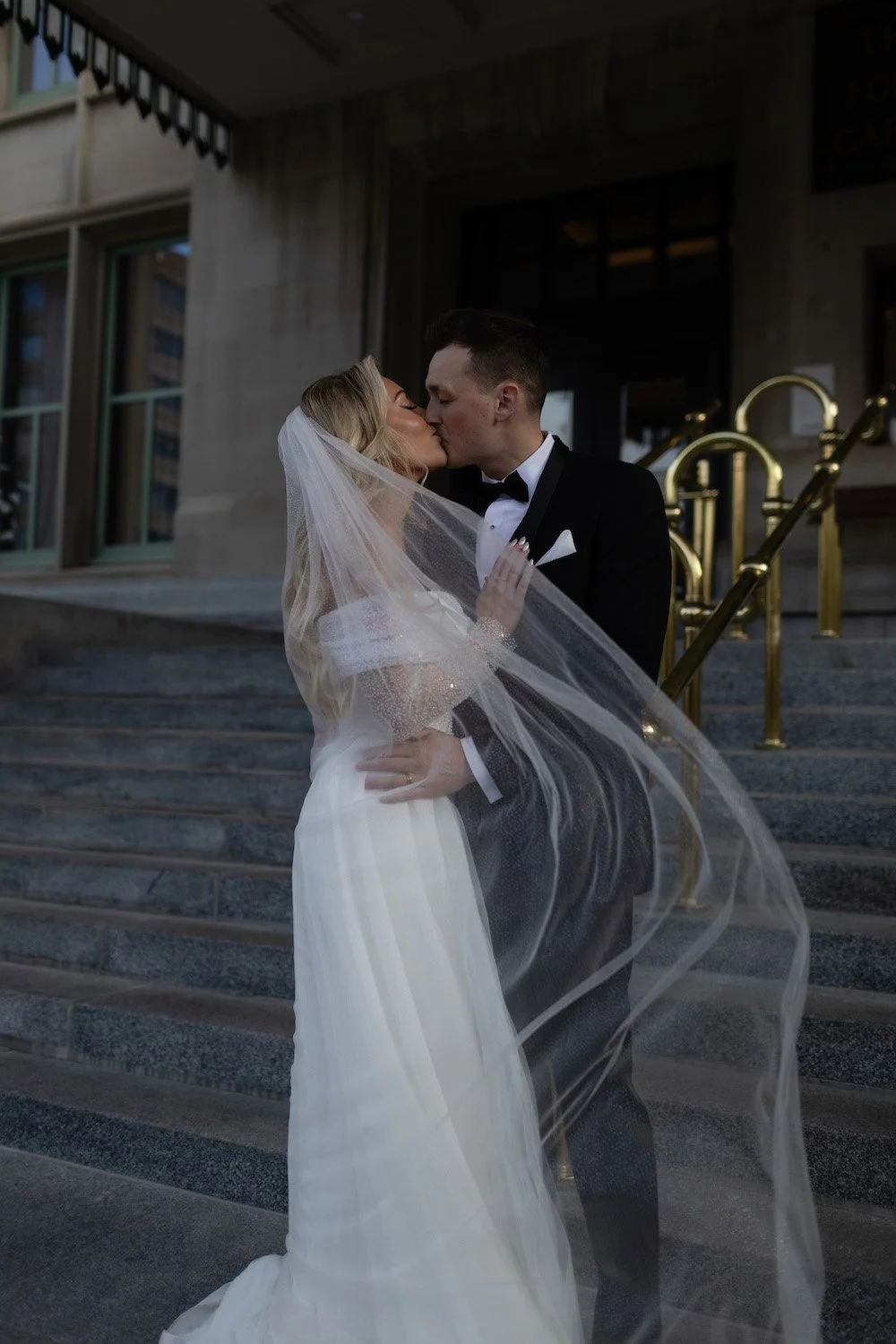
Moody Fashion-Forward Wedding at the Hotel Fort Garry
Being part of Sarah and Scott’s moody, fashion-forward wedding at the Fort Garry Hotel last fall was such a delight.
The flowers were not a huge priority for her — and while most of my couples do put a large emphasis on their florals, I know that many couples out there are in the same place as Sarah! And that’s totally, totally fine.
So instead of doing florals all over the place, we kept a close eye on their budget and chose multi-purpose pieces that would highlight a few key areas, and let Sarah’s fashion be the central design moment.
Photos by Michael & Melanie
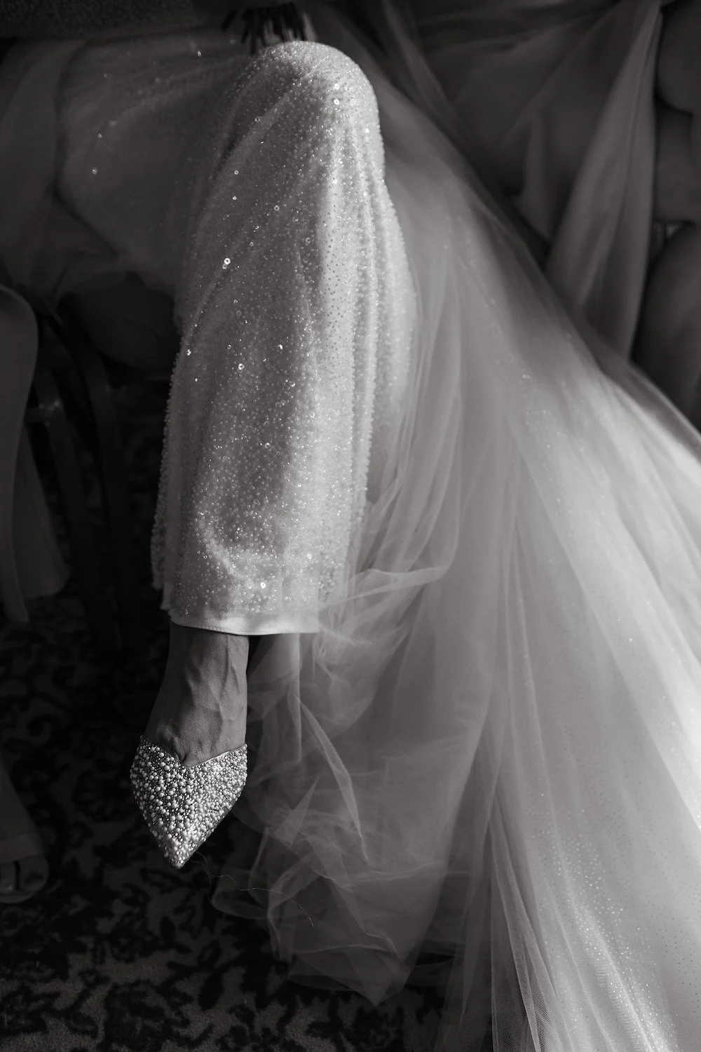


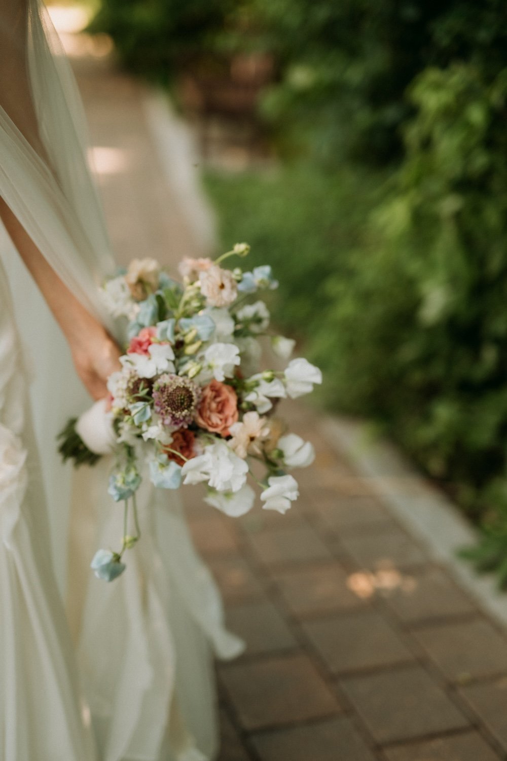
Sarah wanted to go smaller and simpler for her bridal bouquet, keeping it a little more chic and not take away from her dress.
Bridal Bouquet Ingredients: baby’s breath, cream and white spray roses, and playa blanca roses.


I don’t normally post this many portraits and fashion shots, but this gallery from Michael & Melanie is just SO gorgeous. Sarah is all about the fashion and her bridal looks were absolutely divine, so I needed to share a bit more than usual.
The overskirt? The perfect sleeve length? The way she just shimmered? Amazzzing. It’s an Eva Lendel gown, that fate lined up perfectly to make sure she found, on a pre-loved wedding dress site while she was in London, England, of all places. Amazing!!


“Anyone who was on my bridal era journey with me from the beginning knew I didn’t want a lot of flowers initially, but then I found Stone House Creative and immediately changed my mind. Lauren brings a new vision and creativity to this industry I haven’t seen a match for. Her ability to execute someone’s vision is incredible. Thank you for creating such a beautiful backdrop for our celebrations of love.” — Sarah


This ceremony setup has since become one of my most-requested designs by other couples, which is super fun! Sarah wasn’t quite sure what she wanted, but after deciding that she DID want to go with floral decor and tossing around a few ideas, she felt that she needed to reign in the budget. It was actually her idea to repurpose the tall centrepieces and arrange them as an altar around them.
We rented in the mixed clear and gold pedestals, and while we were setting everything up, I decided to call an audible and remove some of the tall stands so the florals were resting right on the pedestals. This added a lot more dimension, created a more designed feeling, and a feeling that that they were floating.
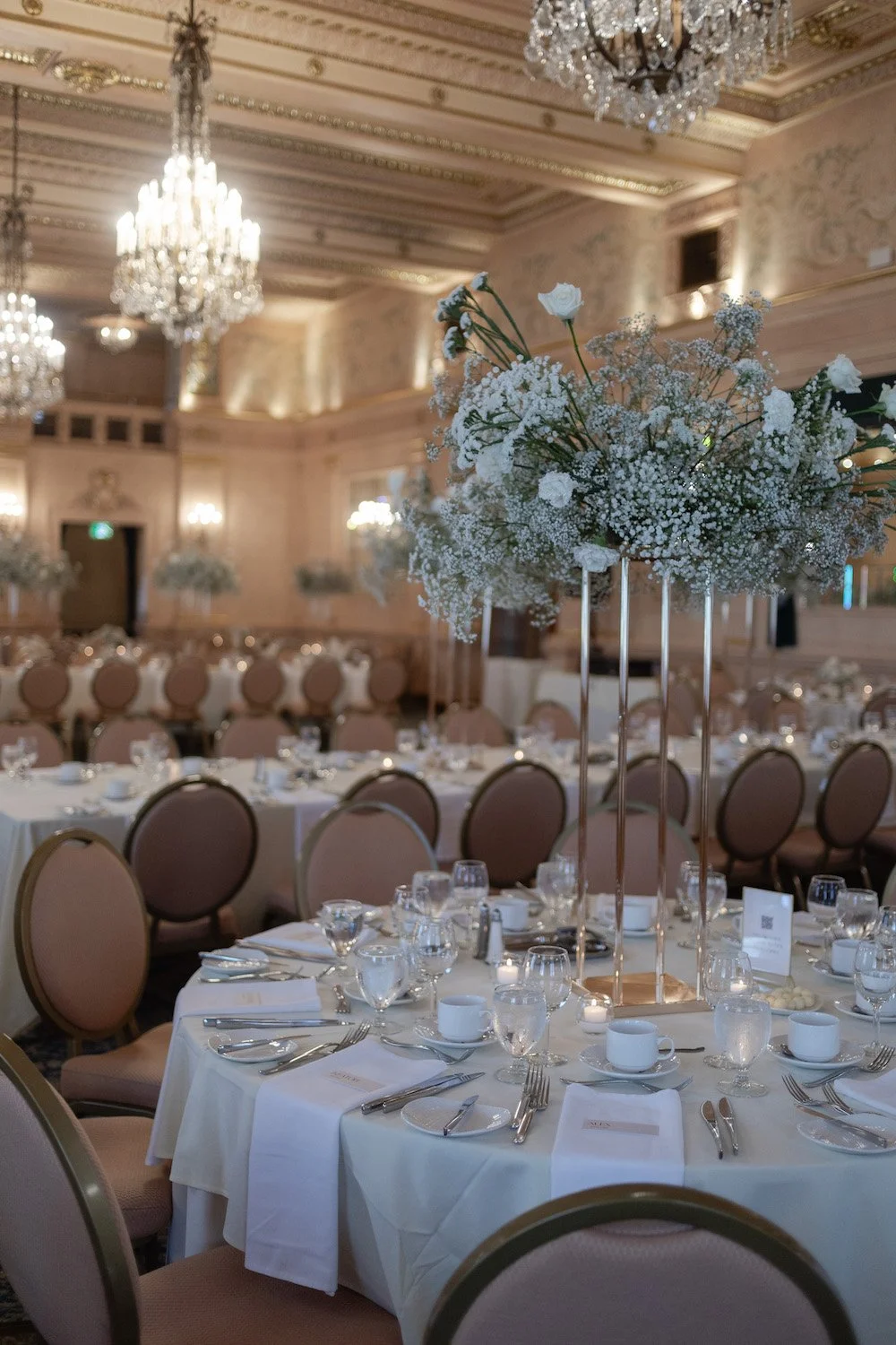


The tall florals were brought over to the guest tables at the reception, paired up with shorter floral arrangements in gold-rimmed vases. I had no idea that the Fort Garry had reupholstered their chairs in this pink tone, but it was lucky! They actually worked perfectly with Sarah’s overall design.
Winnipeg friends will know. Jeanne’s cake, anyone? (I’ve personally never been that into them…aside from the chocolate shavings, which I love)
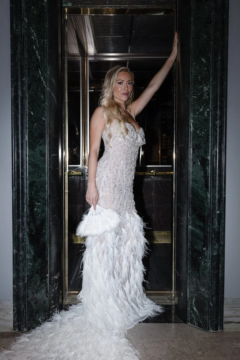


Sarah’s got a pretty cool story about her second dress — she had admired this designer for years (Valdrin Sahiti, known for dressing Khloe Kardashian and Beyonce!!), so she flew to their headquarters in Kosovo (after travelling through Europe to try on wedding dresses everywhere she could find), and met with the design team. She then got hit with a wave of indecision, and couldn’t decide on anything that she loved! She ended up coming home, but kept thinking it over…and finally, figured out the custom designed gown that would be perfect for her. The designers shipped it to her just 8 days before the wedding, complete with 1000+ hand-sewn feathers onto the skirt of the dress.
Looking for a Wedding Floral & Event Designer in Winnipeg?
Dates at the Winnipeg Art Gallery book quickly, and we’re one of their top designers! Reach out to inquire about your date availability.
Whether you already have a specific vision or want me to dream up something custom just for you, reach out to find out how we can create the perfect ambiance for your wedding.


Wedding Inspiration Series: Colour Palette Ideas
We’re back with our latest blog mini-series, with the aim of giving you all the inspiration you need to get into wedding planning. I know that a lot of the different areas of wedding planning can be…let’s say, un-fun…but I hope that all of the pretty can feel like a breath of fresh air for you and reinvigorate your ideas with new inspo!
Today we’re highlighting colour palette inspiration trending for 2025. If you’ve been following me for any amount of time, you’ll know that I’m OBSESSED WITH COLOUR. And when I say that, don’t get nervous: when I say COLOUR, I don’t mean that it has to be neon. Or rainbow. Or Crayloa bright (unless that’s what you want).
There’s such a wide range of what we can do with colour. It really sets the stage for your overall ambiance and vibe, and that’s why colour palette is ALWAYS what I start with when I design a wedding. Layering in different shades and tones, adding depth in just the right places, or a pop of something really vibrant to bring that breath of life…nothing but colour can do that.

Inspiration For yOur Wedding Colour Palette
We’re back with our latest blog mini-series, with the aim of giving you all the inspiration you need to get into wedding planning. I know that a lot of the different areas of wedding planning can be…let’s say, un-fun…but I hope that all of the pretty can feel like a breath of fresh air for you and reinvigorate your ideas with new inspo!
Today we’re highlighting colour palette inspiration trending for 2025. If you’ve been following me for any amount of time, you’ll know that I’m OBSESSED WITH COLOUR. And when I say that, don’t get nervous: when I say COLOUR, I don’t mean that it has to be neon. Or rainbow. Or Crayloa bright (unless that’s what you want).
There’s such a wide range of what we can do with colour. It really sets the stage for your overall ambiance and vibe, and that’s why colour palette is ALWAYS what I start with when I design a wedding. Layering in different shades and tones, adding depth in just the right places, or a pop of something really vibrant to bring that breath of life…nothing but colour can do that.
Photos by Brittany Mahood

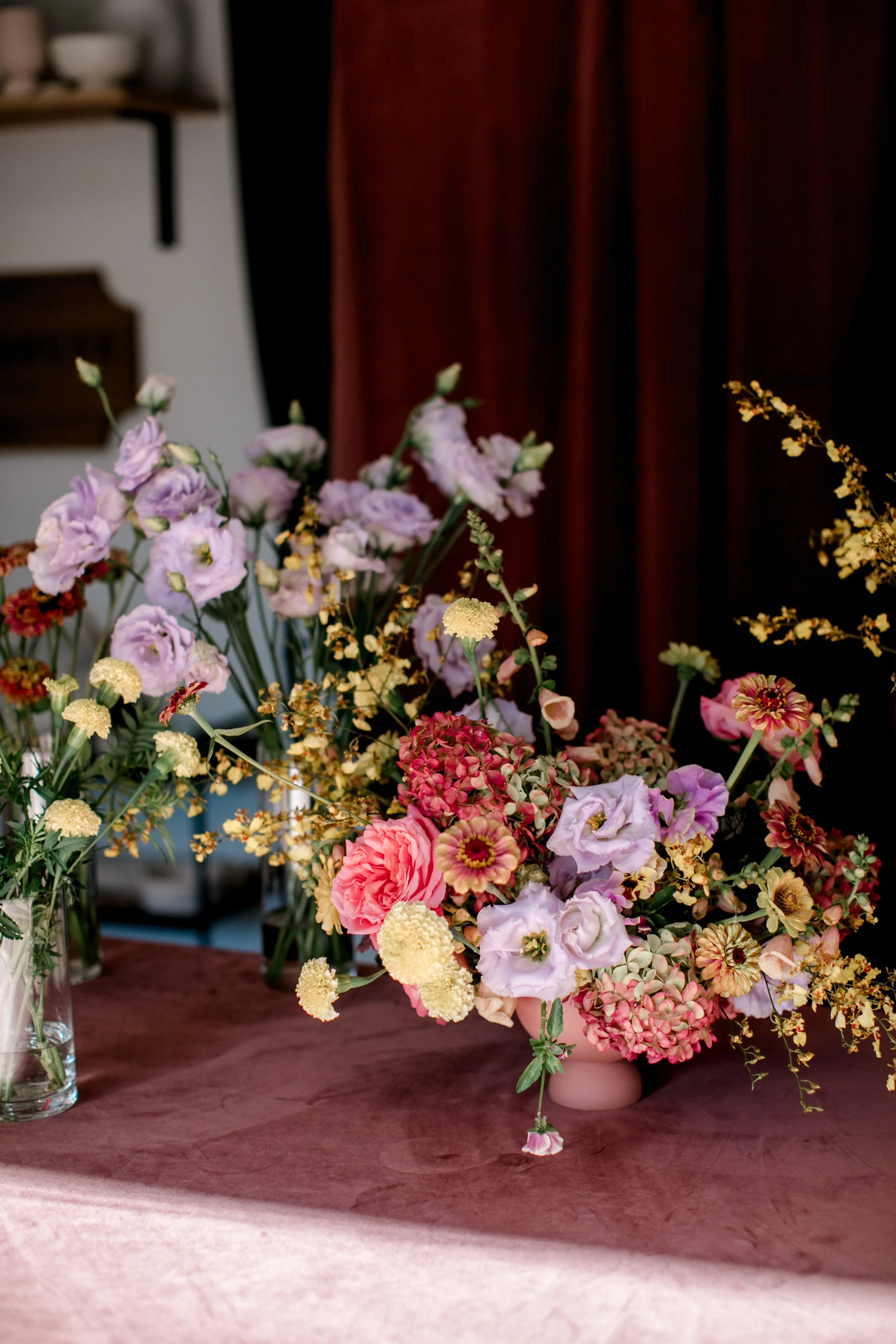
Colour Palette Inspo 1: Pastels
One of the main things I’m seeing for next year is pastels on pastels. 10 years ago we did a ton of romantic pastels, and it’s back in a big Taylor Swift-loving way. But, we’re not just going to go sugar sticky sweet with baby pinks and blues and lavenders. We’ll amp it up in a modern way, of course! That might be a hint of lime or a few pops of saturated pinks that blend with the softer tones, like in the image below.
One of the best ways to ensure that you’ll love your pastel palette is to use locally grown flowers. Locally grown flowers are the BEST for blending a delicious palette (but, of course, you’re limited on the season). We’ll often see multiple tones within a single local bloom, which is what gives us the ability to blend that palette and create something with depth for you.

Below is one of my favourite bouquets I designed this year, in a lovely pastel fluttery combination that was meant to compliment her fluttery ethereal dress. We used more saturated peaches and lavenders throughout the decor flowers, but her bouquet was light and dreamy.

Colour Inspo 2: Reds
Just like in fashion, red has been all the rage in weddings and it’ll continue to move that way for another year or two. I know that a lot of you are afraid of red. You don’t have to be. Yes, it’s bold and it makes a statement BUT do you really want to spend a lot of money on a wedding that doesn’t make any statement at all?
A few ways to play with this:
-Go for a full monochromatic look. Shades of red together is really strong and delicious. I remember a former boss of mine softly suggesting to a bride that she not choose red and white, because it would look like the target symbol…amen to that! If you’re going to go for a bold tone like red, then fully commit to get the most impact.
-Red can read very classic. It can also read very modern, or very bold, etc etc. Choose what direction you want to go and make sure to communicate that to your floral designer, because different shades or varieties of flowers will make or break your look.
-Don’t be afraid to darken your palette for a moody fall/winter wedding, or play it up with some chartreuse or caramel tones for something more summery and fun.


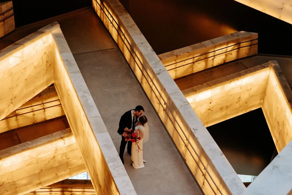
Above are two images from a recent fall wedding we designed at the WAG with Soiree Event Planning. The creative brief called for deep, moody tones of burgundies, dark reds, and plums with architecturally-inspired designs. Obviously we LOVED IT. Much more to come!
Colour Inspo 3: Soft Yellows
This is obviously an extension of the pastel palettes, but one shade I expect we’ll be seeing a lot of (and that I would LOVE to design for you!!) is soft yellow. This hue has a naturally wildflower look to it, and pairs beautifully with soft greens and whites for a really fresh feel. I think soft yellow is best when left on its own or in a simple pairing like these images below, but you could also tuck in a bit of pale pink for some more femininity.


Now, one thing to know is that there aren’t a ton of readily available soft yellow flowers. It’s strange — some of our local growers specifically save seed from their blooms that have been paler than others, so that they can try to encourage the lighter tones more. So, the key is just to avoid using anything that’s too bright, and then working with your fashion and stationery choices to bring in more of that soft yellow. And don’t be put off if your florist suggests something that’s “cream” because that can be the perfect way to pull it together!
LOOKING FOR A WEDDING FLORAL AND EVENT DESIGNER IN WINNIPEG?
I hope you get the idea now, that we’re unapologetic lovers of colour. We would love to make some magic happen for your wedding.
Call me biased, but flowers are the best way to make a statement at your wedding. Whether you already have a specific vision or want me to dream up something custom just for you, reach out to Stone House Creative for stunning bridal bouquets, truly unique ceremony backdrops, and beautiful floral centrepieces to create the perfect ambiance for your wedding!

Warm, Inviting Fall Wedding at SMITH
I just LOVE restaurant weddings, so when Ange and Jonathan first reached out about their fall wedding at Smith, I was pumped. Then I heard more that Connie from Harlow Events had planned, and the ceremony location at the Forks, and I was so excited to be on board.
Warm, inviting, and a colour palette that transitioned from summer to fall was the name of the game here, with a real focus on the guest experience. The couple really wanted their guests to have an amazing time, and that always makes for the best weddings.
Photos by Megan Steen


Oh my goodness gracious, how I LOVED their flowers and colours. Ange and Jonathan’s wedding was in November, so my wholesalers actually had a tricky time getting everything that I wanted because the industry had already shifted away from fall tones. Luckily for us, everything ended up working out flawlessly! The richness and saturation of these tones…divine.
Bridal Bouquet ingredients: Moab, nina, and toffee roses (a STELLAR combination), ranunculus, kangaroo paw, copper beech leaves, cymbidium orchids, and the most divine bittersweet berries.
Angeline didn’t have a wedding party, but I love that the couple still spent time with their friends throughout the day. After we were finished setting up, we took a taco break at the Forks and got to see the girls all hanging out and oohing and aahing over everything, and it was so sweet to watch. It looked like an easy day to be part of — lots of time together, no pressure, and an easy schedule.


I loved this ceremony design and this space. The only other time I’ve been in this room at the Forks was to see a children’s comedian (lol mom life) and obviously this looked a bit better ha!
The chuppah was meant to feel textural and saturated, and it really popped from the white drape behind (which hid a giant hole in the floor — gotta love these old buildings!).
We lined the aisle with candles, and added differently sized pockets of floral throughout the wooden structure. It just looked SO good and the ambiance in this room was amazing.


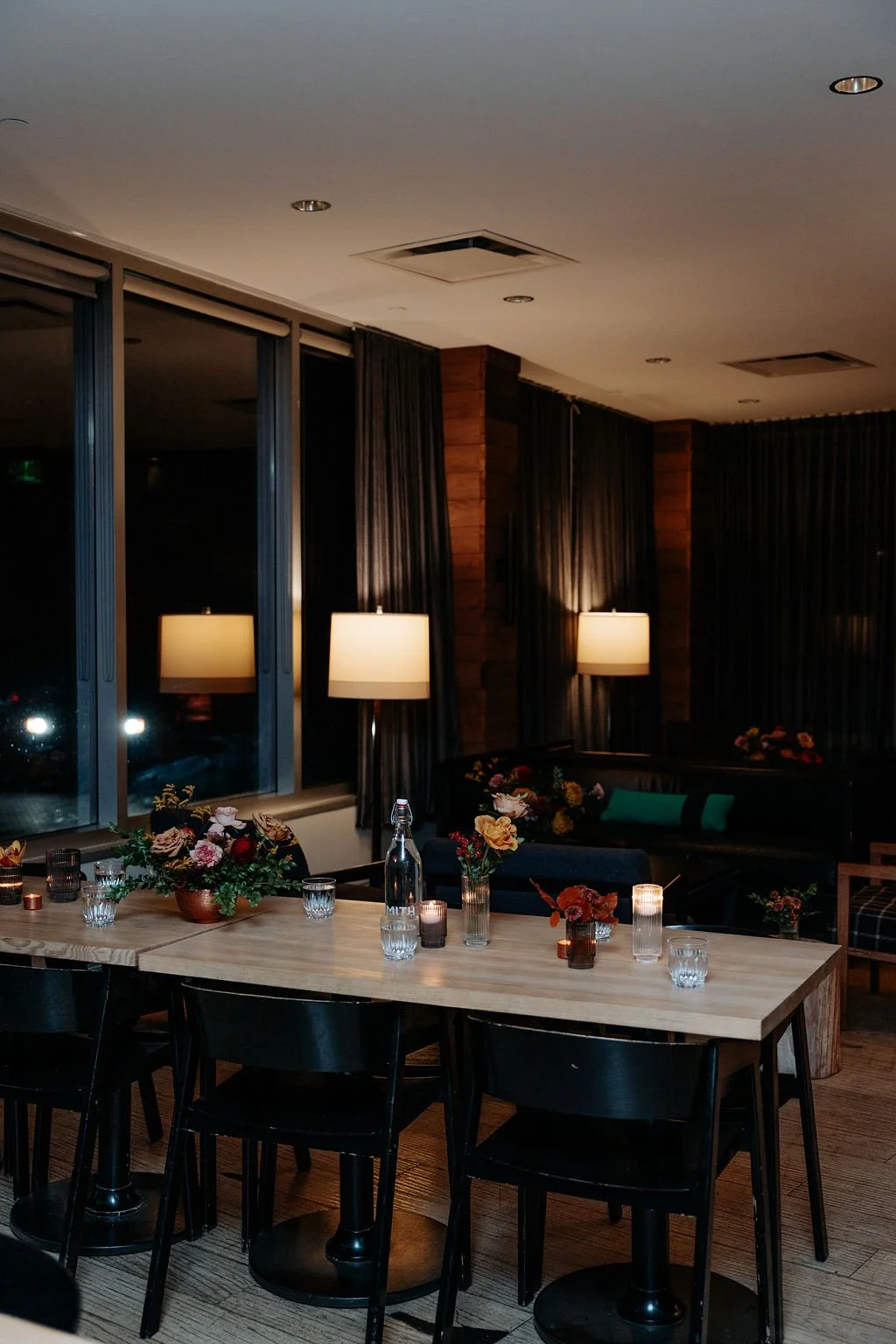
After the ceremony, everyone walked over to Smith for the reception. It was a pretty beautiful day and we lucked out there, at the end of November!
We scattered mixed size floral arrangements and candles throughout the entire restaurant, using copper bowls and ribbed clear and smoke glass vases. I wanted the space to feel very collected but chic, and of course, bring in a lot of warmth through the colours. One of the things I love about Smith is that it has a very distinct vibe but it can handle a lot of different colour palettes.


Another gorgeous wedding, another amazing vendor team, and another fantastic (smelling) meal — seeing as though we don’t actually eat at weddings, but it sure does smell the best at Smith! The ambiance of a restaurant wedding is unlike anything else.
Megan Steen Photography ~ Harlow Events ~ Smith ~ the Forks ~ Dream Day Decorators ~ Event Light ~ Isabel Nayet Hair and MaKeup ~ 4 Square Foto Booth ~ Dirty CatFish Brass Band ~ LoveNote Bride ~ La Petite Paperie ~ Flour and Flower ~ Union Table ~ Collective Event Rentals

LOOKING FOR A WEDDING FLORAL DESIGNER IN WINNIPEG?
We like to consider ourselves specialists in restaurant weddings; we know what it takes to make each space feel unique, create a killer ambiance, and what elements are worth investing in vs not.
Whether you already have a specific vision or want me to dream up something custom just for you, reach out to Stone House Creative for stunning bridal bouquets, truly unique ceremony backdrops, and beautiful floral centrepieces to create the perfect ambiance for your wedding!