

Spanish-Inspired Red Wedding at The White Poplar
Natasha and Joe, in August at The White Poplar — better known as one of my favourite weddings of the year.
And one of your favourites, too — every time I post something from their wedding, Instagram goes wild. The reel I posted of their arch has almost 300 shares…that’s WAY WAY WAY more than anything else I’ve ever shared. So yeah. Natasha and Joe’s wedding is a good one. Let’s dig into it.
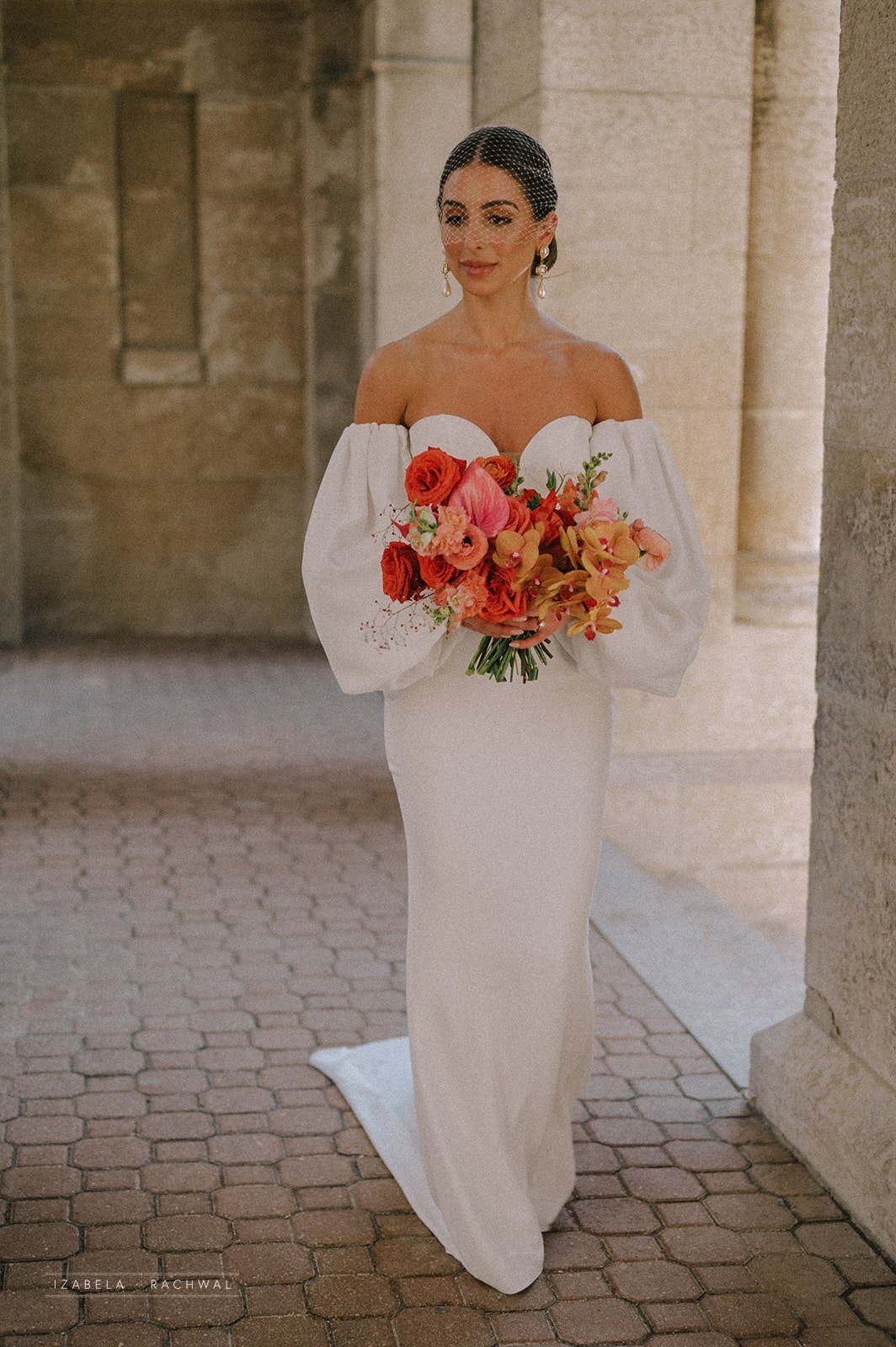
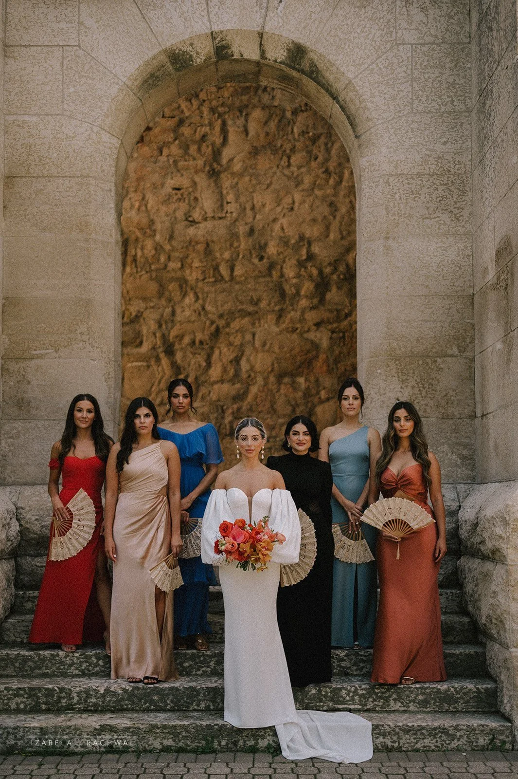
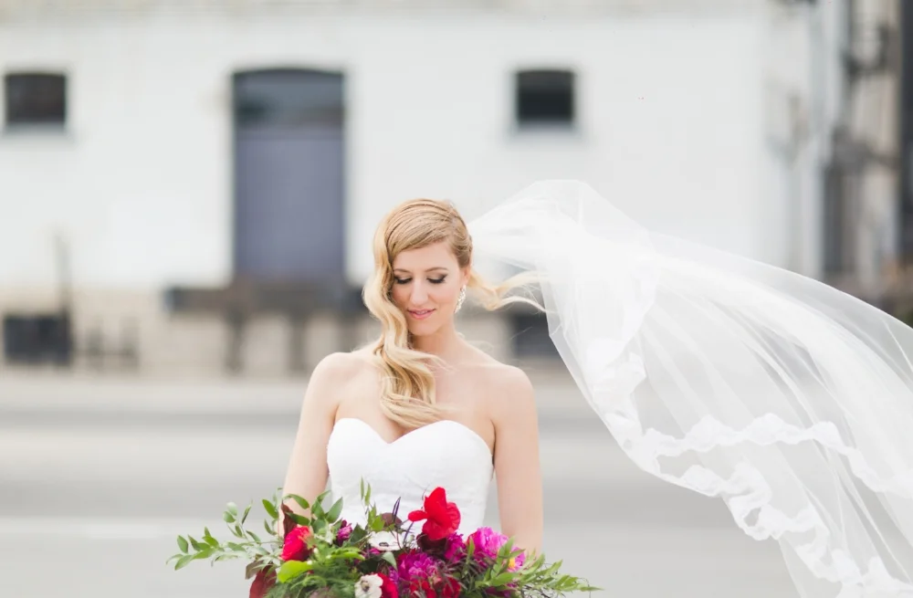
Natasha’s style is obviously impeccable, and she came into the planning with a Spanish-inspired vision. The colour palette? Perfect. Her dresses? Breathtaking. The ceremony arch? One of my absolute faves.
Natasha and Joe, in August at The White Poplar — better known as one of my favourite weddings of the year.
And one of your favourites, too — every time I post something from their wedding, Instagram goes wild. The reel I posted of their arch has almost 300 shares…that’s WAY WAY WAY more than anything else I’ve ever shared. So yeah. Natasha and Joe’s wedding is a good one. Let’s dig into it.
Natasha’s style is obviously impeccable, and she came into the planning with a Spanish-inspired vision. The colour palette? Perfect. Her dresses? Breathtaking. The ceremony arch? One of my absolute faves.
Photos by Rachwal Photography


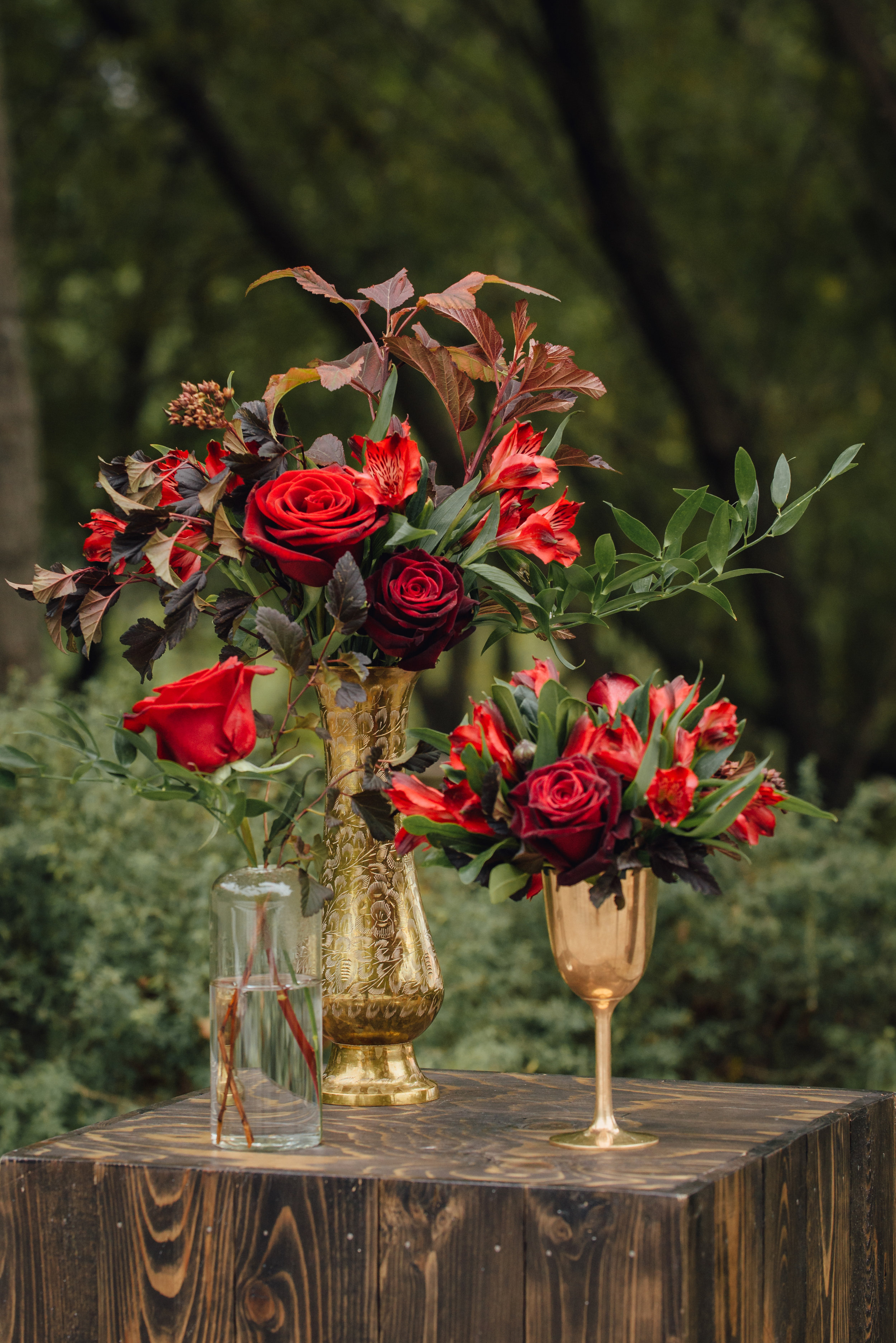
BOUQUET PERFECTION. If I do say so myself 😘 Everything about this bouquet was just perfect. We obviously kept the colouring rich (which looks amazing against white dresses — if you’re on the fence about colour, please: GO FOR IT), focusing on those poppy reds with touches of brighter and softer pink added in, and finished with those breathtaking orchids that couldn’t have been more perfect.
FYI there’s a lesson in here — we don’t have a lot of control over the flowers that come in at our wholesaler, specifically when they’re more specialty flowers. Like, your roses are basically always going to come in with the correct variety and stem count that you want. But something like an orchid is trickier up here in the great white North, so I gave my rep a few colour options that I liked and the overall palette of the wedding, and then hoped for the best. I couldn’t guarantee to Natasha that I was going to get something that was going to be perfect, and so we couldn’t try to control it. BUT IT WAS PERFECT.
Bridal Bouquet Ingredients: Nina roses, rockstar roses, gladiola, ranunculus, snap dragons, Jewels of Opar, sweet pea, anthurium, and those perfect phalaenopsis orchids.


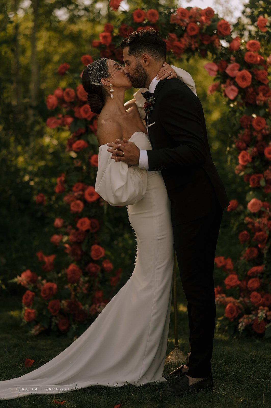
The ceremony. This arch. The perfect spot in the trees. I don’t know what else I can say aside from PERFECTION.
I love designing a statement arch but the red obviously kicked it up a notch unlike any other palette. Someone else, please give me a red palette and I will KISS you.


Okay, so we obviously had a lot of fun with the reception design. Natasha had a clear vision but wasn’t totally sure how to bring it all together or what products were available for rent here in Winnipeg, so I was happy to come alongside her and make suggestions about rentals, styling, and so on — and honestly, the trust that she put in me was AMAZING and that’s what creates the best experience and final product.
Since their wedding was originally going to be at a different venue (and then postponed because of Covid, and then that venue wasn’t actually BUILT so she had to switch gears altogether), Natasha viewed White Poplar as a blank slate that she could do whatever she wanted with.


First, Natasha brought in cross-back chairs instead of the black metal that are standard at the venue, and added white draping to soften the more barn/industrial style space. She also added a dusty rose velvet linen to the head table to create an elevated aesthetic and also make sure the bridesmaids don’t have to worry about sitting prim and proper all night long. We added a gorgeous low floral piece to the centre of the head table, along with clusters of candles and greenery touches to finish that design up.
I wanted to create a sense of undulation down the tables, and Natasha liked the idea of these low arrangements that felt like they were growing out of the tables. We paired those with fuller florals in gold urns, and added plenty of candles in a soft taupe to elevate the aesthetic (this makes SUCH a big difference…sometimes a white candle is the way to go, but sometimes it’s just too stark and basic!).


I loved the place settings! The gold-rimmed plates were lovely and felt rich, and I suggested layering in a terracotta napkin underneath the bread plate, for both function and fashion. It added a bit of authentic rustic vibes, and also didn’t blow away — word to the wise, The White Poplar is suuuuuper windy. Natasha’s friend designed all the stationery on this luxe, luscious paper (isn’t the colour stunning?!) and then on the day-of, when Alex from Alexandra Lillian Events was setting everything up she came up against the wind when setting the place cards. I suggested they be tucked into the salad fork tynes, which again felt a little rustic (in a good way guys, not in a burlap barn way, k?) and also got that job done.


We need to give a MOMENT to this cake. Woah. Jenna Rae Cakes absolutely blew it out of the water with this complete masterpiece. I connected with Jenna in advance of the wedding and let her know what flowers I was using, and what I could provide her with that would last on the cake, and then she just went for it. Seriously, if you want your cake to be a true work of art, you need to connect with Jenna.

And, obviously, the flowers were pretty spectacular, if I do say so myself! My team really killed it, and we had an awesome time designing lush pieces filled with locally grown and specialty imported flowers.


Everything about this day was amazing. What made it even better was the vendor team, all listed below. This was my first time working at White Poplar, and AJ is AMAZING. Alexandra Lillian Events provided coordination services, and she’s always such a breath of fresh air and such a gentle spirit to work alongside. Jenna Rae Cakes BROUGHT IT. Truly, everything about this wedding was just chef’s kiss.* Hire vendors who get your style, and let them help you along the way. It’ll work out so much better for you!
Izabela Rachwal Photography ~ The White Poplar ~ Alexandra Lillian Events ~ Jenna Rae Cakes ~ Planned Perfectly ~ Collective Event Rentals ~ Idyll Paper ~ Faith Robert ~ Chef Ben Kramer ~ Bliss Bridal Boutique ~ JP Media works
LOOKING FOR A WEDDING FLORAL AND EVENT DESIGNER IN WINNIPEG?
My 2024 calendar is now open!
Flowers are the best way to make a statement at your wedding. Whether you already have a specific vision or want me to dream up something custom just for you, reach out to Stone House Creative for stunning bridal bouquets, truly unique ceremony backdrops, and beautiful floral centrepieces to create the perfect ambiance for your wedding!
Kristin and Matt's Fall Wedding at FortWhyte Alive
I have a pretty serious love/hate relationship with fall. I used to love it -- back when I was a kid, fall was the time for packing school supplies into my new backpack and seeing all my friends again. But now that I work in the wedding industry...well, fall means that I basically missed summer. UGH.
But, when I get to work with people like Kristin, it's all okay. She didn't have a super long wish list of flowers that she wanted for her wedding at FortWhyte Alive, which was perfectly fine by me because what she DID want was going to be beautiful.
Black & Gold Photography was great to work with on this wedding, as was Peachy Green Events with some cute decor rentals. Makeup by 2 Chicks and a Bag of Makeup.

All of the luxurious tones and textures in Kristin's bridal bouquet were perfect for the fall day. We used a luxe palette of burgundy and plum, and I created a slightly looser shape without getting too wild. Bridal bouquet ingredients: dahlias, roses, garden roses, ranunculus, silver brunia, ninebark, and italian ruscus. The colours looked great with the burgundy bridesmaid dresses!


FortWhyte Alive has so many great photo spots! This beautiful lake was the setting for Kristin and Matt's outdoor ceremony. Rather than go too big with the flowers and detract from the great view, we decided to go a different route, clustering together smaller arrangements on several wooden stands. It brought together the colour palette, fit really well with the natural setting, and each of the floral pieces were easily moved inside after the wedding!


I had to share this one last photo -- I don't usually have photos taken of me when I deliver flowers, so I'm pretty sure that I was wearing a sports bra and had no makeup on, but it's still kind of fun to show you some of the behind the scenes action!
Ashley and Ken's Bold Wedding at the Fort Garry Hotel
It was a hot day at the beginning of July when Ashley and Ken got married, with their ceremony at The Manitoba Club and the reception next door at the Fort Garry Hotel (with a crazy thunderstorm in the evening!). They chose the Provencher Room at the hotel, which is one of my favourite rooms in the city - it is elegant, romantic, and classic all at the same time. I had a lot of fun with Ashley's inspiration - bold and colourful!
The couple live in Toronto, so it was a lot of emails and picture inspiration until I finally got to meet Ashley about 1 month before the wedding. We changed the plan up a few times, and I just love how Ashley's ideas evolved over the course of their engagement. She really wanted everyone to have a great time and to create a memorable night, and with the help of Amanda Douglas Events, they did just that! Special thanks to Samba Joy Photos.


Luxe Fall Inspiration Highlights
Early this past fall, I wanted to play around with some really beautiful flowers and had a lot of fun designing and creating this luxe inspired fall shoot. My team included the wonderful Kat Willson Photography (who I'm excited to have a few awesome weddings in 2015!), Robin Egg Blue Design, Bliss Bridal Boutique, Caroline Gautron of Edward Carriere, Two Chicks and a Bag of Makeup, and Planned Perfectly. This shoot was featured on one of my favourite international wedding blogs, Wedding Sparrow!
Here are some of my favourite images from the shoot!


When planning this fall shoot, we wanted the overall feel and look to be purposefully simplistic. With the goal of evoking a warm, rich feel as fall colour palettes often do, we also wanted to maintain an overall sense of dignified, elevated style. We wanted to appeal to the fall bride who is stuck with the idea of trotting our those overdone fall themes and who doesn't know how to bring her own sense of style to her wedding. The goal was to create a luxe setting for a wedding, but not overworked and blinged out as is often done. So, it was important that we ground the look with a strong natural element, for which I chose rich wood and natural linen accents on the table and in the bouquet wrap to introduce a quality of depth and texture to the look. Keeping things simple allowed us to explore the colour and texture palette – how would the caramel hues of the garden roses play against the burgundy tapers? What does the contrast between a rich velvet table linen and the refined chair cover bring to the look?


Luxe Love
When it comes to deep colours and weddings, a lot of brides are afraid of going too dark. Others don't know how to integrate red into their palette without ending up with the standard red rose bouquet. I love a good jewel toned palette, and while I'm not always a fan of the typical "luxurious" wedding, I think that a luxe palette of deep red and deep plum can be just what you need!
One of my favourite parts of this bouquet is how the chartreuse ribbon and bright green berry brings life and vibrancy - even better, that berry is part of the deep purple foliage and was foraged from a tree in my neighbourhood!


Bouquet Recipe:
Dahlias, roses, spray roses, ranunculus, scabiosa, bachelor buttons, ruscus, and foraged greenery.
Photos: Brittany Mahood Photography
Styling: Ashley Nicole Design
Florals: Stone House Creative