
Editorial
You've probably heard me say that I LOVE colour.
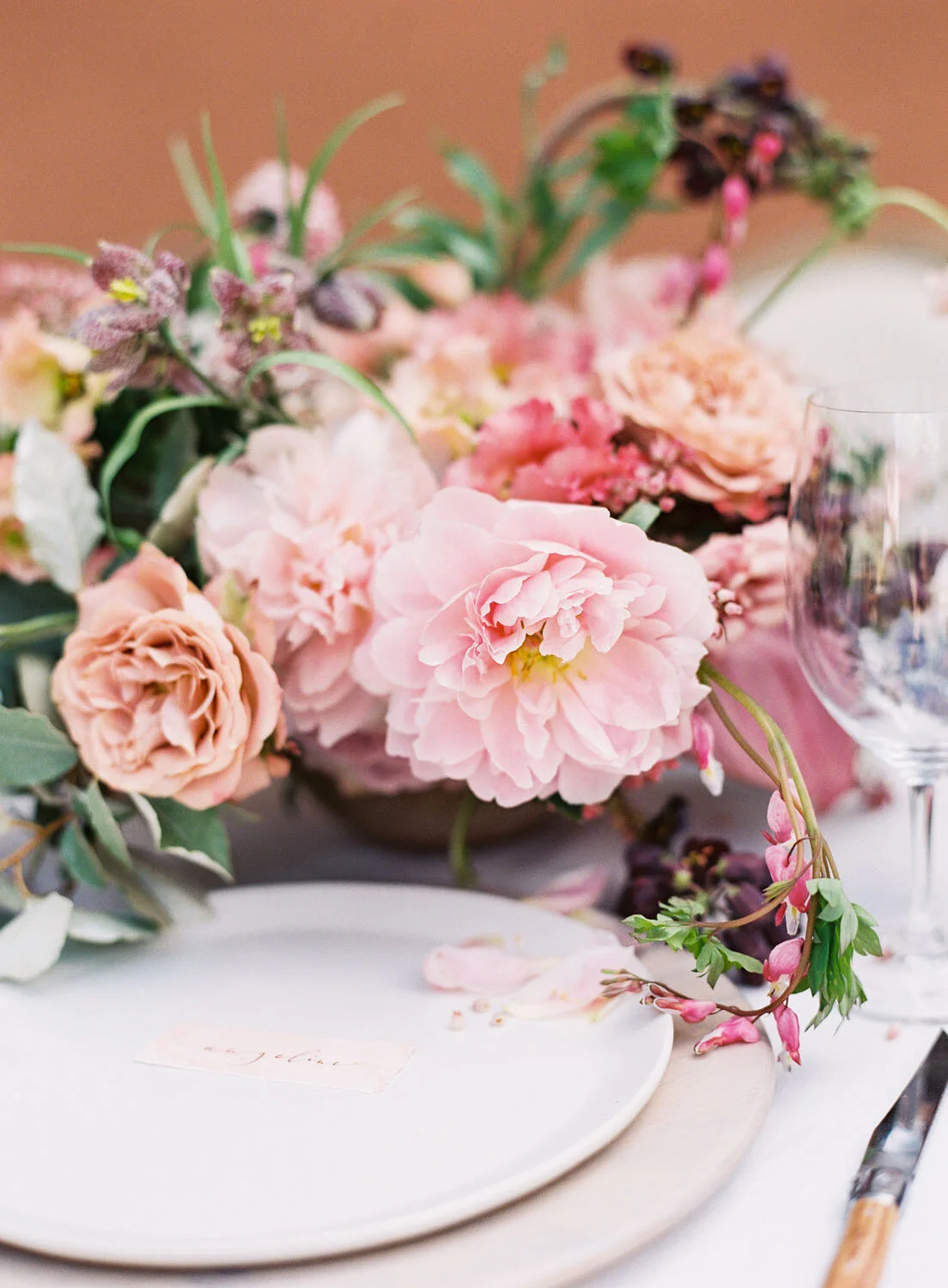
Rosewood Mansion
I realize that colour can make people anxious because they don't always know how to combine different shades and tones, but if you're one of those people, I hope the colour play here inspires you. It's all about finding the right balance between vibrant and muted, and knowing that “colourful” doesn’t have to mean Crayola. A vibrant palette can still be elegant, as evidenced here: coral peonies are the standout, but really make up a very small percentage of the overall floral elements. Cappuccino and mauve roses, pink lisianthus, and plum scabiosa with silvery foliage are the primary selections and they all work together to create a compelling, elevated take on vibrance.
Photo Credit: Kayla Barker Photography


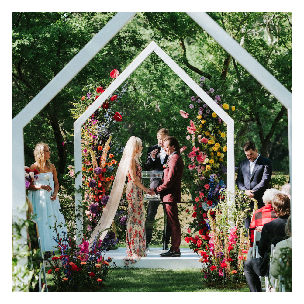
Modern Rainbow Clear Top Tent Wedding in Charleswood
sam & Evan
